VITHIT packaging
VITHIT is a health beverage company specializing in low-calorie, vitamin-infused drinks, utilizing visually distinctive, branded packaging to emphasize health and wellness positioning. Their approach integrates clear product information and vibrant design to enhance shelf appeal and consumer trust.
Packaging Portfolio
VITHIT’s packaging system spans clear PET bottles, aluminum cans, and visually impactful single-layer retail cartons. Bottles and cans feature wraparound labels with high-color saturation and prominent health information, while retail cartons are engineered for both in-store display and e-commerce protection. Packaging structures are lightweight yet robust, designed for bulk shipments and optimized for shelf visibility, with easy-carry carton handles and open-top configurations that facilitate consumer access and product inspection.

The image features a variety of beverage packaging, including plastic bottles and aluminum cans. The bottles are smooth and cylindrical, made of clear plastic with labels. The cans are also cylindrical, made of aluminum with colorful printed graphics. The retail cartons are flat, featuring vibrant colors and graphics, designed for display. Each packaging type has distinct branding elements, with clear product information and logos.
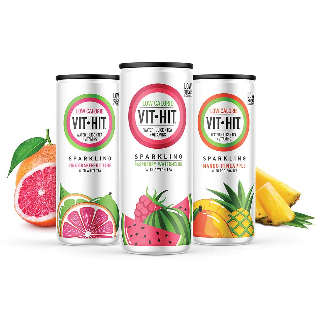
The image features three cylindrical cans, each with a smooth, metallic surface. The cans are adorned with vibrant graphics representing the flavors: Pink Grapefruit Lime, Raspberry Watermelon, and Mango Pineapple. Each can has a clean, modern design with a white background and colorful fruit illustrations. The tops of the cans are flat with a pull-tab opening, and the bottoms are slightly rounded.

The packaging consists of a retail carton that holds multiple beverage bottles. The carton features a smooth, flat construction without any visible fluted layers, indicating it is made from single-layer paperboard. The exterior is printed with vibrant colors, primarily red and white, showcasing the product branding and health messaging. The bottles are arranged in a grid formation, with the carton having a cut-out handle for easy carrying. The overall design is clean and visually appealing, aimed at attracting consumers in a retail environment.

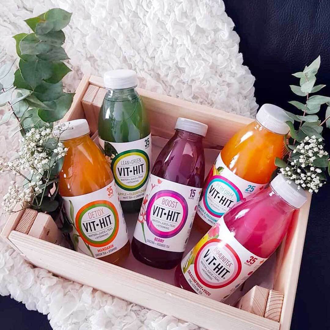
The image showcases a collection of beverage bottles, each with a clear plastic body and a screw-on cap. The bottles are cylindrical in shape, featuring a smooth surface with no visible fluted layers. Each bottle contains a different colored liquid, indicating various flavors. The labels are prominently displayed, wrapping around the bottles, showcasing vibrant graphics and product information.
The packaging consists of a sturdy, rectangular carton that holds multiple beverage bottles. The carton is designed to be visually appealing, featuring a clean, smooth surface with vibrant colors and graphics. Each bottle is clearly visible through the open top of the carton, which is likely designed for retail display. The overall structure is lightweight yet durable, suitable for holding multiple bottles securely.
About the Brand
VITHIT operates in the health drink sector, offering a spectrum of low-calorie beverages packaged in both bottles and cans with a strong focus on branding and consumer convenience. The company leverages direct-to-consumer channels to reach health-conscious buyers in the UK and Ireland.
Packaging plays a central role in VITHIT’s market strategy, supporting product differentiation with bright colors, clear health messaging, and structural formats such as PET bottles, aluminum cans, and printed retail cartons. Their subscription model and e-commerce focus necessitate packaging that balances visual impact with shipping resilience and cost efficiency.
Key Differentiator: VITHIT stands out through its integration of health-focused messaging directly on packaging, consistent use of energy-driven visual elements, and the alignment of packaging formats with D2C logistics and consumer unboxing expectations.
Design System
Visual Style
Clean, sans-serif typography paired with a vibrant color palette reflecting product flavors (e.g., reds, greens, oranges, and whites). Aesthetic prioritizes clarity, freshness, and modern appeal.
Brand Identity
Consistent use of the VITHIT logo, large product names, and health callouts (e.g., 'Low Sugar', 'Immunity'). Iconography and layout are standardized across SKUs, ensuring instant brand recognition and clear communication of functional benefits.
Packaging Design
Primary packaging uses PET and aluminum for recyclability and product protection. Cartons rely on single-layer paperboard with high-quality printing, focusing on lightweight strength and visual merchandising. Structural design emphasizes easy transport, stacking, and unboxing.
User Experience
Packaging is engineered for both retail and direct-to-consumer models, ensuring a positive unboxing experience with bright graphics, accessible product arrangement, and messaging that reinforces health and wellness values throughout the customer journey.
Company Metrics
Business insights for VITHIT based on available data
Market Positioning
Brand Values & Focus
Key Competitors
Target Market: Health-conscious consumers in the UK and Ireland seeking low-calorie, vitamin-enriched drinks with convenient online ordering and delivery options.
Packaging Assessment
Overall Grade
Visual appeal and presentation quality
Packaging durability and protection
Eco-friendliness and recyclable materials
Cost efficiency and value for money
Packaging assessment for VITHIT based on industry standards and best practices
Frequently Asked Questions
What types of packaging materials does VITHIT use for its beverage products?
VITHIT utilizes clear PET plastic bottles, aluminum cans, and single-layer paperboard retail cartons. Their packaging is designed for both visual shelf impact and secure transport.
How does VITHIT ensure packaging supports both branding and product protection?
The company leverages vibrant, brand-consistent labeling and graphics while selecting durable materials and structures—such as sturdy cartons and impact-resistant bottles—to protect contents during e-commerce and retail distribution.
What sustainability practices are evident in VITHIT’s packaging?
While recyclable materials like PET and aluminum are present, further transparency on recycled content or advanced eco-initiatives would strengthen their sustainability profile.
Discover other Food & Drink companies
Explore more companies in the food & drink industry and their packaging strategies
PrepMyMeal
Food & Drink
PrepMyMeal is a food production company specializing in high-protein meal delivery services. They offer a variety of natural, nutritious meals designed for fitness enthusiasts and those seeking convenience in meal preparation.
kerex - terre exotique
Food & Drink
Kerex - Terre Exotique specializes in the international trade of gourmet food and drink products, offering a unique selection of spices and culinary ingredients.
Thés de la Pagode
Food & Drink
Thés de la Pagode is a French company specializing in organic teas and infusions, focusing on health and well-being. Established in 1987, they prioritize sustainable practices and high-quality ingredients sourced through fair trade.