kerex - terre exotique packaging
Kerex - Terre Exotique specializes in importing and distributing premium gourmet spices and culinary ingredients. Their packaging strategy leverages rigid and carton box structures with strong brand integration, aiming to create a memorable consumer experience while supporting product safety and presentation.
Packaging Portfolio
Kerex - Terre Exotique's packaging portfolio is defined by the predominant use of rigid boxes and luxury gift sets, constructed from thick chipboard and paperboard for enhanced durability and upscale presentation. These are frequently complemented by folding cartons with die-cut windows for product visibility and cylindrical metal tins for individual spice containment. The packaging solutions feature structural inserts and snug closures for product protection, while the exterior design leverages decorative graphics, cultural motifs, and prominent logo placement to reinforce brand storytelling. The mix of premium materials and complex structures is tailored for both retail display and gifting occasions.

The packaging is a folding carton with a smooth, flat construction. It features three transparent windows on the front, allowing visibility of the contents inside. The exterior is adorned with vibrant tropical graphics, including leaves and colorful patterns, creating an eye-catching design. The edges are clean and precise, indicative of high-quality paperboard construction.
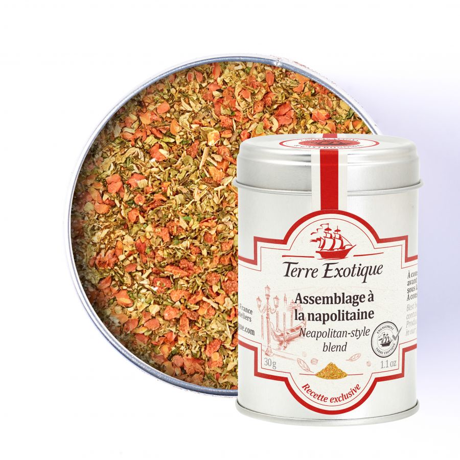
The packaging consists of a cylindrical metal tin with a smooth surface finish. The lid is flat and fits snugly onto the body of the tin. The exterior features a predominantly white background with colorful graphics and text. The design includes a decorative border and illustrations related to the product. The overall appearance is clean and polished, suggesting a premium product.
The packaging consists of a sturdy, thick-walled box that holds multiple smaller tins. The outer box features a decorative design with a colorful illustration of various landmarks and symbols, suggesting a thematic connection to exotic locations. The box is primarily white with a rich maroon logo and text, giving it a premium appearance. The smaller tins inside are cylindrical and have a metallic finish, with labels that include product names and descriptions.

The packaging is a rigid box designed to hold three spice cans. It features a sturdy construction with thick chipboard walls, giving it a premium feel. The exterior is adorned with colorful graphics depicting cultural elements, including a dancer and iconic landmarks, which are printed in vibrant colors. The box has a window cut-out to showcase the cans inside, and the edges are cleanly finished with precise folds. The overall shape is rectangular, designed to fit the three cans snugly.
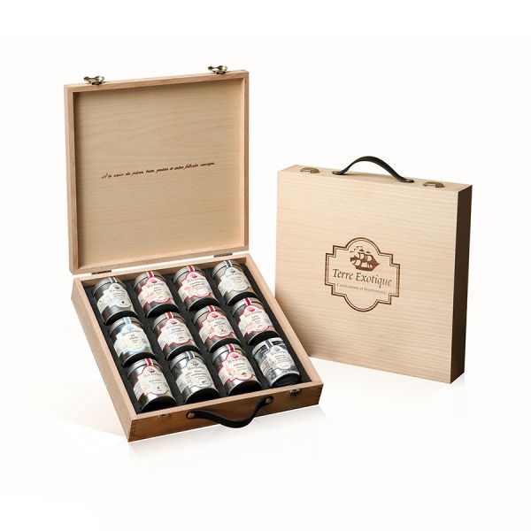
The packaging consists of a sturdy, rectangular box made from thick chipboard, featuring a wooden appearance. The box has a hinged lid that opens to reveal a compartment holding multiple jars. The interior is designed to securely hold the jars in place, likely with custom inserts. The exterior is adorned with a decorative engraving of the brand name and logo, enhancing its premium look.
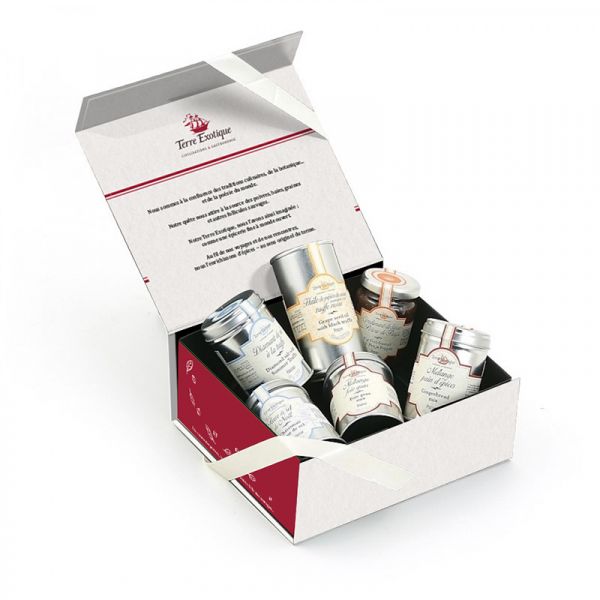
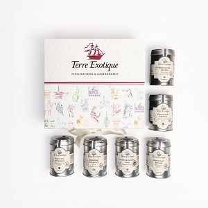
The packaging is a rigid box with a thick, sturdy construction, featuring a clean, flat exterior with a smooth finish. The box is primarily white with a decorative design in red, including a logo and text. The interior holds multiple smaller containers, suggesting a premium presentation. The box opens with a hinged lid and has a ribbon closure, enhancing its luxury appeal.
About the Brand
Kerex - Terre Exotique operates in the gourmet food sector, with a focus on the distribution of high-quality spices and culinary products. The company's packaging approach combines robust rigid boxes and folded cartons with visually engaging graphics and brand-forward design. Their solutions clearly emphasize product protection, upscale presentation, and strong shelf impact.
Established in 1998 in Rochecorbon, France, Kerex - Terre Exotique leverages a curated assortment of packaging formats to support both B2C and professional segments. The brand favors luxury rigid boxes, gift sets, and metal tins for enhanced product safety and premium positioning, complemented by vibrant carton boxes that allow visibility of product contents. Consistency in design, from logo placement to color palette, reinforces their identity in the competitive gourmet food landscape.
Key Differentiator: Kerex - Terre Exotique stands out through its integration of premium packaging structures and thematic visual storytelling, aligning packaging aesthetics with the brand’s culinary exploration ethos.
Design System
Visual Style
Serif and elegant sans-serif typography, a palette combining white, deep reds, and vibrant accent colors, and a visual approach that mixes clean layouts with detailed illustrative graphics representing exotic and cultural themes.
Brand Identity
Consistent logo usage across all packaging, prominent placement of the Terre Exotique brand name, integration of decorative borders and thematic illustrations, and standardized iconography for product differentiation.
Packaging Design
Emphasis on rigid chipboard, quality paperboard, and metal tins; preference for multi-component gift sets and structural inserts that secure products; focus on premium feel and shelf appeal over minimalist efficiency.
User Experience
Unboxing is designed to create a sense of discovery and luxury, with secure closures, layered reveals, and thematic visuals supporting both gifting and everyday use. Packaging supports the customer journey by inviting exploration and reinforcing the brand’s culinary narrative.
Company Metrics
Business insights for kerex - terre exotique based on available data
Market Positioning
Brand Values & Focus
Key Competitors
Target Market: Gourmet food enthusiasts, culinary professionals, and premium gift buyers seeking unique spices and specialty ingredients.
Packaging Assessment
Overall Grade
Visual appeal and presentation quality
Packaging durability and protection
Eco-friendliness and recyclable materials
Cost efficiency and value for money
Packaging assessment for kerex - terre exotique based on industry standards and best practices
Frequently Asked Questions
What types of packaging does Kerex - Terre Exotique use for its products?
Kerex - Terre Exotique utilizes a mix of rigid boxes, luxury gift sets, folding carton boxes with windows, and custom metal tins. These formats are selected for durability, presentation, and to reinforce brand identity.
How does the company ensure the safety of its products during shipping?
Packaging solutions include thick-walled rigid boxes with custom inserts, ensuring product stability and minimizing transit damage. The use of snug-fitting cartons and secure closures further enhances logistics safety.
Is sustainability considered in Kerex - Terre Exotique’s packaging choices?
While premium packaging is prioritized, recyclable paperboard and metal tin materials are evident. However, the prevalence of rigid, multi-material structures may limit overall recyclability compared to more minimalist solutions.
Discover other Food & Drink companies
Explore more companies in the food & drink industry and their packaging strategies
PrepMyMeal
Food & Drink
PrepMyMeal is a food production company specializing in high-protein meal delivery services. They offer a variety of natural, nutritious meals designed for fitness enthusiasts and those seeking convenience in meal preparation.
Thés de la Pagode
Food & Drink
Thés de la Pagode is a French company specializing in organic teas and infusions, focusing on health and well-being. Established in 1987, they prioritize sustainable practices and high-quality ingredients sourced through fair trade.
ruf lebensmittelwerk kg
Food & Drink
RUF Lebensmittelwerk KG is a German food production company specializing in a variety of baking mixes and drink products. Founded in 1920, the company is known for its high-quality ingredients and innovative food solutions.