PrepMyMeal packaging
PrepMyMeal is a D2C meal delivery company specializing in high-protein, nutrition-focused meals shipped across Germany. Their packaging emphasizes brand visibility, durability, and freshness, leveraging custom-printed corrugated boxes and food-safe containers tailored to refrigerated logistics.
Packaging Portfolio
PrepMyMeal's packaging portfolio incorporates a strategic mix of corrugated outer shipping boxes for durability and brand presentation, internal folding cartons for portioned meals, and flexible pouches for select products. The use of custom-printed graphics, eco-design elements, and cushioning materials provides layered protection and enhances unboxing. The predominance of recyclable kraft and paperboard materials aligns with current industry trends toward sustainability, while the integration of refrigerated logistics imposes specific requirements on insulation and food safety.
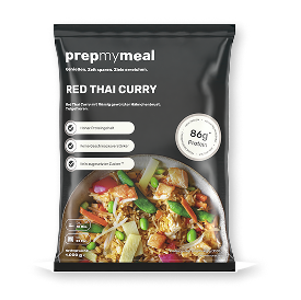
The packaging is a flexible pouch made from a multi-layer film. It features a matte black background with a glossy finish on the food imagery. The front displays a vibrant image of the meal, showcasing colorful vegetables and protein, which is visually appealing. The text is printed in white and light gray, providing contrast against the dark background. The pouch has a resealable top, indicated by a zipper closure, and is designed to stand upright.
The outer packaging is a brown corrugated box with visible fluted edges when viewed from the side. The box appears to be sturdy, designed for shipping, and shows signs of handling with slight wear. Inside, there is a green box labeled 'prepmymeal' surrounded by straw-like cushioning material, indicating a protective layer for the contents.
The image features multiple food packaging containers made of a sturdy, brown paperboard material with a smooth finish. The containers are rectangular with clean, precise edges and folds, indicating a folding carton design. They are lightweight and appear to be designed for takeout or meal prep, with a glossy exterior finish. The containers are stacked and have a green color on the outside, with the brand name 'prepmymeal' prominently displayed in white text. Additionally, there is a larger corrugated box in the background, which is kraft colored and shows signs of typical shipping wear.
The packaging is a brown corrugated box with visible fluted layers when viewed from the side. It has a sturdy construction suitable for shipping. The box features a clean, rectangular shape with flaps that are folded down to secure the contents. The exterior is primarily kraft-colored, with printed branding elements on one side.
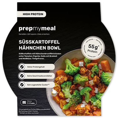
The packaging is a flat, smooth, single-layer paperboard carton with a rounded bottom and a wide opening at the top. The exterior features a matte finish with vibrant colors, primarily black with bright green and orange accents. The front displays a large image of the meal, along with text highlighting its high protein content and other nutritional benefits. The edges are clean and precise, indicating a well-constructed fold. There are no visible flaps or tabs, and the carton appears to be designed for easy access to the contents.
About the Brand
PrepMyMeal operates within the food and drink sector, focusing on direct-to-consumer meal delivery with an emphasis on health, protein content, and convenience. Their packaging strategy combines branded, protective corrugated boxes, recyclable food containers, and flexible pouches to ensure meal freshness and product integrity during transit.
The company utilizes a mix of folding carton containers, flexible pouches, and corrugated shipping boxes, all custom-branded to reinforce PrepMyMeal's identity. The primary packaging is designed to maintain product quality through refrigerated logistics, while the visual design highlights nutritional value and meal imagery. Packaging decisions balance cost, durability, and sustainability, reflecting evolving consumer expectations in the meal delivery space.
Key Differentiator: PrepMyMeal’s use of custom-printed, brand-consistent packaging across multiple formats—combined with refrigerated delivery—differentiates them in the competitive D2C meal delivery market.
Design System
Visual Style
Modern sans-serif typography, a color palette centered on green, black, and kraft brown, and high-contrast meal imagery create a clean, health-focused aesthetic.
Brand Identity
Consistent logo placement across all packaging types, use of simple iconography for nutritional highlights, and strict adherence to visual guidelines ensure cohesive brand recognition.
Packaging Design
Preference for recyclable corrugated and paperboard materials, folding carton and pouch structures, and protective cushioning reflect a philosophy prioritizing product safety, sustainability, and efficient logistics.
User Experience
Packaging is structured to support a positive customer journey, from secure delivery to clear, attractive presentation and informative design elements that reinforce PrepMyMeal’s health and convenience positioning.
Company Metrics
Business insights for PrepMyMeal based on available data
Market Positioning
Brand Values & Focus
Key Competitors
Target Market: Health-conscious consumers, fitness enthusiasts, and individuals seeking convenient, nutritious meal solutions in Germany and surrounding Tier I markets.
Packaging Assessment
Overall Grade
Visual appeal and presentation quality
Packaging durability and protection
Eco-friendliness and recyclable materials
Cost efficiency and value for money
Packaging assessment for PrepMyMeal based on industry standards and best practices
Frequently Asked Questions
What types of packaging does PrepMyMeal use for meal delivery?
PrepMyMeal employs a range of packaging, including branded corrugated shipping boxes, paperboard meal containers, flexible resealable pouches, and internal cushioning materials. These solutions are chosen to ensure product safety, temperature control, and brand presentation.
How does PrepMyMeal address sustainability in its packaging?
PrepMyMeal integrates recyclable materials such as kraft corrugated boxes and paperboard containers, and uses minimalistic designs to reduce material waste. However, the need for food safety and insulation may limit the use of fully compostable or biodegradable options.
What is the visual approach to PrepMyMeal's packaging design?
The packaging features a consistent color palette (green, black, kraft brown), prominent logo placement, and modern typography, with meal images and nutritional information supporting an informative and appealing unboxing experience.
Discover other Food & Drink companies
Explore more companies in the food & drink industry and their packaging strategies
every.
Food & Drink
every. offers a subscription-based service delivering frozen, nutrient-rich vegan meals directly to customers' homes, emphasizing convenience and health.
kerex - terre exotique
Food & Drink
Kerex - Terre Exotique specializes in the international trade of gourmet food and drink products, offering a unique selection of spices and culinary ingredients.
Thés de la Pagode
Food & Drink
Thés de la Pagode is a French company specializing in organic teas and infusions, focusing on health and well-being. Established in 1987, they prioritize sustainable practices and high-quality ingredients sourced through fair trade.