TeeFee | La Marchante GmbH packaging
TeeFee specializes in organic, sugar-free beverages for families, with an emphasis on health and sustainability. Their packaging approach leverages playful, vibrant designs and eco-friendly materials to enhance shelf appeal and reflect their brand values.
Packaging Portfolio
TeeFee's packaging portfolio is dominated by single-layer paperboard folding cartons and PET bottles, each optimized for retail shelf presence and consumer engagement. The cartons utilize high-impact, glossy finishes and playful, child-targeted illustrations, while the bottles feature ergonomic designs and seasonal graphics. All packaging formats display clear branding, organic certification, and product information, aligning with both regulatory requirements and consumer expectations in the organic beverage segment. The use of lightweight, recyclable materials further supports sustainable logistics and brand positioning.

The packaging features a smooth, flat construction typical of a folding carton. It is predominantly purple with colorful graphics and illustrations. The edges are clean and precise, indicating a well-constructed box. The front displays the brand name 'TeeFee' prominently, along with images of fruits, suggesting it contains a beverage or juice product. The overall design is vibrant and appealing, aimed at attracting consumers.

The image features various juice packaging types, primarily in the form of Tetra Pak cartons and plastic bottles. The cartons exhibit a smooth, flat construction typical of single-layer paperboard, with vibrant colors and graphics. The bottles are made of plastic with a smooth finish and have a colorful design. The overall presentation is bright and appealing, aimed at children and families.

The packaging consists of various beverage cartons, characterized by their smooth, flat construction without fluted layers. The cartons are predominantly rectangular with clean edges and folds, featuring colorful graphics and product information. Each carton has a spout for pouring, indicating functionality for liquid contents. The overall design is vibrant and appealing, aimed at attracting consumers.
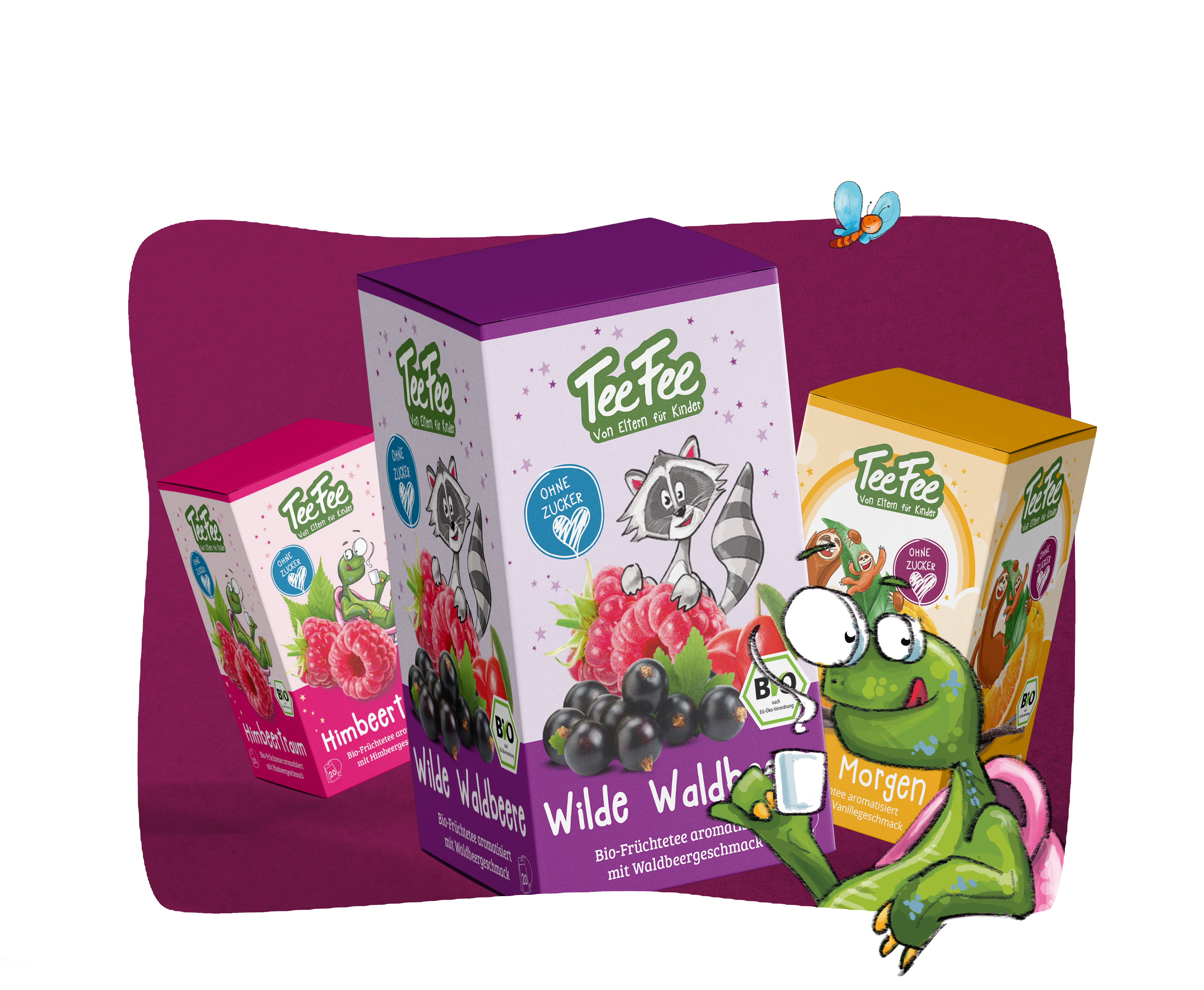
The packaging consists of several folding cartons made of single-layer paperboard. Each box features smooth, flat construction with clean edges and folds. The boxes are brightly colored, with a glossy finish that enhances visual appeal. The design includes playful graphics and vibrant colors, making them attractive for retail display.
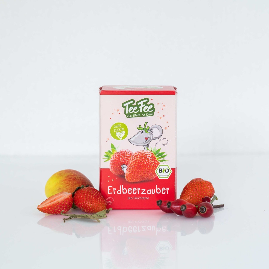
The packaging is a small, rectangular folding carton made from a single layer of paperboard. It features a smooth, flat construction without any visible fluted layers. The exterior is predominantly red with colorful graphics, including images of strawberries and a cartoon mouse. The edges are clean and precise, indicative of a well-constructed retail package. The top has a tuck flap closure, and the overall appearance is lightweight and suitable for retail display.

The image features three beverage bottles with colorful graphics and a distinct design. Each bottle has a unique character, including a Santa Claus, a gingerbread man, and a snowman, all depicted in vibrant colors. The bottles are plastic with a smooth surface, featuring a clear cap and a spout for easy pouring. The labels are bright and eye-catching, with images of fruits and festive elements.
About the Brand
TeeFee, based in Frankfurt, Germany, produces organic fruit and herbal teas and sugar-free beverages designed for children and parents. The company utilizes bright, engaging packaging with a strong visual identity tailored to attract health-conscious families.
Since its founding in 2014, TeeFee has consistently prioritized sustainable packaging solutions that support both brand differentiation and environmental objectives. The company's packaging system includes paperboard cartons and PET bottles, both optimized for retail presentation and logistical safety. By incorporating organic certification symbols and playful illustrations, TeeFee effectively communicates product quality and appeals to its core demographic.
Key Differentiator: TeeFee's unique positioning lies in its integration of family-centric, playful packaging design with a clear commitment to sustainability and organic certification, setting it apart in the competitive organic beverage sector.
Design System
Visual Style
The visual design system employs rounded, playful typography and a vibrant color palette dominated by reds, purples, and greens. The overall aesthetic approach is child-friendly, with cartoon-style illustrations and high-contrast visuals.
Brand Identity
Branding is anchored by the prominent TeeFee logo, consistent placement of organic and BIO certification icons, and the use of friendly character mascots. Visual consistency is maintained across all SKUs through repeated motifs and structured information hierarchy.
Packaging Design
Material choices focus on recyclable paperboard and PET, favoring lightweight, flat-packable structures to optimize logistics and reduce environmental impact. Structural design emphasizes easy-open features and functional closures for both dry and liquid products.
User Experience
The packaging design is tailored to create an engaging, memorable unboxing experience for children and parents. Clear labeling, ergonomic handling, and playful graphics support an intuitive and positive customer journey, reinforcing trust and repeat purchase behavior.
Company Metrics
Business insights for TeeFee | La Marchante GmbH based on available data
Market Positioning
Brand Values & Focus
Key Competitors
Target Market: Health-conscious families seeking organic, sugar-free beverage options for children and adults.
Packaging Assessment
Overall Grade
Visual appeal and presentation quality
Packaging durability and protection
Eco-friendliness and recyclable materials
Cost efficiency and value for money
Packaging assessment for TeeFee | La Marchante GmbH based on industry standards and best practices
Frequently Asked Questions
What packaging materials does TeeFee use for its products?
TeeFee primarily uses single-layer paperboard cartons and PET bottles. The cartons feature vibrant, playful graphics and organic certification labeling, while the bottles are designed with colorful, seasonal themes.
How does TeeFee address sustainability in its packaging?
TeeFee's packaging strategy includes the use of recyclable paperboard, eco-friendly inks, and a focus on minimizing material waste. The brand prominently displays organic and ecological certifications on its packaging.
What is the unboxing experience like for TeeFee products?
The unboxing experience is characterized by high visual appeal, with child-friendly illustrations, vivid colors, and clear branding, resulting in a positive emotional response and strong shelf impact.
Discover other Food & Drink companies
Explore more companies in the food & drink industry and their packaging strategies
PrepMyMeal
Food & Drink
PrepMyMeal is a food production company specializing in high-protein meal delivery services. They offer a variety of natural, nutritious meals designed for fitness enthusiasts and those seeking convenience in meal preparation.
kerex - terre exotique
Food & Drink
Kerex - Terre Exotique specializes in the international trade of gourmet food and drink products, offering a unique selection of spices and culinary ingredients.
Thés de la Pagode
Food & Drink
Thés de la Pagode is a French company specializing in organic teas and infusions, focusing on health and well-being. Established in 1987, they prioritize sustainable practices and high-quality ingredients sourced through fair trade.