Teatap packaging
Teatap specializes in premium natural teas and infusions, with a strong emphasis on eco-responsibility and creative flavor profiles. Their packaging strategy leverages flexible pouches, retail cartons, and canisters, prioritizing product freshness, visual appeal, and sustainable materials.
Packaging Portfolio
Teatap’s packaging portfolio is characterized by the strategic use of flexible stand-up pouches with resealable closures, maximizing product freshness and consumer convenience. Paperboard retail cartons are employed for curated kits and seasonal offerings, supporting structured presentation and retail readiness. Cylindrical metal canisters and eco-friendly pouches further diversify the portfolio, enabling both bulk and single-use applications. Material selection reflects a balanced approach to product protection, visual impact, and sustainability, with a clear trend toward recyclable and low-impact substrates.

The packaging consists of colorful stand-up pouches, each with a vibrant color scheme including yellow, green, blue, and red. The pouches feature a glossy finish and a clear window at the front, allowing visibility of the tea contents inside. Each pouch has a resealable top, facilitating easy access and storage. The design is clean and modern, with a leaf motif prominently displayed on each pouch.

The image features a cylindrical container and a round pouch. The cylindrical container is made of metal with a smooth, glossy white finish. It has a tight-fitting lid that likely screws on or presses down to seal. The round pouch is made of paperboard with a smooth surface, featuring a bright yellow label with the brand name 'TeaTap' prominently displayed. The label includes product information and a graphic element resembling a leaf.
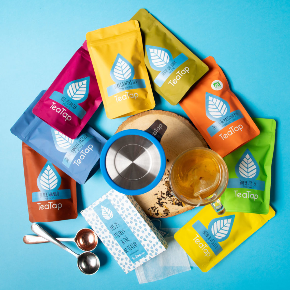
The image features multiple colorful pouches arranged in a circular pattern, each containing tea products. The pouches are made of a flexible material, likely a type of plastic or foil, with a matte or glossy finish. They have a resealable top and are designed for retail display. Each pouch prominently features a logo and product name, with vibrant colors including blue, green, yellow, red, and purple. The overall appearance is bright and appealing, aimed at attracting consumers.
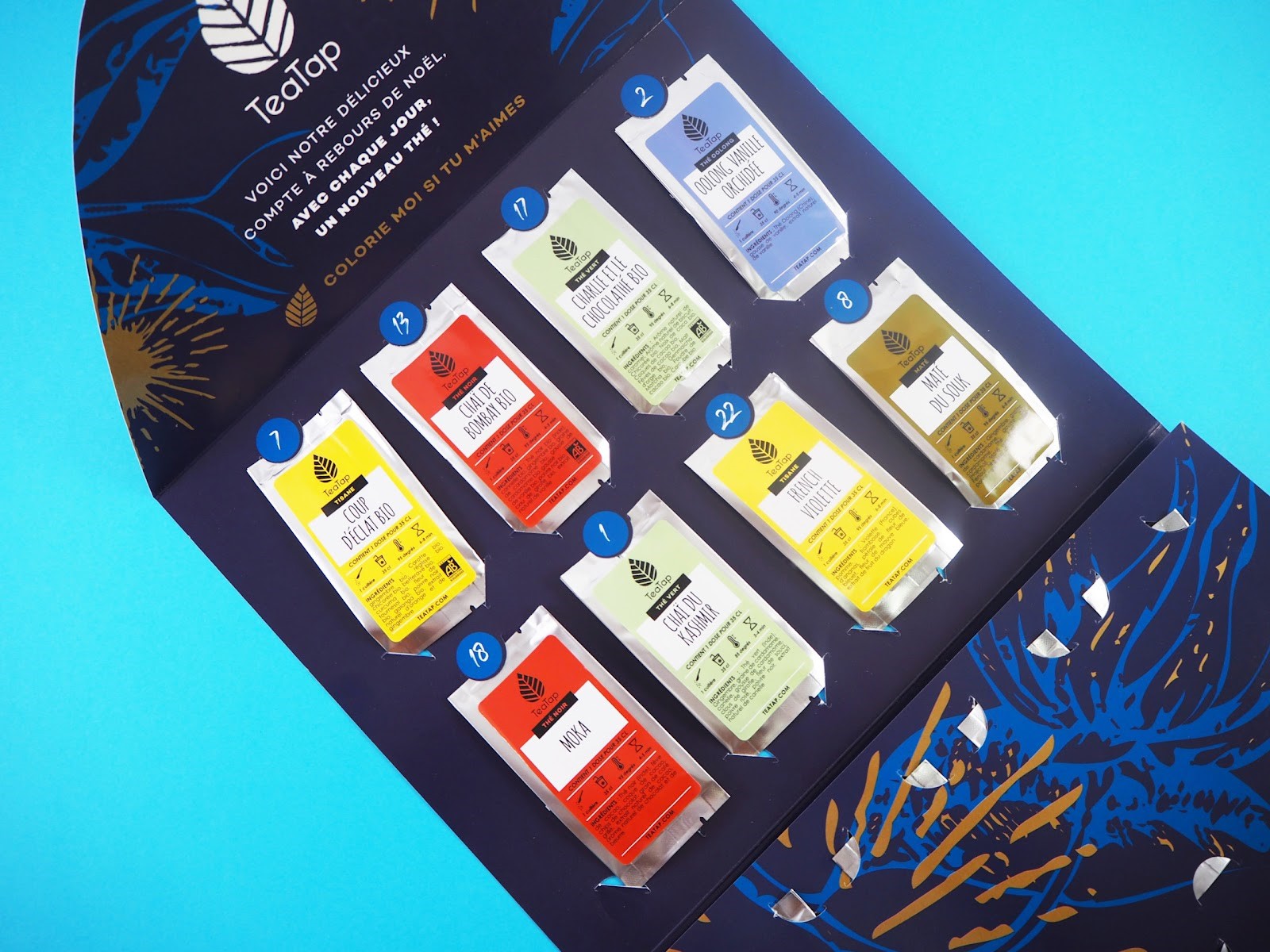
The packaging is a retail display box designed to hold multiple tea sachets. It features a smooth, flat construction with a colorful printed exterior. The box has a foldable design with a top flap that opens to reveal the tea sachets arranged in a grid. Each sachet is visible through cut-out sections, allowing customers to see the product inside. The overall shape is rectangular, with a sturdy base that supports the weight of the sachets.

The packaging consists of several retail cartons made of smooth, flat paperboard. The cartons feature a colorful design with a predominantly orange and white color scheme, showcasing a pattern of leaves and the TealTap logo prominently displayed. The edges are clean and precise, indicating a well-constructed folding carton. The overall appearance is lightweight and suitable for retail display, with a glossy finish that enhances visual appeal.
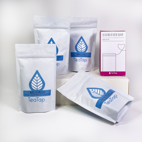
The packaging consists of multiple stand-up pouches made from a flexible material, likely a type of plastic or composite film. Each pouch features a resealable top and a flat bottom, allowing it to stand upright. The surface is smooth with a matte finish, and the pouches are primarily white with a blue logo and leaf design. The pouches are uniform in size and shape, with clear labeling indicating the product inside.
About the Brand
Teatap is a French tea company offering a diverse portfolio of natural teas, herbal infusions, and tea kits. The brand is recognized for its commitment to sustainable sourcing, minimal additives, and packaging solutions that support both freshness and environmental responsibility.
Founded in 2017 and operating in the Food & Drink sector, Teatap has quickly established a reputation for quality and innovation within the specialty tea market. Their products are distinguished by unique blends and a clear focus on health-conscious consumers. The company’s packaging systems are designed to balance product protection, consumer convenience, and environmental impact, utilizing stand-up pouches, retail cartons, and cylindrical canisters.
Key Differentiator: Teatap’s notable differentiator is the integration of eco-responsible packaging formats—such as recyclable pouches and bulk options—paired with a modern, cohesive brand identity and a focus on community engagement.
Design System
Visual Style
Typography is modern and legible, typically sans-serif, supporting clean readability. The color palette incorporates bright, saturated hues such as blue, green, yellow, red, and orange, paired with white space for contemporary visual clarity. Aesthetic approach emphasizes vibrancy and freshness.
Brand Identity
Logo usage is prominent across all packaging, featuring the TeaTap mark and supporting graphics such as leaf motifs. Iconography is minimal but consistent, reinforcing product differentiation through color and clear labeling. Visual consistency is maintained through uniform placement of logos, color schemes, and product information.
Packaging Design
Material choices include flexible composite films for pouches, FSC-certified or recyclable paperboard for cartons, and metal for canisters. Structural design principles focus on resealability, stand-up stability, and retail display optimization, ensuring both convenience and protection.
User Experience
Packaging is designed to support a positive customer journey through easy opening, resealability, and visual appeal. Clear labeling and color coding aid in product selection, while the unboxing experience is enhanced by thoughtful design details that align with the brand’s sustainability and quality positioning.
Company Metrics
Business insights for Teatap based on available data
Market Positioning
Brand Values & Focus
Key Competitors
Target Market: Health-conscious consumers and tea enthusiasts in France and broader European markets seeking premium, natural, and eco-friendly beverage options.
Packaging Assessment
Overall Grade
Visual appeal and presentation quality
Packaging durability and protection
Eco-friendliness and recyclable materials
Cost efficiency and value for money
Packaging assessment for Teatap based on industry standards and best practices
Frequently Asked Questions
What types of packaging does Teatap use for their tea products?
Teatap utilizes a mix of flexible stand-up pouches, paperboard retail cartons, and metal canisters. These formats are selected for their ability to preserve product freshness, facilitate resealability, and support retail display, with an emphasis on recyclable and eco-friendly materials.
How does Teatap address sustainability in their packaging?
Teatap prioritizes eco-responsible packaging by offering recyclable materials, bulk purchasing options to reduce single-use waste, and designs that minimize unnecessary packaging. Their approach is aligned with industry best practices for sustainability in the beverage sector.
What role does packaging play in Teatap’s brand strategy?
Packaging is central to Teatap’s brand strategy, serving as a key touchpoint for communicating quality, sustainability, and visual consistency. The use of distinctive colors, clear labeling, and cohesive graphic elements supports both shelf appeal and brand recognition.
Discover other Food & Drink companies
Explore more companies in the food & drink industry and their packaging strategies
PrepMyMeal
Food & Drink
PrepMyMeal is a food production company specializing in high-protein meal delivery services. They offer a variety of natural, nutritious meals designed for fitness enthusiasts and those seeking convenience in meal preparation.
kerex - terre exotique
Food & Drink
Kerex - Terre Exotique specializes in the international trade of gourmet food and drink products, offering a unique selection of spices and culinary ingredients.
Thés de la Pagode
Food & Drink
Thés de la Pagode is a French company specializing in organic teas and infusions, focusing on health and well-being. Established in 1987, they prioritize sustainable practices and high-quality ingredients sourced through fair trade.