Over the Edge Bike Shop packaging
Over the Edge Bike Shop specializes in mountain bikes, e-bikes, and cycling accessories, combining a community-driven retail model with a curated product selection. Their packaging strategy leverages branded carton boxes and retail display formats, emphasizing presentation and retail shelf impact.
Packaging Portfolio
Over the Edge Bike Shop employs a packaging portfolio dominated by single-layer paperboard carton boxes and flexible pouches, optimized for retail shelf presence and easy product access. These structures are designed to house snack bars, energy drinks, and other accessories, utilizing clean folds, die-cut windows, and high-impact graphics to reinforce brand recognition. Material choices favor recyclable paperboard for cartons, balancing print quality with environmental considerations, while flexible pouches provide lightweight, space-efficient solutions for smaller consumables. The overall approach prioritizes retail visibility, product protection, and consistent branding.
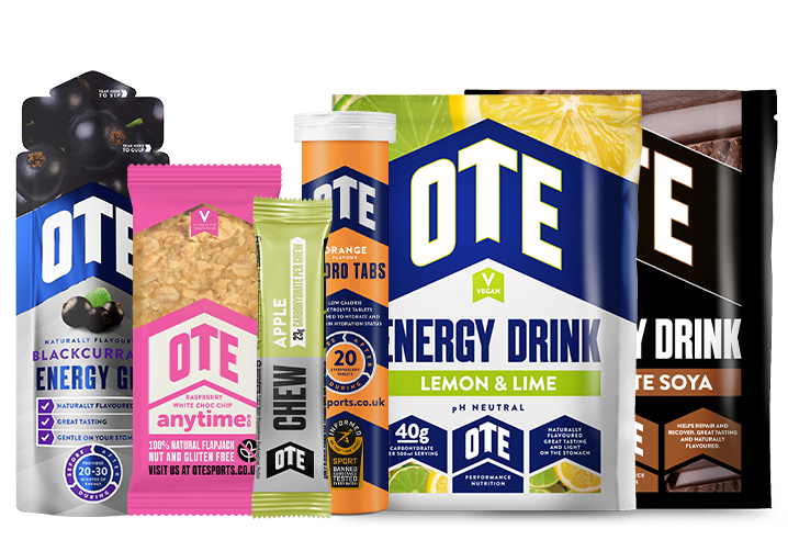
The image features a variety of retail packaging types for energy drinks and snacks. The energy drink containers are primarily cylindrical, made of a smooth paperboard material with vibrant colors and graphics. The snack bar packaging is a flat, rectangular pouch with a glossy finish, showcasing colorful branding and product information. Each package has clean edges and folds, typical of folding cartons, with no visible fluted layers. The overall presentation is designed for retail visibility, with eye-catching colors and logos.
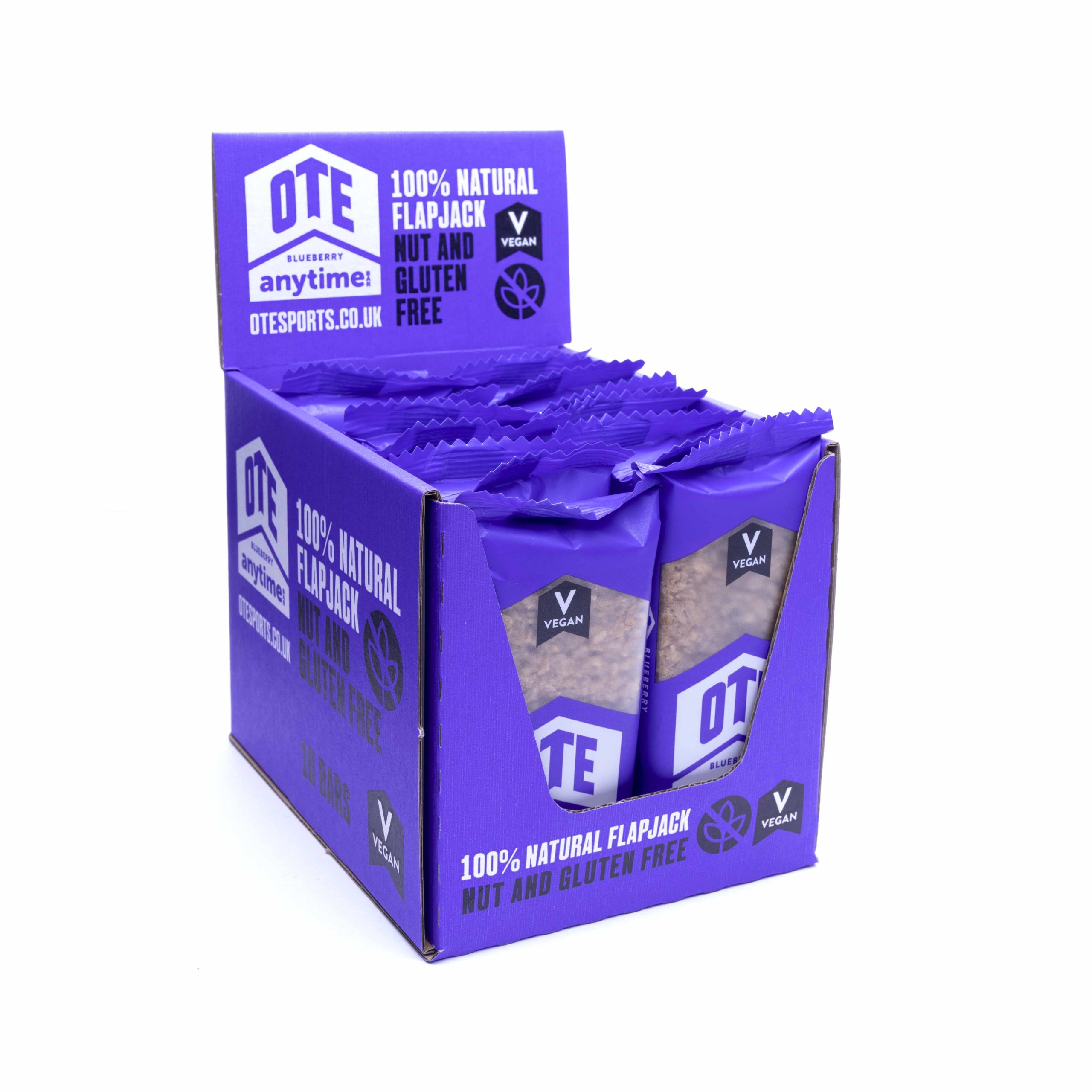
The packaging is a retail display box designed to hold multiple snack bars. It features a smooth, flat construction without any visible fluted layers, indicating it is made from single-layer paperboard. The box is predominantly purple with white and blue accents, displaying the product information clearly on the front and sides. The edges are clean and precise, with a folded top that allows for easy access to the individual snack bars inside.
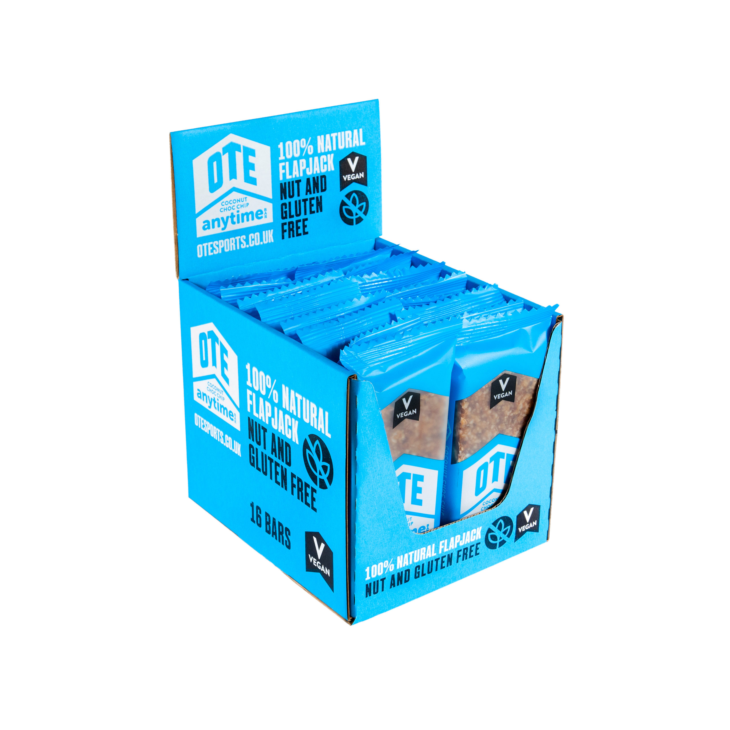
The packaging is a retail display box designed to hold multiple individual product packages. It features a smooth, flat construction with clean edges and folds, indicative of single-layer paperboard. The box is predominantly blue with vibrant graphics and text. The front panel has a cut-out for visibility of the product inside, and the overall shape is rectangular, designed for countertop display.
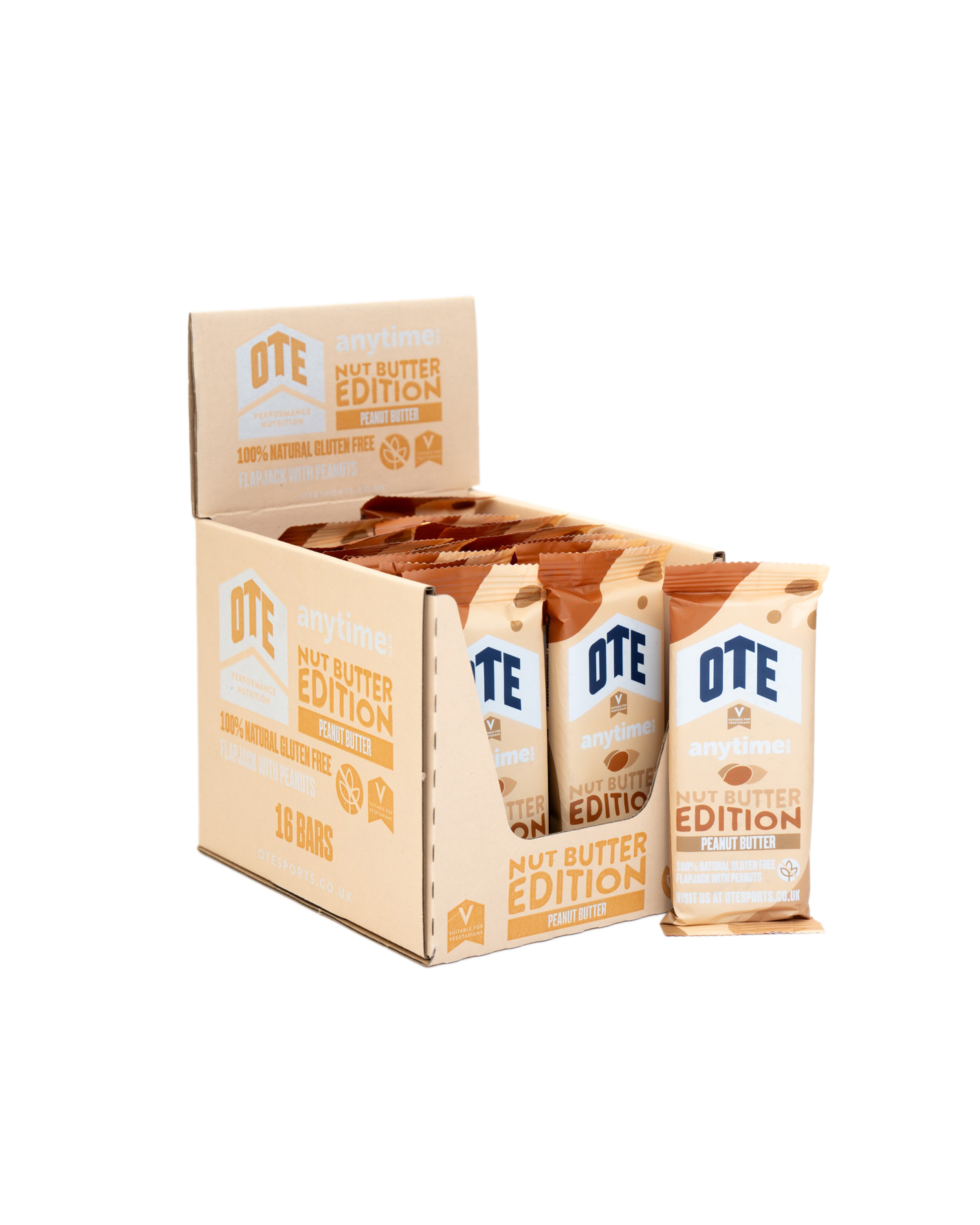
The packaging is a folding carton box designed to hold multiple snack bars. It features a smooth, flat construction without visible fluted layers, indicating it is made from single-layer paperboard. The exterior is a light kraft color with printed graphics. The box has clean edges and folds, with a top flap that opens to reveal the individual snack bars inside. The overall shape is rectangular, designed for easy display and access.
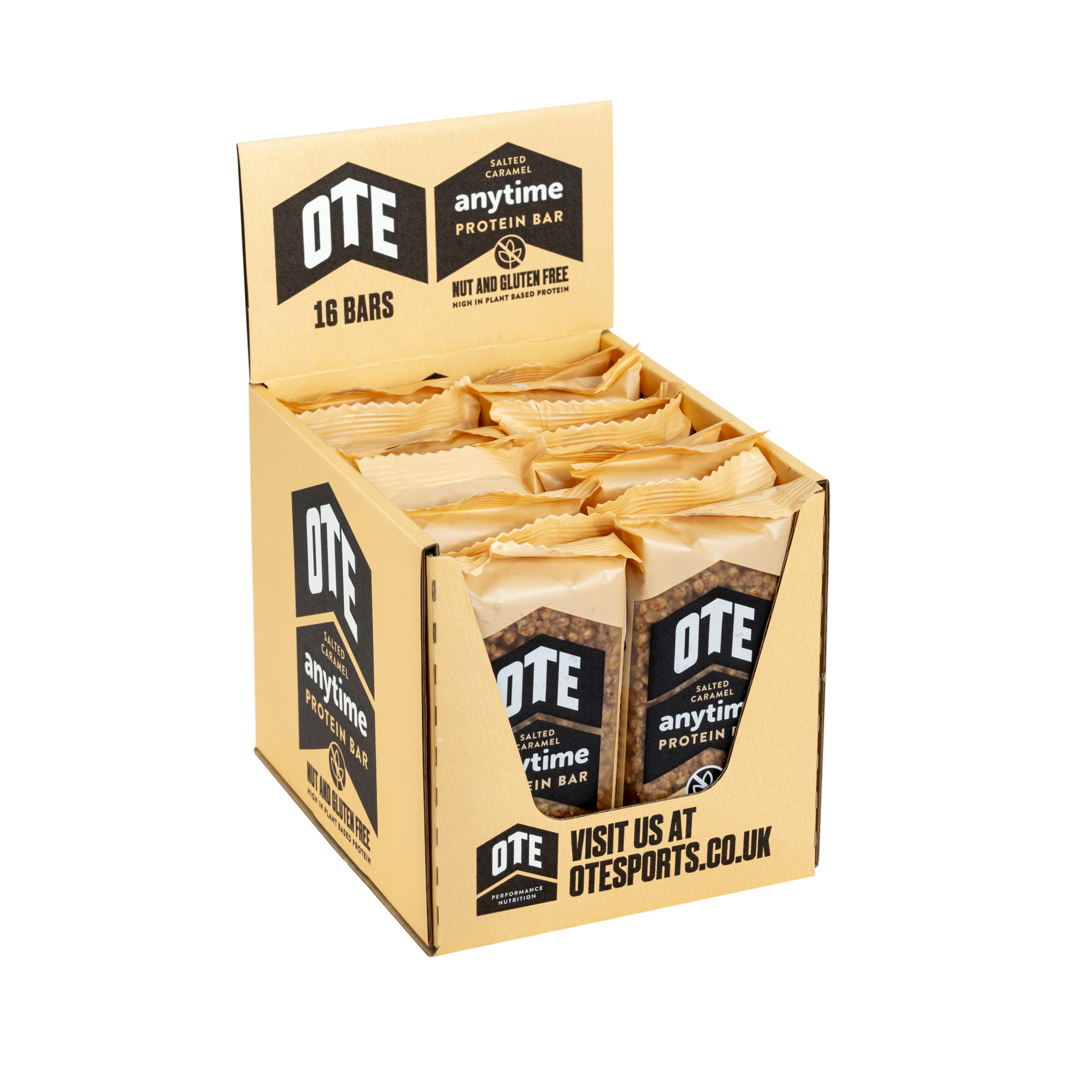
The packaging is a retail display box designed to hold multiple protein bars. It features a smooth, flat construction without any visible fluted layers, indicating it is made from single-layer paperboard. The box has a rectangular shape with a slightly open top for easy access to the bars. The exterior is printed with bold graphics, showcasing the product name and branding elements prominently.
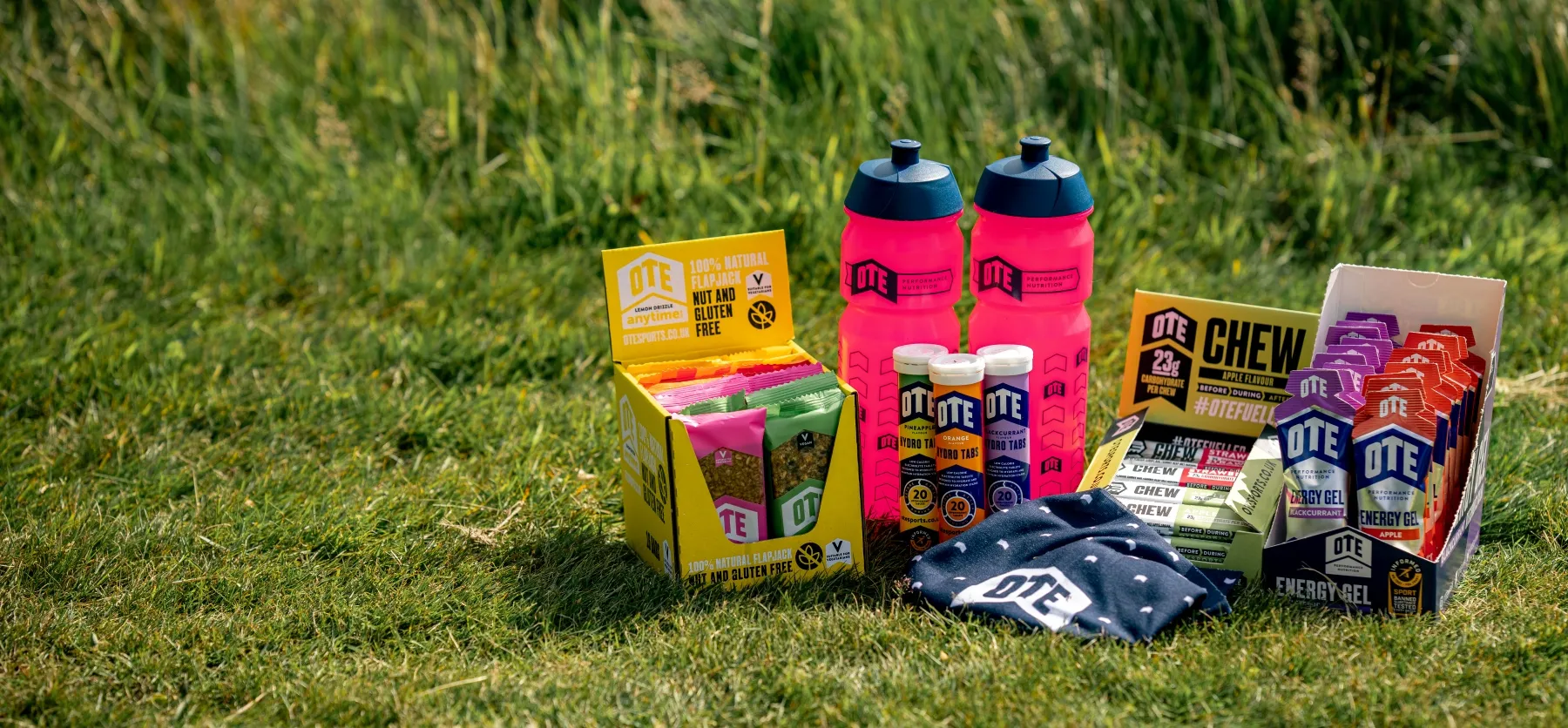
The image features a collection of products including a retail carton and flexible pouches. The retail carton is brightly colored with a smooth, flat construction and clean edges, indicative of single-layer paperboard. The flexible pouches are made from a thin, lightweight material, likely a type of plastic or coated paper, designed for easy handling and storage. The overall arrangement is visually appealing, set against a natural backdrop.
About the Brand
Over the Edge Bike Shop operates as a community-centric cycling retailer, providing a broad range of mountain bikes, e-bikes, and biking accessories. Their packaging approach centers on visually impactful, single-layer paperboard cartons and flexible pouches designed for retail display and efficient product access.
The company prioritizes consistency in branding across its packaging portfolio, with each carton and pouch incorporating the OTE logo, distinctive color palettes, and clear product information. Packaging is engineered for retail shelf visibility, ease of access, and efficient storage, with a focus on single-layer paperboard and lightweight flexible materials to optimize logistics and customer experience.
Key Differentiator: What sets Over the Edge Bike Shop apart is its integration of trend-driven product curation with cohesive branded packaging, tailored for both retail and event-based community engagement.
Design System
Visual Style
The visual design leverages bold, modern sans-serif typography with a vibrant color palette featuring blues, purples, and accent tones. The overall aesthetic is energetic, clean, and visually striking to appeal to sports and cycling audiences.
Brand Identity
Brand identity is reinforced through consistent logo placement, clear use of the OTE brand name, and a visually unified set of graphics and iconography across all packaging touchpoints. Logos are prominently displayed on primary packaging panels to maximize recognition.
Packaging Design
Material selection emphasizes single-layer paperboard for retail cartons, complemented by flexible, glossy pouches for snacks and supplements. Structural design focuses on flat, rectangular forms with easy-access features and high surface printability for graphics.
User Experience
Packaging is engineered to enhance the customer journey, providing intuitive unboxing, clear information display, and memorable visual cues aligned with the brand’s community-driven ethos. Design elements support both the retail shopping experience and the sense of participation in the cycling community.
Company Metrics
Business insights for Over the Edge Bike Shop based on available data
Market Positioning
Brand Values & Focus
Key Competitors
Target Market: Cycling enthusiasts, both novice and experienced, seeking premium mountain bikes, e-bikes, and related accessories through retail and online channels.
Packaging Assessment
Overall Grade
Visual appeal and presentation quality
Packaging durability and protection
Eco-friendliness and recyclable materials
Cost efficiency and value for money
Packaging assessment for Over the Edge Bike Shop based on industry standards and best practices
Frequently Asked Questions
What types of packaging does Over the Edge Bike Shop use for its products?
The company utilizes single-layer paperboard carton boxes for retail display, along with flexible pouches for snacks and energy products. These formats are chosen for their visual impact, structural efficiency, and alignment with brand identity.
How does the packaging contribute to the customer experience?
Packaging is designed to enhance the unboxing and in-store experience through bold graphics, consistent branding, and easy access to products, supporting both retail sales and community-driven events.
Does Over the Edge Bike Shop prioritize sustainable packaging?
The company primarily uses recyclable paperboard materials, indicating a moderate commitment to sustainability, though there is opportunity for further eco-friendly innovation.
Discover other Sports companies
Explore more companies in the sports industry and their packaging strategies
Matchday Nutrition GmbH
Sports
Matchday Nutrition GmbH specializes in providing nutritional products designed for athletes and sports enthusiasts. Based in Berlin, Germany, the company focuses on performance, hydration, and recovery solutions tailored for the sports community.
Salomon
Sports
Salomon is a leading company in the sporting goods industry, specializing in high-quality outdoor and athletic apparel and equipment. They focus on providing innovative products for various activities, including running, hiking, skiing, and snowboarding.
Kelme
Sports
Kelme is a sporting goods company specializing in high-performance athletic footwear and apparel. Based in Alicante, Spain, they focus on meeting the needs of athletes with innovative products.