Matchday Nutrition GmbH packaging
Matchday Nutrition GmbH specializes in premium sports nutrition products for athletes, utilizing branded carton boxes and flexible pouches to ensure product integrity and strong shelf presence. Their packaging strategy emphasizes visual consistency, high-impact graphics, and functional protection for direct-to-consumer e-commerce logistics.
Packaging Portfolio
Matchday Nutrition GmbH utilizes a mix of single-layer folding carton boxes and laminated flexible pouches for its product lines. Carton boxes are used for retail display and direct-to-consumer shipments, featuring precise construction, tuck flaps, and vibrant graphics for visual impact. Flexible pouches are employed for portioned supplements and sample packs, offering lightweight convenience and shelf stability. The packaging design prioritizes bold color palettes, consistent branding, and clear product differentiation, while materials choices balance cost-efficiency with basic protection against moisture and physical impact.

The packaging consists of a folding carton box used for retail display, featuring a bright green color with a hexagonal pattern. The box is open at the top and contains individually wrapped snack bars. The edges are clean and precise, indicating a well-constructed design. The surface has a matte finish with a slight texture, enhancing grip. The box displays the brand name 'MATCHDAY' prominently on the front and sides, along with product names like 'BITE' and 'REFUEL'.

The packaging consists of a retail display box made from smooth, flat paperboard. It features a vibrant green color with a glossy finish. The box is designed to hold multiple individual snack bars, which are visible through an open top. The edges are clean and precise, with no visible fluted layers, indicating it is a single-layer paperboard construction. The front of the box displays the product name 'MATCHDAY BITE PEANUT BUTTER' prominently in bold lettering, along with a graphic of a peanut butter swirl.
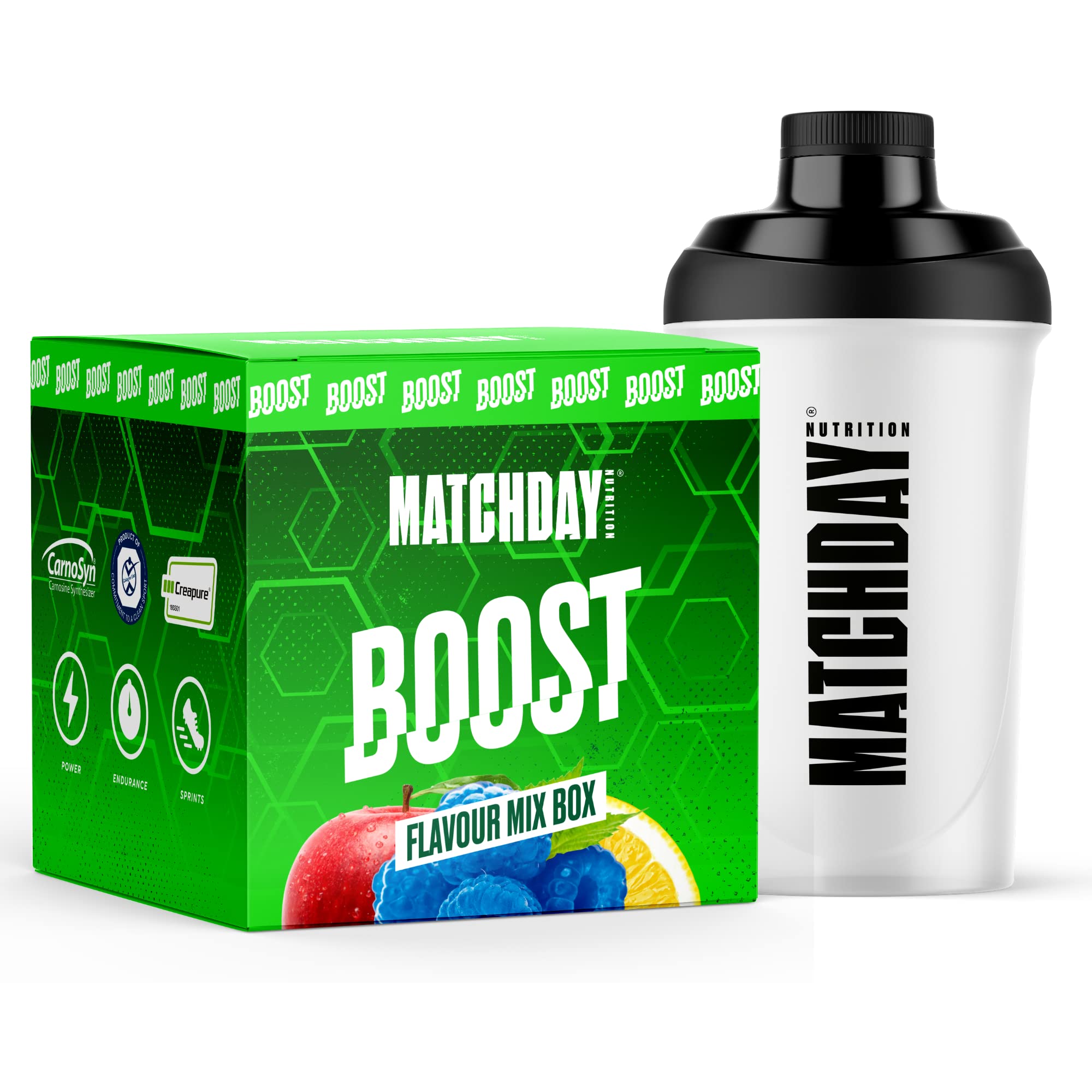
The packaging is a folding carton box made of single-layer paperboard. It features a smooth, flat construction with clean edges and folds. The box is predominantly green with hexagonal patterns and the word 'BOOST' prominently displayed in bold white letters. The design includes colorful images of the product flavors, enhancing its appeal. The box has a glossy finish, giving it a vibrant look.

The packaging consists of multiple pouches arranged in a grid layout. Each pouch features a vibrant green background with bold white and colored text indicating the product name and flavor. The pouches have a matte finish with a slight sheen, giving them a modern look. They are designed for easy visibility on retail shelves, with clear labeling and a consistent design theme across different products.

The packaging consists of several retail carton boxes, primarily in a vibrant green color with bold white and black text. Each box features a smooth, flat construction without visible fluted layers, indicating it is made from single-layer paperboard. The boxes have clean edges and precise folds, typical of folding cartons used for retail products. The surface finish appears to be matte with some glossy elements in the text. The graphics include product names like 'BOOST', 'HYDRO', and 'REFUEL', prominently displayed, alongside a grid-like pattern in the background. The boxes have tuck flaps for closure and are designed to be stacked for retail display.
About the Brand
Matchday Nutrition GmbH is a Berlin-based sports nutrition company targeting athletes and fitness enthusiasts with science-backed supplements and snacks. The brand leverages a direct-to-consumer model, prioritizing both product efficacy and a cohesive, high-visibility packaging approach.
Founded in 2018, Matchday Nutrition has evolved from a startup to a recognized brand in the sports nutrition sector. Their product assortment includes hydration drinks, energy boosters, recovery aids, and protein snacks, all delivered in packaging designed for maximum retail impact and logistical efficiency. The company utilizes folding carton boxes and flexible pouches with bold visual branding to reinforce product recognition and consumer trust.
Key Differentiator: A distinct strength is their consistently applied, athlete-centric visual identity across all packaging formats, enabling immediate brand recognition and strong shelf differentiation.
Design System
Visual Style
Typography leverages bold, sans-serif fonts with high legibility, set against a vibrant green and black color palette accented by white and product-specific hues. Overall aesthetic is modern, energetic, and sports-centric.
Brand Identity
Branding is anchored by the MATCHDAY logo and consistent use of product names ('BOOST', 'HYDRO', 'REFUEL'). Iconography and graphic patterns (e.g., hexagons, grids) reinforce the athletic identity. Visual consistency is maintained across all packaging formats and digital assets.
Packaging Design
Material selection favors single-layer paperboard for cartons and high-barrier flexible films for pouches. Structural design emphasizes easy stacking, secure closures, and retail visibility. The philosophy centers on balancing visual impact with functional protection and efficient logistics.
User Experience
Packaging supports the customer journey with intuitive opening mechanisms, clear product information, and a visually cohesive unboxing sequence. Design choices reinforce brand values of performance and reliability, enhancing trust and perceived quality at every customer touchpoint.
Company Metrics
Business insights for Matchday Nutrition GmbH based on available data
Market Positioning
Brand Values & Focus
Key Competitors
Target Market: Athletes, sports enthusiasts, and fitness-focused consumers seeking reliable, high-quality nutrition products in the EU and global e-commerce markets.
Packaging Assessment
Overall Grade
Visual appeal and presentation quality
Packaging durability and protection
Eco-friendliness and recyclable materials
Cost efficiency and value for money
Packaging assessment for Matchday Nutrition GmbH based on industry standards and best practices
Frequently Asked Questions
What types of packaging does Matchday Nutrition GmbH use for its products?
Matchday Nutrition GmbH primarily deploys folding carton boxes and flexible pouches, engineered for both retail display and direct shipping. Materials are predominantly single-layer paperboard and laminated flexible films, optimized for visual appeal, protection, and branding.
How does Matchday Nutrition’s packaging support its e-commerce business model?
The packaging is designed for durability and compactness, supporting efficient shipping and minimizing damage. Consistent branding across all formats enhances the unboxing experience and drives customer loyalty in a direct-to-consumer environment.
What environmental considerations are present in Matchday Nutrition’s packaging?
While carton boxes likely offer some recyclability, the use of flexible pouches may limit overall eco-friendliness. No explicit sustainability initiatives are noted, indicating room for future improvements in material sourcing and recyclability.
Discover other Sports companies
Explore more companies in the sports industry and their packaging strategies
fizik
Sports
Fizik specializes in high-performance cycling equipment, particularly shoes and saddles designed for competitive cycling. The company combines innovative materials and technology to ensure comfort and efficiency for cyclists.
Kelme
Sports
Kelme is a sporting goods company specializing in high-performance athletic footwear and apparel. Based in Alicante, Spain, they focus on meeting the needs of athletes with innovative products.
Outdoor Sports Gear Co.
Sports
Outdoor Sports Gear Co. specializes in providing high-quality sporting goods and apparel for outdoor enthusiasts. With a focus on hiking and camping gear, the company aims to outfit adventurers for their next expedition.