Mieszko SA packaging
Mieszko SA is a Polish confectionery manufacturer specializing in chocolate pralines and assorted sweets, with a legacy rooted in traditional craftsmanship. Their packaging strategy combines high-impact visual branding with diverse material formats to support both gifting occasions and retail presence.
Packaging Portfolio
Mieszko SA’s packaging portfolio features a mix of rigid carton boxes and flexible plastic bags tailored for confectionery. Single-layer paperboard cartons with glossy or matte finishes are prevalent for premium and retail-facing products, prioritizing structural integrity and shelf impact. Flexible, transparent plastic bags are used for bulk and individually wrapped items, providing product visibility and ease of handling. Across all formats, packaging is engineered for visual differentiation and strong branding, with an emphasis on vibrant color schemes and precise structural folds for optimal retail presentation.
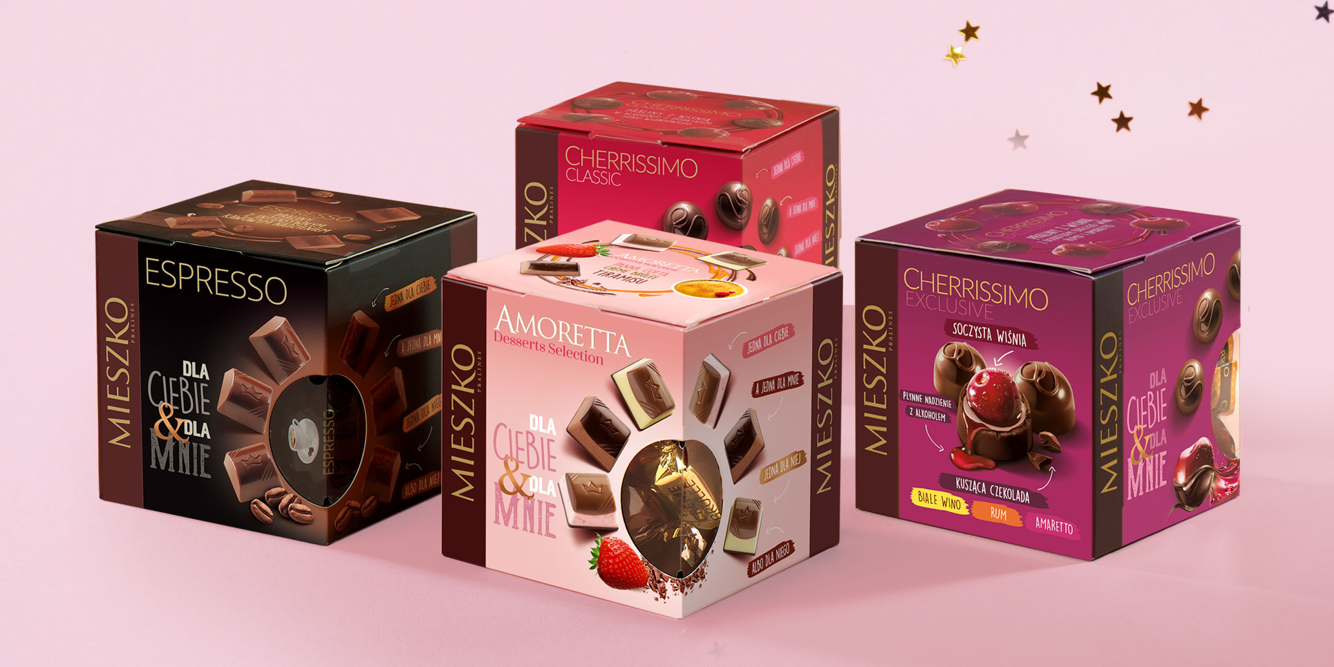
The packaging consists of four distinct folding carton boxes, each featuring a smooth, flat construction without any visible fluted layers. The boxes are predominantly square in shape, designed for retail display. Each box has clean, precise edges and folds, indicative of high-quality paperboard. The surface finish appears to be a combination of matte and glossy elements, enhancing the visual appeal. The boxes are adorned with vibrant graphics and colors, showcasing various chocolate products.
The packaging consists of several colorful folding cartons, each designed for different chocolate products. The boxes have a smooth, flat construction without any visible fluted layers, indicating they are made from single-layer paperboard. Each box features vibrant colors, with a glossy finish that enhances the visual appeal. The edges are clean and precise, with well-defined folds. The design includes various graphics and text, prominently displaying the product names and branding elements.
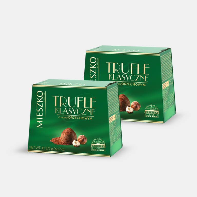
The packaging consists of a smooth, flat construction without any visible fluted layers, indicating it is made from single-layer paperboard. The box features clean, precise edges and folds, typical of retail packaging. It has a glossy finish with vibrant green and gold colors, showcasing the product name and branding prominently on the front. The overall shape is rectangular with a slightly tapered top, which is common for retail cartons.
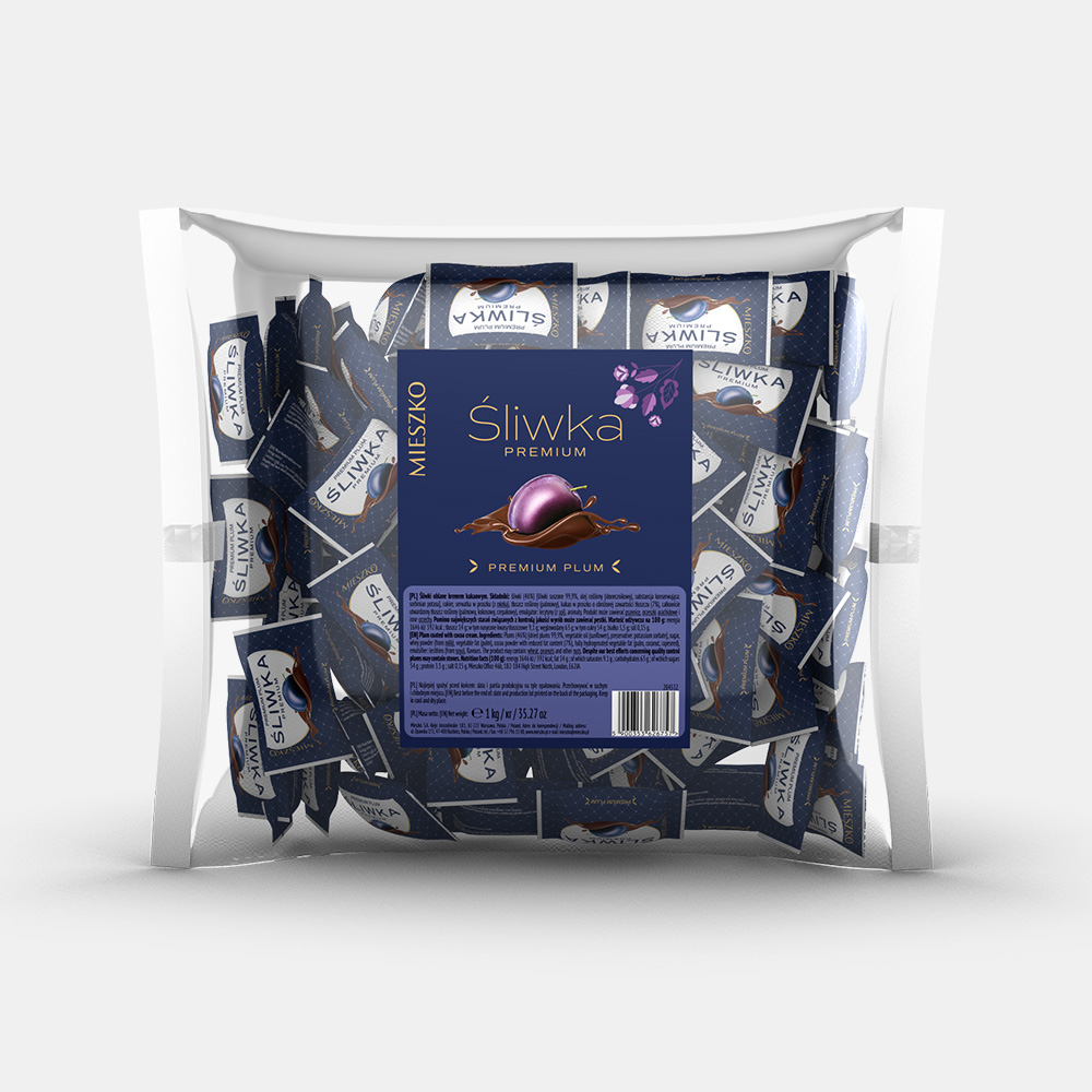
The packaging is a transparent flexible bag containing multiple individually wrapped products. The bag has a clear front, allowing visibility of the contents, while the back features a dark blue label with product information. The bag is sealed at the top and bottom, with a smooth surface and no visible flaps or tabs.
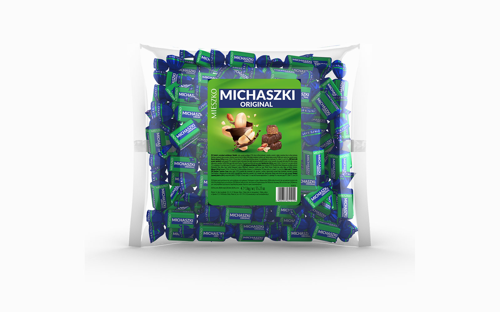
The packaging consists of a clear plastic bag filled with individually wrapped candies. The bag is sealed at the top and features a large printed label on the front. The label displays vibrant colors, predominantly green with blue accents, and includes images of the candies. The overall shape is rectangular, and the bag appears to be transparent, allowing visibility of the contents inside.
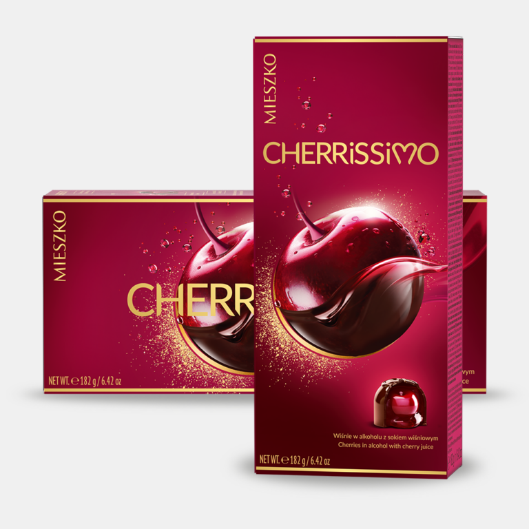
The packaging consists of a smooth, flat construction made from single-layer paperboard. It features a vibrant red color with glossy finishes, showcasing a prominent image of a cherry. The edges are clean and precise, indicative of a well-constructed folding carton. The front displays the product name 'CHERRÍSSIMO' in bold, gold lettering, with a subtle sheen that enhances its visual appeal. The overall design is elegant and eye-catching, aimed at attracting consumers in a retail environment.
About the Brand
Mieszko SA delivers a wide range of chocolate and confectionery products, leveraging both tradition and innovation in manufacturing. The company emphasizes premium positioning through visually distinct and occasion-focused packaging designed to enhance shelf appeal and consumer perception.
Operating from two production facilities in Racibórz, Mieszko SA utilizes a mix of carton boxes and flexible packaging to accommodate their diverse product lines and seasonal offerings. The packaging consistently features prominent brand elements and color schemes aligned with product segmentation, supporting both logistical efficiency and marketing objectives. The use of transparent materials for some flexible bags also facilitates product visibility, a key consideration in confectionery retail.
Key Differentiator: Mieszko SA stands out for its integration of tradition-driven branding and contemporary packaging formats, maintaining high consistency in visual identity across multiple product lines.
Design System
Visual Style
The visual system employs bold, saturated colors (e.g., reds, greens, blues, golds) and glossy or matte finishes to enhance shelf presence. Typography is clean and modern, with prominent use of bold sans-serif fonts for product names and elegant serif accents for brand elements.
Brand Identity
Branding is centered on consistent logo placement, use of the Mieszko name, and recurring iconography such as product imagery and festive motifs. All pack formats display the logo and product name prominently, ensuring instant recognition and visual consistency across the portfolio.
Packaging Design
Material selection favors single-layer carton for structural packaging and flexible plastics for bagged goods. The design philosophy merges aesthetic appeal with structural simplicity, prioritizing clean lines, secure folds, and eye-catching graphics to balance protection and brand communication.
User Experience
Packaging is designed to support the customer journey from shelf selection to unboxing, with vibrant graphics, tactile finishes, and transparent elements driving engagement. The structural integrity and ease of opening contribute to a positive unboxing experience, aligning with the brand’s premium positioning.
Company Metrics
Business insights for Mieszko SA based on available data
Market Positioning
Brand Values & Focus
Key Competitors
Target Market: Mieszko SA targets Polish and international consumers seeking premium chocolate and confectionery products, with a focus on gifting occasions, seasonal retail, and personal indulgence.
Packaging Assessment
Overall Grade
Visual appeal and presentation quality
Packaging durability and protection
Eco-friendliness and recyclable materials
Cost efficiency and value for money
Packaging assessment for Mieszko SA based on industry standards and best practices
Frequently Asked Questions
What types of packaging materials does Mieszko SA primarily use?
Mieszko SA primarily utilizes single-layer paperboard cartons for premium chocolates and flexible plastic packaging for bulk and individually wrapped confections.
How does Mieszko SA balance branding and practicality in packaging?
The company prioritizes strong visual branding through consistent logo placement and distinctive color palettes, while also ensuring packaging formats are suitable for both retail display and product protection.
Is sustainability a focus in Mieszko SA’s packaging strategy?
While the company uses some recyclable materials, the current packaging mix leans towards conventional plastics and coated paperboard, with moderate adoption of eco-friendly alternatives.
Discover other Food & Drink companies
Explore more companies in the food & drink industry and their packaging strategies
PrepMyMeal
Food & Drink
PrepMyMeal is a food production company specializing in high-protein meal delivery services. They offer a variety of natural, nutritious meals designed for fitness enthusiasts and those seeking convenience in meal preparation.
Thés de la Pagode
Food & Drink
Thés de la Pagode is a French company specializing in organic teas and infusions, focusing on health and well-being. Established in 1987, they prioritize sustainable practices and high-quality ingredients sourced through fair trade.
kerex - terre exotique
Food & Drink
Kerex - Terre Exotique specializes in the international trade of gourmet food and drink products, offering a unique selection of spices and culinary ingredients.