MAYU Water packaging
MAYU Water specializes in premium hydration products, utilizing structured water technology and eco-conscious materials. Their packaging strategy emphasizes sustainability and brand consistency, with carefully selected formats that balance product protection, consumer experience, and environmental priorities.
Packaging Portfolio
MAYU Water’s packaging portfolio is characterized by the extensive use of single-layer paperboard carton boxes and rigid chipboard containers. These solutions are designed for both direct product containment (such as dropper bottles and glassware) and premium bundle presentation. The packaging consistently leverages recyclable materials, kraft finishes, and minimalistic structural designs to reinforce the brand’s health and sustainability messaging. Rigid cylindrical boxes provide elevated protection and display value for flagship products, while folding cartons facilitate efficient logistics and shelf impact.
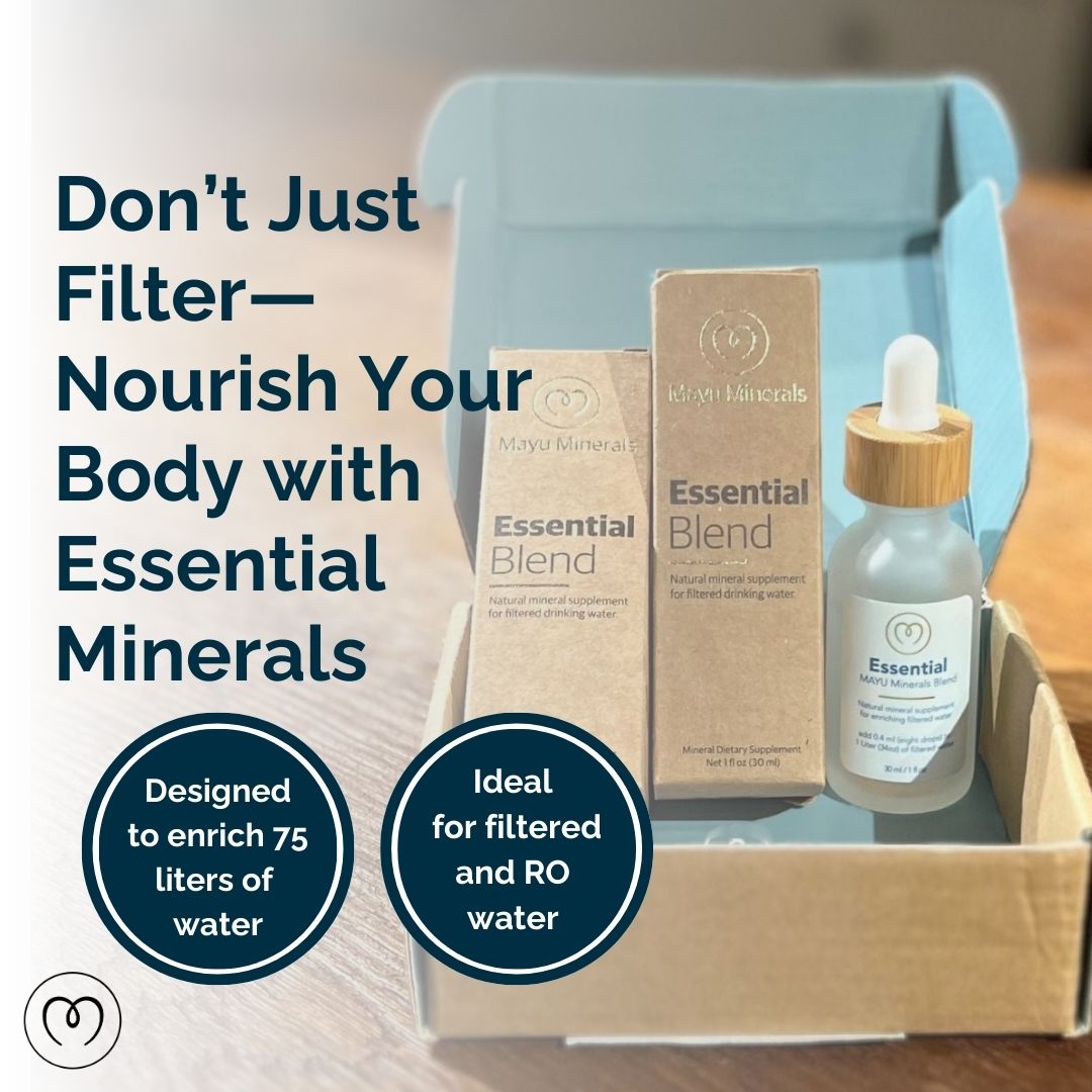
The packaging consists of a folding carton with a smooth, flat construction. It is primarily light blue with a matte finish, featuring clean edges and precise folds. The interior is designed to hold a bottle and a box, indicating a retail presentation. The carton has a tuck flap closure at the top, ensuring secure closure while allowing for easy opening. The front displays a prominent graphic with bold text, and the sides have additional branding elements.
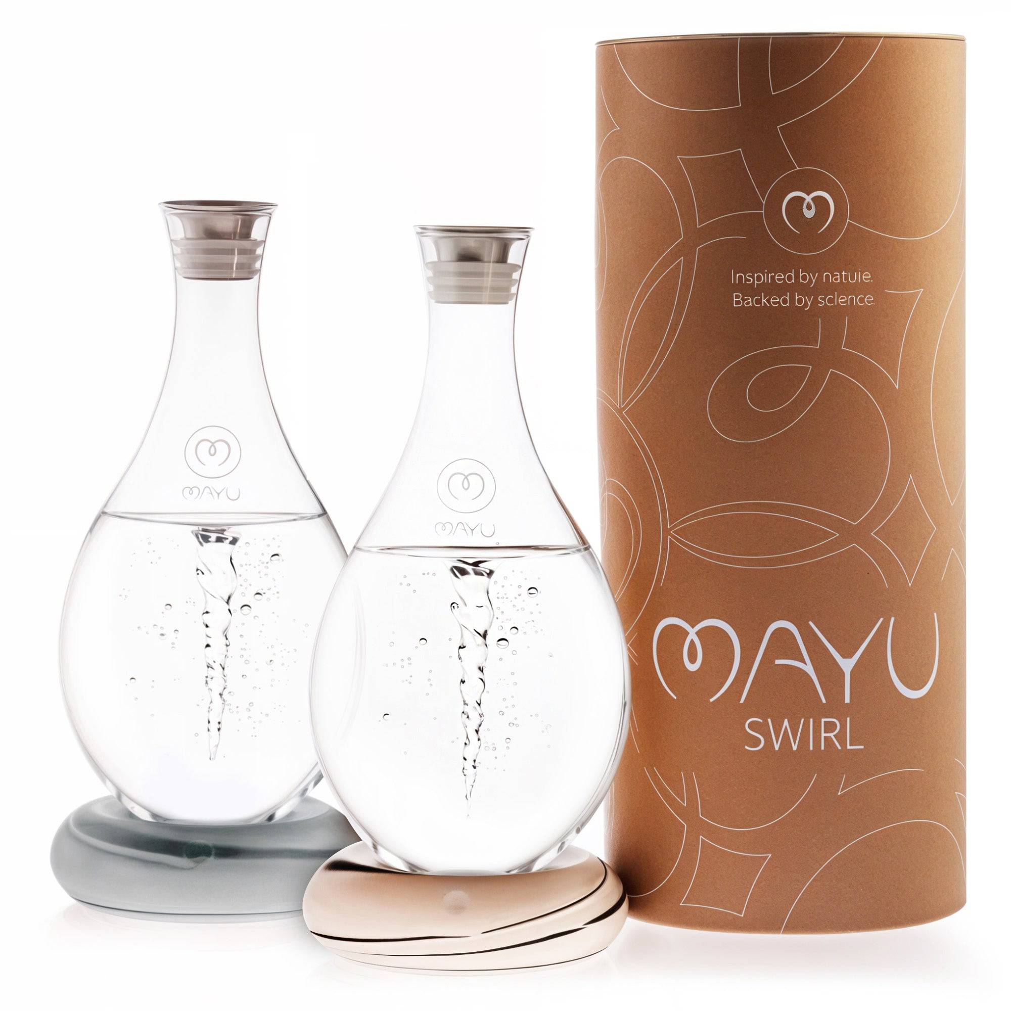
The packaging is a cylindrical rigid box made of thick chipboard, featuring a premium design. The exterior is a kraft brown color with a smooth finish, adorned with a subtle pattern that enhances its luxury appearance. The top of the box is open, showcasing two elegantly shaped glass bottles inside, which are held in place by a molded insert. The box has a clean, precise edge and a sturdy construction, indicative of high-quality packaging.

The packaging consists of a retail carton that is smooth and flat, made from single-layer paperboard. The box features clean edges and folds, with a glossy finish that enhances its visual appeal. The front displays the product name 'MAYU WATER' prominently, along with the description 'ESSENTIAL MINERAL SUPPLEMENT'. The color scheme includes a combination of white and light blue, with gold accents. The back of the box contains usage instructions and additional product information, printed in a clear, legible font.
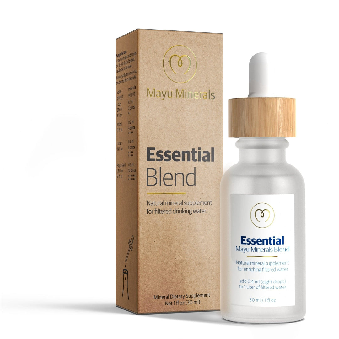
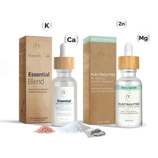
The packaging consists of a tall, rectangular folding carton that houses a glass dropper bottle. The carton features a smooth, flat construction without fluted layers, indicative of single-layer paperboard. It has clean, precise edges and folds, with a natural kraft finish that gives it an organic appearance. The front of the carton prominently displays the product name 'Essential Blend' in bold, modern typography, alongside a minimalist logo. The back of the carton includes detailed product information and nutritional facts, printed in a smaller, legible font. The overall design is simple yet elegant, emphasizing the natural aspect of the product.
The packaging consists of a tall, rectangular carton box and a glass dropper bottle. The carton box features a smooth, flat construction with clean edges and folds, typical of folding cartons. It is primarily a light beige color with minimalistic design elements. The bottle is clear glass with a wooden cap, showcasing the liquid inside. The overall appearance is clean and modern, suitable for retail display.
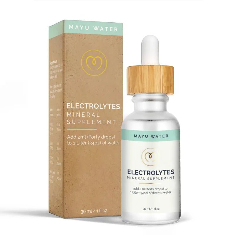
The packaging consists of a slender, rectangular carton that houses a glass bottle. The carton features a smooth, flat construction with clean edges and folds. It has a colorful design with a matte finish, predominantly in soft hues that complement the product inside. The front displays the product name 'ELECTROLYTES MINERAL SUPPLEMENT' in bold, clear typography, along with usage instructions. The bottle itself is transparent, showcasing the liquid inside, and has a dropper cap.
About the Brand
MAYU Water, based in Israel, delivers innovative hydration solutions focused on enhancing water quality and wellness. The company employs direct-to-consumer distribution and prioritizes sustainable packaging as a core element of its brand strategy.
Founded in 2016, MAYU Water operates with a small, agile team and a business model centered on direct customer engagement. The brand’s packaging consistently reflects its commitment to eco-friendliness, utilizing recyclable carton boxes and premium rigid boxes for core products and bundles. Their visual identity and packaging construction are tightly linked to their brand positioning around health, wellness, and environmental stewardship.
Key Differentiator: MAYU Water’s unique value lies in its integration of structured water technology with a sustainability-focused packaging strategy, distinguishing itself through premium presentation and reduced plastic usage.
Design System
Visual Style
The visual approach centers on clean typography, with modern sans-serif fonts, a palette of soft blues, whites, kraft browns, and gold accents. The overall aesthetic is minimal, with high contrast and restrained use of color to convey purity and wellness.
Brand Identity
Logo and product names are prominently featured on all primary packaging panels, complemented by minimalist iconography and consistent graphic motifs. Branding elements are applied uniformly to reinforce recognition and trust.
Packaging Design
Materials are chosen for recyclability and tactile quality, with structural emphasis on folding carton boxes for liquid supplements and rigid chipboard tubes for premium bundles. The design philosophy prioritizes secure product fit, clean lines, and a balance between protection and materials efficiency.
User Experience
Packaging is engineered for intuitive unboxing, with easy-to-open closures and clear product presentation. The design supports a seamless customer journey from online order to delivery, enhancing perceived value and reinforcing the brand’s sustainability commitments.
Company Metrics
Business insights for MAYU Water based on available data
Market Positioning
Brand Values & Focus
Key Competitors
Target Market: Health-conscious, eco-aware consumers seeking premium hydration solutions, primarily through direct-to-consumer e-commerce channels.
Packaging Assessment
Overall Grade
Visual appeal and presentation quality
Packaging durability and protection
Eco-friendliness and recyclable materials
Cost efficiency and value for money
Packaging assessment for MAYU Water based on industry standards and best practices
Frequently Asked Questions
What types of packaging materials does MAYU Water use?
MAYU Water primarily utilizes single-layer paperboard carton boxes and rigid chipboard containers, with a focus on recyclable and minimal plastic materials, supporting both product safety and sustainability.
How does MAYU Water’s packaging support sustainability objectives?
The packaging strategy emphasizes recyclable materials, reduction of single-use plastics, and minimalistic designs, aligning with the company’s goal of minimizing environmental impact while maintaining premium product presentation.
Does the packaging enhance the unboxing experience for customers?
Yes, the combination of well-designed carton and rigid boxes, premium finishes, and consistent branding contributes to a positive unboxing experience, reinforcing the perceived value of MAYU Water products.
Are MAYU Water’s packaging solutions cost-efficient?
The use of premium rigid boxes and customized carton formats increases presentation value but may lead to moderately higher packaging costs, reflecting a balance between quality and expenditure.
Discover other Food & Drink companies
Explore more companies in the food & drink industry and their packaging strategies
PrepMyMeal
Food & Drink
PrepMyMeal is a food production company specializing in high-protein meal delivery services. They offer a variety of natural, nutritious meals designed for fitness enthusiasts and those seeking convenience in meal preparation.
kerex - terre exotique
Food & Drink
Kerex - Terre Exotique specializes in the international trade of gourmet food and drink products, offering a unique selection of spices and culinary ingredients.
Thés de la Pagode
Food & Drink
Thés de la Pagode is a French company specializing in organic teas and infusions, focusing on health and well-being. Established in 1987, they prioritize sustainable practices and high-quality ingredients sourced through fair trade.