Les Fruits Détendus packaging
Les Fruits Détendus produces organic granolas and snacks with a focus on health and sustainability. Their packaging strategy prioritizes eco-friendly materials and distinctive structural formats to reinforce brand values and enhance shelf appeal.
Packaging Portfolio
Les Fruits Détendus employs recyclable folding carton boxes as the primary packaging format, characterized by smooth matte finishes and unique triangular tops for retail differentiation. Each SKU features vivid, color-coded graphics and clear product labeling, supporting both shelf impact and consumer navigation. The use of single-layer paperboard ensures recyclability, while the design incorporates both functional and aesthetic elements such as clean edges and precise folds. Packaging is optimized for both retail display and e-commerce shipment, balancing visual appeal with structural integrity.
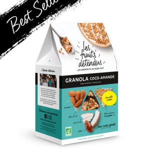
The packaging is a folding carton with a smooth, flat construction, featuring a triangular top. It is primarily white with vibrant turquoise and black accents. The edges are clean and precise, indicating a well-constructed box. The front displays a large logo and product name, with additional graphics and a 'Best Seller' label in the top corner. The overall design is appealing and modern.
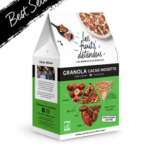
The packaging is a folding carton with a triangular top, showcasing a smooth, flat construction. It features a predominantly green color scheme with images of granola and nuts. The front displays the product name 'GRANOLA CACAO-NOIXETTE' in bold, white font, along with a 'Best Seller' banner in black across the top. The sides have additional product information and graphics, maintaining a clean and precise edge with no visible fluted layers.
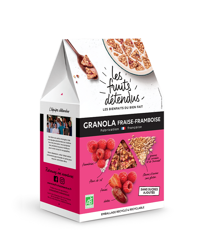
The packaging is a folding carton with a smooth, flat construction. It features a triangular top that gives it a unique shape. The exterior is predominantly pink with images of raspberries and granola pieces, along with text indicating the product name and brand. The edges are clean and well-defined, with precise folds. The overall appearance is vibrant and eye-catching, designed for retail display.
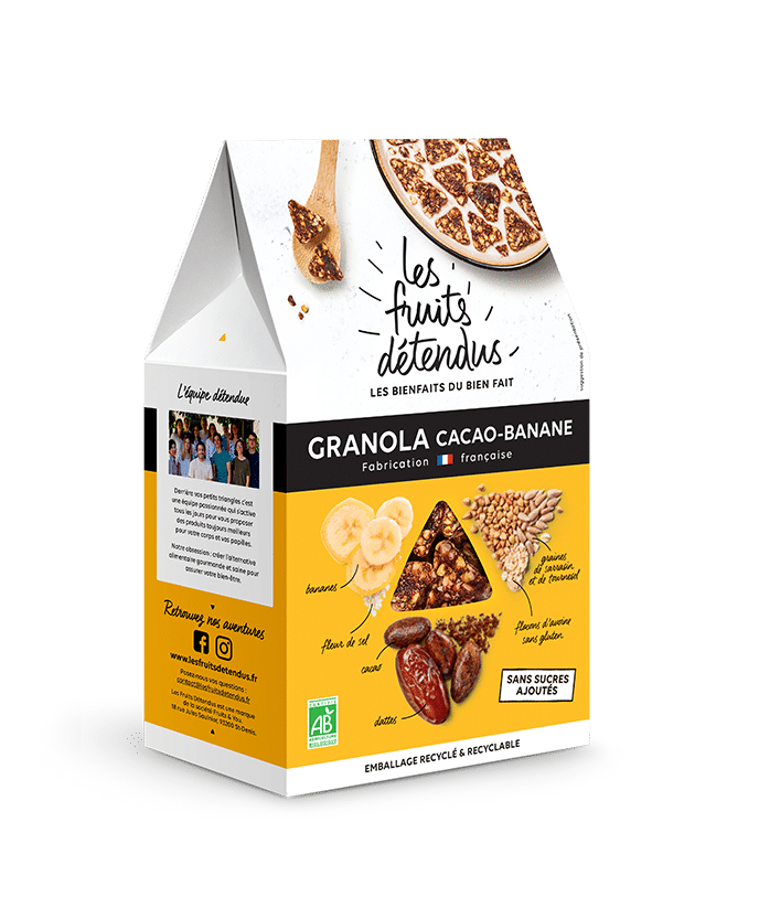
The packaging is a folding carton with a smooth, flat construction, featuring a triangular top that gives it a distinctive shape. It is primarily white with vibrant graphics and colors. The front showcases images of granola, bananas, and nuts, along with product information. The edges are clean and precise, indicating high-quality manufacturing. The surface has a matte finish, enhancing the visual appeal.
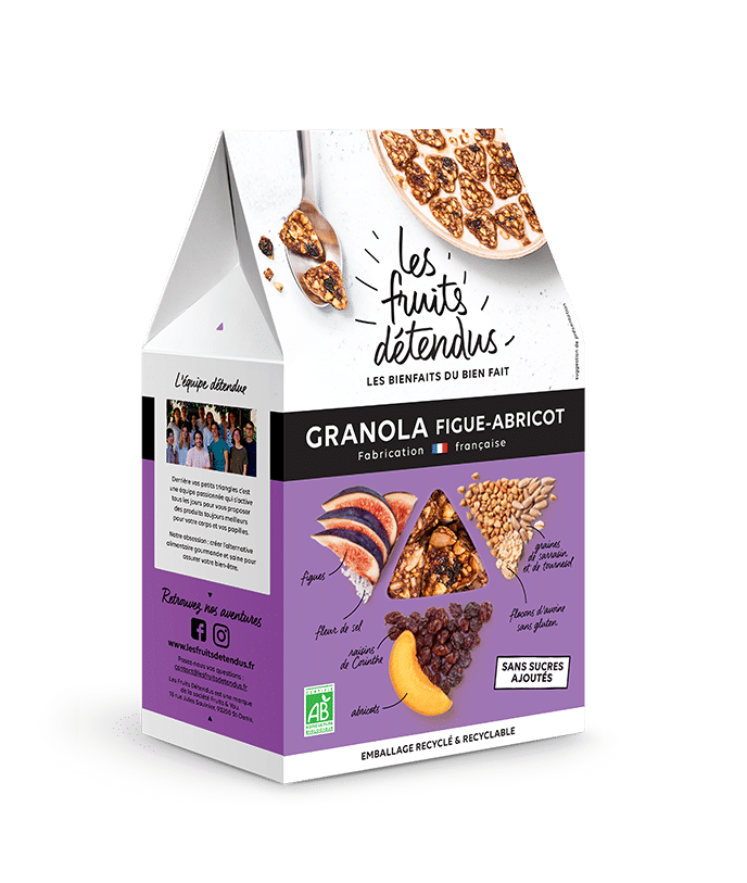
The packaging is a folding carton with a smooth, flat construction made from a single layer of paperboard. It features a triangular top with a distinctive shape, likely designed for easy stacking and display. The exterior is predominantly white with vibrant colors, showcasing images of figs and apricots, along with product information and branding elements. The edges are clean and precise, indicating high-quality manufacturing. The carton has a matte finish, enhancing its visual appeal.
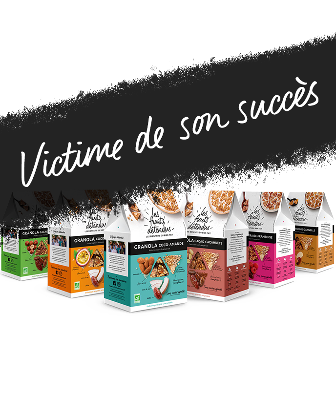
The packaging consists of several retail cartons, each featuring a smooth, flat construction without visible fluted layers. The boxes are brightly colored, with a mix of matte and glossy finishes. Each carton has clean, precise edges and folds, characteristic of folding cartons used for retail. The design includes a triangular top flap, which is typical for this type of packaging.
About the Brand
Les Fruits Détendus is a French food company specializing in organic, gluten-free, and sugar-free granolas and snacks. The brand emphasizes transparent sourcing, local production, and environmental responsibility across its operations.
Since its establishment in 2015, Les Fruits Détendus has targeted health-conscious consumers seeking nutritious, convenient snack options. The company employs a direct-to-consumer (D2C) model and leverages a compact team to ensure quality control over both product formulation and packaging execution. Its packaging portfolio is designed not only for retail impact but also to align with environmentally sustainable practices, utilizing recyclable carton materials and offering bulk formats to minimize waste.
Key Differentiator: The brand's unique integration of eco-friendly packaging with a playful, health-driven visual identity distinguishes it within the premium healthy snack segment.
Design System
Visual Style
Bright, saturated color palette reflecting individual product flavors (turquoise, pink, green, white); sans-serif, clear typography for high legibility; playful, illustrative ingredient graphics paired with clean layouts.
Brand Identity
Consistent use of the Les Fruits Détendus logo and company name on all packaging; prominent flavor and product variant labeling; use of certification icons (organic, French-made); visual motifs reinforcing health and naturalness.
Packaging Design
Sustainably sourced, recyclable carton material; folding carton structure with signature triangular top for brand distinctiveness; emphasis on clean, precise construction and matte finishes to enhance tactile quality.
User Experience
Packaging design supports an intuitive consumer journey by using color-coding for quick flavor identification, clear allergen and ingredient information, and tactile finishes for enhanced unboxing. The structural design facilitates both shelf presence and ease of opening, contributing to a positive brand interaction.
Company Metrics
Business insights for Les Fruits Détendus based on available data
Market Positioning
Brand Values & Focus
Key Competitors
Target Market: Health-conscious consumers seeking organic, gluten-free, and sugar-free snacks, primarily in France and Western Europe, with a focus on environmentally aware buyers.
Packaging Assessment
Overall Grade
Visual appeal and presentation quality
Packaging durability and protection
Eco-friendliness and recyclable materials
Cost efficiency and value for money
Packaging assessment for Les Fruits Détendus based on industry standards and best practices
Frequently Asked Questions
What packaging materials does Les Fruits Détendus use?
Les Fruits Détendus primarily utilizes recyclable folding carton boxes with matte and gloss finishes, designed to be both visually appealing and environmentally responsible.
How does Les Fruits Détendus ensure its packaging is sustainable?
The company selects recyclable paperboard materials and offers bulk purchasing options, actively reducing single-use plastic and supporting lower environmental impact.
Is Les Fruits Détendus' packaging customized for retail?
Yes, the packaging features custom structural designs such as triangular tops for shelf differentiation, with distinct color coding and branded graphics for each product variant.
Discover other Food & Drink companies
Explore more companies in the food & drink industry and their packaging strategies
kerex - terre exotique
Food & Drink
Kerex - Terre Exotique specializes in the international trade of gourmet food and drink products, offering a unique selection of spices and culinary ingredients.
Thés de la Pagode
Food & Drink
Thés de la Pagode is a French company specializing in organic teas and infusions, focusing on health and well-being. Established in 1987, they prioritize sustainable practices and high-quality ingredients sourced through fair trade.
PrepMyMeal
Food & Drink
PrepMyMeal is a food production company specializing in high-protein meal delivery services. They offer a variety of natural, nutritious meals designed for fitness enthusiasts and those seeking convenience in meal preparation.