Kultsnack packaging
Kultsnack specializes in freeze-dried fruit snacks targeting health-conscious consumers across Europe. Their packaging approach utilizes vibrant, retail-ready flexible pouches and carton display boxes engineered for both shelf impact and product protection.
Packaging Portfolio
Kultsnack’s packaging portfolio consists of single-layer paperboard retail display boxes and multi-layer flexible stand-up pouches. Carton boxes are engineered for efficient shelf display and rapid access, featuring precise folding and vibrant, full-color printing. Flexible pouches incorporate resealable closures for convenience and extended freshness, utilizing matte finishes and custom illustrations to differentiate fruit varieties. The combination of structural rigidity for transport and eye-catching, user-friendly flexible formats reflects a data-driven approach to balancing logistics, branding, and consumer experience.
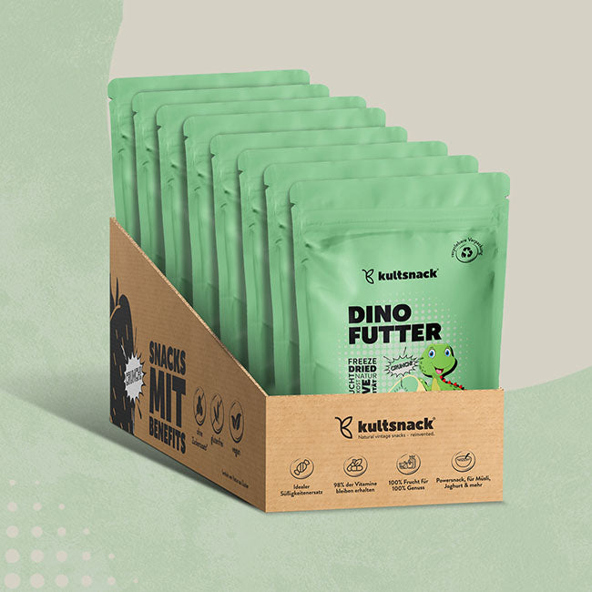
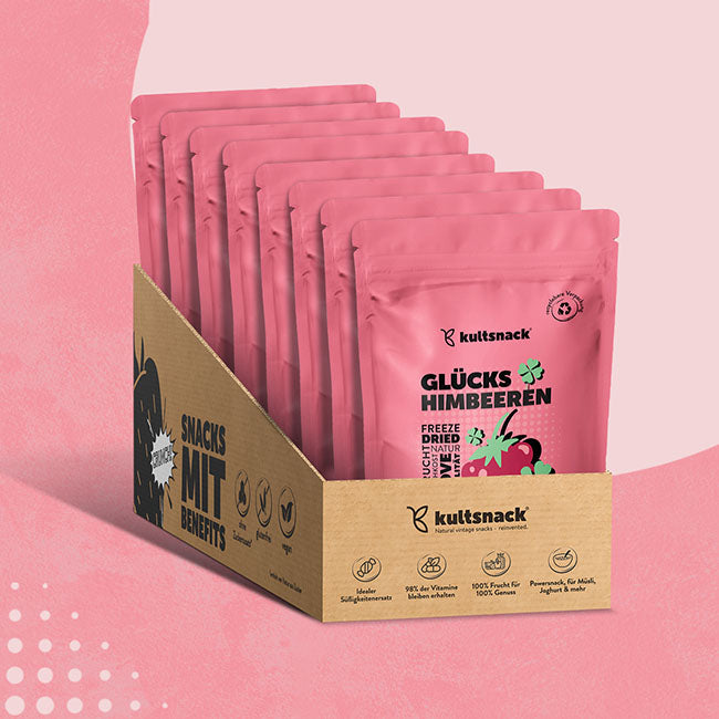
The packaging consists of a display box made from single-layer paperboard, featuring a smooth and flat construction. The box has a light brown kraft color with printed graphics on the exterior. The front of the box has cut-out sections to display the product pouches inside, which are arranged in a standing position. The edges are clean and precise, indicating a well-constructed folding carton design. The overall shape is rectangular, designed for retail display.
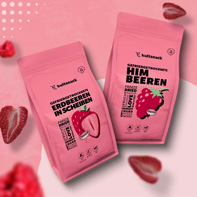
The packaging consists of a stand-up pouch made from a flexible material, likely a multi-layer film. The pouch is predominantly pink with a matte finish, featuring a resealable top. The front displays vibrant graphics of strawberries and text in contrasting colors, including black and green. The design is modern and appealing, with a clear window to showcase the product inside.
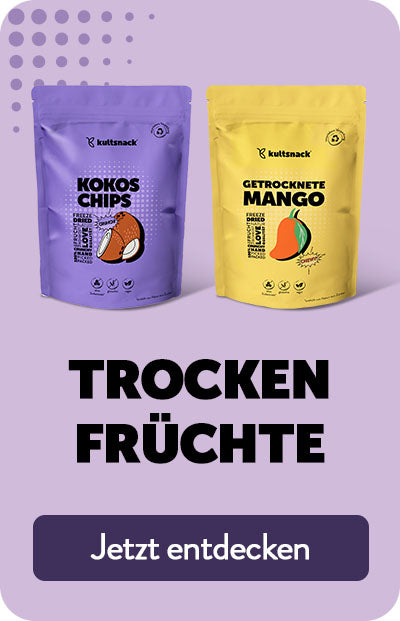
The packaging consists of two flexible bags, one purple and one yellow, each containing a different type of dried fruit. The bags have a smooth surface with vibrant colors and illustrations of the products inside. The purple bag features a graphic of coconut chips, while the yellow bag displays a graphic of dried mango. The overall design is modern and appealing, aimed at attracting consumers in a retail setting.
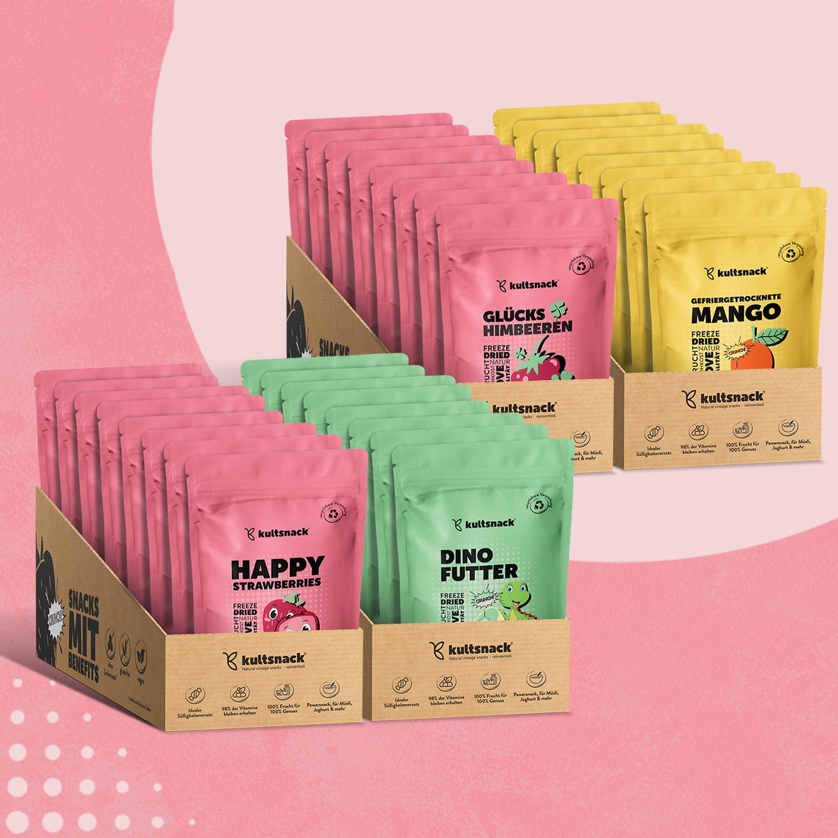
The packaging consists of a retail display box made of smooth, single-layer paperboard, housing multiple pouches of snacks. The box has clean, precise edges and folds, with a flat construction that is typical for retail packaging. The pouches are brightly colored, featuring various graphics and product names, while the box itself has a kraft appearance with printed branding elements.
The packaging consists of a retail display box made of single-layer paperboard, featuring a smooth, flat construction. The box is designed to hold multiple pouches of snacks, with a slanted top for easy access. The exterior is printed with vibrant colors and graphics, prominently displaying the brand name and product information. The box has clean edges and folds, indicative of precise manufacturing.
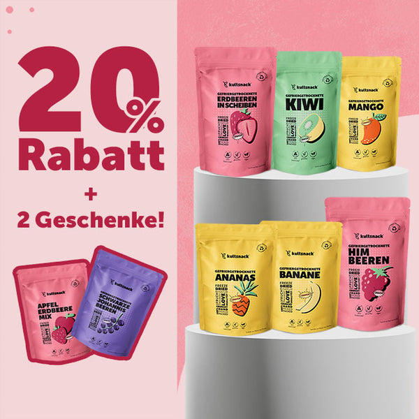
The image features several stand-up pouches arranged in a visually appealing manner. Each pouch has a vibrant color scheme, with distinct fruit illustrations and product names prominently displayed. The pouches have a resealable top, allowing for easy access and storage. The overall design is modern and eye-catching, suitable for retail display.
About the Brand
Kultsnack delivers a diverse portfolio of freeze-dried fruits, positioning itself as a leading provider of natural, additive-free snacks in the European market. The brand operates with a direct-to-consumer e-commerce model, leveraging visually impactful packaging to reinforce its health-centric value proposition.
The company emphasizes quality and transparency, offering detailed nutritional information, clear product visuals, and engaging customer reviews. Packaging is integral to their strategy, with a focus on resealable, stand-up flexible pouches and shelf-ready carton boxes that facilitate retail display and enhance consumer convenience. All materials and graphics are tailored to appeal to both individual health-focused buyers and families.
Key Differentiator: Kultsnack's unique strength lies in its combination of premium, vibrant packaging and its direct engagement with health-oriented European customers, supported by consistent branding and strong customer satisfaction metrics.
Design System
Visual Style
Typography is bold and sans-serif, supporting legibility and a modern appeal. The color palette is vibrant, with dominant hues reflecting fruit flavors—pink, yellow, green, and purple—against kraft and neutral backgrounds. A playful, colorful aesthetic is maintained throughout.
Brand Identity
Logo placement is consistent across all packaging, typically accompanied by large product names and illustrated fruit graphics. Iconography is minimal but expressive, using playful motifs for families and children. Visual consistency is achieved through recurring color themes and typography.
Packaging Design
Material choices prioritize single-layer paperboard for cartons (recyclable) and multi-layer films for pouches (resealable but with moderate recyclability). Structural design philosophy emphasizes retail display efficiency, product protection, and ease of consumer use.
User Experience
The packaging supports an intuitive customer journey, from visual shelf impact to resealable pouches for on-the-go snacking. Graphics, color coding, and tactile finishes are employed to enhance engagement, drive repeat purchase, and reinforce the health-focused brand promise.
Company Metrics
Business insights for Kultsnack based on available data
Market Positioning
Brand Values & Focus
Key Competitors
Target Market: Health-conscious consumers and families in Germany and broader Europe seeking natural snack alternatives via e-commerce and retail channels.
Packaging Assessment
Overall Grade
Visual appeal and presentation quality
Packaging durability and protection
Eco-friendliness and recyclable materials
Cost efficiency and value for money
Packaging assessment for Kultsnack based on industry standards and best practices
Frequently Asked Questions
What types of packaging does Kultsnack use for its products?
Kultsnack primarily employs flexible stand-up pouches for individual snack portions and single-layer paperboard carton display boxes for retail presentation. These formats are designed for product visibility, resealability, and logistics efficiency.
How does Kultsnack address sustainability in its packaging?
While the company uses recyclable paperboard for its display boxes, most flexible pouches are likely multi-material films with limited recyclability. Overall, sustainability efforts are moderate and align with industry norms for snack foods.
How does Kultsnack’s packaging influence the unboxing experience?
Packaging is designed with vibrant graphics and clear branding, creating a positive visual impact and a playful, welcoming unboxing experience tailored to both adults and children.
Discover other Food & Drink companies
Explore more companies in the food & drink industry and their packaging strategies
PrepMyMeal
Food & Drink
PrepMyMeal is a food production company specializing in high-protein meal delivery services. They offer a variety of natural, nutritious meals designed for fitness enthusiasts and those seeking convenience in meal preparation.
kerex - terre exotique
Food & Drink
Kerex - Terre Exotique specializes in the international trade of gourmet food and drink products, offering a unique selection of spices and culinary ingredients.
Thés de la Pagode
Food & Drink
Thés de la Pagode is a French company specializing in organic teas and infusions, focusing on health and well-being. Established in 1987, they prioritize sustainable practices and high-quality ingredients sourced through fair trade.