koakult gmbh packaging
koakult gmbh, a Berlin-based D2C food and drink company, specializes in cacao-based energy beverages and snacks. Their packaging approach prioritizes sustainability, brand visibility, and product protection, utilizing flexible pouches and retail cartons with strong visual branding.
Packaging Portfolio
koakult gmbh’s packaging portfolio is characterized by the use of flexible stand-up pouches—often composed of paper-plastic composites—and retail-ready carton boxes. The pouches feature resealable tops, matte finishes, and clear windows for product visibility, prioritizing both freshness and consumer convenience. Carton formats are used for gift sets and retail display, constructed from smooth paperboard with colorful, brand-consistent graphics. Across all formats, certification icons (organic, fair trade, vegan) are prominently displayed, reinforcing the brand's commitment to transparency and sustainability.

The packaging consists of a retail display box containing multiple individual cartons of a beverage product. The display box is made from smooth paperboard with a colorful design, featuring a cut-out section for visibility of the product inside. The individual cartons are neatly arranged and have clean edges and folds, indicating a precise construction. The overall appearance is vibrant and appealing, designed for retail visibility.
The packaging consists of a stand-up pouch made from a kraft paper-like material with a resealable top. The front features a clear window that allows visibility of the product inside. The pouch is printed with vibrant colors, including green and black, and includes various certifications and product information. The edges are smooth, and the overall shape is rectangular with a flat bottom for stability.

The packaging consists of a retail display box featuring multiple individual product cartons. The display box has a smooth, flat construction without fluted layers, typical of carton boxes. The outer surface is printed with vibrant colors and graphics, prominently displaying the brand name 'KoaWach' along with product descriptions. The individual product cartons are also made of paperboard, showcasing a similar design and color scheme. The overall structure is designed for retail visibility, with clean edges and folds.

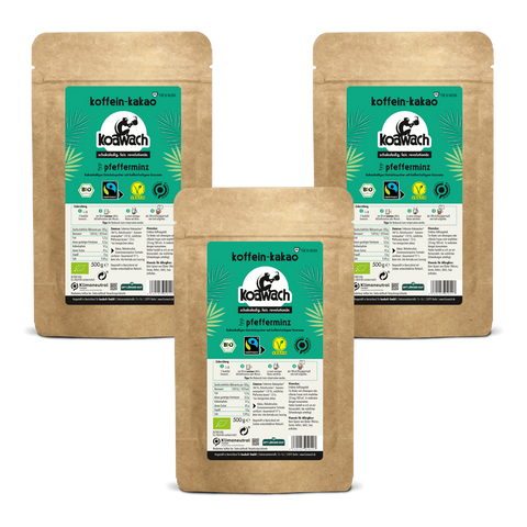
The packaging consists of three distinct pouches, each made from a flexible material that appears to be a composite of paper and plastic. The pouches have a matte finish with a slight texture, giving them a premium feel. Each pouch features a resealable top, allowing for easy access and storage. The front of each pouch displays vibrant graphics, including the brand logo, product name, and various certifications. The design incorporates earthy tones, primarily browns and creams, which align with the product's natural ingredients.
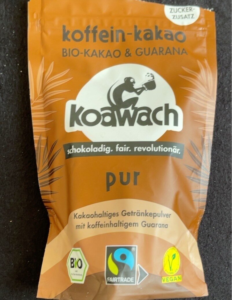
The packaging is a stand-up pouch made of a flexible material, likely a composite of plastic and foil. It features a smooth surface with a matte finish and a resealable top. The design includes a large, central logo and product name, with additional text and icons indicating organic and fair trade certifications.

The packaging is a flexible pouch made from a composite material, featuring a matte finish with a smooth texture. The design includes a vibrant color scheme with shades of beige and purple, and it prominently displays the brand name 'koawach' in bold black lettering. The front features additional text in a smaller font, providing product details and certifications such as 'BIO' and 'FAIRTRADE'. The top of the pouch is sealed, and there is a tear strip for easy opening.
About the Brand
koakult gmbh operates within the German food and beverage sector, delivering health-oriented cacao beverages and snacks through a robust D2C e-commerce model. The company emphasizes ethical sourcing, fair trade, and climate-neutral practices across its operations.
With a product portfolio spanning cacao-infused drinks, energy snacks, and special edition gift sets, koakult gmbh integrates sustainability throughout its value chain. Packaging choices reflect a balance between premium consumer presentation, logistical efficiency, and environmental responsibility, with a strong focus on recyclable materials and clear, vibrant brand communication.
Key Differentiator: koakult gmbh stands out through its integration of fair trade sourcing, climate-neutral commitments, and innovative use of guarana as a natural caffeine source—all reflected in their eco-conscious, visually distinctive packaging.
Design System
Visual Style
Typography is clean and modern, with bold sans-serif fonts for product names and legible supporting text. The color palette emphasizes earthy tones—browns, creams, and greens—contrasted with vibrant accent colors for product differentiation. The overall aesthetic is natural and energetic, supporting the brand’s health-oriented positioning.
Brand Identity
Consistent logo placement and usage across all packaging; iconography includes certification badges and product-specific illustrations. Visual consistency is maintained through repeated motifs, color schemes, and structured layouts, supporting instant brand recognition.
Packaging Design
Materials include paper-plastic composites for flexible pouches and smooth paperboard for cartons, balancing product protection with environmental considerations. Resealable features and windows are incorporated for user convenience, while structural designs prioritize both retail display and shipping integrity.
User Experience
Packaging design supports an engaging customer journey by combining tactile, resealable materials with visually appealing graphics and clear information hierarchy. The unboxing process is intentionally premium, reinforcing positive brand association and increasing the likelihood of repeat purchases.
Company Metrics
Business insights for koakult gmbh based on available data
Market Positioning
Brand Values & Focus
Key Competitors
Target Market: Health-conscious consumers in Germany seeking sustainable, ethical alternatives to traditional caffeinated beverages through both e-commerce and retail channels.
Packaging Assessment
Overall Grade
Visual appeal and presentation quality
Packaging durability and protection
Eco-friendliness and recyclable materials
Cost efficiency and value for money
Packaging assessment for koakult gmbh based on industry standards and best practices
Frequently Asked Questions
What types of packaging does koakult gmbh use?
koakult gmbh utilizes flexible pouches (often paper-plastic composites) and carton boxes for both individual products and retail display, emphasizing resealability, protection, and visual shelf appeal.
How sustainable are koakult gmbh’s packaging solutions?
Their packaging incorporates recyclable and composite materials, with clear labeling of organic and fair trade certifications. Climate-neutral initiatives further support their sustainability profile, though some plastic use remains for barrier and reseal functions.
How does packaging support the brand’s customer experience?
Packaging is designed for both functionality and emotional impact, with resealable pouches, premium matte finishes, and consistent visual branding across product lines, enhancing both the unboxing experience and retail shelf visibility.
Discover other Food & Drink companies
Explore more companies in the food & drink industry and their packaging strategies
PrepMyMeal
Food & Drink
PrepMyMeal is a food production company specializing in high-protein meal delivery services. They offer a variety of natural, nutritious meals designed for fitness enthusiasts and those seeking convenience in meal preparation.
kerex - terre exotique
Food & Drink
Kerex - Terre Exotique specializes in the international trade of gourmet food and drink products, offering a unique selection of spices and culinary ingredients.
Thés de la Pagode
Food & Drink
Thés de la Pagode is a French company specializing in organic teas and infusions, focusing on health and well-being. Established in 1987, they prioritize sustainable practices and high-quality ingredients sourced through fair trade.