House of Townend packaging
House of Townend is a longstanding wine merchant specializing in premium and fine wines for the UK market. Their packaging strategy employs rigid boxes and branded carriers to reinforce a luxury brand image while focusing on product protection and elevated unboxing experiences.
Packaging Portfolio
House of Townend utilizes a focused packaging portfolio centered on rigid chipboard gift boxes and premium paper wine carriers. These structures are engineered for both high-impact presentation and robust bottle protection, featuring matte or glossy finishes, die-cut handles, and prominent brand logos. The consistent application of deep blue colorways and gold or silver foiling supports brand recognition, while the structural emphasis on thick walls and upright formats minimizes transit risk. Limited use of non-recyclable materials suggests a moderate approach to sustainability.

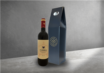
The packaging is a tall, narrow box designed to hold a wine bottle. It features a sturdy, thick construction that suggests a premium feel, likely made from chipboard. The exterior is smooth and finished in a dark blue color, with a glossy appearance. The box has a cut-out handle at the top for easy carrying. The front displays a circular logo, while the sides are plain, emphasizing the box's elegant design.

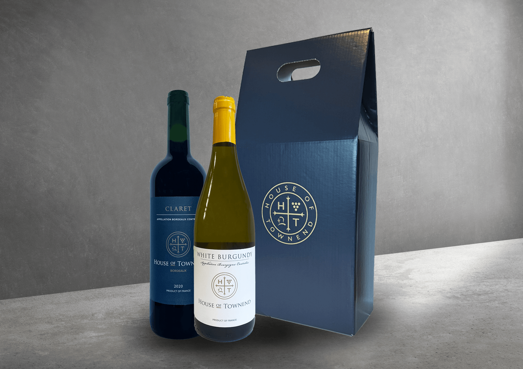
The packaging is a sturdy, rigid box designed to hold two bottles of wine. It features a premium construction with thick walls, likely made of chipboard. The exterior is finished in a matte navy blue color, giving it a luxurious appearance. The box has a die-cut handle at the top for easy carrying and a smooth surface with no visible fluting. The front displays a circular logo in gold, with the text 'HOUSE OF TOWNEND' prominently featured, indicating the brand. The overall shape is rectangular, designed to securely hold the wine bottles upright.
The packaging consists of a sturdy paper bag designed to hold wine bottles. It features a rectangular base and a tall, upright structure with a cut-out handle at the top for easy carrying. The exterior is predominantly dark blue with a smooth finish, and the bag has a clean, elegant appearance. The front displays a circular logo with the letters 'H', 'T', and grape motifs, indicating a wine-related product. The overall design is simple yet sophisticated, appealing to wine consumers.

The packaging is a sturdy, upright carrier designed to hold two bottles of wine. It features a thick, premium construction with a glossy finish. The exterior is a deep blue color, while the interior is likely a lighter shade. The bag has a die-cut handle at the top for easy carrying. The front displays a circular logo prominently, along with the brand name 'KUKI' in an elegant font. The overall design is sleek and modern, suitable for a luxury product.

The packaging is a sturdy, upright wine carrier designed to hold two bottles. It features a thick, chipboard construction with a glossy finish. The exterior is a deep navy blue, providing a premium appearance. The front displays a circular logo with the brand name, 'House of Townend', prominently featured. The top has a cut-out handle for easy carrying, and the sides are smooth with no visible flaps or closures.
About the Brand
House of Townend operates as a premium wine merchant, offering a curated selection of fine wines through both retail and e-commerce channels. Their packaging solutions are designed to complement the premium positioning of their products, with an emphasis on rigid, branded structures for both protection and customer perception.
Leveraging over a century of industry experience, House of Townend invests in packaging formats such as rigid gift boxes and branded wine carriers, primarily utilizing chipboard and high-quality paper materials. These formats serve both logistical and brand objectives—mitigating breakage risks and enhancing shelf and gifting appeal. The visual consistency across their packaging fosters strong brand recall and aligns with the expectations of their discerning clientele.
Key Differentiator: House of Townend differentiates itself through consistent use of premium, custom-branded packaging that supports both product safety and a high-end brand experience, setting it apart in a competitive wine retail market.
Design System
Visual Style
The visual design employs classic serif typography, a deep navy blue primary color palette, and gold/silver accenting to evoke sophistication. Surfaces are typically matte or glossy for premium tactile feedback.
Brand Identity
Branding is built around a circular logo, often paired with 'House of Townend' text and heritage references. Logo placement is consistent and prominent, supporting strong visual identity across formats.
Packaging Design
Primary materials include rigid chipboard and premium paperboard, chosen for strength and upscale presentation. Structural design favors upright boxes and reinforced carriers, with die-cut handles for user convenience.
User Experience
Packaging is optimized for both gifting and direct consumer delivery, with attention to unboxing rituals and tactile quality. The design supports a positive customer journey from purchase through presentation, aligning with premium wine expectations.
Company Metrics
Business insights for House of Townend based on available data
Market Positioning
Brand Values & Focus
Key Competitors
Target Market: House of Townend targets wine enthusiasts, collectors, and gift purchasers within the UK, focusing on both individual consumers and corporate clients seeking premium wine selections.
Packaging Assessment
Overall Grade
Visual appeal and presentation quality
Packaging durability and protection
Eco-friendliness and recyclable materials
Cost efficiency and value for money
Packaging assessment for House of Townend based on industry standards and best practices
Frequently Asked Questions
What types of packaging does House of Townend use for their wine products?
House of Townend predominantly uses rigid boxes and branded paper carriers constructed from chipboard and premium paperboard. These formats are selected for their durability, aesthetic appeal, and ability to reinforce the company's luxury positioning.
How does House of Townend’s packaging contribute to product safety during logistics?
The use of thick-walled, rigid chipboard structures and reinforced carriers provides robust protection against transit damage, minimizing breakage and supporting safe delivery through e-commerce and in-store channels.
To what extent does House of Townend focus on sustainability in its packaging?
While packaging is primarily focused on durability and presentation, most materials appear to be paper-based and potentially recyclable. However, there is limited evidence of advanced sustainability features such as recycled content or explicit eco-certifications.
Discover other Food & Drink companies
Explore more companies in the food & drink industry and their packaging strategies
PrepMyMeal
Food & Drink
PrepMyMeal is a food production company specializing in high-protein meal delivery services. They offer a variety of natural, nutritious meals designed for fitness enthusiasts and those seeking convenience in meal preparation.
kerex - terre exotique
Food & Drink
Kerex - Terre Exotique specializes in the international trade of gourmet food and drink products, offering a unique selection of spices and culinary ingredients.
Thés de la Pagode
Food & Drink
Thés de la Pagode is a French company specializing in organic teas and infusions, focusing on health and well-being. Established in 1987, they prioritize sustainable practices and high-quality ingredients sourced through fair trade.