Fairytale packaging
Fairytale specializes in premium cakes, sweet treats, and curated gifts, leveraging visually impactful and structurally robust packaging to enhance customer experience. Their packaging strategy emphasizes luxury presentation and strong brand alignment, utilizing rigid boxes and custom-printed bags for both protection and aesthetics.
Packaging Portfolio
Fairytale's packaging portfolio is anchored by high-strength rigid boxes in various formats—cylindrical, rectangular, and tray-based—constructed primarily from chipboard with matte or glossy pink finishes. These are often enhanced with gold foil logos, ribbon closures, and fitted inserts for product stability. The use of custom-branded paper shopping bags with rope handles extends the luxury experience to the retail handoff. Packaging is engineered for both product protection and visual impact, supporting gifting occasions while maintaining consistent brand presentation across all formats.
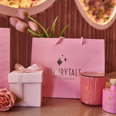
The packaging consists of a pink shopping bag made from a sturdy paper material. It features a smooth surface with a matte finish, and the bag has a rectangular shape with a flat bottom, allowing it to stand upright. The handles are made of a soft, pink rope material, providing a comfortable grip. The front of the bag prominently displays the brand name 'FAIRYTALE' in a stylish font, accompanied by a diamond logo, which adds a touch of elegance. The overall design is simple yet sophisticated, appealing to a luxury market.
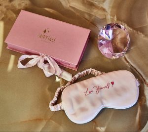
The packaging is a rectangular rigid box with a smooth, sturdy construction. It features a soft pink exterior with a glossy finish, adorned with gold foil lettering that reads 'FAIRTALE' prominently on the top. The box has a ribbon closure, which adds a touch of elegance. The interior is likely designed to securely hold the contents, possibly with a fitted insert. The overall appearance is luxurious and premium, suitable for gifting.
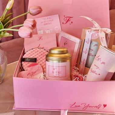
The packaging is a sturdy, thick-walled box with a luxurious appearance. It is primarily pink, featuring a smooth surface finish with a matte texture. The box is adorned with elegant graphics and text, including the phrase 'Love Yourself!' in a stylish font. Inside, the box contains various items, suggesting it is designed for gifting. The overall shape is rectangular with a lid that opens to reveal the contents.
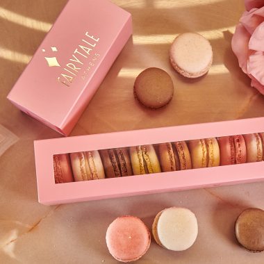
The packaging is a rectangular rigid box with a thick, sturdy construction. It features a smooth, matte pink exterior with a glossy gold logo embossed on the top. The box has a clear plastic window on the front, allowing visibility of the macarons inside. The interior is designed to securely hold the macarons in place, preventing movement during transport.
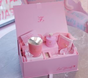
The packaging is a luxury gift box with a thick, sturdy construction. It features a smooth, matte pink exterior with a premium feel. The box has a hinged lid that opens to reveal various items inside, including a candle, a bottle, and other small products, all arranged neatly. The interior is lined with soft materials to protect the contents. The edges are clean and precise, indicating high-quality manufacturing. The overall shape is rectangular, with a flat base and a lid that fits snugly.
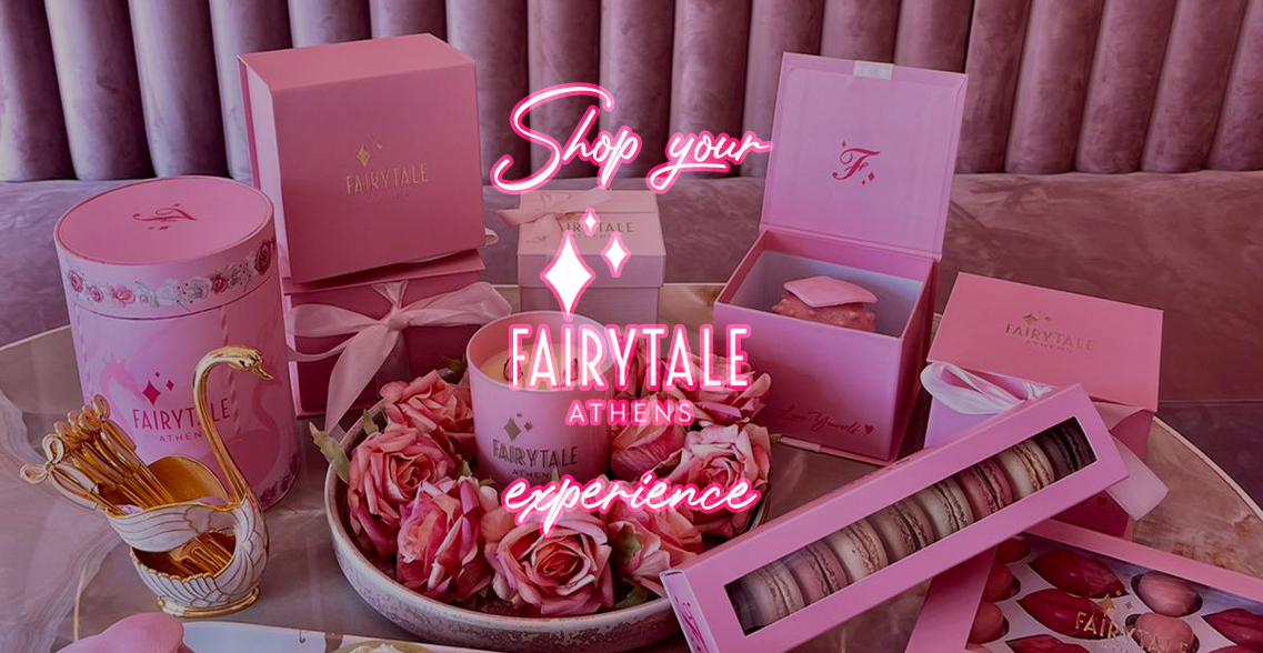
The packaging consists of several rigid boxes and cartons, primarily in a soft pink color scheme. The boxes have thick walls, indicative of chipboard construction, providing a premium feel. The surfaces are smooth with a glossy finish, enhancing the luxurious appearance. The boxes feature clean, precise edges and folds, with some adorned with decorative elements such as ribbons and logos. The overall arrangement includes a cylindrical box, rectangular boxes, and a tray of macarons, all contributing to a cohesive aesthetic.
About the Brand
Fairytale operates as a direct-to-consumer e-commerce brand, focusing on celebratory cakes, gourmet sweet treats, and bespoke gift boxes. The company’s packaging solutions are integral to its brand experience, utilizing high-grade rigid cartons, luxury gift boxes, and custom-branded shopping bags designed to reinforce a premium positioning.
The packaging approach at Fairytale is characterized by cohesive visual branding, with a consistent pink color palette, matte and glossy finishes, and gold foil accents. Material selections prioritize structural integrity for fragile confectionery items while supporting a memorable unboxing process. Brand identity is clearly communicated through prominent logos and elegant typography, enhancing perceived value and customer satisfaction.
Key Differentiator: Fairytale distinguishes itself through meticulously crafted, custom-branded packaging that merges high visual appeal with product protection, emphasizing emotional resonance and gifting suitability.
Design System
Visual Style
The visual design style is defined by a cohesive soft pink color palette, elegant serif and script typography, and an emphasis on matte and glossy textural contrasts. Gold foil detailing and minimalistic graphics reinforce a premium, celebratory aesthetic.
Brand Identity
Brand identity is communicated through prominent logo placement, consistent use of the 'FAIRYTALE' name, and recurring motifs such as ribbons and gold accents. Iconography is minimal, focusing on core branding elements for high recognizability across all packaging types.
Packaging Design
Material choices prioritize rigid chipboard for strength and luxury perception, with structural designs including fitted inserts, windowed boxes, and hinged lids. The philosophy emphasizes product protection, premium unboxing, and a cohesive visual system.
User Experience
Packaging is designed to maximize emotional impact at unboxing, using tactile finishes and carefully arranged product displays. The user experience extends from online ordering through delivery or in-store pickup, supporting a seamless and memorable brand journey.
Company Metrics
Business insights for Fairytale based on available data
Market Positioning
Brand Values & Focus
Key Competitors
Target Market: Urban and suburban consumers in Greece seeking premium cakes, gifts, and celebratory treats—primarily targeting adults and families celebrating special occasions.
Packaging Assessment
Overall Grade
Visual appeal and presentation quality
Packaging durability and protection
Eco-friendliness and recyclable materials
Cost efficiency and value for money
Packaging assessment for Fairytale based on industry standards and best practices
Frequently Asked Questions
How does Fairytale's packaging contribute to the customer experience?
Fairytale’s packaging is designed for both visual impact and functional protection, employing luxury materials and cohesive branding to enhance the unboxing experience and reinforce the brand’s premium positioning.
What materials and formats are most commonly used in Fairytale's packaging?
The brand predominantly utilizes rigid chipboard boxes with matte or glossy finishes, complemented by custom-printed paper shopping bags with rope handles and gold foil detailing.
Does Fairytale use sustainable packaging solutions?
While the rigid boxes and paper bags are typically recyclable, there is limited evidence of dedicated eco-friendly materials or explicit sustainability initiatives in their current packaging portfolio.
Discover other Food & Drink companies
Explore more companies in the food & drink industry and their packaging strategies
PrepMyMeal
Food & Drink
PrepMyMeal is a food production company specializing in high-protein meal delivery services. They offer a variety of natural, nutritious meals designed for fitness enthusiasts and those seeking convenience in meal preparation.
kerex - terre exotique
Food & Drink
Kerex - Terre Exotique specializes in the international trade of gourmet food and drink products, offering a unique selection of spices and culinary ingredients.
Thés de la Pagode
Food & Drink
Thés de la Pagode is a French company specializing in organic teas and infusions, focusing on health and well-being. Established in 1987, they prioritize sustainable practices and high-quality ingredients sourced through fair trade.