Equal Exchange UK packaging
Equal Exchange UK is a social enterprise specializing in organic and fairtrade food products, with a packaging strategy that emphasizes sustainability, clear branding, and protection of goods throughout the supply chain. Their packaging portfolio includes retail cartons, flexible pouches, and corrugated shipping boxes, all designed to balance brand identity, consumer appeal, and logistical efficiency.
Packaging Portfolio
Equal Exchange UK employs a mix of paperboard folding cartons for retail display (notably for chocolate and tea), flexible stand-up pouches with resealable features for coffee, and robust corrugated cardboard boxes for shipping. The packaging portfolio emphasizes recyclability, print clarity for certification displays, and color-rich branding to ensure shelf distinction. Each format is tailored to product requirements, balancing consumer engagement at point-of-sale with the need for secure transit and minimal environmental footprint.

The image features three distinct coffee packaging bags. The first bag is a red, stand-up pouch with a floral design, likely made of a flexible material. The second bag is a bright blue, flat pouch with a simple design and a logo. The third bag is a pinkish-red, flat pouch with a bold black label. All bags are designed for retail display and feature vibrant colors and clear branding.
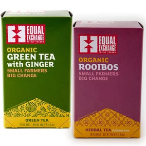
The packaging consists of two folding cartons, each made from a single layer of paperboard. The boxes are rectangular with smooth, flat surfaces and clean edges. The exterior features vibrant colors, with one box in green and the other in purple, both showcasing intricate designs and branding elements. The boxes have a glossy finish, enhancing their visual appeal. Each box has a top flap that folds down to close, typical of folding carton construction.

The packaging is a rectangular shipping box made from corrugated cardboard. It features a brown kraft exterior with visible fluted edges when viewed from the side. The box has a sturdy construction, suitable for shipping heavier items. There is shipping tape applied along the top seam, indicating it has been sealed for transport. The box shows minimal signs of wear, suggesting it is in good condition.

The image features various packaging types, including rectangular folding cartons for chocolate bars and a flexible bag for coffee. The cartons are made of smooth paperboard with vibrant colors and floral designs, while the bag has a matte finish with a clear window. Each packaging type has clean edges and precise folds, typical of retail packaging.

The packaging is a stand-up pouch made of flexible material, featuring a vibrant red color with a glossy finish. The front displays a large logo and product name in bold black and white text, with additional product details in yellow. The top has a resealable zipper, and there is a clear window allowing visibility of the coffee inside. The sides are flat and smooth, with no visible fluted layers, indicating it is not corrugated or rigid.
About the Brand
Equal Exchange UK delivers organic and fairtrade food products, directly sourced from smallholder farmers and packaged for direct-to-consumer distribution. Their approach to packaging is rooted in ethical sourcing, visibility of eco-certifications, and a consistent visual identity across multiple packaging formats.
Operating as a cooperative, Equal Exchange UK prioritizes transparency and environmental stewardship in both sourcing and packaging. Their packaging materials are chosen for both retail visibility and shipping resilience, with a focus on recyclable substrates and bold, easily identifiable branding. The integration of organic and fairtrade certifications on-pack further reinforces their mission-led positioning. Packaging formats are adapted for product type, including folding cartons for confectionery, flexible pouches for coffee, and sturdy corrugated boxes for logistics.
Key Differentiator: Direct trade partnerships and a mission-driven approach to packaging, emphasizing sustainability, strong social impact messaging, and clear, unambiguous branding.
Design System
Visual Style
Bold, high-contrast color palettes (reds, greens, purples), sans-serif and modern typography, and prominent product imagery. Visuals prioritize clarity and shelf impact while supporting ethical messaging.
Brand Identity
Frequent, high-visibility use of the Equal Exchange logo, consistent placement of certification icons (organic, fairtrade), and strong adherence to a unified color system. Iconography and taglines reinforce the cooperative, mission-driven ethos.
Packaging Design
Material choices favor recyclable paperboard, flexible plastics with reduced environmental impact, and durable corrugated cardboard. Structural design is functional, with folding cartons for ease of stacking and display, stand-up pouches for resealability, and sturdy shipping boxes for logistics efficiency.
User Experience
Packaging delivers a clear, consistent user journey: from strong shelf appeal and easy product identification to informative labeling and practical resealability. The unboxing experience is designed to reinforce brand values and provide transparency about sourcing and sustainability.
Company Metrics
Business insights for Equal Exchange UK based on available data
Market Positioning
Brand Values & Focus
Key Competitors
Target Market: Eco-conscious consumers, ethical food buyers, and wholesale partners seeking organic, fairtrade products with robust sustainability credentials.
Packaging Assessment
Overall Grade
Visual appeal and presentation quality
Packaging durability and protection
Eco-friendliness and recyclable materials
Cost efficiency and value for money
Packaging assessment for Equal Exchange UK based on industry standards and best practices
Frequently Asked Questions
What materials does Equal Exchange UK use in its packaging?
Equal Exchange UK utilizes paperboard folding cartons, flexible stand-up pouches (often with resealable features), and corrugated cardboard shipping boxes. These materials are selected for their recyclability, durability, and ability to maintain product integrity.
How does Equal Exchange UK integrate sustainability into its packaging strategy?
The company emphasizes recyclable materials, minimalistic design to reduce excess waste, and the clear communication of organic and fairtrade certifications. This approach aligns with their broader environmental and ethical commitments.
How does the packaging design support the brand's mission?
Packaging consistently features the Equal Exchange logo, bold color palettes, and messaging that highlights support for small farmers and ethical sourcing, ensuring a cohesive consumer experience that reinforces the brand’s values.
Discover other Food & Drink companies
Explore more companies in the food & drink industry and their packaging strategies
PrepMyMeal
Food & Drink
PrepMyMeal is a food production company specializing in high-protein meal delivery services. They offer a variety of natural, nutritious meals designed for fitness enthusiasts and those seeking convenience in meal preparation.
kerex - terre exotique
Food & Drink
Kerex - Terre Exotique specializes in the international trade of gourmet food and drink products, offering a unique selection of spices and culinary ingredients.
Thés de la Pagode
Food & Drink
Thés de la Pagode is a French company specializing in organic teas and infusions, focusing on health and well-being. Established in 1987, they prioritize sustainable practices and high-quality ingredients sourced through fair trade.