Chocolat Chapon packaging
Chocolat Chapon specializes in artisanal chocolates, employing a sophisticated packaging strategy that emphasizes visual storytelling and premium material selection. Their packaging reflects both luxury and brand heritage, with a consistent focus on delivering an elevated unboxing experience.
Packaging Portfolio
Chocolat Chapon's packaging portfolio demonstrates a strong reliance on rigid boxes with custom inserts, folding cartons, and premium paper shopping bags, all featuring intricate illustrations and brand-centric graphics. The use of high GSM paper, sturdy board, and occasional flexible pouches reflects a deliberate balance between shelf impact and product protection. Structural formats are adapted for both individual retail units and multi-item gift assortments, optimized for seasonal and corporate gifting. The portfolio highlights a commitment to visual differentiation and perceived luxury, though with moderate emphasis on eco-friendly material sourcing.

The packaging is a rectangular rigid box with a thick, sturdy construction. The lid features a vibrant, colorful design with floral patterns and a central logo, while the base is a solid red color. The box opens from the top, revealing an assortment of chocolates arranged neatly inside. The chocolates are displayed in a well-fitted insert that holds each piece securely.

The packaging is a flat, rectangular box with a smooth surface and vibrant, colorful graphics. It features a floral design with various animals, including birds and a zebra, set against a blue sky and mountains. The box has clean edges and folds, indicating a precise construction typical of folding cartons. The top of the box prominently displays the brand name 'CHAPON' in bold, black letters, which contrasts with the colorful background.

The packaging is a thick, sturdy box with a premium appearance. It features a decorative exterior in a dark color, likely brown or deep burgundy, with a glossy finish. The interior showcases a pop-up display of characters, enhancing the visual appeal. The box is designed to hold chocolates, with a compartment for the confections. The edges are clean and precise, indicating high-quality construction.

The packaging is a flexible pouch featuring a vivid design with a jungle theme, including a prominent illustration of a leopard surrounded by lush green foliage and colorful flowers. The overall shape is rectangular with a flat bottom, allowing it to stand upright. The top portion appears to have a sealed edge, typical of flexible pouches.

The packaging is a retail shopping bag made from sturdy paper material. It features a vibrant floral design with a mix of colors including blue, orange, and pink. The bag has a solid orange base and a decorative front with intricate floral patterns and a prominent logo. The handles are black and made of rope, providing a sturdy grip. The overall construction appears to be well-made, suitable for carrying items from a retail environment.
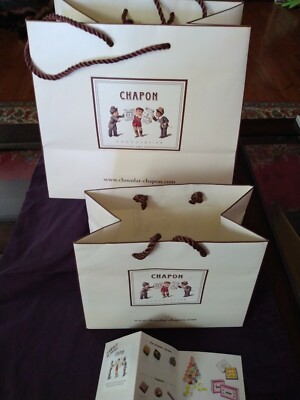
The packaging consists of three retail shopping bags made from thick paper with a smooth finish. Each bag features a rectangular shape with a flat bottom and is designed to stand upright. The bags have a white background with a decorative illustration of characters on the front, along with the brand name 'CHAPON' prominently displayed. The handles are made of twisted paper rope, adding a sturdy yet elegant touch to the design.
About the Brand
Chocolat Chapon is a renowned French chocolatier recognized for its handcrafted chocolate products and distinctive, artistically driven packaging. Their approach integrates intricate structural formats such as rigid gift boxes, cartons, and flexible pouches, each designed to reinforce premium brand positioning and enhance customer engagement.
The company leverages a diverse packaging portfolio, utilizing sturdy rigid boxes for luxury assortments, visually compelling cartons for retail, and flexible pouches with high-impact graphics for specialty items. Consistency in branding, design motifs, and material quality is evident across all formats, supporting both product protection and shelf appeal. Their packaging strategy is closely aligned with seasonal gifting and premium retail demands, providing a cohesive customer experience from purchase through unboxing.
Key Differentiator: Chocolat Chapon's packaging stands out for its artistic integration of brand storytelling, leveraging high-impact visual themes and premium materials to deliver a memorable and cohesive brand experience.
Design System
Visual Style
Typography utilizes bold, serif fonts for the brand name, complemented by playful, illustrative graphics and a vibrant, nature-inspired color palette (blues, reds, oranges, greens). The overall aesthetic is a fusion of luxury and whimsical artistry.
Brand Identity
The CHAPON logo is consistently featured across all formats, often centrally placed and surrounded by thematic illustrations (flora, fauna, characters). Iconography is hand-drawn and cohesive, reinforcing brand storytelling. Visual consistency is maintained through repeating motifs and color harmonies, supporting instant brand recognition.
Packaging Design
Material selection favors rigid board for gift boxes, high-density carton for retail units, and laminated paper for bags. Design philosophy prioritizes structure for protection, visual differentiation for shelf appeal, and modularity for seasonal adaptations. Premium finishes such as gloss, embossing, and custom inserts are prevalent.
User Experience
Packaging is designed to facilitate a memorable customer journey, with layered unboxing, visually engaging graphics, and tactile elements. The approach supports both emotional engagement (gifting, surprise) and functional needs (secure transport, ease of opening), directly reinforcing the brand’s luxury positioning.
Company Metrics
Business insights for Chocolat Chapon based on available data
Market Positioning
Brand Values & Focus
Key Competitors
Target Market: Affluent consumers, chocolate gifting buyers, and gourmet food enthusiasts seeking premium and visually distinctive products, both domestically in France and via international e-commerce.
Packaging Assessment
Overall Grade
Visual appeal and presentation quality
Packaging durability and protection
Eco-friendliness and recyclable materials
Cost efficiency and value for money
Packaging assessment for Chocolat Chapon based on industry standards and best practices
Frequently Asked Questions
What types of packaging does Chocolat Chapon primarily use?
Chocolat Chapon utilizes a mix of rigid boxes, folding cartons, flexible pouches, and premium shopping bags, all featuring branded illustrations and high-quality finishes tailored to both retail and gifting contexts.
How does Chocolat Chapon ensure product quality during shipping?
The brand employs robust structural designs and sturdy materials, particularly in its rigid boxes and cartons, to protect chocolates against physical damage and environmental factors during transit.
Does Chocolat Chapon use sustainable packaging materials?
While their packaging emphasizes durability and premium aesthetics, there is limited public evidence of extensive use of eco-friendly or recycled materials; however, paper-based formats do suggest partial alignment with sustainability practices.
Discover other Food & Drink companies
Explore more companies in the food & drink industry and their packaging strategies
PrepMyMeal
Food & Drink
PrepMyMeal is a food production company specializing in high-protein meal delivery services. They offer a variety of natural, nutritious meals designed for fitness enthusiasts and those seeking convenience in meal preparation.
kerex - terre exotique
Food & Drink
Kerex - Terre Exotique specializes in the international trade of gourmet food and drink products, offering a unique selection of spices and culinary ingredients.
Thés de la Pagode
Food & Drink
Thés de la Pagode is a French company specializing in organic teas and infusions, focusing on health and well-being. Established in 1987, they prioritize sustainable practices and high-quality ingredients sourced through fair trade.