Chefclub packaging
Chefclub specializes in children-focused culinary products and educational cooking tools, utilizing vibrant and playful packaging to reinforce their brand's educational mission. Their packaging strategy emphasizes visual engagement and safety, leveraging colorful carton boxes and retail-ready structures to enhance product appeal and customer experience.
Packaging Portfolio
Chefclub relies on custom folding carton boxes constructed from smooth, recyclable paperboard, with a consistent use of glossy finishes to boost shelf presence and consumer appeal. Packaging formats include windowed boxes for product visibility, die-cut handles for enhanced portability, and clear graphic storytelling tailored to children. All designs prioritize safety, with clean folds and sturdy assembly to minimize structural failure. These choices reflect a focus on retail readiness, visual differentiation, and cost-effective manufacturing typical in the educational toy and food segments.

The packaging consists of several retail cartons, primarily made of smooth, flat paperboard. The boxes feature vibrant colors and playful graphics, including illustrations of kitchen utensils and food items. The edges are clean and precise, indicative of a folding carton design. Each box has a glossy finish, enhancing the visual appeal. The packaging is designed to be eye-catching, suitable for retail display.

The packaging features a smooth, flat construction typical of folding cartons, with vibrant colors and playful graphics. The front displays a colorful illustration of various baking items and characters, appealing to children. The edges are clean and precise, with a glossy finish that enhances the visual appeal. The packaging includes a cut-out handle at the top for easy carrying, and the back provides additional information and recipes, indicating its retail purpose.

The packaging consists of a flat, smooth, single-layer paperboard box with a colorful design. The box features clean edges and folds, typical of retail packaging. The front displays vibrant graphics with cartoonish images of chocolate molds, including bear and star shapes, set against a bright background. The overall appearance is playful and appealing, suitable for a children's product.

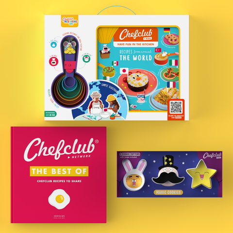
The packaging is a folding carton box with a smooth, flat construction. It features a colorful design with playful graphics, including cartoon animals and cooking elements. The box has clean edges and precise folds, typical of retail packaging. The front displays the product name prominently, along with images of the contents, which include measuring cups and a cookbook. The overall appearance is vibrant and appealing to children and parents alike.
The packaging consists of a colorful, smooth, flat construction with precise edges and folds. It features a vibrant design with illustrations of various dishes and cooking utensils, prominently displaying the Chefclub branding. The carton has a glossy finish, enhancing the visual appeal and making the colors pop.

The packaging consists of two folding cartons, each featuring a colorful design. The boxes are made of smooth, flat paperboard with clean edges and folds. The front of each box showcases a clear window displaying the product inside, with vibrant graphics and a playful design. The boxes are predominantly bright colors, with one in red and the other in blue, both featuring images of madeleines and branding elements prominently displayed.
About the Brand
Chefclub operates in the food and drink sector, targeting families with a range of cooking tools, kits, and resources designed for children. The company employs packaging solutions that are visually engaging, emphasizing playfulness and accessibility while ensuring product security during transit. Chefclub's packaging is closely aligned with its brand identity, designed to be both functional for young users and appealing for retail and e-commerce channels.
Founded in 2016 in Paris, Chefclub has established a niche presence by integrating educational themes into its product and packaging strategy. The company utilizes folding carton boxes with glossy finishes, playful graphics, and clear branding, ensuring high shelf visibility and enhancing the unboxing experience for children and parents. Structural features such as die-cut handles and product windows further optimize usability and presentation. Chefclub's approach is informed by a balance of cost efficiency, visual storytelling, and the safety requirements inherent to products for children.
Key Differentiator: Chefclub distinguishes itself through the integration of educational content, child-safe packaging structures, and a consistently playful aesthetic that directly appeals to its young target audience.
Design System
Visual Style
Vivid color palettes featuring primary and secondary brights, playful custom illustrations, and large, legible sans-serif typography. The overall approach is bold and engaging, designed to attract children and stand out in family retail environments.
Brand Identity
Consistent use of the Chefclub logo, integrated product names, and whimsical iconography depicting food items, utensils, and cartoon characters. Branding remains uniform across all SKUs, reinforcing recognition.
Packaging Design
Material selection centers on smooth, coated paperboard for print clarity and durability. Structural elements include folding cartons with die-cuts and windows, optimizing shelf presentation and safe, easy handling.
User Experience
Packaging is engineered to deliver a positive unboxing narrative for children—clear product views, accessible opening mechanisms, and playful graphics create anticipation and reinforce brand values. Educational content and recipe integration on packaging further support the customer journey.
Company Metrics
Business insights for Chefclub based on available data
Market Positioning
Brand Values & Focus
Key Competitors
Target Market: Families with young children seeking educational, hands-on cooking experiences; parents prioritizing safe, engaging, and accessible culinary tools for home use.
Packaging Assessment
Overall Grade
Visual appeal and presentation quality
Packaging durability and protection
Eco-friendliness and recyclable materials
Cost efficiency and value for money
Packaging assessment for Chefclub based on industry standards and best practices
Frequently Asked Questions
What type of packaging does Chefclub use for its children's culinary products?
Chefclub predominantly uses folding carton boxes with vivid, child-friendly graphics, clear product windows, and die-cut handles for portability, all designed to enhance visual appeal and usability for young users.
How does Chefclub ensure packaging safety for children?
Packaging is engineered with smooth edges, durable paperboard materials, and secure closures, minimizing risk and supporting safe handling by children and families.
Is Chefclub's packaging environmentally friendly?
The primary material is recyclable paperboard, but sustainability initiatives are moderate; packaging is not fully optimized for minimal environmental impact compared to leading eco-friendly brands.
Discover other Food & Drink companies
Explore more companies in the food & drink industry and their packaging strategies
PrepMyMeal
Food & Drink
PrepMyMeal is a food production company specializing in high-protein meal delivery services. They offer a variety of natural, nutritious meals designed for fitness enthusiasts and those seeking convenience in meal preparation.
kerex - terre exotique
Food & Drink
Kerex - Terre Exotique specializes in the international trade of gourmet food and drink products, offering a unique selection of spices and culinary ingredients.
Thés de la Pagode
Food & Drink
Thés de la Pagode is a French company specializing in organic teas and infusions, focusing on health and well-being. Established in 1987, they prioritize sustainable practices and high-quality ingredients sourced through fair trade.