Cheef packaging
Cheef delivers nutritionally balanced meal solutions via a direct-to-consumer model, utilizing a structured and brand-consistent packaging strategy. Their packaging approach emphasizes secure delivery, clear product labeling, and strong visual branding to enhance the customer experience.
Packaging Portfolio
Cheef employs a multi-layered packaging system combining corrugated shipping boxes, branded carton trays, and transparent food containers. Corrugated boxes provide external protection and structure, while inner trays and carton boxes offer portioning and branding opportunities. The visual consistency is achieved through the repeated use of the Cheef logo, green leaf motifs, and kraft color schemes. Packaging formats are optimized for freshness, transport durability, and shelf appeal, with both paper-based and limited plastic components to balance sustainability and food safety.
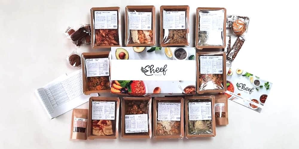
The image displays multiple food packaging trays and boxes arranged in an organized layout. Each tray appears to be made of a clear plastic material, showcasing the food contents inside. The trays have a rectangular shape with smooth edges and are sealed with a clear film. There are also cardboard boxes with a kraft exterior, likely used for containing multiple trays. The overall presentation is neat, with labels visible on each tray, providing nutritional information and product details.

The packaging consists of several flat, rectangular containers made from a single layer of paperboard. Each container has a smooth, flat construction with clean edges and folds. The exterior features a light brown kraft color with green leaf graphics along the bottom edge, creating a natural and organic aesthetic. The brand name 'Cheef' is prominently displayed in a bold, black font across the center of each container. The overall appearance is lightweight and designed for retail display.
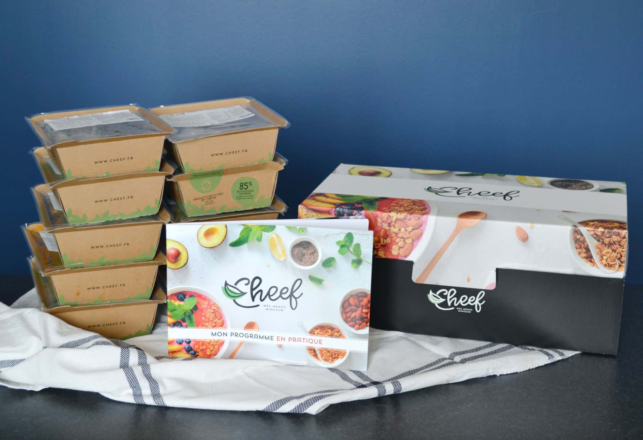
The image features a combination of packaging types, including a retail carton box and several food containers. The retail carton box is predominantly black with a glossy finish, featuring a logo and product information on the front. The food containers are made of a clear plastic material, showcasing the contents inside, with a simple design and labels indicating the product details. The overall arrangement suggests a retail display setup.
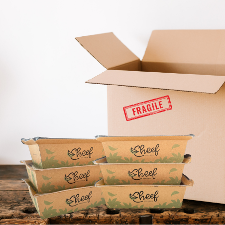
The image shows a large corrugated box that is partially open, revealing several smaller trays inside. The outer box is made of brown kraft corrugated cardboard, displaying visible fluted edges when viewed from the side. The box has a 'FRAGILE' label affixed to the top flap. The inner trays are also made of a similar kraft material, featuring a printed design with the brand name 'Cheef' and decorative green leaf motifs. The trays are neatly stacked within the box, indicating a secure fit.
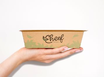
The packaging is a shallow, rectangular food container made from a single layer of paperboard. It has a smooth surface with a kraft brown color and features a green leaf design along the bottom edge. The edges are clean and precise, indicating a well-constructed folding carton. The container appears lightweight and is designed for easy handling.
About the Brand
Cheef operates in the prepared meal delivery sector, serving health-conscious consumers with tailored meal plans focusing on weight loss and balanced nutrition. The company employs a variety of packaging formats such as corrugated shipping boxes, branded carton trays, and clear-lidded food containers to ensure product integrity and ease of use.
With a business model centered on recurring, bi-weekly deliveries, Cheef's packaging must balance logistical robustness with brand presentation. The use of kraft materials, eco-friendly motifs, and consistent logo application reinforces their health-oriented image while ensuring meals arrive fresh and intact. Packaging also plays a role in customer retention, with design choices supporting both functional and emotional aspects of the unboxing experience.
Key Differentiator: Cheef distinguishes itself through a combination of customized meal programs and packaging that integrates strong brand elements, sustainability cues, and clear product information, supporting both logistics and marketing objectives.
Design System
Visual Style
Cheef's visual design features clean sans-serif typography, a natural color palette dominated by kraft browns and greens, and minimalistic graphic elements. The aesthetic emphasizes freshness, health, and simplicity.
Brand Identity
The Cheef logo is consistently displayed on primary and secondary packaging, accompanied by green leaf motifs that reinforce the brand's wellness positioning. Iconography is kept minimal, focusing on clarity and alignment with health-related themes. Visual consistency is maintained across all touchpoints.
Packaging Design
Material selection favors recyclable kraft paper and corrugated board for external packaging, with selective use of clear plastic for food visibility and portion control. Structural designs prioritize stacking efficiency, secure closure, and ease of opening, supporting both logistics and end-user convenience.
User Experience
Packaging is designed to facilitate an organized and pleasant unboxing, with clear product information and easy meal identification. The structure supports freshness, protects contents during transit, and visually conveys the brand’s health and sustainability values throughout the customer journey.
Company Metrics
Business insights for Cheef based on available data
Market Positioning
Brand Values & Focus
Key Competitors
Target Market: Health-conscious consumers in France seeking convenient, nutritious meal delivery solutions, including individuals, families, and workplace groups.
Packaging Assessment
Overall Grade
Visual appeal and presentation quality
Packaging durability and protection
Eco-friendliness and recyclable materials
Cost efficiency and value for money
Packaging assessment for Cheef based on industry standards and best practices
Frequently Asked Questions
How does Cheef address packaging sustainability?
Cheef incorporates recyclable kraft materials and minimalist designs in their packaging. While primarily using paper-based corrugated and carton boxes, the inclusion of some plastic food trays is notable. The overall approach demonstrates a commitment to eco-friendly materials, though there is room for further reduction in single-use plastics.
What security features are present in Cheef's packaging for logistics?
Cheef's packaging employs robust corrugated shipping boxes with secure inner trays, protective bubble wraps when necessary, and tamper-evident seals. These choices aim to mitigate damage during transit and maintain food quality.
How does the packaging enhance the customer experience?
Branded visuals, clear nutritional labeling, and organized tray arrangements contribute to an intuitive and visually appealing unboxing. The packaging supports ease of meal identification and storage, aligning with the brand's health and convenience proposition.
Discover other Food & Drink companies
Explore more companies in the food & drink industry and their packaging strategies
PrepMyMeal
Food & Drink
PrepMyMeal is a food production company specializing in high-protein meal delivery services. They offer a variety of natural, nutritious meals designed for fitness enthusiasts and those seeking convenience in meal preparation.
kerex - terre exotique
Food & Drink
Kerex - Terre Exotique specializes in the international trade of gourmet food and drink products, offering a unique selection of spices and culinary ingredients.
Thés de la Pagode
Food & Drink
Thés de la Pagode is a French company specializing in organic teas and infusions, focusing on health and well-being. Established in 1987, they prioritize sustainable practices and high-quality ingredients sourced through fair trade.