Cafédirect packaging
Cafédirect specializes in ethically sourced coffee and beverages, prioritizing direct trade with growers and sustainable practices. Their packaging strategy leverages vibrant, brand-centric designs across flexible pouches, cartons, and rigid boxes to ensure both retail presence and eco-conscious delivery.
Packaging Portfolio
Cafédirect employs a multi-format packaging strategy, utilizing high-graphic folding cartons for retail display, flexible stand-up pouches with resealable closures for coffee freshness and consumer convenience, and rigid boxes for premium product lines. Materials are chosen for their recyclability and shelf appeal, with paperboard and flexible laminates dominating the portfolio. The packaging structure emphasizes retail efficiency, product protection, and a strong brand narrative, while certification labeling and distinct color schemes reinforce both sustainability credentials and shelf differentiation.
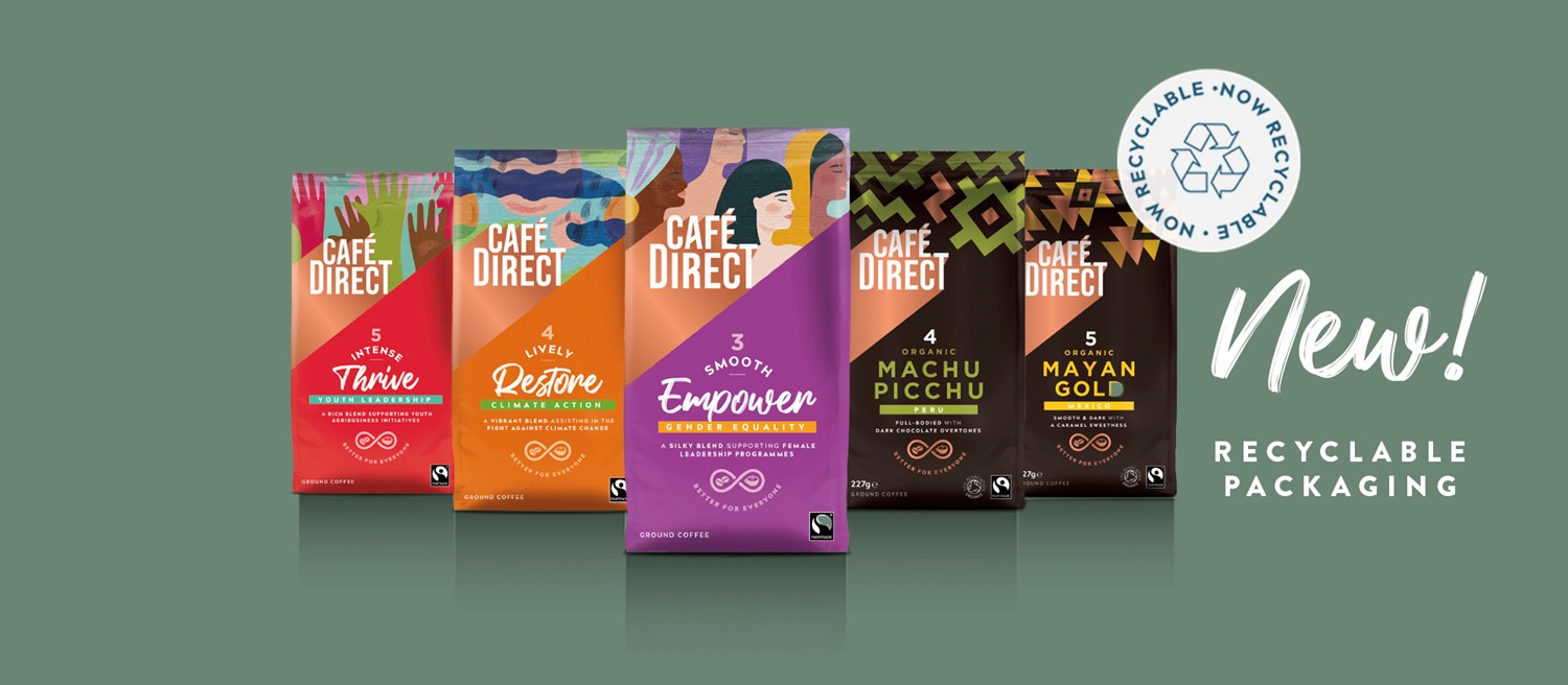
The packaging consists of several colorful folding cartons that are smooth and flat in construction. Each carton features vibrant graphics and distinct colors, with clean edges and folds. The design includes various illustrations and text that highlight the product names and features. The cartons are lightweight and have a retail-friendly appearance, suitable for display on shelves.
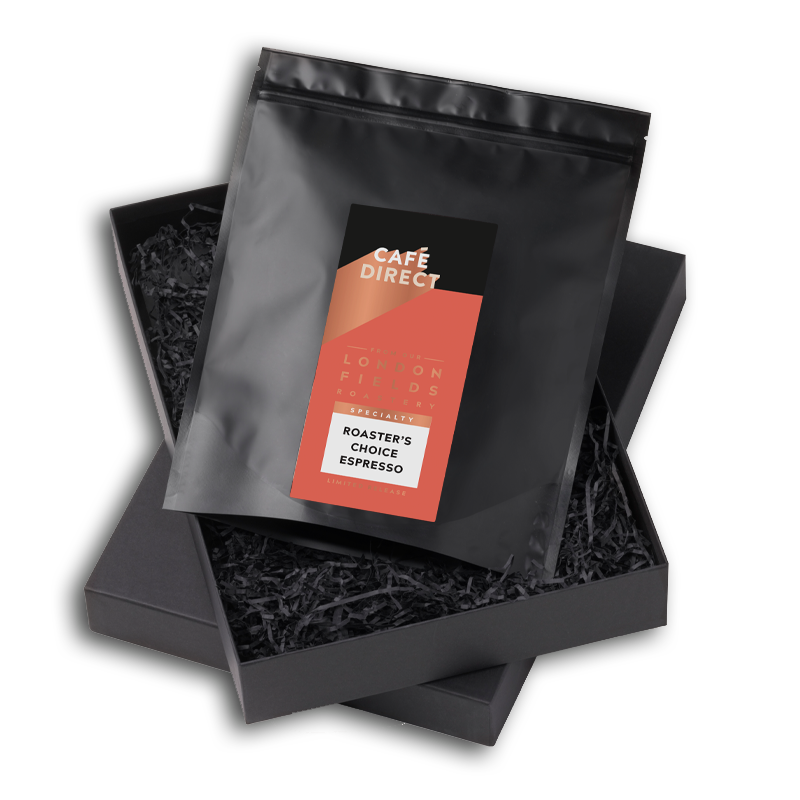
The packaging consists of a sturdy black rigid box with a smooth exterior finish. Inside, there is a black bag containing coffee, which is sealed and features a label. The box has a clean, elegant design with no visible flaps or tabs, indicating a premium construction. The overall shape is rectangular, designed to hold the inner bag securely.
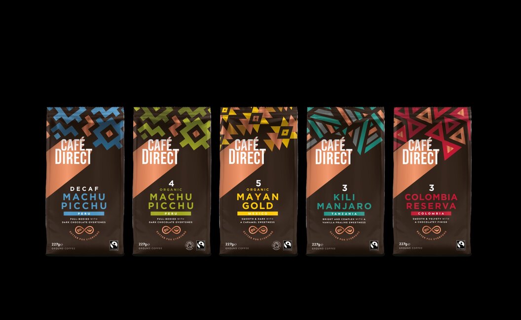
The packaging consists of several stand-up pouches made from flexible materials, featuring vibrant colors and intricate designs. Each pouch has a resealable top and a clear window that allows visibility of the coffee inside. The bags are adorned with geometric patterns and bold typography, creating an eye-catching appearance.
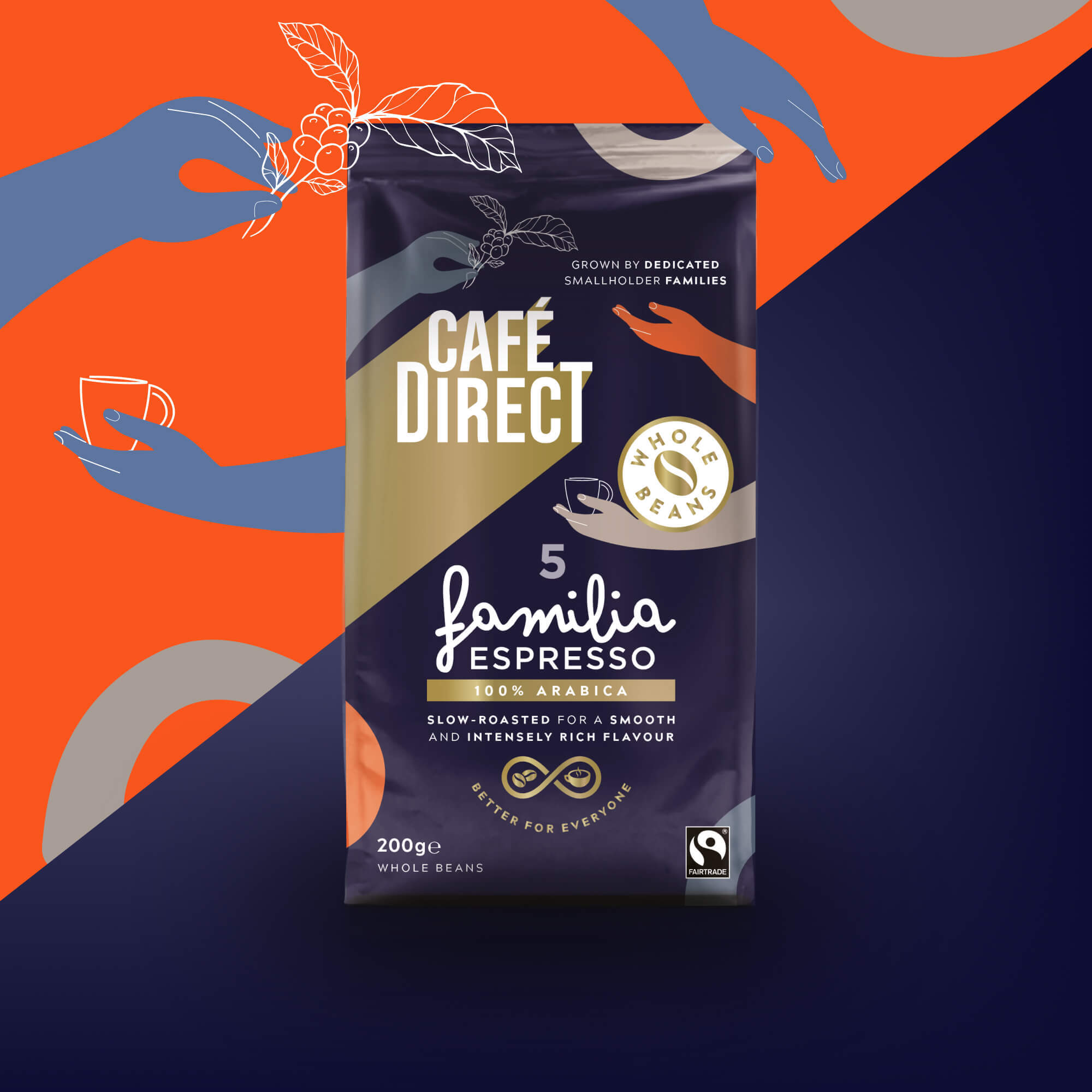
The packaging is a stand-up pouch made of flexible material, featuring a resealable top. The front displays vibrant graphics with a dark background and colorful accents. The brand name 'CAFÉ DIRECT' is prominently featured at the top in bold, white letters. Below it, the product name 'familia Espresso' is displayed in a smaller font, accompanied by a graphic of coffee beans. The overall design is modern and appealing, aimed at attracting consumers in a retail environment.
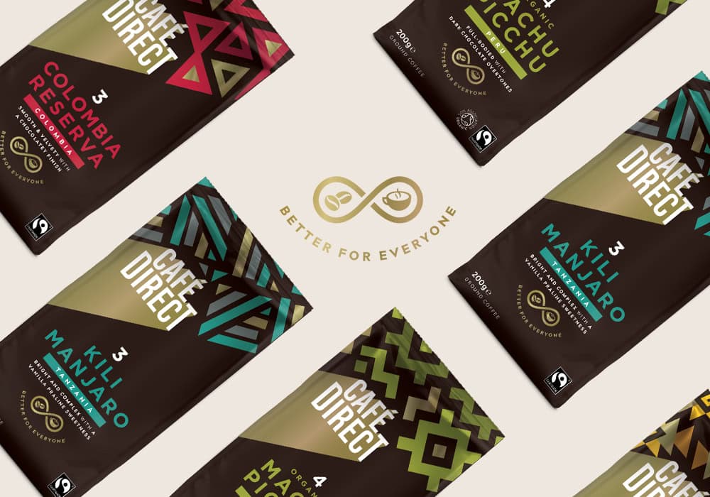
The packaging consists of multiple flat pouches, each featuring a matte finish with vibrant geometric patterns and colors. The bags are designed to hold coffee, with a clear focus on branding and product information. The top of each bag has a resealable closure, and the overall shape is rectangular with a slight taper towards the bottom.

The packaging consists of three distinct folding cartons, each with a smooth, flat construction. The cartons are primarily made of paperboard, featuring vibrant colors and graphics that reflect the brand's identity. Each carton has clean, precise edges and folds, indicative of high-quality retail packaging. The front of each carton prominently displays the brand name 'Café Direct' in bold, stylized font, along with product names and descriptions. The overall design is colorful and engaging, appealing to consumers.
About the Brand
Cafédirect operates in the UK food and drink sector, with a focus on premium coffee and beverage offerings that emphasize ethical sourcing and sustainability. The company’s packaging is characterized by a commitment to both retail shelf impact and environmentally responsible materials.
Positioning itself as a leader in sustainable coffee, Cafédirect integrates its brand mission into its packaging choices, utilizing recyclable carton boxes, flexible pouches with resealable closures, and premium rigid gift boxes. The packaging consistently communicates their values through clear labeling, Fairtrade certifications, and vivid, distinctive graphics. This approach is aimed at enhancing customer perception while supporting logistics efficiency and environmental initiatives.
Key Differentiator: Cafédirect’s direct-trade model and transparent sustainability reporting, reflected in its packaging through certifications and eco-friendly materials, set it apart from conventional coffee brands.
Design System
Visual Style
Cafédirect’s design utilizes bold, geometric typography and vibrant color blocking, with a palette dominated by rich browns, golds, and complementary accent colors. The aesthetic is modern, clean, and retail-focused, ensuring instant shelf recognition.
Brand Identity
The Café Direct logo is consistently prominent on all packaging, often paired with Fairtrade and sustainability icons. Visual consistency is achieved through repeat use of signature colors, geometric motifs, and standardized font treatments across formats.
Packaging Design
Material selection prioritizes recyclable paperboard for cartons and flexible multilayer film for pouches, balancing sustainability with product protection. Structural design favors easy-open features, resealable closures, and compact forms for logistics optimization.
User Experience
Packaging is designed to deliver a high-impact unboxing experience, with tactile finishes, clear labeling, and storytelling elements that reinforce the brand’s ethical mission. Customer journey touchpoints are supported through resealable packaging for freshness and premium gift boxes for elevated brand engagement.
Company Metrics
Business insights for Cafédirect based on available data
Market Positioning
Brand Values & Focus
Key Competitors
Target Market: Ethically conscious UK consumers seeking premium coffee and beverage products, with a focus on direct-to-consumer online purchasing and retail shoppers valuing sustainability.
Packaging Assessment
Overall Grade
Visual appeal and presentation quality
Packaging durability and protection
Eco-friendliness and recyclable materials
Cost efficiency and value for money
Packaging assessment for Cafédirect based on industry standards and best practices
Frequently Asked Questions
What types of packaging does Cafédirect use?
Cafédirect utilizes a mix of recyclable carton boxes for retail, flexible stand-up coffee pouches with resealable features, and rigid boxes for premium gifting, all designed for brand consistency, logistics efficiency, and sustainability.
How sustainable is Cafédirect’s packaging?
The company incorporates recyclable and responsibly sourced materials, with clear labeling regarding environmental impact and Fairtrade certification. Flexible pouches are designed for freshness and reduced material use, while cartons emphasize recyclability.
How does packaging contribute to Cafédirect’s brand experience?
Packaging features bold graphics, consistent branding, and storytelling elements that reinforce Cafédirect’s ethical mission, delivering a compelling unboxing experience and clear communication of product values.
Discover other Food & Drink companies
Explore more companies in the food & drink industry and their packaging strategies
PrepMyMeal
Food & Drink
PrepMyMeal is a food production company specializing in high-protein meal delivery services. They offer a variety of natural, nutritious meals designed for fitness enthusiasts and those seeking convenience in meal preparation.
kerex - terre exotique
Food & Drink
Kerex - Terre Exotique specializes in the international trade of gourmet food and drink products, offering a unique selection of spices and culinary ingredients.
Thés de la Pagode
Food & Drink
Thés de la Pagode is a French company specializing in organic teas and infusions, focusing on health and well-being. Established in 1987, they prioritize sustainable practices and high-quality ingredients sourced through fair trade.