Brothers Cider packaging
Brothers Cider is a UK-based beverage producer specializing in craft ciders and fruit-flavored alcoholic drinks. Their packaging strategy combines vibrant visual branding with functional, recyclable materials to support both marketing impact and sustainability objectives.
Packaging Portfolio
Brothers Cider employs a portfolio of packaging formats centered on aluminum cans—favored for their recyclability, barrier properties, and lightweight nature—accompanied by paperboard retail cartons and generic corrugated boxes for shipping. The can designs feature high-impact, multi-color graphics and flavor-specific branding, enhancing shelf visibility and consumer engagement. Secondary packaging focuses on cost-effective protection during distribution, with minimal branding to optimize resource use and reduce waste. The integration of recyclable substrates across primary and secondary packaging demonstrates a balance between brand expression, functionality, and environmental responsibility.

The packaging consists of four aluminum cans, each featuring a distinct color scheme and graphic design representing different flavors of cider. The cans are cylindrical in shape with a smooth surface and a glossy finish. Each can has a pull-tab top for easy opening and is adorned with vibrant illustrations of fruit and playful characters, enhancing visual appeal.

The image displays five aluminum cans of cider, each with distinct colorful graphics representing different flavors. The cans are cylindrical in shape, with a smooth surface and no visible seams. Each can features a glossy finish, enhancing the vibrant colors of the designs. The graphics include illustrations of fruits such as pineapple, passionfruit, raspberry, lime, dark berries, and apple, with bold typography for the brand name 'BROTHERS' prominently displayed.

The image features a variety of aluminum cans arranged on a bed of ice. Each can is brightly colored, showcasing different fruit illustrations and vibrant designs. The cans have a cylindrical shape, typical of beverage packaging, with a smooth surface and no visible seams or fluted layers. The tops of the cans are flat with a pull-tab opening, and the bottoms are slightly indented. The overall presentation is visually appealing, emphasizing the refreshing nature of the drinks.
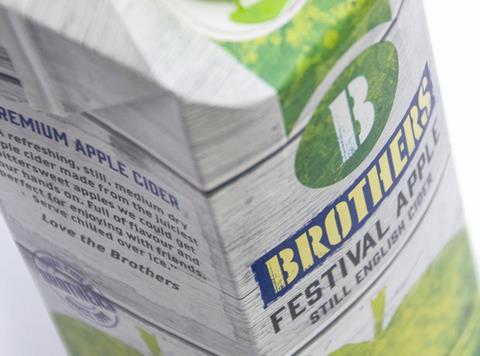
The packaging is a folding carton made of smooth, flat paperboard. It features a rectangular shape with clean edges and folds. The exterior has a matte finish with a light texture, predominantly in shades of green and white, with vibrant graphics depicting apples and a logo prominently displayed. The top of the carton has a tuck flap closure, and the sides feature printed text and images that convey product information.

The image features multiple aluminum cans of cider, each with a distinct color scheme and design. The cans are arranged in a grid format, showcasing different flavors. Each can has a smooth, shiny surface typical of aluminum, with vibrant colors and graphics representing the flavor. The cans are cylindrical in shape with a pull-tab top for easy opening. The branding is prominently displayed on each can, with the 'BROTHERS' logo and flavor descriptions.
About the Brand
Brothers Cider operates in the UK beverage sector, producing a diverse range of ciders with an emphasis on artisanal methods and innovative flavors. Their packaging approach is strongly aligned with brand identity, leveraging distinctive can designs and impactful graphics to enhance shelf presence and consumer recognition.
The company utilizes a combination of aluminum cans, retail cartons, and corrugated shipping boxes to deliver products safely and efficiently to consumers and retailers. While primary packaging is highly branded and visually distinctive, secondary shipping materials are more utilitarian, prioritizing protection and logistics efficiency. Brothers Cider's strategy also integrates sustainability practices, favoring recyclable materials and minimalistic secondary packaging.
Key Differentiator: Brothers Cider's key differentiator is the integration of bold, fruit-forward visual branding with eco-conscious packaging solutions, supporting both market appeal and reduced environmental impact.
Design System
Visual Style
The visual design employs bold, sans-serif typography combined with a saturated, fruit-inspired color palette. Illustration-driven graphics dominate, creating a playful yet premium aesthetic that resonates with the target demographic.
Brand Identity
Logo usage is prominent and consistent, typically occupying prime space on the front of cans and cartons. Iconography includes fruit illustrations and playful characters, reinforcing flavor cues and brand personality. Visual consistency is maintained across packaging formats, supporting strong brand recognition.
Packaging Design
Material choices prioritize aluminum and paperboard for their recyclability and protective properties. Structural design is straightforward: standard 330-500ml cans with pull-tabs, folding cartons for multipacks, and robust corrugated boxes for logistics. The design philosophy emphasizes clarity, durability, and minimal excess material.
User Experience
Packaging is engineered to enhance the customer journey through vibrant first impressions (visual shelf appeal), tactile quality (glossy can finishes), and intuitive usability (easy-open cans, clear labeling). Brand storytelling is integrated through design, supporting a cohesive experience from purchase to consumption.
Company Metrics
Business insights for Brothers Cider based on available data
Market Positioning
Brand Values & Focus
Key Competitors
Target Market: UK-based adult consumers seeking high-quality, innovative cider products, including both traditional cider enthusiasts and younger demographics attracted by fruit-forward flavors and distinctive branding.
Packaging Assessment
Overall Grade
Visual appeal and presentation quality
Packaging durability and protection
Eco-friendliness and recyclable materials
Cost efficiency and value for money
Packaging assessment for Brothers Cider based on industry standards and best practices
Frequently Asked Questions
What packaging materials does Brothers Cider primarily use?
Brothers Cider primarily utilizes aluminum cans for its core product range, complemented by folding paperboard cartons for retail and corrugated boxes for shipping. This selection prioritizes recyclability and structural integrity.
How does Brothers Cider address sustainability in its packaging?
The company emphasizes the use of recyclable materials, such as aluminum and paperboard, and employs minimalistic, unbranded corrugated boxes to reduce waste and environmental footprint.
How does the packaging support the Brothers Cider brand experience?
Packaging features vibrant, consistent design elements—such as bold graphics and clear logo placement—creating a strong shelf impact and reinforcing brand recognition throughout the customer journey.
Discover other Food & Drink companies
Explore more companies in the food & drink industry and their packaging strategies
PrepMyMeal
Food & Drink
PrepMyMeal is a food production company specializing in high-protein meal delivery services. They offer a variety of natural, nutritious meals designed for fitness enthusiasts and those seeking convenience in meal preparation.
kerex - terre exotique
Food & Drink
Kerex - Terre Exotique specializes in the international trade of gourmet food and drink products, offering a unique selection of spices and culinary ingredients.
Thés de la Pagode
Food & Drink
Thés de la Pagode is a French company specializing in organic teas and infusions, focusing on health and well-being. Established in 1987, they prioritize sustainable practices and high-quality ingredients sourced through fair trade.