Brew Tea Company packaging
Brew Tea Company specializes in premium loose-leaf teas and tea blends, delivered directly to consumers through a robust e-commerce platform. Their packaging strategy employs visually distinct cartons and tins, prioritizing strong brand identity, shelf appeal, and structural integrity.
Packaging Portfolio
Brew Tea Company’s packaging portfolio consists of matte-finished folding carton boxes for tea bags, rigid tins for loose leaf tea, and specialty gift boxes incorporating multiple formats. The use of single-layer paperboard and tin provides a balance of lightweight structure and product protection. The visual approach employs high-saturation colors and bold typography, supporting both shelf presence and e-commerce presentation. Packaging is consistently branded, with clear product differentiation and information hierarchy, while material choices favor recyclability and consumer convenience.

The packaging is a folding carton made of single-layer paperboard, featuring a smooth, flat construction with clean edges and folds. The box is predominantly lavender in color, with a matte finish that gives it a modern and appealing look. The front displays the brand name 'BREW TEA Co' in bold, black typography, along with product information such as 'Earl Grey' and 'Proper Tea Bags'. The top of the box has circular icons, possibly indicating product features or certifications.
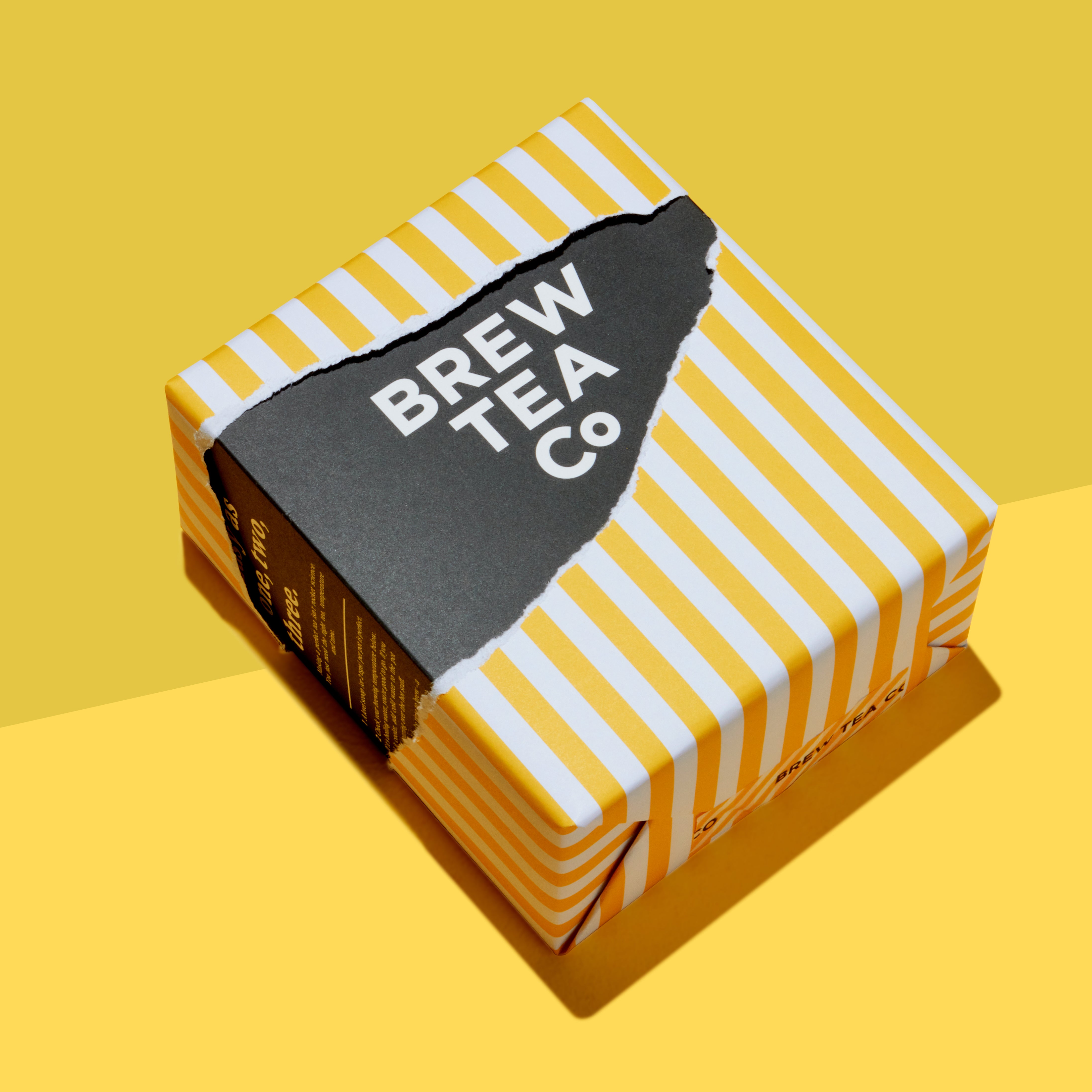
The packaging is a square, folding carton with a smooth, flat construction. It features a vibrant yellow and white striped design on the sides, with a contrasting black panel on top that displays the brand name 'BREW TEA CO' in bold white letters. The edges are clean and precise, indicating a well-constructed carton suitable for retail display. The overall appearance is bright and eye-catching, designed to attract consumer attention.

The packaging is a rectangular folding carton made of single-layer paperboard. It features a smooth, flat construction with clean edges and folds. The exterior is a bright yellow with black text and graphics. The front displays the product name 'Brew Tea Co' prominently, along with the type of tea ('ENGLISH BREAKFAST') and a description ('Strong & Malty'). The back includes additional product information and icons indicating quality. The carton has a matte finish, giving it a premium feel, and is lightweight in appearance.

The packaging consists of a sturdy black rigid box with a smooth finish, prominently featuring a bright yellow label on the front. The label includes the product name 'THE MATCHMAKER' in bold, uppercase letters, along with the brand name 'BREW TEA CO' in a smaller font. The box contains three colorful tea tins, each with a glossy finish, in pink and blue colors, showcasing a modern design. The tins are cylindrical with a tight-fitting lid, and the overall presentation is visually appealing and premium.
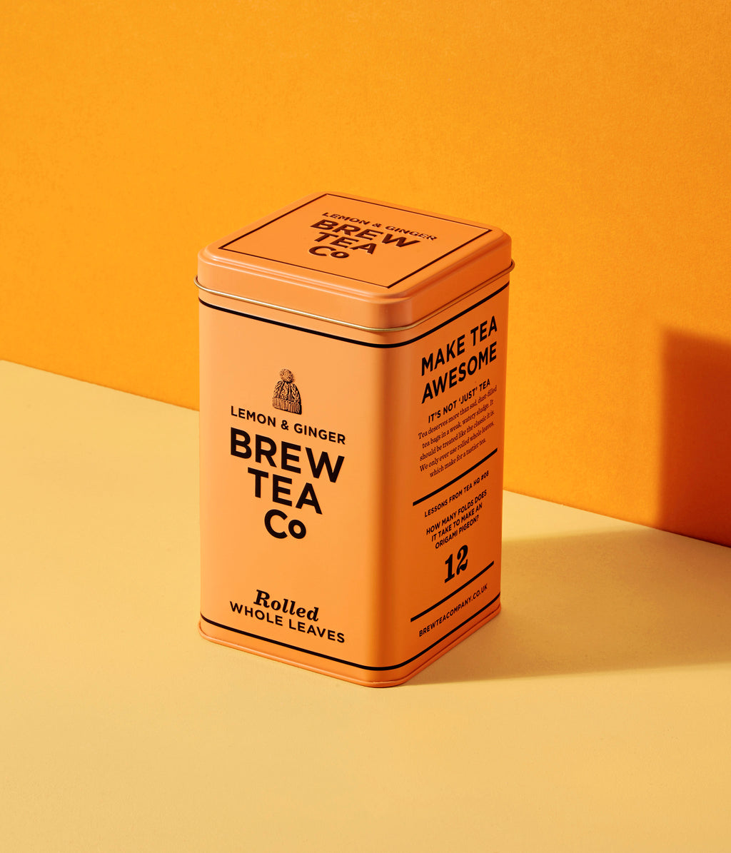
The packaging is a rectangular tin with a smooth, metallic surface. It features a vibrant orange color with a matte finish. The front displays the product name 'LEMON & GINGER' prominently, along with the brand name 'BREW TEA Co' in bold, black lettering. The design includes a decorative logo at the top and marketing text stating 'MAKE TEA AWESOME'. The edges are clean and precise, with a sturdy construction indicative of a rigid box. The lid is a separate piece that fits snugly on top, providing a secure closure.

The packaging consists of three distinct folding cartons, each featuring a smooth, flat construction without any visible fluted layers. The cartons are rectangular and have clean, precise edges and folds. They are predominantly colored in vibrant hues, with a matte finish that enhances their visual appeal. Each carton has a unique design, showcasing different colors and typography that convey product information clearly.
About the Brand
Brew Tea Company is a UK-based tea brand offering loose leaf teas, tea bags, and iced tea blends, with a direct-to-consumer model that emphasizes quality and customer retention through subscriptions. Their packaging is central to both their visual identity and product protection, using vibrant, matte-finished cartons and premium tins tailored to modern retail and e-commerce environments.
Operating with a medium-sized team and focused on high-quality, ethically sourced tea, Brew Tea Company’s packaging choices reflect a balance of brand expression and practical logistics. Their product lineup—including retail cartons, rigid gift boxes, and tea tins—aligns with contemporary consumer expectations for both presentation and sustainability, leveraging bold color schemes and clear typography for instant shelf recognition.
Key Differentiator: Brew Tea Company differentiates itself by integrating 100% rolled whole leaves with a visually cohesive, brand-forward packaging system that enhances both the unboxing experience and environmental responsibility.
Design System
Visual Style
The brand utilizes a modern, minimalist aesthetic with bold sans-serif typography, a high-contrast color palette (yellow, lavender, orange, and black), and matte finishes to reinforce a premium yet approachable image.
Brand Identity
Logo usage is consistent and prominent on all packaging, supported by clear iconography and uniform product labeling. Visual consistency is achieved through strict adherence to color schemes, typography, and layout principles across formats.
Packaging Design
Material choices include recyclable paperboard for cartons and reusable tins for premium SKUs, prioritizing structure and shelf stability. The structural design philosophy emphasizes clean lines, precise folds, and modularity to facilitate both retail display and e-commerce logistics.
User Experience
Packaging design is tailored to enhance the customer journey, from shelf impact to unboxing satisfaction. Clear labeling and intuitive opening mechanisms support ease of use, while consistent branding reinforces trust and product recognition at every touchpoint.
Company Metrics
Business insights for Brew Tea Company based on available data
Market Positioning
Brand Values & Focus
Key Competitors
Target Market: Health-conscious and specialty tea consumers in the UK and EU, with a focus on D2C e-commerce buyers seeking premium, ethically packaged tea products.
Packaging Assessment
Overall Grade
Visual appeal and presentation quality
Packaging durability and protection
Eco-friendliness and recyclable materials
Cost efficiency and value for money
Packaging assessment for Brew Tea Company based on industry standards and best practices
Frequently Asked Questions
What types of packaging does Brew Tea Company use?
Brew Tea Company utilizes folding carton boxes for retail tea bags, rigid tins for loose leaf blends, and premium gift boxes for curated sets, all designed with a focus on visual impact and structural durability.
How does Brew Tea Company address sustainability in its packaging?
The brand prioritizes recyclable materials—primarily paperboard and tin—and uses minimal plastic, aligning with industry trends toward eco-friendly packaging, though further transparency on full life-cycle impact would strengthen their position.
How does Brew Tea Company’s packaging compare to competitors?
Compared to major competitors, Brew Tea Company’s packaging is more visually distinctive and cohesive, with a strong emphasis on matte finishes, vibrant colors, and clear branding, while maintaining standard industry levels of product protection and sustainability.
Discover other Food & Drink companies
Explore more companies in the food & drink industry and their packaging strategies
PrepMyMeal
Food & Drink
PrepMyMeal is a food production company specializing in high-protein meal delivery services. They offer a variety of natural, nutritious meals designed for fitness enthusiasts and those seeking convenience in meal preparation.
kerex - terre exotique
Food & Drink
Kerex - Terre Exotique specializes in the international trade of gourmet food and drink products, offering a unique selection of spices and culinary ingredients.
Thés de la Pagode
Food & Drink
Thés de la Pagode is a French company specializing in organic teas and infusions, focusing on health and well-being. Established in 1987, they prioritize sustainable practices and high-quality ingredients sourced through fair trade.