Brekky packaging
Brekky specializes in direct-to-consumer healthy breakfast products, utilizing custom-branded, visually engaging packaging to reinforce its premium positioning. The company employs cylindrical cans, paperboard cartons, and rigid containers designed for both shelf appeal and functional protection during distribution.
Packaging Portfolio
Brekky’s packaging portfolio centers around cylindrical metal cans, rigid paperboard tubes, and single-layer carton boxes. The metal and paperboard structures offer robust product protection and support shelf stability. Packaging features a matte or glossy finish with vibrant, brand-aligned graphics, optimizing for both retail and D2C e-commerce environments. The containers are designed for resealability and portion control, while carton boxes are used for bundling and seasonal offerings. Across all SKUs, the packaging demonstrates a high level of print quality, color consistency, and integration of consumer-facing information.
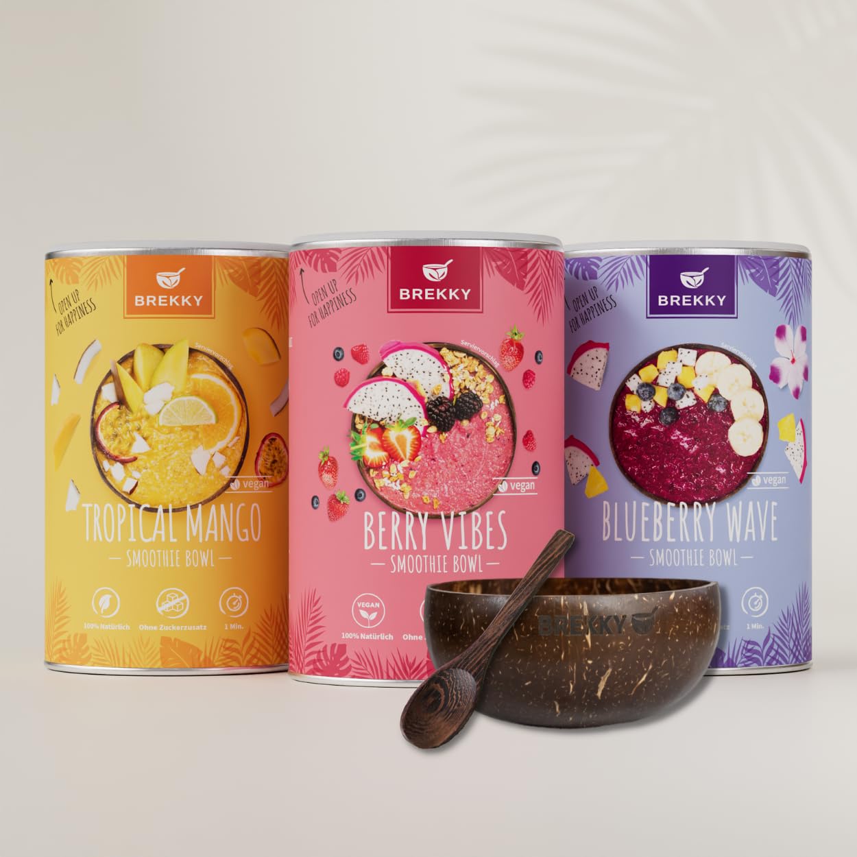
The packaging consists of cylindrical metal cans with vibrant, colorful labels. Each can features a different flavor, with images of the ingredients prominently displayed. The labels are smooth and glossy, with bright colors like orange, pink, and purple. The design includes a mix of fruit illustrations and text that highlights the product's attributes, such as 'vegan' and 'smoothie bowl'. The cans have a clean, modern aesthetic with rounded edges.

The image features cylindrical containers for protein powder in two colors: a light brown can labeled 'VANILLA' and a dark purple can labeled 'BERRY'. Both cans have a smooth, glossy finish with clear, bold text. Additionally, there is a shaker bottle with a white body and a logo, alongside two clear glasses and a booklet with images of food items. The overall presentation is clean and modern, with a focus on health and nutrition.

The image features a variety of packaging types, primarily consisting of cylindrical and rectangular containers. The cylindrical containers are made of smooth, flat paperboard, showcasing vibrant colors and graphics. The rectangular boxes are also made of paperboard, with clean edges and folds. The overall appearance is bright and appealing, aimed at retail display. The products are arranged aesthetically, suggesting a focus on branding and consumer appeal.

The packaging consists of cylindrical canisters with a smooth surface, primarily in a bright yellow color featuring tropical fruit imagery. The design includes a clear label with vibrant graphics of passion fruit and coconut, and the text is printed in bold, contrasting colors. Each canister has a seamless construction with a metal lid at the top and a base that appears sturdy and durable.

The packaging is a cylindrical container made of metal with a smooth, seamless surface. It features a matte finish with a pastel color scheme, predominantly light brown with white and dark brown accents. The top of the container is sealed with a metal lid, which is likely a twist-off or pop-off type. The design includes a large, circular graphic of a smoothie bowl topped with banana slices and coconut flakes, giving a clear indication of the product inside. The text is printed in a modern, sans-serif font, with the product name prominently displayed.

The packaging consists of various cylindrical and rectangular boxes made from single-layer paperboard. The boxes have smooth, flat surfaces without visible fluted layers, indicating they are made from thinner paperboard. The colors are vibrant, featuring shades of orange, purple, and pink, with a matte finish. Each box has clean edges and precise folds, typical of retail packaging. The design includes colorful graphics and images of fruits, along with product names and branding elements prominently displayed.
About the Brand
Brekky delivers nutritious, vegan breakfast solutions directly to consumers, emphasizing convenience and quality. Their packaging strategy is characterized by the use of cylindrical metal and paperboard containers, coupled with retail cartons, to ensure both product freshness and strong visual branding.
With a focus on health-conscious consumers in the food & drink sector, Brekky's packaging integrates vibrant color palettes and prominent logo placement to enhance brand recall and shelf impact. The combination of recyclable materials and thoughtful structural design supports both sustainability and the demands of e-commerce logistics. The approach prioritizes visual differentiation and consumer engagement while balancing cost and protection requirements.
Key Differentiator: Brekky’s unique value lies in its seamless blend of strong visual branding, product protection, and a targeted focus on vegan, natural ingredients, all reflected in its cohesive packaging portfolio.
Design System
Visual Style
Modern, sans-serif typography combined with a bold, vibrant color palette (oranges, pinks, purples, yellows) creates strong shelf presence. The aesthetic is clean yet playful, leveraging high-saturation hues and large, clear product images.
Brand Identity
Logo is consistently placed on all primary and secondary packaging; iconography is minimal and product-focused. Visual consistency is maintained through uniform color schemes, recurring graphic motifs, and standardized label layouts.
Packaging Design
Preference for recyclable paperboard and metal; structural choices prioritize rigidity and resealability. Design philosophy emphasizes protection, freshness, and ease of use for consumers, with secondary packaging supporting bundling and e-commerce logistics.
User Experience
Packaging is optimized for intuitive unboxing and immediate product recognition, with clear preparation instructions and engaging visuals enhancing the overall customer journey. The approach reinforces brand trust and supports repeat purchase behavior through a positive, memorable unboxing experience.
Company Metrics
Business insights for Brekky based on available data
Market Positioning
Brand Values & Focus
Key Competitors
Target Market: Health-conscious consumers in Germany and other Tier I markets seeking convenient, vegan, and premium breakfast solutions delivered directly to their homes.
Packaging Assessment
Overall Grade
Visual appeal and presentation quality
Packaging durability and protection
Eco-friendliness and recyclable materials
Cost efficiency and value for money
Packaging assessment for Brekky based on industry standards and best practices
Frequently Asked Questions
What types of packaging does Brekky primarily use?
Brekky uses a mix of cylindrical metal cans, rigid paperboard tubes, and retail cartons. These formats are chosen for their visual appeal, product protection, and compatibility with e-commerce shipping.
How does Brekky address sustainability in its packaging?
Brekky utilizes recyclable materials such as paperboard and metal, and their design avoids unnecessary plastic components. The company’s focus on plant-based products extends to packaging choices that minimize environmental impact.
How effective is Brekky’s packaging for logistics and product protection?
The rigid and sealed structures of Brekky’s containers offer a high degree of protection, reducing the risk of contamination or damage during transit and supporting last-mile delivery reliability.
Discover other Food & Drink companies
Explore more companies in the food & drink industry and their packaging strategies
PrepMyMeal
Food & Drink
PrepMyMeal is a food production company specializing in high-protein meal delivery services. They offer a variety of natural, nutritious meals designed for fitness enthusiasts and those seeking convenience in meal preparation.
kerex - terre exotique
Food & Drink
Kerex - Terre Exotique specializes in the international trade of gourmet food and drink products, offering a unique selection of spices and culinary ingredients.
Thés de la Pagode
Food & Drink
Thés de la Pagode is a French company specializing in organic teas and infusions, focusing on health and well-being. Established in 1987, they prioritize sustainable practices and high-quality ingredients sourced through fair trade.