Zimt&Pfeffer packaging
Zimt&Pfeffer delivers a diverse range of premium spices, superfoods, and natural foods direct to consumers via online and retail channels. Their packaging strategy emphasizes stand-up pouches with resealable features, using natural kraft materials and minimalist branding to reinforce a clean, sustainable image.
Packaging Portfolio
Zimt&Pfeffer’s packaging portfolio centers on stand-up, resealable pouches constructed from kraft paper or composite flexible films. These formats feature clear product windows for visibility, matte finishes for tactile appeal, and heat-sealed closures to ensure product freshness. Labeling relies on bold, color-coded accents and prominent logo placement, supporting both shelf differentiation and user navigation. The structural design optimizes space efficiency and logistics handling while reinforcing a premium, eco-conscious brand narrative.

The packaging consists of three stand-up pouches made from a kraft paper-like material. Each pouch has a rounded bottom allowing it to stand upright. The pouches feature a smooth, matte finish with a slight texture. The front of each pouch displays a prominent orange label with a spiral logo and product name in bold white text. The pouches have a resealable top, indicated by a zipper closure. The overall appearance is clean and modern, suitable for retail display.

The packaging is a stand-up pouch made of kraft paper with a clear plastic window. It features a rounded bottom, allowing it to stand upright. The front has a vibrant red label with white text, while the back is plain kraft. The top of the pouch has a heat-sealed closure, and there are no visible flaps or tabs.
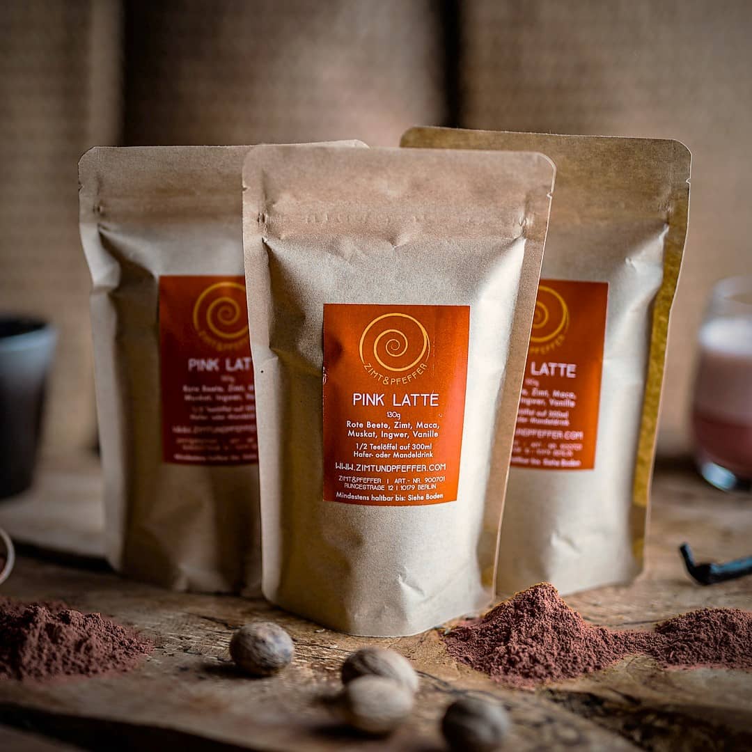
The packaging consists of three stand-up pouches made from a flexible material with a kraft paper appearance. Each pouch has a clear window in the front, allowing visibility of the product inside. The pouches are sealed at the top with a zip-lock mechanism, making them resealable. The edges are smooth and well-formed, indicating a high-quality construction. The overall shape is rectangular, tapering slightly towards the bottom to allow for stability when standing.

The packaging consists of two stand-up pouches made from a kraft paper-like material with a matte finish. Each pouch features a rounded bottom allowing it to stand upright. The top of the pouches is sealed, and there is a resealable zipper closure visible. The front of the pouches has a circular logo prominently displayed, along with product information and a description. The overall appearance is clean and minimalistic, with a natural aesthetic.

The packaging consists of two stand-up pouches made from a flexible material, likely a type of plastic or composite film. Each pouch features a matte finish with a natural beige color, giving it an organic appearance. The front of the pouches displays a prominent logo and product name in a contrasting dark color, while the back likely contains additional product information and nutritional details. The pouches have a resealable top, allowing for easy access and storage.
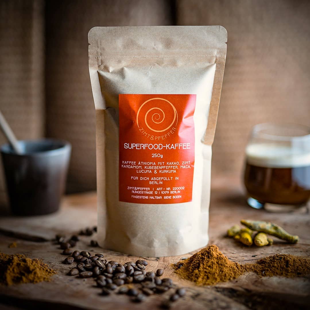
The packaging is a stand-up pouch made of a flexible material, likely a composite of plastic and paper. It features a rounded bottom that allows it to stand upright. The front of the pouch has a large, circular logo at the top, with the product name 'SUPERFOOD-KAFFEE' prominently displayed in bold white font. Below this, there is additional product information in smaller text. The overall color scheme is earthy, with a kraft paper background and red accents. The pouch has a matte finish, giving it a natural look.
About the Brand
Zimt&Pfeffer operates as a Berlin-based provider of high-quality spices, herbs, and superfoods, focusing on natural, health-oriented products. Their direct-to-consumer model leverages both an e-commerce platform and physical retail space to engage food-conscious buyers. The company’s packaging approach is characterized by a commitment to sustainability, using flexible, resealable stand-up pouches with distinctive, clean branding.
Founded in 2018, Zimt&Pfeffer has prioritized a visually cohesive packaging system that aligns with their emphasis on natural ingredients and premium quality. The use of kraft paper-like materials supports the brand's eco-friendly positioning, while resealable structures enhance product freshness and usability for customers. Branding elements such as spiral logos and bold, colored labels contribute to strong shelf presence and brand recall.
Key Differentiator: Zimt&Pfeffer differentiates through its integration of sustainable packaging materials, minimalist aesthetic, and consistent brand presentation across a broad selection of food and beverage products.
Design System
Visual Style
Uses sans-serif typography combined with a restrained, earthy color palette (kraft browns, natural reds, and orange accents). The aesthetic is minimalist, leveraging negative space and matte textures to convey organic quality.
Brand Identity
Consistent use of the spiral logo, bold product names, and website URL across all packaging. Iconography is minimal and functional, supporting strong brand recognition and visual coherence throughout the range.
Packaging Design
Focus on recyclable kraft materials and flexible composites for durability and reduced environmental footprint. Structural philosophy prioritizes resealable pouches for practicality and freshness, with transparent windows for product visibility.
User Experience
Packaging is designed for intuitive use, with resealable tops and stand-up formats enhancing storage convenience. Clean labeling and color coding streamline product selection and reinforce brand trust at every customer touchpoint.
Company Metrics
Business insights for Zimt&Pfeffer based on available data
Market Positioning
Brand Values & Focus
Key Competitors
Target Market: Health-conscious consumers seeking premium spices, superfoods, and natural culinary products, primarily in Germany and broader European markets.
Packaging Assessment
Overall Grade
Visual appeal and presentation quality
Packaging durability and protection
Eco-friendliness and recyclable materials
Cost efficiency and value for money
Packaging assessment for Zimt&Pfeffer based on industry standards and best practices
Frequently Asked Questions
What packaging formats does Zimt&Pfeffer primarily use?
Zimt&Pfeffer primarily utilizes stand-up, resealable pouches made from kraft paper-like and flexible composite materials, often featuring clear product windows and matte finishes.
How does Zimt&Pfeffer address sustainability in its packaging?
The company prioritizes eco-friendly packaging by using recyclable kraft materials and minimalist designs, aiming to reduce environmental impact while maintaining product integrity.
Discover other Food & Drink companies
Explore more companies in the food & drink industry and their packaging strategies
ruf lebensmittelwerk kg
Food & Drink
RUF Lebensmittelwerk KG is a German food production company specializing in a variety of baking mixes and drink products. Founded in 1920, the company is known for its high-quality ingredients and innovative food solutions.
PrepMyMeal
Food & Drink
PrepMyMeal is a food production company specializing in high-protein meal delivery services. They offer a variety of natural, nutritious meals designed for fitness enthusiasts and those seeking convenience in meal preparation.
kerex - terre exotique
Food & Drink
Kerex - Terre Exotique specializes in the international trade of gourmet food and drink products, offering a unique selection of spices and culinary ingredients.