Wild Life Botanicals packaging
Wild Life Botanicals specializes in non-alcoholic sparkling beverages infused with botanicals and nutrients, targeting health-conscious consumers seeking alternatives to traditional wines. Their packaging employs visually distinctive, premium materials that reinforce the brand’s wellness and sophistication positioning.
Packaging Portfolio
Wild Life Botanicals’ packaging utilizes a mix of rigid presentation boxes, standard carton boxes, and aluminum cans, each tailored for specific product formats such as bottles and ready-to-drink servings. The use of thick-walled rigid boxes provides a premium tactile experience and protection for gift and single-bottle offerings, while carton boxes offer cost-effective logistics for multi-bottle shipments. Aluminum cans support both product freshness and sustainability, as they are widely recyclable. All formats feature cohesive botanical artwork and brand identifiers, ensuring strong shelf presence and consistent consumer recognition.
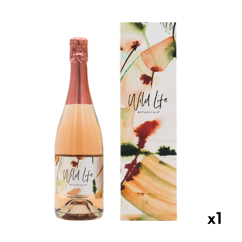
The packaging is a tall, rectangular box designed to hold a single bottle. It features a sturdy construction with thick walls, giving it a premium feel. The exterior is adorned with a colorful, artistic design that includes soft watercolor elements in shades of orange, green, and pink, creating a natural and botanical aesthetic. The top of the box is finished with a metallic rose gold foil, complementing the luxurious appearance.

The packaging consists of a collection of bottles and cans arranged within a decorative rigid box. The box has a premium appearance with thick walls and is covered in a colorful design featuring botanical illustrations. The interior is lined with white tissue paper, adding a touch of elegance. The bottles are glass with labels that match the box design, and the cans are aluminum, also featuring similar graphics. The overall presentation is luxurious and well-assembled.

The packaging consists of two tall, narrow boxes designed to hold wine bottles. Each box features a smooth, flat construction without visible fluted layers, indicating a single-layer paperboard material. The boxes are adorned with a colorful, abstract design that includes splashes of green, orange, and black, creating a vibrant and artistic appearance. The top of each box is open, allowing for easy access to the bottles inside. The edges are clean and precise, with no visible wear or damage.

The packaging consists of two aluminum cans, each featuring a vibrant and artistic design. The cans are tall and cylindrical, typical for beverage packaging, with a smooth surface finish. The artwork includes colorful watercolor-style illustrations of botanical elements, which are complemented by the brand name 'Wild Life Botanicals' prominently displayed in a stylish font. The cans are topped with standard pull-tab lids, indicating they are designed for easy opening. The overall aesthetic is modern and appealing, suitable for a beverage product.
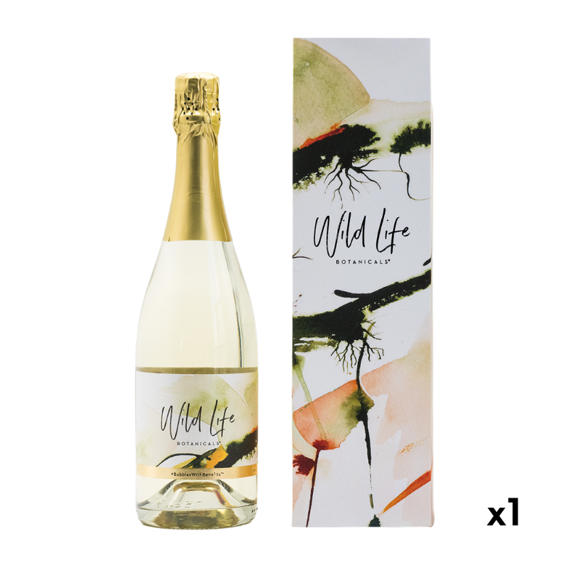
The packaging is a tall, slender box designed to hold a bottle, featuring a sturdy construction with thick walls. The exterior is adorned with a colorful, artistic design that incorporates watercolors and organic shapes, predominantly in shades of green, orange, and cream. The box has a clean, smooth finish with a matte texture, enhancing its premium appearance. The top of the box is open, allowing for easy access to the bottle inside.
About the Brand
Wild Life Botanicals operates in the non-alcoholic beverage sector, offering botanical-infused sparkling wines with a focus on health and wellness. The brand leverages direct-to-consumer sales and uses visually impactful, structurally robust packaging formats to support its premium market positioning.
Packaging for Wild Life Botanicals is characterized by rigid boxes, carton formats, and aluminum cans, each featuring watercolor botanical illustrations and consistent branding elements. These choices not only provide adequate product protection but also enhance perceived value and align with wellness-focused messaging. The brand’s approach balances shelf appeal, user experience, and logistical considerations.
Key Differentiator: The integration of artistic botanical themes with premium packaging materials sets Wild Life Botanicals apart, delivering both a visually engaging unboxing and a strong alignment with health-centric brand values.
Design System
Visual Style
The visual design employs modern, sans-serif typography paired with organic, watercolor-inspired illustrations in pastel and botanical shades (greens, oranges, pinks, rose gold). This creates a fresh, contemporary, and natural aesthetic that communicates wellness and indulgence.
Brand Identity
Branding relies on the prominent display of the 'Wild Life Botanicals' logo, consistent use of botanical iconography, and a harmonious color palette across all packaging elements. The visual system ensures high recognizability and maintains coherence between primary and secondary packaging.
Packaging Design
Materials include premium paperboard for rigid and carton boxes, and aluminum for cans, all selected for their balance of protection, shelf appeal, and sustainability. Structural designs favor clean lines, sturdy construction, and tactile finishes (e.g., matte textures, foil accents) to reinforce luxury and product safety.
User Experience
Packaging is designed for an elevated unboxing experience, supporting gifting occasions and reinforcing brand values at every touchpoint. Easy-open structures, interior presentation elements (such as tissue lining), and cohesive graphics guide consumers through a seamless and memorable product interaction.
Company Metrics
Business insights for Wild Life Botanicals based on available data
Market Positioning
Brand Values & Focus
Key Competitors
Target Market: Health-conscious adults, wellness-focused consumers, and individuals seeking premium non-alcoholic alternatives for social and celebratory occasions.
Packaging Assessment
Overall Grade
Visual appeal and presentation quality
Packaging durability and protection
Eco-friendliness and recyclable materials
Cost efficiency and value for money
Packaging assessment for Wild Life Botanicals based on industry standards and best practices
Frequently Asked Questions
What types of packaging does Wild Life Botanicals use?
The company utilizes rigid gift boxes, carton boxes for bottles, and aluminum cans, all featuring consistent botanical-inspired artwork and prominent branding.
How does Wild Life Botanicals ensure packaging aligns with its brand values?
Packaging design emphasizes wellness and sophistication through watercolor botanical motifs, high-quality materials, and a cohesive visual system that reinforces the brand’s commitment to health and premium experiences.
What sustainability practices are reflected in their packaging choices?
While the use of recyclable paperboard and aluminum supports eco-friendliness, there is limited evidence of advanced sustainability initiatives such as post-consumer recycled content or minimalistic packaging. Their choices align with standard industry practices for premium beverages.
Discover other Food & Drink companies
Explore more companies in the food & drink industry and their packaging strategies
PrepMyMeal
Food & Drink
PrepMyMeal is a food production company specializing in high-protein meal delivery services. They offer a variety of natural, nutritious meals designed for fitness enthusiasts and those seeking convenience in meal preparation.
kerex - terre exotique
Food & Drink
Kerex - Terre Exotique specializes in the international trade of gourmet food and drink products, offering a unique selection of spices and culinary ingredients.
Teegschwendner GmbH
Food & Drink
Teegschwendner GmbH is a specialty tea company based in Germany, offering a wide selection of high-quality teas and tea-related accessories. They focus on providing unique tea experiences through carefully sourced and curated products.