Upfront packaging
Upfront specializes in health-focused food and beverage products, prioritizing ingredient transparency and functional nutrition. Their packaging solutions utilize modern, minimalist designs across flexible, rigid, and carton structures to reinforce brand clarity and user trust.
Packaging Portfolio
Upfront’s packaging portfolio includes flexible metallic wrappers for protein bars, resealable stand-up pouches for supplements, rigid cylindrical containers for premium products, and carton boxes for retail display and multipacks. The material selection balances barrier protection for nutritional integrity with visual minimalism. Design execution consistently leverages clear branding, ingredient transparency, and functional layouts. Structural formats are optimized for D2C shipping, shelf presence, and user convenience, reflecting a data-driven approach to both product safety and consumer experience.
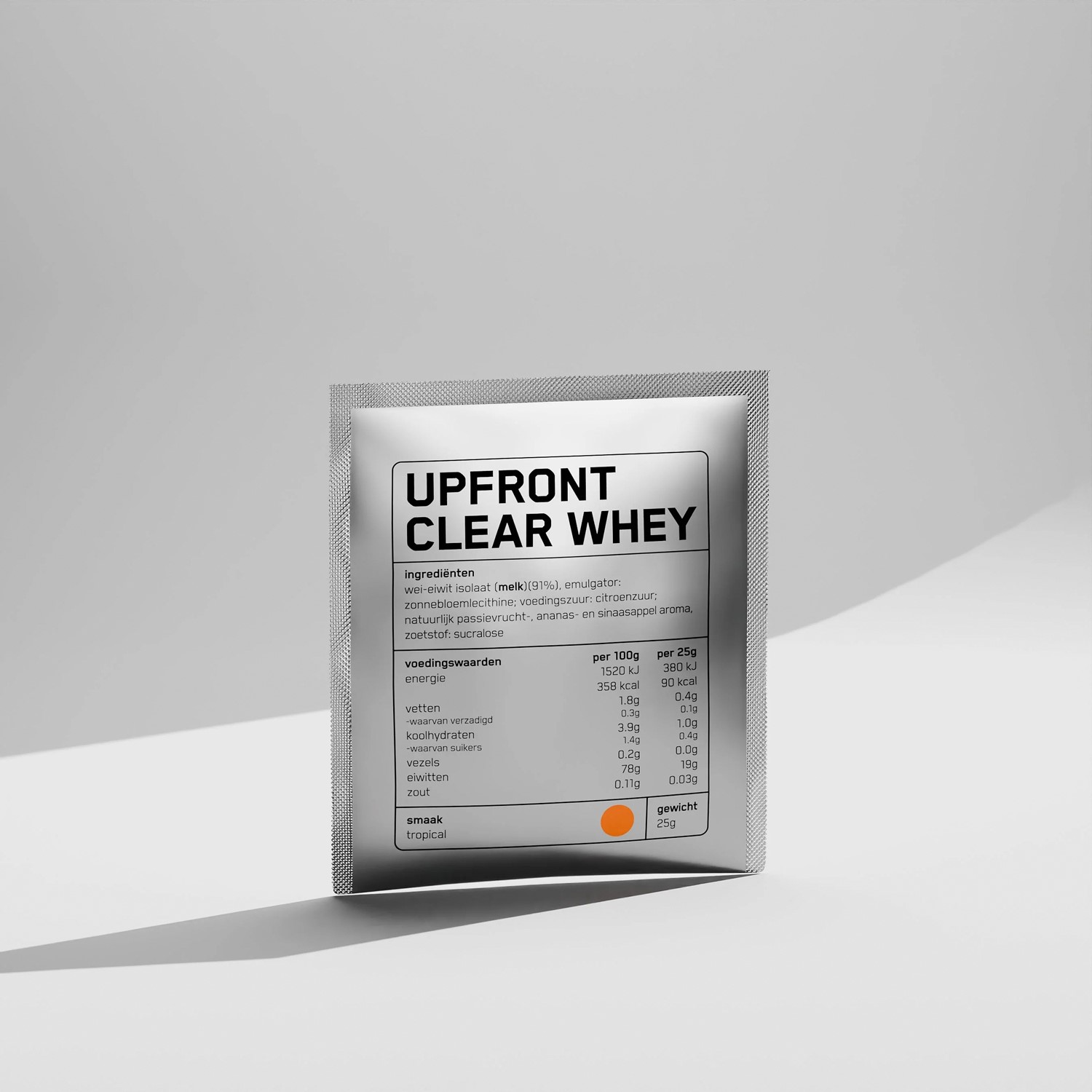
The packaging is a stand-up pouch made of a flexible material that allows it to maintain an upright position. The pouch has a silver metallic finish with a matte texture. The front features a clear window that allows visibility of the product inside. The top of the pouch has a resealable zipper closure, providing convenience for repeated use. The edges are sealed, and the overall shape is rectangular with a slightly rounded bottom.
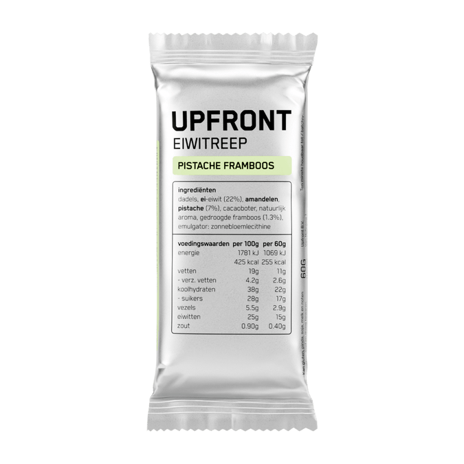
The packaging is a flexible wrapper for a protein bar, characterized by a shiny, metallic surface. It is sealed at the ends and has a smooth texture. The wrapper features a prominent logo and product name, with clear ingredient information displayed. The overall design is sleek and modern, appealing to health-conscious consumers.
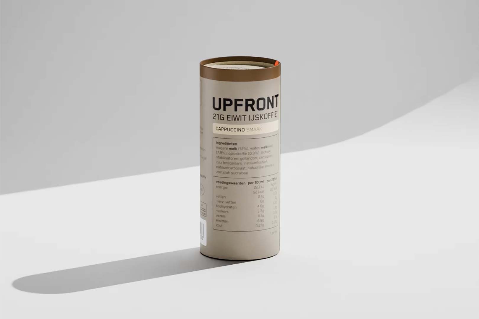
The packaging is a cylindrical container made of thick chipboard with a premium appearance. It features a smooth, matte finish with a kraft exterior. The top is slightly domed, and the base is flat. The container is designed to hold a product securely, with a sturdy construction that suggests durability.

The packaging consists of a rectangular carton box with a smooth, flat construction. It features clean edges and folds, indicative of a single-layer paperboard material. The box is primarily white with a matte finish, showcasing a minimalist design. The front displays a clear product label with black text and a barcode, while the sides are unprinted, maintaining a sleek appearance. The box is designed to hold multiple bags of chips, indicating a retail packaging purpose.
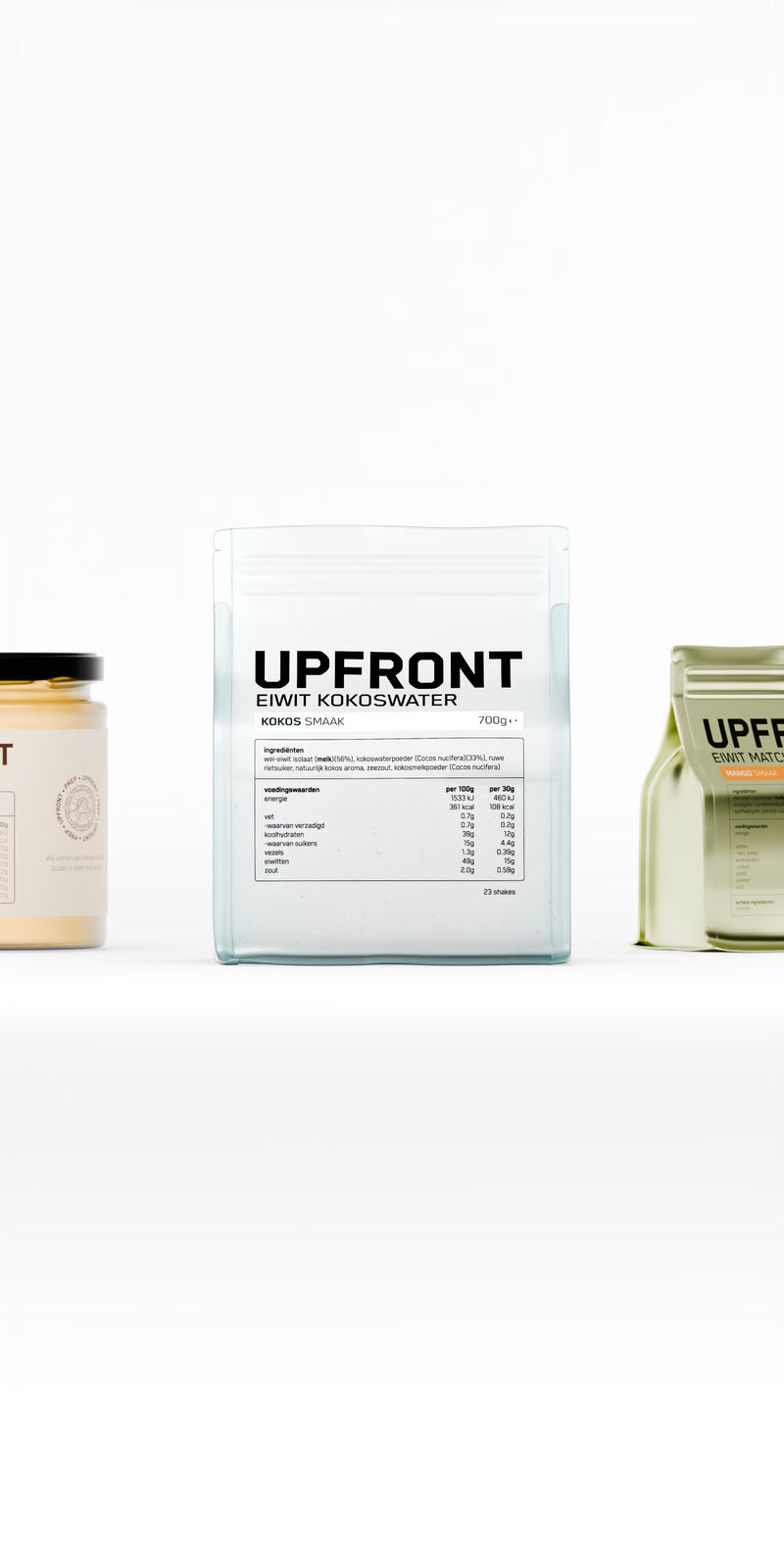
The packaging consists of three distinct containers, with the central one being a square, transparent carton. It has a smooth, flat construction with clean edges and folds. The carton features a minimalistic design with a large, bold 'UPFRONT' logo prominently displayed on the front. The overall color scheme is predominantly white with black text, giving it a modern and sleek appearance. The other two containers are cylindrical, with one being opaque and the other semi-transparent, both showcasing a similar branding style.
About the Brand
Upfront operates within the food and drink industry, emphasizing direct-to-consumer sales of nutritional products with clear labeling and honest ingredient disclosures. The company positions itself on functional product benefits and consumer trust, using packaging as a key vector for brand communication and product information.
Upfront's product range includes protein bars, supplements, functional drinks, and healthy snacks, all designed for health-conscious consumers seeking performance-oriented nutrition. Their packaging approach consistently leverages minimalist graphics, high-contrast color schemes, and straightforward ingredient lists to support transparency. Structural formats span flexible single-serve wrappers, rigid cylindrical containers, and carton boxes, each selected for optimal product protection and shelf presence.
Key Differentiator: Upfront's unique value lies in its unwavering commitment to ingredient transparency and honest marketing, which is reinforced through packaging that minimizes ambiguity and maximizes clarity for consumers.
Design System
Visual Style
Upfront’s aesthetic employs sans-serif typography, a restrained palette dominated by white, black, and metallic accents, and high visual contrast for clarity. Design elements emphasize readability and modernity, appealing to a performance-driven audience.
Brand Identity
Logo usage is prominent and consistent, with the 'UPFRONT' mark displayed across all packaging. Iconography is minimal, supporting a clear and uncluttered look. Visual consistency is maintained through uniform labeling, bold product names, and standardized ingredient lists.
Packaging Design
Material choices prioritize a mix of recyclable paperboard for cartons and rigid containers, alongside flexible films for single-serve applications. Structural design focuses on protection, ease of use, and efficient storage, with a strong emphasis on minimalism and user clarity.
User Experience
The design system supports a seamless customer journey by ensuring packaging is easy to open, informative, and visually coherent. Clear product information and transparent ingredient lists reinforce trust and facilitate quick purchasing decisions, enhancing the overall brand experience.
Company Metrics
Business insights for Upfront based on available data
Market Positioning
Brand Values & Focus
Key Competitors
Target Market: Health-conscious consumers seeking high-quality, transparent nutritional products in the European direct-to-consumer food and beverage market.
Packaging Assessment
Overall Grade
Visual appeal and presentation quality
Packaging durability and protection
Eco-friendliness and recyclable materials
Cost efficiency and value for money
Packaging assessment for Upfront based on industry standards and best practices
Frequently Asked Questions
What types of packaging does Upfront use for its product range?
Upfront employs a mix of flexible wrappers for bars, stand-up pouches for supplements, rigid cylindrical containers for premium products, and carton boxes for retail and multi-pack formats, aligning each packaging choice with the functional and branding needs of the product.
How does Upfront address sustainability in its packaging?
While Upfront focuses on minimalist and recyclable materials such as paperboard cartons and chipboard cylinders, the use of flexible metallic films and some plastic elements in pouches may limit full recyclability. The company demonstrates moderate sustainability efforts, particularly in paper-based formats.
How does Upfront's packaging reinforce its brand positioning?
Upfront’s packaging is characterized by clear, prominent logo placement, simple color palettes, and transparent ingredient listings, directly supporting the brand’s core messages of honesty, functionality, and performance-driven nutrition.
Discover other Food & Drink companies
Explore more companies in the food & drink industry and their packaging strategies
Thés de la Pagode
Food & Drink
Thés de la Pagode is a French company specializing in organic teas and infusions, focusing on health and well-being. Established in 1987, they prioritize sustainable practices and high-quality ingredients sourced through fair trade.
kerex - terre exotique
Food & Drink
Kerex - Terre Exotique specializes in the international trade of gourmet food and drink products, offering a unique selection of spices and culinary ingredients.
ruf lebensmittelwerk kg
Food & Drink
RUF Lebensmittelwerk KG is a German food production company specializing in a variety of baking mixes and drink products. Founded in 1920, the company is known for its high-quality ingredients and innovative food solutions.