TryCreate packaging
TryCreate is a direct-to-consumer health supplements and fitness accessories brand with a focus on vegan, non-GMO formulations. Their packaging strategy leverages vibrant, flexible pouches and rigid supplement containers to reinforce brand identity and ensure product integrity.
Packaging Portfolio
TryCreate’s packaging portfolio is dominated by flexible stand-up pouches and rigid cylindrical supplement containers. Flexible pouches, constructed from laminated plastics or films, are used for gummies and powders, offering resealability, moisture protection, and lightweight transport. Rigid tubs provide tamper-resistance and product stability for bulk supplements. Across formats, the packaging is characterized by high-gloss finishes, vibrant color palettes, and clearly printed product and brand information. The selection of materials and formats aligns with industry standards for supplement protection and shelf appeal, though with moderate emphasis on recyclability.

The packaging is a cylindrical container with a wide mouth, typically used for dietary supplements. It features a white plastic lid and a bright blue body with a glossy finish. The container has a label wrapped around it, displaying product information and branding elements. The label includes a vibrant blue background with white text and graphics, indicating the flavor and type of product. The container is placed on a clean, neutral-colored surface, with a few gummies scattered around it.

The packaging is a cylindrical container with a wide mouth, typically used for dietary supplements. The container has a smooth, glossy surface with a bright green lid and a white body. The label features a vibrant design with bold colors and clear text, indicating the product type and flavor. The overall appearance is modern and appealing, suitable for retail display.
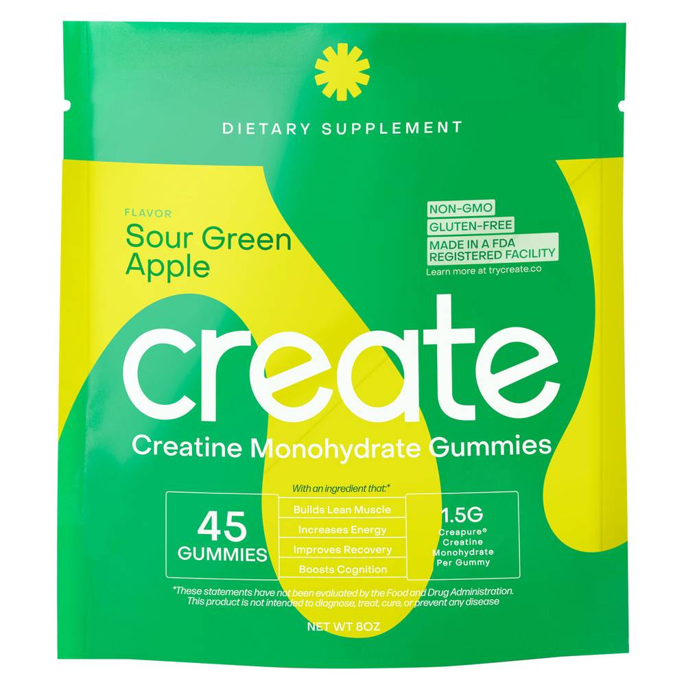
The packaging is a stand-up pouch made from a flexible material. It features a vibrant yellow background with a large green sun graphic. The front prominently displays the product name 'create' in bold, white letters, along with the flavor 'Sour Green Apple' in smaller text. The pouch has a clear window that allows visibility of the gummies inside. The edges are sealed, and the top has a zip-lock closure for resealability.
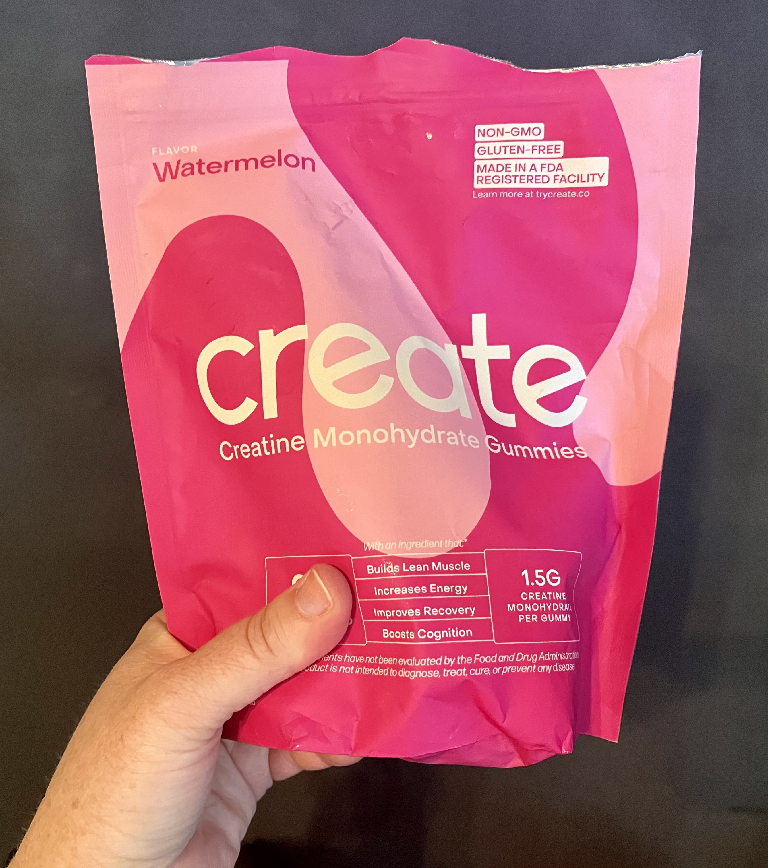
The packaging is a stand-up pouch made of flexible material, predominantly pink with a gradient effect. The front features a large, bold logo that reads 'create' in white, with the flavor 'Watermelon' displayed prominently. The design includes a glossy finish that enhances the vibrant colors. The pouch has a resealable top, allowing for easy access and storage. The back of the pouch likely contains nutritional information and other product details, although not visible in the image.

The packaging is a stand-up pouch made of a flexible material, featuring a vibrant green color with a glossy finish. The front displays a large yellow graphic element that curves around the pouch, creating a dynamic visual effect. The product name 'create' is prominently featured in a bold, modern font, while the flavor 'Sour Green Apple' is listed below in a smaller font. The back of the pouch likely contains nutritional information and usage instructions, although this is not visible in the image.
About the Brand
TryCreate specializes in creatine-based health supplements and fitness accessories, targeting health-conscious consumers seeking performance and wellness improvements. The company employs visually impactful, modern packaging formats such as stand-up pouches and cylindrical supplement containers, designed to enhance shelf presence and facilitate ease of use.
The packaging portfolio demonstrates a commitment to premium aesthetics, with consistent use of bold colors, clean typography, and resealable structures to support both preservation and user convenience. Flexible packaging formats are chosen for their lightweight, protective qualities, while rigid containers are utilized for product types requiring enhanced durability. Brand messaging and product details are clearly communicated through high-contrast labeling, aligning with the expectations of the health and fitness segment.
Key Differentiator: TryCreate differentiates itself through a combination of vegan, non-GMO product positioning and a contemporary, color-driven packaging approach that balances branding impact with functional protection.
Design System
Visual Style
TryCreate’s packaging utilizes a bold, contemporary color palette featuring bright oranges, greens, blues, and pinks, paired with clean, sans-serif typography for clarity. Glossy finishes and gradient effects enhance visual appeal, aiming for standout shelf presence.
Brand Identity
Brand identity relies on prominent 'create' wordmarks, minimalistic iconography, and consistent flavor-based color coding. Logo usage is bold and centrally placed, with supporting elements such as dietary badges and product descriptors maintaining clarity and consistency.
Packaging Design
Material selection prioritizes lightweight, flexible plastics for single-use and resealable pouches, and durable HDPE or PET for supplement tubs. Structural choices focus on ease of use, product protection, and visual differentiation, but have moderate sustainability emphasis.
User Experience
Packaging is designed for intuitive access, resealability, and clear communication of product benefits, supporting a seamless customer journey from first impression to repeat use. The visual system reinforces brand trust and positions TryCreate as a premium choice in the supplement sector.
Company Metrics
Business insights for TryCreate based on available data
Market Positioning
Brand Values & Focus
Key Competitors
Target Market: Fitness enthusiasts, athletes, and health-conscious consumers seeking vegan, non-GMO supplements and related fitness accessories via direct-to-consumer channels.
Packaging Assessment
Overall Grade
Visual appeal and presentation quality
Packaging durability and protection
Eco-friendliness and recyclable materials
Cost efficiency and value for money
Packaging assessment for TryCreate based on industry standards and best practices
Frequently Asked Questions
What types of packaging does TryCreate use for their supplements?
TryCreate utilizes flexible stand-up pouches for gummies and powders, alongside cylindrical plastic tubs for supplement products, optimizing both product freshness and visual impact.
How does TryCreate’s packaging reinforce their brand identity?
The packaging employs a consistent visual language with bold brand marks, modern typography, and vibrant color schemes, directly aligning with the brand’s wellness-focused, energetic positioning.
Is the packaging designed with sustainability in mind?
While the use of lightweight flexible pouches and recyclable containers offers some sustainability advantages, the materials appear primarily plastic-based, indicating moderate but improvable eco-friendliness.
Discover other Beauty & Fitness companies
Explore more companies in the beauty & fitness industry and their packaging strategies
Owari
Beauty & Fitness
Owari specializes in 100% natural beauty and fitness products, designed to enhance health and wellness. The company proudly offers its products made in France, emphasizing quick delivery and customer support.
Big Moustache
Beauty & Fitness
Big Moustache specializes in shaving and grooming products tailored for men, providing a hassle-free subscription service for razor blades and skincare essentials.
Pure Altitude
Beauty & Fitness
Pure Altitude specializes in high-quality beauty and skincare products that leverage the expertise of spa treatments to enhance daily routines. The brand offers a diverse range of products tailored for both facial and body care.