Pure Altitude packaging
Pure Altitude specializes in premium skincare inspired by alpine environments, delivering products focused on hydration and protection. Their packaging strategy leverages high-quality, brand-consistent rigid boxes, tins, and flexible formats to enhance product presentation and reinforce luxury positioning.
Packaging Portfolio
Pure Altitude’s packaging portfolio consists primarily of rigid chipboard gift boxes with embossed and matte finishes, designed for both multi-product presentation and structural integrity. The lineup also includes stand-up pouches for select products, decorative paper gift bags with branded tags, and round tin containers housing glass jars for specialized treatments. These solutions combine high GSM paperboard, glass, and select flexible composites to ensure product safety, visual appeal, and consistent luxury branding, though the use of mixed-material pouches may pose recycling challenges.
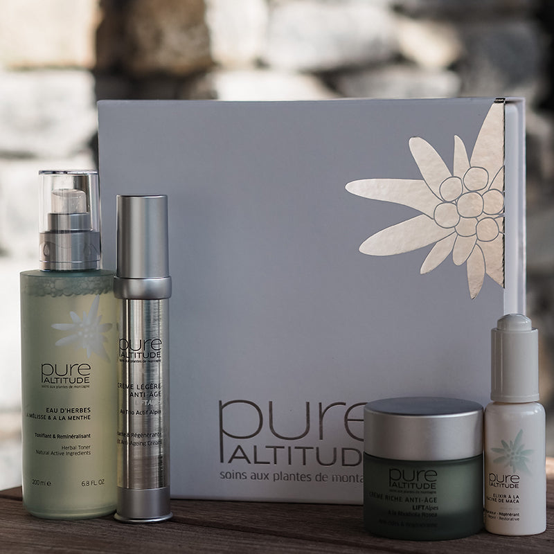
The packaging is a sturdy, thick box with a premium appearance. It features a smooth, matte finish with a decorative floral design embossed on the lid. The edges are clean and precise, indicating high-quality construction. The box is designed to hold multiple skincare products, with a compartmentalized interior that securely fits each item.
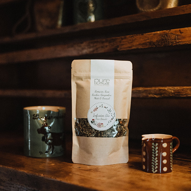
The packaging is a stand-up pouch made of a flexible material, likely a composite of plastic and foil. It features a flat bottom allowing it to stand upright. The front has a clear window showing the contents, with a round label in the center displaying the brand name and product information. The top of the pouch is sealed, and it appears to have a resealable zipper closure. The overall color is a natural kraft brown, giving it an organic feel.

The packaging consists of various retail cartons and containers, primarily made of smooth, flat paperboard. The boxes are designed with clean edges and folds, showcasing a light color palette with soft pastels. The packaging features printed logos and product information, with some items having a glossy finish. The overall appearance is elegant and consistent with a luxury brand aesthetic.

The packaging is a square-shaped box with a clean, smooth exterior. It features a white base color with a subtle floral design in a light gray tone on one side. The edges are sharp and well-defined, indicating high-quality construction. The box has a sturdy feel, suggesting it is made from thick chipboard. The top flap is designed to fit snugly into the base, providing a secure closure. There are no visible signs of wear or damage, indicating it is in excellent condition.

The packaging consists of a round tin container that houses two small jars. The tin has a smooth, metallic surface with a printed label on the top featuring a natural aesthetic. The jars inside are made of glass with a matte finish, and they are topped with clear lids. The overall design is elegant and reflects a premium feel.

The packaging is a gift bag made of paper, featuring a decorative design with a teal background and white snowflake motifs. It has a sturdy construction with a flat bottom, allowing it to stand upright. The bag is topped with a circular tag that includes the brand name 'Pure Altitude' and additional decorative elements. The handles are likely made from twisted paper, providing a comfortable grip.
About the Brand
Pure Altitude is a French beauty brand focused on luxury skincare, integrating natural alpine ingredients and spa expertise in their formulations. The company operates primarily via e-commerce, targeting discerning consumers seeking effective, high-end skincare solutions.
With a compact team and a revenue range indicative of a boutique operation, Pure Altitude differentiates itself through its commitment to quality and a strong emphasis on natural, eco-conscious beauty. The brand's product line spans serums, creams, sun protection, and specialized treatments, all packaged to reflect luxury and purity. Their packaging strategy demonstrates a balance between premium presentation and functional product protection, with a growing attention to the sustainability expectations of the beauty sector.
Key Differentiator: Distinctive use of alpine botanicals and spa-driven formulations, supported by cohesive, visually refined packaging aligning with luxury beauty market expectations.
Design System
Visual Style
The visual design employs modern sans-serif typography, a restrained color palette featuring whites, soft pastels, teal, and natural kraft browns, and clean, uncluttered layouts that evoke purity and sophistication.
Brand Identity
Branding is anchored by the 'pure ALTITUDE' logo, consistently applied in prominent positions across all packaging, supported by subtle alpine and floral iconography. Visual consistency is maintained via repeated motifs, uniform font usage, and harmonious color schemes.
Packaging Design
Material selection favors rigid chipboard for gift boxes, high-quality paperboard for retail cartons, glass for jars, and flexible composite films for select pouches. Structural design prioritizes secure closures, compartmentalization, and tactile finishes to enhance perceived value and product safety.
User Experience
Packaging is designed to create a premium unboxing experience, with compartmentalized interiors and tactile finishes supporting a sense of indulgence. Clear branding and product information facilitate trust and ease-of-use, while the overall aesthetic reinforces the brand’s luxury and natural positioning throughout the customer journey.
Company Metrics
Business insights for Pure Altitude based on available data
Market Positioning
Brand Values & Focus
Key Competitors
Target Market: Affluent, health-conscious consumers seeking premium, naturally-inspired skincare solutions primarily in France and other Tier I markets.
Packaging Assessment
Overall Grade
Visual appeal and presentation quality
Packaging durability and protection
Eco-friendliness and recyclable materials
Cost efficiency and value for money
Packaging assessment for Pure Altitude based on industry standards and best practices
Frequently Asked Questions
What types of packaging formats does Pure Altitude utilize?
Pure Altitude employs a range of packaging formats including rigid gift boxes, compartmentalized retail cartons, decorative tins, stand-up pouches, and branded paper gift bags, all designed to optimize product protection and reinforce luxury branding.
How does Pure Altitude address sustainability in its packaging?
While the brand's packaging features recyclable paperboard, glass, and some paper-based gift options, there is a moderate use of composite flexible pouches that may impact recyclability. The overall approach aligns with industry trends toward eco-friendliness but could increase transparency and use of certified sustainable materials.
How effective is the unboxing experience for Pure Altitude products?
The unboxing experience is highly curated, featuring tactile rigid boxes, embossed motifs, and compartmentalized interiors that enhance perceived value and create a strong emotional impact for customers.
Discover other Beauty & Fitness companies
Explore more companies in the beauty & fitness industry and their packaging strategies
Big Moustache
Beauty & Fitness
Big Moustache specializes in shaving and grooming products tailored for men, providing a hassle-free subscription service for razor blades and skincare essentials.
Cultiv Cosmetique
Beauty & Fitness
Cultiv Cosmetique is a French skincare brand that provides organic and eco-friendly beauty products inspired by nature. They focus on effective skincare solutions for various skin concerns.
Owari
Beauty & Fitness
Owari specializes in 100% natural beauty and fitness products, designed to enhance health and wellness. The company proudly offers its products made in France, emphasizing quick delivery and customer support.