try foods packaging
Try Foods curates gourmet tasting sets designed to educate and engage consumers in the exploration of premium food and drink products. Their packaging approach emphasizes structured presentation and brand clarity, using robust rigid and carton boxes to enhance both product protection and the unboxing experience.
Packaging Portfolio
Try Foods employs a packaging portfolio dominated by rigid chipboard boxes and folding carton constructions, tailored for retail and direct-to-consumer fulfillment. These formats are characterized by clean, modern aesthetics, with prominent branding and compartmentalized interiors for individual product samples. Kraft paper pouches and bags are used as secondary packaging within the main boxes, enhancing product segmentation and presentation. The structural choices support both shelf visibility and safe shipment, while the use of paper-based substrates aligns with common industry sustainability practices.
The packaging is a rectangular folding carton designed to hold multiple small beverage bottles. It features a smooth, flat construction with clean edges and folds. The exterior is primarily white with a matte finish, accented by a simple design. The front showcases a logo and product name, while the sides may have additional branding elements. The carton has a top flap that folds down to secure the contents, and the bottom is glued for stability.
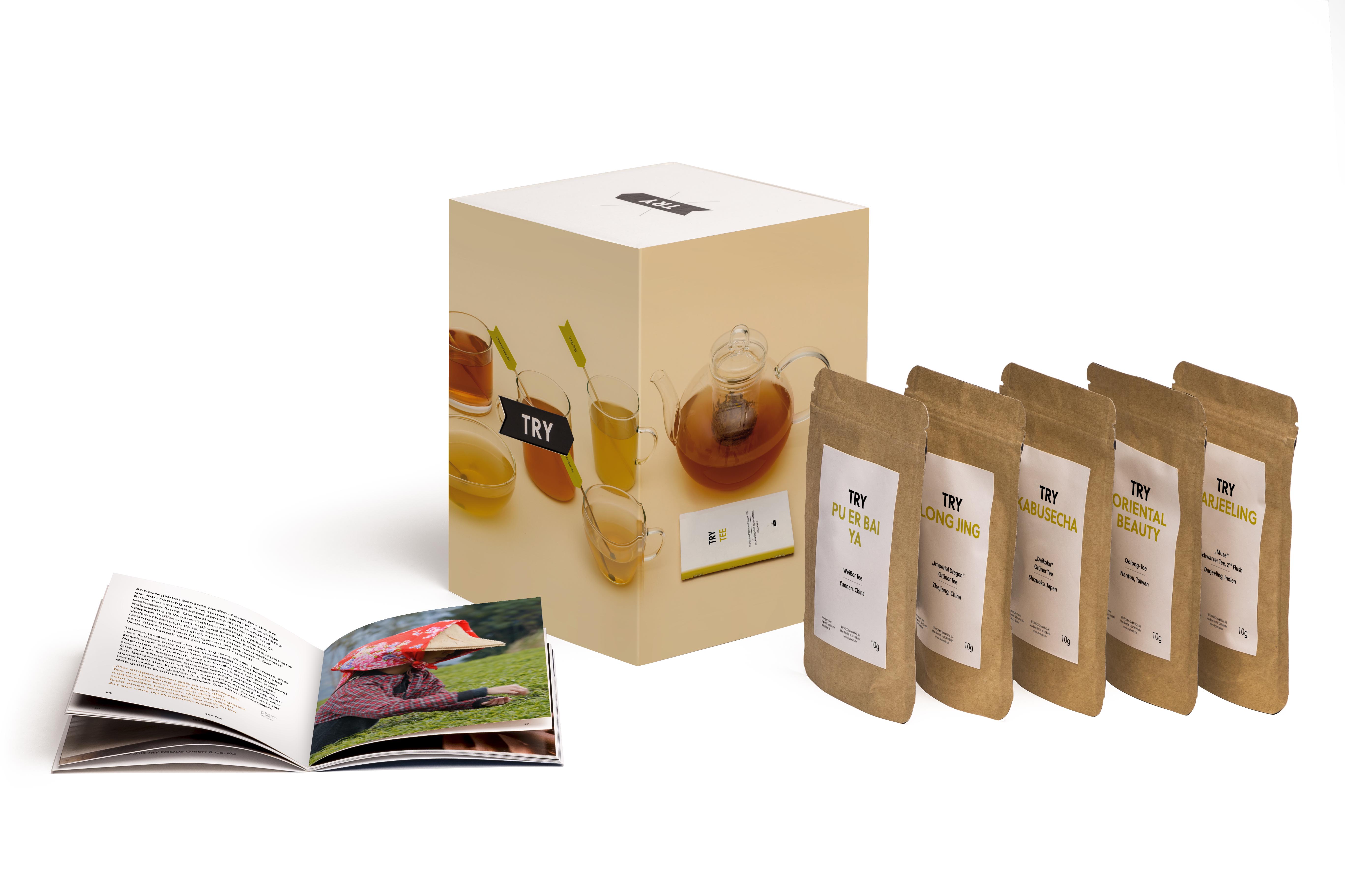
The packaging consists of a sturdy, thick-walled box with a premium appearance, featuring a glossy finish. The box is square-shaped and has a lid that lifts off. It contains several smaller pouches of tea samples, which are made from a kraft paper material. The overall design is clean and modern, with a focus on showcasing the tea products inside. The box is adorned with minimalistic graphics and text, emphasizing the brand 'TRY'.

The packaging consists of a white folding carton box with a clean, smooth surface. The box has a rectangular shape with a top flap that opens to reveal inner contents. The exterior features bold, red typography stating 'TRY SCHOKOLADE' prominently on the front, along with additional text in a smaller font. The edges are clean and precise, indicating a well-constructed fold. Inside, there are several brown paper bags, neatly arranged, which likely contain the product. The overall appearance is modern and minimalistic.

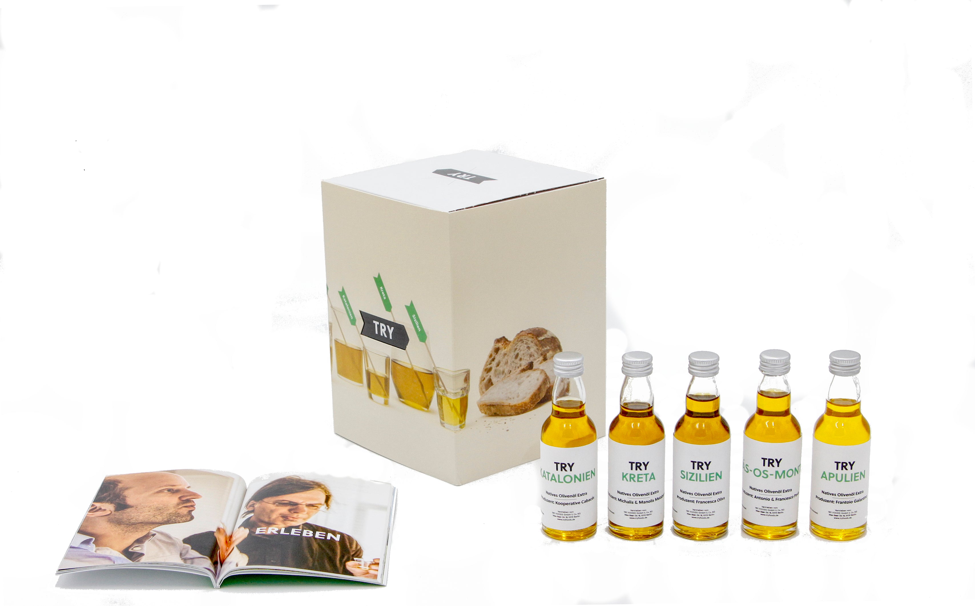
The packaging consists of a sturdy, square gift box with a smooth, matte finish. The box is predominantly white with a subtle design featuring the word 'TRY' prominently displayed on the front. Inside the box, there are several individual pouches made of kraft paper, each containing a different product. The pouches have a clean, minimalist design with a label that includes the product name in a clear font. The overall presentation is neat and organized, suggesting a premium unboxing experience.

The packaging consists of a smooth, flat construction without visible fluted layers, indicative of a single-layer paperboard. The box has clean, precise edges and folds, with a glossy finish that enhances its visual appeal. The design features a combination of colors and graphics, prominently displaying the brand name 'TRY' along with product images and descriptions. The overall shape is rectangular, suitable for retail display, and the box appears to be well-constructed with no visible signs of wear.

The packaging consists of a sturdy, square box with a premium appearance. The box features a clean, matte finish with a predominantly black exterior and a white top. The front displays vibrant images of food items, suggesting a culinary theme. The box is well-constructed with sharp edges and a solid feel, indicating high-quality chipboard material. Inside, there are several pouches arranged neatly, each with a clear window showcasing the contents. The overall design is modern and appealing, suitable for retail display.
About the Brand
Try Foods operates in the Food & Drink sector, specializing in tasting sets that introduce customers to a variety of gourmet items. With a focus on education and flavor discovery, their packaging is a key component in delivering a structured, high-quality product experience.
Based in Berlin, Try Foods integrates educational resources with curated product selections, using packaging as both a protective solution and a brand communication tool. Their use of rigid and carton boxes, coupled with minimalist branding, ensures product integrity and a consistent brand image throughout the customer journey. This approach also supports e-commerce fulfillment, balancing presentation with logistical efficiency.
Key Differentiator: Strong integration of educational content and premium packaging formats tailored to immersive tasting experiences.
Design System
Visual Style
The packaging utilizes sans-serif typography, a restrained color palette (primarily white, black, and subtle accent colors), and minimalist graphic elements. The overall design favors clarity, modernity, and premium cues.
Brand Identity
Consistent logo usage with 'TRY' prominently displayed, minimal iconography, and uniform application of visual elements across all packaging formats ensure strong brand recognition. Branding is applied both to outer boxes and inner product pouches for cohesive identity.
Packaging Design
Material choices prioritize rigid chipboard and folding carton for structural strength and tactile quality. The design philosophy emphasizes compartmentalization, product visibility, and premium finishes such as matte or glossy coatings to reinforce perceived value.
User Experience
The packaging is structured to support a guided, educational unboxing process, with clearly segmented compartments and labeling. This enhances both the functional delivery and the sensory impact of the tasting experience, reinforcing customer engagement and perceived product quality.
Company Metrics
Business insights for try foods based on available data
Market Positioning
Brand Values & Focus
Key Competitors
Target Market: Urban food enthusiasts, gifting consumers, and corporate clients in Germany and broader European markets interested in premium tasting experiences.
Packaging Assessment
Overall Grade
Visual appeal and presentation quality
Packaging durability and protection
Eco-friendliness and recyclable materials
Cost efficiency and value for money
Packaging assessment for try foods based on industry standards and best practices
Frequently Asked Questions
What types of packaging does Try Foods use for their tasting sets?
Try Foods primarily utilizes rigid boxes and carton boxes, often featuring individual kraft paper pouches or bags for product samples. The packaging is designed for durability, visual appeal, and organized product presentation.
How does Try Foods' packaging align with their brand identity?
Their packaging features a modern, minimalist design with the 'TRY' logo and clean typography, reflecting the company's educational and premium positioning in the gourmet sector.
Is Try Foods' packaging sustainable?
The use of paperboard and kraft materials suggests a moderate sustainability focus, though there is limited evidence of advanced eco-friendly features such as recycled content or certified sustainable sourcing.
Discover other Food & Drink companies
Explore more companies in the food & drink industry and their packaging strategies
kerex - terre exotique
Food & Drink
Kerex - Terre Exotique specializes in the international trade of gourmet food and drink products, offering a unique selection of spices and culinary ingredients.
PrepMyMeal
Food & Drink
PrepMyMeal is a food production company specializing in high-protein meal delivery services. They offer a variety of natural, nutritious meals designed for fitness enthusiasts and those seeking convenience in meal preparation.
Teegschwendner GmbH
Food & Drink
Teegschwendner GmbH is a specialty tea company based in Germany, offering a wide selection of high-quality teas and tea-related accessories. They focus on providing unique tea experiences through carefully sourced and curated products.