true fruits gmbh packaging
true fruits gmbh specializes in fruit-based beverages with a strong focus on natural ingredients and sustainable packaging. Their packaging strategy integrates visually distinctive branding and robust material choices to support product freshness and eco-conscious positioning.
Packaging Portfolio
true fruits gmbh deploys a packaging portfolio centered on clear glass bottles for primary beverage containment, offering both high barrier properties and full recyclability. Secondary packaging includes corrugated boxes engineered for both e-commerce and retail, featuring structural inserts for impact protection and product stability. Retail cartons utilize matte-finish paperboard for branding, while color schemes and typography deliver strong shelf presence. This multi-format approach ensures product integrity, supports supply chain efficiency, and aligns with evolving sustainability requirements in the food and beverage sector.
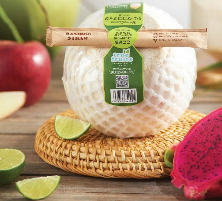
The packaging consists of a flat, smooth paperboard carton that is wrapped around a fruit. It features a green label with product information and branding elements. The carton has clean edges and is folded neatly, indicating a retail packaging style. The surface appears to have a matte finish, providing a natural look.

The image shows three glass bottles filled with fruit juices, each with a different color. The bottles are cylindrical with a clear glass finish, allowing the vibrant colors of the juices to be visible. Each bottle has a metal cap and features a label that wraps around the body. The labels are white with bold text indicating the flavor and brand name. The bottles appear to have condensation on the surface, suggesting they are chilled.

The packaging consists of a clear glass bottle with a green liquid inside. The bottle has a rounded body and a narrow neck, topped with a green metal cap. The surface of the bottle is smooth and glossy, with condensation visible, indicating a cold beverage. The label is prominently displayed on the front, featuring the brand name 'true fruits' in a bold, modern font, along with product details listed vertically on the side.
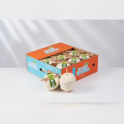
The packaging is a corrugated box with a visible fluted inner layer, characterized by its sturdy construction. The box features an orange and blue color scheme with the brand name 'true fruits' prominently displayed. The edges of the box are slightly worn, indicating handling, and it includes flaps for closure. The box appears to be designed for shipping, as it is robust enough to hold multiple items.
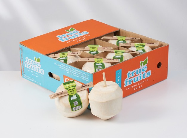
The packaging is a corrugated box with a visible fluted inner layer, featuring a sturdy construction suitable for shipping. The box is divided into sections to hold individual fruit products securely. The exterior has a two-tone color scheme with orange and blue sections, and the edges are cleanly cut with visible fluting when viewed from the side. The box appears to have been designed for retail display, with a large opening on the top for easy access.
About the Brand
true fruits gmbh is a German beverage company recognized for its premium smoothies, shots, and limited edition drinks. The brand distinguishes itself through a commitment to ingredient transparency and a progressive approach to packaging that emphasizes sustainability and brand identity.
Founded in 2006 in Bonn, Germany, true fruits targets health-conscious consumers seeking high-quality, additive-free drinks. The company utilizes a direct-to-consumer business model, leveraging e-commerce and modern retail channels. Packaging is central to their brand experience, with an emphasis on glass bottles and custom corrugated shipping solutions that balance protection with visual impact.
Key Differentiator: true fruits gmbh stands out for its consistent integration of eco-friendly packaging materials, distinctive glass bottle formats, and a strong brand narrative around sustainability and design.
Design System
Visual Style
The visual system utilizes bold, sans-serif typography, vibrant accent colors (notably green, orange, and blue), and a minimalist layout approach, ensuring clarity and modernity across all touchpoints.
Brand Identity
Logo application is prominent, with high-contrast placement and consistent iconography. Packaging maintains visual coherence through repetition of color palette, font, and label formatting, reinforcing instant brand recognition.
Packaging Design
Material selection favors glass for primary packaging and corrugated fiberboard for shipping, chosen for recyclability, durability, and tactile quality. Structural designs balance product protection with display functionality, incorporating windowed boxes and secure inserts.
User Experience
Design prioritizes transparent product visibility, intuitive unboxing, and tactile engagement. The packaging journey—from initial shipment to end-user interaction—reinforces brand values of freshness, quality, and environmental responsibility.
Company Metrics
Business insights for true fruits gmbh based on available data
Market Positioning
Brand Values & Focus
Key Competitors
Target Market: Health-conscious individual consumers in Germany and international markets seeking premium, natural beverage options with a strong emphasis on sustainability.
Packaging Assessment
Overall Grade
Visual appeal and presentation quality
Packaging durability and protection
Eco-friendliness and recyclable materials
Cost efficiency and value for money
Packaging assessment for true fruits gmbh based on industry standards and best practices
Frequently Asked Questions
What types of packaging does true fruits gmbh utilize?
true fruits gmbh primarily uses clear glass bottles for beverages, supported by corrugated boxes and custom carton packaging for shipping and retail presentation. Their packaging emphasizes recyclability and brand visibility.
How does true fruits gmbh address sustainability in their packaging?
The company prioritizes recyclable materials, particularly glass, and promotes upcycling initiatives. Packaging design choices minimize environmental impact while supporting product protection and brand storytelling.
What is the visual design approach of true fruits packaging?
Packaging features bold typography, minimalist color schemes, and prominent logo placement, ensuring immediate brand recognition and a contemporary aesthetic appeal.
Discover other Food & Drink companies
Explore more companies in the food & drink industry and their packaging strategies
Thés de la Pagode
Food & Drink
Thés de la Pagode is a French company specializing in organic teas and infusions, focusing on health and well-being. Established in 1987, they prioritize sustainable practices and high-quality ingredients sourced through fair trade.
Terres de Café
Food & Drink
Terres de Café is a specialty coffee retailer based in Paris, France, known for its commitment to sustainability and high-quality coffee sourcing.
kerex - terre exotique
Food & Drink
Kerex - Terre Exotique specializes in the international trade of gourmet food and drink products, offering a unique selection of spices and culinary ingredients.