Tchibo Coffee Service GmbH packaging
Tchibo Coffee Service GmbH delivers B2B coffee solutions, leveraging over 50 years of expertise in the food and beverage sector. Their packaging approach emphasizes functional design, brand consistency, and sustainability, ensuring secure delivery and a recognizable brand presence across all product formats.
Packaging Portfolio
Tchibo Coffee Service GmbH employs a multi-tiered packaging system tailored for B2B distribution. Their portfolio consists of flexible stand-up pouches and flat bags for coffee beans, offering resealability and product freshness, often constructed from composite films with matte or glossy finishes. Retail cartons with tuck-flap closures provide secondary packaging for smaller SKUs, featuring robust branding and product information. Corrugated shipping boxes are used for bulk logistics, emphasizing structural integrity during transit. Across all formats, visual consistency and clear labeling are maintained, supporting both brand recognition and functional requirements.
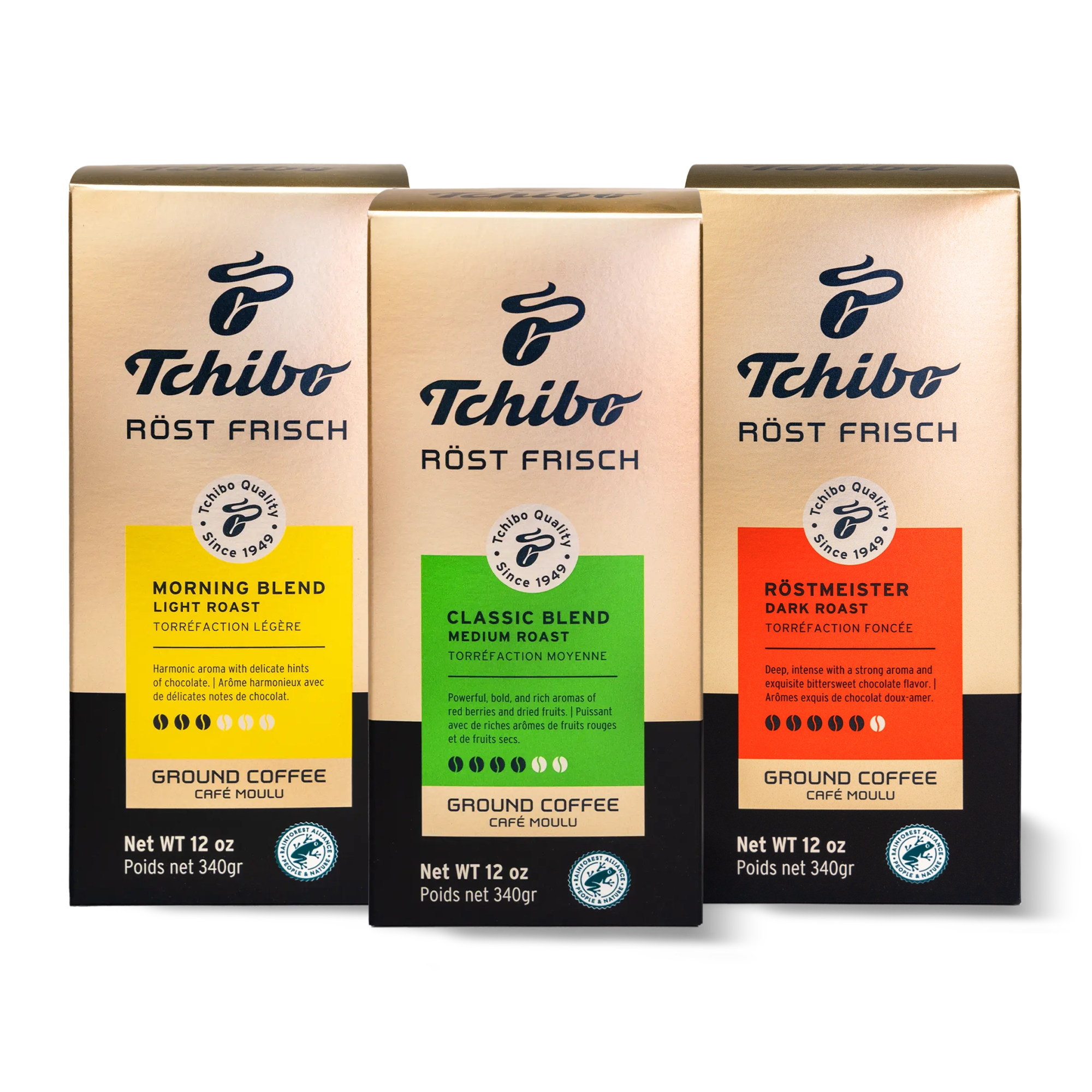
The packaging consists of three individual boxes, each designed for retail display. Each box has a smooth, flat construction with clean edges and folds. The boxes are primarily colored in a light beige with gold accents, featuring a glossy finish that enhances visual appeal. The front of each box prominently displays the product name and brand logo, with additional information about the coffee blend. The boxes are rectangular in shape and have a standard folding carton design, with tuck flaps at the top for closure.
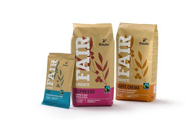
The packaging consists of three bags of coffee, each with a distinct size and color scheme. The bags are made from a flexible material, likely a type of plastic or composite film, designed to maintain freshness. The surface is smooth with a matte finish, and the bags feature a resealable top. The colors include a light brown base with bold graphics in contrasting colors for each type of coffee. The design includes floral motifs and the word 'FAIR' prominently displayed, indicating a focus on fair trade.
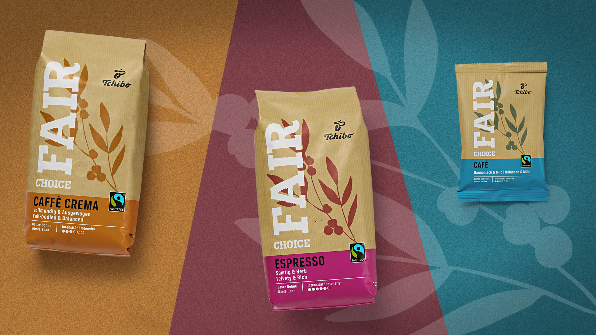
The image features three coffee bags in varying sizes and designs. The largest bag on the left is a stand-up pouch with a matte finish, displaying a bold 'FAIR' in large white letters against a brown background. The middle bag is slightly smaller, also a stand-up pouch, with a similar design but in a different color scheme. The smallest bag on the right is a flat pouch with a bright blue background and a similar design style. Each bag has a clear window to showcase the coffee inside, with a resealable top for convenience.
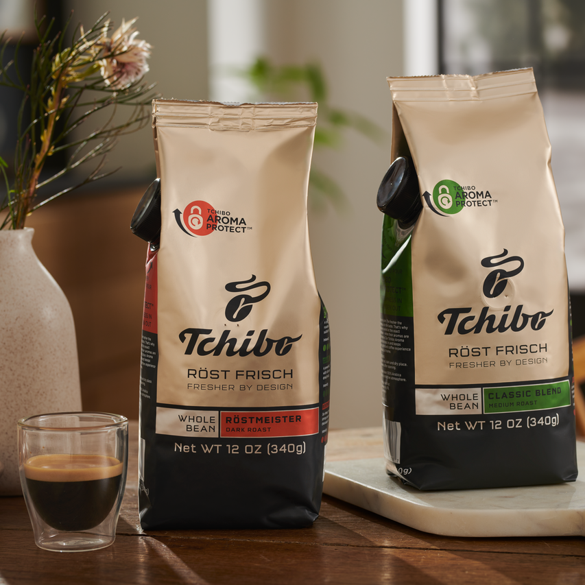
The packaging consists of two bags of coffee, each with a sleek, modern design. The bags are made of a flexible material that appears to be a combination of plastic and foil, providing a barrier to preserve freshness. The front of each bag features a glossy finish with a prominent logo and product information. The bags are upright, showcasing a clean and professional appearance. Each bag has a resealable top, which is common for coffee packaging to maintain freshness.

The packaging consists of a brown corrugated box with visible fluted edges when viewed from the side. The box is sturdy, indicating it is designed for shipping and can hold heavy items. It shows signs of handling, such as slight crushing at the corners. The box is opened at the top, revealing several coffee packages inside, which are neatly arranged.
About the Brand
Tchibo Coffee Service GmbH specializes in providing coffee machines, Fairtrade-certified coffee beans, and associated accessories to business clients across multiple sectors. Their packaging strategy incorporates flexible packaging, retail cartons, and corrugated shipping boxes tailored for both protection and premium presentation.
With a robust B2B business model and a focus on operational efficiency, Tchibo integrates sustainability into its supply chain by utilizing recyclable flexible packaging and cartons. The company’s packaging design prioritizes logistics safety, user-friendly features such as resealable closures, and clear branding, all while supporting a high-volume distribution model handling over 460,000 cups of coffee daily.
Key Differentiator: Tchibo’s key differentiator is the integration of Fairtrade and sustainable practices into its packaging and sourcing, combined with consistent, high-visibility branding across diverse packaging formats.
Design System
Visual Style
Uses modern sans-serif typography, a palette of earth tones and bold accent colors (e.g., browns, blues, golds), and a matte or glossy finish depending on format. Layouts are clean with strong visual hierarchy.
Brand Identity
Prominent Tchibo logo placement, unified iconography (e.g., Fairtrade marks), and consistent use of brand colors across all SKUs. Product names and certifications are clearly displayed for transparency and recall.
Packaging Design
Material choices prioritize barrier protection (multi-layer films for beans), recyclability, and durability. Structural design focuses on resealable closures for freshness, sturdy cartons for retail, and reinforced corrugated boxes for shipping.
User Experience
Resealable and easy-open features improve usability. Clear labeling facilitates quick identification for business clients. The design supports a seamless customer journey from delivery to consumption, enhancing operational convenience and reinforcing premium brand perception.
Company Metrics
Business insights for Tchibo Coffee Service GmbH based on available data
Market Positioning
Brand Values & Focus
Key Competitors
Target Market: Business clients in offices, retail, hospitality, and gastronomy sectors seeking premium coffee solutions with an emphasis on sustainable and branded packaging.
Packaging Assessment
Overall Grade
Visual appeal and presentation quality
Packaging durability and protection
Eco-friendliness and recyclable materials
Cost efficiency and value for money
Packaging assessment for Tchibo Coffee Service GmbH based on industry standards and best practices
Frequently Asked Questions
What packaging materials does Tchibo Coffee Service GmbH primarily use?
Tchibo predominantly utilizes flexible packaging for coffee beans, retail cartons for smaller product formats, and corrugated boxes for logistics and shipping. Material selection balances product freshness, protection, and sustainability considerations.
How does Tchibo address sustainability in its packaging?
Tchibo incorporates recyclable materials, Fairtrade-certified labeling, and design features that support reduced environmental impact, with a focus on both primary and secondary packaging sustainability.
Does Tchibo’s packaging support brand recognition?
Yes, Tchibo maintains consistent visual identity through prominent logo placement, cohesive color palettes, and clear typography across all packaging formats, reinforcing brand recognition throughout the supply chain.
Discover other Food & Drink companies
Explore more companies in the food & drink industry and their packaging strategies
Thés de la Pagode
Food & Drink
Thés de la Pagode is a French company specializing in organic teas and infusions, focusing on health and well-being. Established in 1987, they prioritize sustainable practices and high-quality ingredients sourced through fair trade.
Terres de Café
Food & Drink
Terres de Café is a specialty coffee retailer based in Paris, France, known for its commitment to sustainability and high-quality coffee sourcing.
PrepMyMeal
Food & Drink
PrepMyMeal is a food production company specializing in high-protein meal delivery services. They offer a variety of natural, nutritious meals designed for fitness enthusiasts and those seeking convenience in meal preparation.