Tash Sisterhood packaging
Tash Sisterhood specializes in beauty and fitness products tailored for women, with a direct-to-consumer e-commerce approach. Their packaging strategy emphasizes premium materials, minimalist branding, and high-quality presentation, aligning with industry standards for cosmetics and wellness products.
Packaging Portfolio
Tash Sisterhood employs a portfolio of packaging solutions including single-layer paperboard cartons, rigid chipboard jars, and sleek cylindrical bottles with pump mechanisms. The majority of primary packaging formats emphasize structural integrity and shelf appeal, using matte and glossy finishes with a consistent brand palette. Packaging design prioritizes clarity of information and modern minimalism, while material selection balances product protection with reasonable sustainability. This approach enhances the premium perception of the brand while supporting supply chain efficiency and consumer engagement.

The packaging is a small, round cosmetic jar with a thick, sturdy chipboard base and a smooth, glossy finish. The jar is predominantly white with a clear, transparent lid that showcases the product inside. The jar features a minimalist design with a label that includes the product name and brand information in a modern font. The overall appearance is sleek and premium, suitable for beauty products.
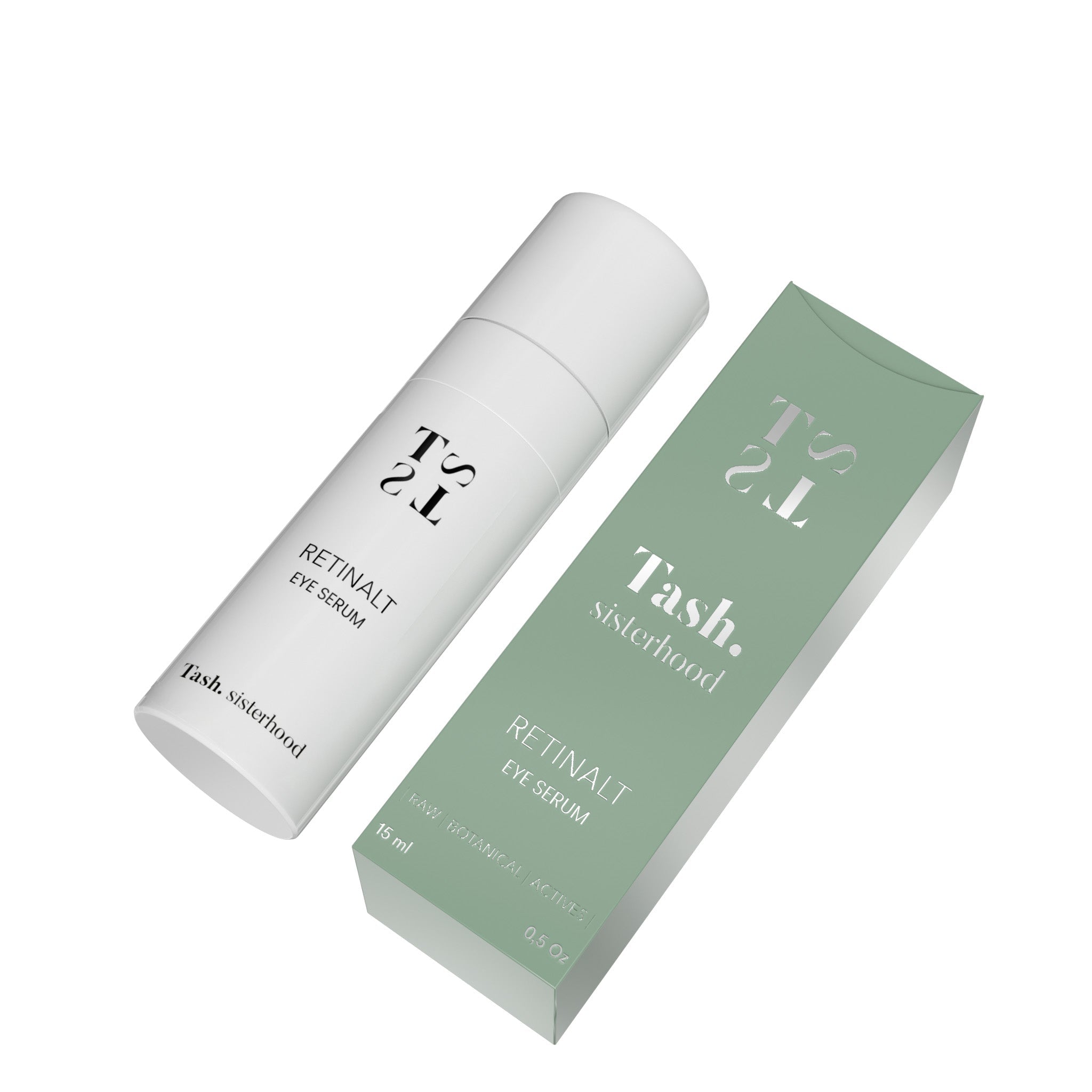
The packaging consists of a smooth, flat carton box designed to hold a small bottle of eye serum. The box features clean, precise edges and folds, indicative of a folding carton construction. The exterior is predominantly a soft green color with white text, creating a modern and appealing aesthetic. The front of the box prominently displays the product name 'Retinalt Eye Serum' in a stylish font, with the brand name 'Tash Sisterhood' also clearly visible. The overall design is minimalistic, enhancing the product's luxury appeal.

The packaging consists of a cylindrical bottle with a smooth, matte white finish. The bottle has a pump dispenser at the top, which is typical for liquid products such as serums. The overall design is sleek and modern, with minimalistic branding. The label features the product name 'RETINALT EYE SERUM' in bold, black font. The bottle is adorned with a circular award graphic indicating it has won a beauty award in 2023.

The packaging consists of a tall, narrow carton box with a smooth, flat construction. The box features a vibrant yellow exterior with a glossy finish. The front displays the brand name 'Tash. sisterhood' prominently, along with product details such as 'RETINALT SERUM + VIT C'. The edges are clean and precise, indicating high-quality printing. The box has a tuck-top closure, allowing it to open easily from the top. The overall shape is rectangular, designed to hold a cylindrical serum bottle securely inside.

The packaging consists of a smooth, flat construction with a single-layer paperboard. The box is primarily purple with a glossy finish, featuring a clean and modern design. The front displays the brand name 'Tash. sisterhood' prominently, along with the product name 'RETINALT ESSENCE + VIT C'. The edges are precise, and the folds are well-defined, indicating quality construction. The back of the box likely contains additional product information and instructions, although not visible in the image.

The packaging consists of a slender, rectangular carton box designed to hold a cosmetic product. The box features a smooth, flat construction without any visible fluted layers, indicating it is made from a single-layer paperboard. The exterior is predominantly a soft green color with a matte finish, enhancing its premium appearance. The front displays the product name 'Retinalt Eye Serum' in a modern, sans-serif font, with the brand name 'Tash. sisterhood' prominently featured. The overall design is clean and minimalistic, with a focus on typography.
About the Brand
Tash Sisterhood operates in the beauty and fitness sector, delivering a curated selection of cosmetics, skincare, and wellness products for women. The brand integrates community values and empowerment messaging throughout its product and packaging strategies.
Tash Sisterhood utilizes a direct-to-consumer model, leveraging social media and content-driven engagement to connect with customers. Their approach to packaging reflects both visual sophistication and functional protection, as seen in their use of single-layer carton boxes, rigid cosmetic jars, and bottles with pump dispensers. Emphasis is placed on clean design, material quality, and clear branding to create a cohesive and recognizable unboxing experience.
Key Differentiator: Distinctive for its focus on minimalist, premium packaging and a strong brand narrative centered around empowerment and sustainability in the beauty and fitness market.
Design System
Visual Style
The visual system employs modern sans-serif typography and a color palette of soft greens, purples, whites, and vibrant yellows, creating a clean, contemporary aesthetic typical of premium cosmetic brands. Matte and glossy finishes are used for tactile and visual differentiation.
Brand Identity
Branding elements include the 'Tash. sisterhood' logo, consistent use of product names, and minimalist iconography. Visual consistency is maintained across SKUs through repeated color schemes and typography, ensuring cohesive shelf presence and brand recognition.
Packaging Design
Material choices focus on single-layer paperboard for cartons, rigid chipboard for jars, and durable plastics for bottles, reflecting a structural design philosophy that values protection, ease of use, and visual clarity. Closures and edges are precise for product safety and premium feel.
User Experience
The design enhances the customer journey by delivering a premium unboxing experience, clear on-pack information, and strong visual branding, supporting both emotional engagement and functional usability from purchase to product use.
Company Metrics
Business insights for Tash Sisterhood based on available data
Market Positioning
Brand Values & Focus
Key Competitors
Target Market: Women seeking high-quality beauty and fitness products with a focus on self-care, empowerment, and premium, sustainable presentation.
Packaging Assessment
Overall Grade
Visual appeal and presentation quality
Packaging durability and protection
Eco-friendliness and recyclable materials
Cost efficiency and value for money
Packaging assessment for Tash Sisterhood based on industry standards and best practices
Frequently Asked Questions
What types of packaging does Tash Sisterhood use for its products?
Tash Sisterhood primarily uses single-layer paperboard carton boxes for retail packaging, rigid cosmetic jars for creams and masks, and cylindrical bottles with pump dispensers for serums. All packaging features clean, modern branding and color consistency.
How does Tash Sisterhood address sustainability in its packaging?
The brand demonstrates a commitment to sustainability by prioritizing recyclable paperboard materials and minimalist design, though the degree of recycled content and overall environmental impact is not fully disclosed.
What is the unboxing experience like for Tash Sisterhood products?
The unboxing experience is designed for premium appeal, with matte or glossy finishes, precise structural details, and prominent branding, delivering both visual impact and product protection.
Discover other Beauty & Fitness companies
Explore more companies in the beauty & fitness industry and their packaging strategies
Big Moustache
Beauty & Fitness
Big Moustache specializes in shaving and grooming products tailored for men, providing a hassle-free subscription service for razor blades and skincare essentials.
Owari
Beauty & Fitness
Owari specializes in 100% natural beauty and fitness products, designed to enhance health and wellness. The company proudly offers its products made in France, emphasizing quick delivery and customer support.
Pure Altitude
Beauty & Fitness
Pure Altitude specializes in high-quality beauty and skincare products that leverage the expertise of spa treatments to enhance daily routines. The brand offers a diverse range of products tailored for both facial and body care.