Tarquins Gin packaging
Tarquins Gin is a Cornish-based premium gin producer known for handcrafted small-batch spirits and a diverse flavor portfolio. Their packaging strategy leverages distinctive branding, premium materials, and a focus on both sustainability and customer experience.
Packaging Portfolio
Tarquins Gin employs a suite of packaging formats tailored to the premium spirits sector, including rigid gift boxes for multi-bottle assortments, custom-printed folding cartons for individual retail bottles, and branded drinkware for on-premise events. Material selection prioritizes paperboard and rigid fiberboard for structural integrity and a tactile, high-end feel, while print finishes such as gloss accents and matte coatings reinforce shelf presence. The packaging portfolio demonstrates a commitment to both product security during transit and visual storytelling that supports the brand’s artisanal narrative.

The packaging consists of a flat, smooth, single-layer paperboard carton that is primarily blue with a matte finish. The edges are clean and precise, indicating a well-constructed folding carton. The carton features printed graphics and text, with a glossy appearance on certain elements. The overall design is visually appealing and aligns with a retail presentation.

The packaging consists of a tall, slender carton box with a smooth, flat construction. The exterior is a kraft brown color, indicative of paperboard material. The box features clean, precise edges and folds, typical of folding cartons used for retail packaging. There is a visible bottle of gin inside, suggesting that this carton is designed specifically for spirits. The top of the carton has a pointed design, enhancing its aesthetic appeal. The overall appearance is lightweight yet sturdy.
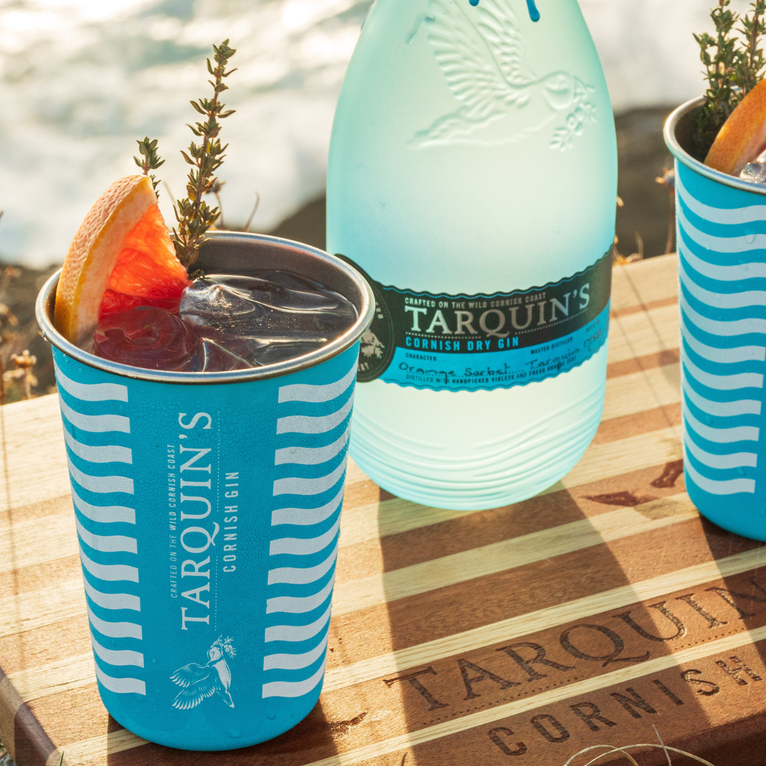
The packaging consists of a cylindrical cup made of a lightweight material, likely paper or plastic, featuring a vibrant blue color with white stripes. The cup has a smooth surface with a glossy finish, showcasing a design that includes the brand name 'TARQUIN'S' prominently displayed. The cup is filled with a dark beverage and garnished with a slice of orange and a sprig of herb, indicating its use for serving drinks.

The packaging consists of a cylindrical cup designed for beverages, featuring a vibrant blue color with white wave patterns. The cup has a smooth surface, indicating a paper or plastic material, and is likely insulated to hold cold drinks. The top of the cup is open, allowing for easy access to the drink inside. The cup is adorned with a logo and brand name prominently displayed, along with decorative elements like fruit garnishes.

The packaging is a rectangular rigid box designed to hold multiple small bottles of gin. It features a sturdy construction with thick walls, providing a premium feel. The exterior is adorned with a bright blue color, complemented by white wave patterns along the edges. The front has a clear plastic window that showcases the four gin bottles inside, each uniquely colored and capped. The box has a clean, high-quality finish, suggesting a luxury presentation.
About the Brand
Tarquins Gin operates in the premium spirits segment, producing gin with a strong emphasis on artisanal methods and local sourcing. Their packaging approach reflects a balance between visual impact and functional protection, using custom structural designs and branded materials to reinforce their identity.
The company’s packaging strategy integrates rigid boxes for gift sets, folding cartons for individual bottles, and branded drinkware for events, ensuring robust product protection and consistent branding across channels. Materials such as kraft paperboard and rigid fiberboard are utilized to convey a premium feel while supporting sustainability objectives. The visual system leverages signature blue tones and maritime motifs to evoke a sense of place and authenticity, appealing to both retail and direct-to-consumer markets.
Key Differentiator: Tarquins Gin differentiates itself through a combination of regionally inspired branding, premium packaging finishes, and a consistent emphasis on storytelling and artisanal craftsmanship.
Design System
Visual Style
The visual identity incorporates serif and script typography, a vibrant maritime blue palette with white accents, and wave-inspired graphic motifs. The overall aesthetic is both modern and evocative of coastal Cornwall.
Brand Identity
Logo usage is prominent and consistent across all packaging surfaces, with supplementary iconography referencing Cornish heritage. Visual consistency is maintained through repeated use of brand colors, wave motifs, and typographic hierarchy.
Packaging Design
Material choices focus on recyclable kraft and rigid boards, with structural designs that prioritize both product protection and visual impact. Windowed boxes for gift sets and reinforced folding cartons for bottles align with a premium positioning.
User Experience
The design system supports a positive customer journey by providing a memorable unboxing experience, clear product information, and cohesive branding that enhances perceived value and encourages repeat purchases.
Company Metrics
Business insights for Tarquins Gin based on available data
Market Positioning
Brand Values & Focus
Key Competitors
Target Market: Affluent consumers, gifting buyers, and premium spirits enthusiasts in the UK and international e-commerce markets seeking distinctive, high-quality gin products.
Packaging Assessment
Overall Grade
Visual appeal and presentation quality
Packaging durability and protection
Eco-friendliness and recyclable materials
Cost efficiency and value for money
Packaging assessment for Tarquins Gin based on industry standards and best practices
Frequently Asked Questions
How does Tarquins Gin approach packaging sustainability?
Tarquins Gin incorporates recyclable paper-based materials and minimizes plastic use in their packaging, with a focus on kraft cartons and rigid gift boxes. This approach supports environmental responsibility while maintaining product protection and premium shelf presence.
What packaging formats are used for Tarquins Gin products?
The brand utilizes a mix of rigid gift boxes for multi-bottle sets, folding carton boxes for individual bottles, and branded drink cups for events, all featuring strong visual identity and robust structural design.
How does packaging contribute to Tarquins Gin’s brand experience?
Packaging plays a key role in reinforcing Tarquins Gin’s artisanal ethos and Cornish heritage, using distinctive colors, high-quality materials, and consistent branding to enhance the unboxing and gifting experience.
Discover other Food & Drink companies
Explore more companies in the food & drink industry and their packaging strategies
Terres de Café
Food & Drink
Terres de Café is a specialty coffee retailer based in Paris, France, known for its commitment to sustainability and high-quality coffee sourcing.
kerex - terre exotique
Food & Drink
Kerex - Terre Exotique specializes in the international trade of gourmet food and drink products, offering a unique selection of spices and culinary ingredients.
PrepMyMeal
Food & Drink
PrepMyMeal is a food production company specializing in high-protein meal delivery services. They offer a variety of natural, nutritious meals designed for fitness enthusiasts and those seeking convenience in meal preparation.