Tahe Cosmetics packaging
Tahe Cosmetics operates in the beauty and personal care sector, offering professional-grade hair, skin, and nail products. Their packaging strategy incorporates branded corrugated and carton boxes, prioritizing both visual appeal and protective functionality for salon and consumer markets.
Packaging Portfolio
Tahe Cosmetics employs a mix of corrugated boxes for logistics and single-layer carton boxes for retail shelf presence, both featuring high brand visibility and consistent design language. Packaging is characterized by precise folding, a combination of matte and gloss finishes, and clear, bilingual labeling. The use of recyclable paperboard and kraft materials balances durability with environmental considerations. Gift packaging, such as branded matte-finish paper bags with ribbon handles, further extends their premium positioning, while the integration of product-specific color schemes enhances differentiation across lines.
The packaging is a flat, rectangular folding carton made from a single layer of paperboard. It features a smooth surface with clean edges and precise folds. The exterior is predominantly teal with white text and graphics, providing a modern and sleek appearance. The front displays the product name 'Peptide T98' prominently, along with a logo and additional product information. The carton has a glossy finish that enhances the visual appeal.
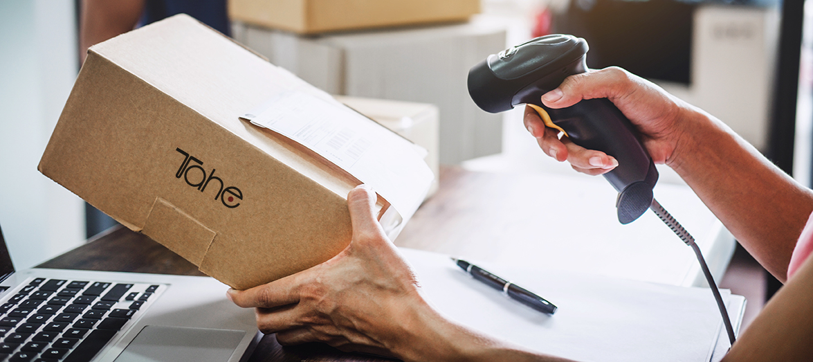
The packaging is a corrugated box made from layered paperboard, featuring a visible fluted inner layer. It has a brown kraft exterior, typical of shipping boxes. The edges are slightly worn, indicating handling, and it has a shipping label affixed to one side. The box is rectangular in shape and appears to be sturdy, suitable for shipping purposes.
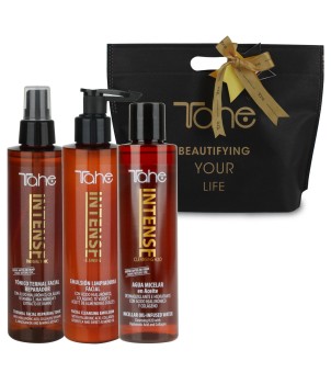
The packaging consists of a black gift bag made from sturdy paper material, featuring a matte finish. The bag has a rectangular shape with a flat bottom and is designed to hold multiple cosmetic products. It has a decorative ribbon handle that is tied in a bow at the top, adding a premium touch. The front of the bag displays the brand name 'Tahe' prominently in gold lettering, along with the tagline 'BEAUTIFYING YOUR LIFE' in a smaller font beneath it. The overall design is elegant and suitable for retail presentation.
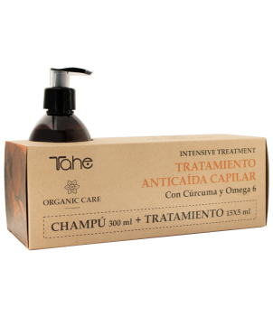
The packaging is a flat, rectangular carton box made from single-layer paperboard. It features smooth, clean edges and precise folds. The exterior is a kraft brown color, providing a natural look. The front displays product information, including the brand name 'Tahe' and product details in both Spanish and English. The design includes a simple layout with a focus on readability, using a combination of dark and light text. The box has a glossy finish that enhances its visual appeal.
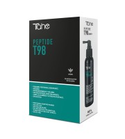
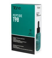
The packaging is a folding carton made of smooth, single-layer paperboard. It features a rectangular shape with clean, precise edges and folds. The exterior is predominantly black with teal accents, showcasing a modern design. The front displays the product name 'Peptide T98' in bold, white lettering, while the back includes detailed product information and usage instructions. The surface appears to have a matte finish, contributing to a sleek appearance.
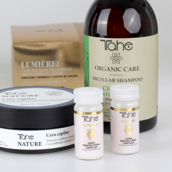
The image features a combination of retail cartons and bottles. The cartons are made of smooth, flat paperboard with clean edges and folds, typically used for cosmetic products. They have a matte finish with printed graphics. The bottles are made of glass or plastic with labels, showcasing a glossy finish and vibrant colors. The overall arrangement suggests a retail display for cosmetic products.
About the Brand
Tahe Cosmetics is a Spanish beauty brand specializing in hair, skin, and nail care products, with a dual B2B and B2C focus. The company is recognized for its innovative formulas featuring natural and organic ingredients, as well as its commitment to professional standards.
The brand's international reach and close collaborations with salons underscore its commitment to quality and professionalism. Packaging is a key component of Tahe Cosmetics' strategy, with a clear emphasis on clean, contemporary designs that reinforce product efficacy and brand image. Their approach leverages natural color palettes, clear product labeling, and a mix of gloss and matte finishes to create shelf appeal and improve customer perception.
Key Differentiator: Tahe Cosmetics differentiates itself through its integration of sustainability, natural formulations, and consistent professional-grade packaging that aligns closely with salon and retail expectations.
Design System
Visual Style
Typography is modern and highly legible, typically using sans-serif fonts in bold weights for brand and product names, paired with lighter type for descriptions. The color palette ranges from neutral kraft browns to vibrant teals and classic blacks, with selective use of gold for premium lines. The overall aesthetic is clean, professional, and minimalistic, supporting high-end positioning.
Brand Identity
The logo is consistently applied across all packaging types, often centered or prominently placed. Iconography is minimal and product-focused, allowing the brand name and product details to dominate visual hierarchy. Visual consistency is maintained through uniform color schemes, font usage, and structured layouts.
Packaging Design
Material selection emphasizes recyclable paperboard and sturdy corrugated cardboard, with finishes tailored to the product line (gloss for visual impact, matte for premium feel). Structural designs prioritize secure closures, clean folds, and efficient stacking for both logistics and retail environments.
User Experience
Packaging is designed to support a seamless customer journey, from safe product delivery to an engaging unboxing experience. Clear labeling and branding assist in product identification, while high-quality finishes and thoughtful structural details enhance perceived value and reinforce brand trust.
Company Metrics
Business insights for Tahe Cosmetics based on available data
Market Positioning
Brand Values & Focus
Key Competitors
Target Market: Professional hair and beauty salons, retail consumers seeking premium hair, skin, and nail care products, and international distributors in the beauty & fitness sector.
Packaging Assessment
Overall Grade
Visual appeal and presentation quality
Packaging durability and protection
Eco-friendliness and recyclable materials
Cost efficiency and value for money
Packaging assessment for Tahe Cosmetics based on industry standards and best practices
Frequently Asked Questions
What packaging materials does Tahe Cosmetics primarily use?
Tahe Cosmetics utilizes a combination of corrugated cardboard for shipping and single-layer paperboard cartons for retail packaging, often with gloss or matte finishes and prominent brand elements.
How does Tahe Cosmetics address sustainability in its packaging?
The brand employs recyclable materials and natural color palettes, though further improvements could be made in material sourcing and minimizing plastic components.
Is Tahe Cosmetics' packaging suitable for international shipping?
Yes, the use of durable corrugated boxes and secure folding cartons supports safe logistics for both domestic and international markets.
Discover other Beauty & Fitness companies
Explore more companies in the beauty & fitness industry and their packaging strategies
Orris Paris
Beauty & Fitness
Orris Paris specializes in creating artisanal skincare products that combine potent botanical ingredients with modern cleansing rituals. The company emphasizes natural, holistic practices in its formulations.
Pure Altitude
Beauty & Fitness
Pure Altitude specializes in high-quality beauty and skincare products that leverage the expertise of spa treatments to enhance daily routines. The brand offers a diverse range of products tailored for both facial and body care.
Big Moustache
Beauty & Fitness
Big Moustache specializes in shaving and grooming products tailored for men, providing a hassle-free subscription service for razor blades and skincare essentials.