TADA Ramen packaging
TADA Ramen delivers premium ramen broths, noodles, and seasonings direct to consumers, emphasizing accessibility and authenticity. Their packaging strategy leverages sustainable materials and custom designs to secure product integrity while reinforcing brand identity.
Packaging Portfolio
TADA Ramen’s packaging portfolio encompasses clear glass jars with metal lids for sauces and pastes, flexible stand-up pouches with resealable closures for noodles and dry components, and custom-printed paperboard carton boxes for bundled kits and gifting. Material selection emphasizes product freshness and shelf visibility, while design execution ensures consistent branding across all formats. The use of recyclable glass and paperboard, along with minimal yet effective flexible plastics, reflects a balanced approach to sustainability, cost, and consumer appeal.

The packaging consists of a smooth, flat construction without any visible fluted layers, indicating it is made from single-layer paperboard. The box is primarily black with vibrant colors for the branding elements. The edges are clean and precise, showcasing a professional finish. The front features a large, colorful logo and product information, while the sides may have additional graphics or text.

The packaging consists of a clear glass jar with a metal lid. The jar is filled with a creamy substance, likely a sauce or paste related to ramen. The label is prominently displayed on the front, featuring a circular design with the brand name 'TADA' in a modern font. The background of the label is white, and there are colorful graphics depicting ingredients, enhancing the visual appeal.
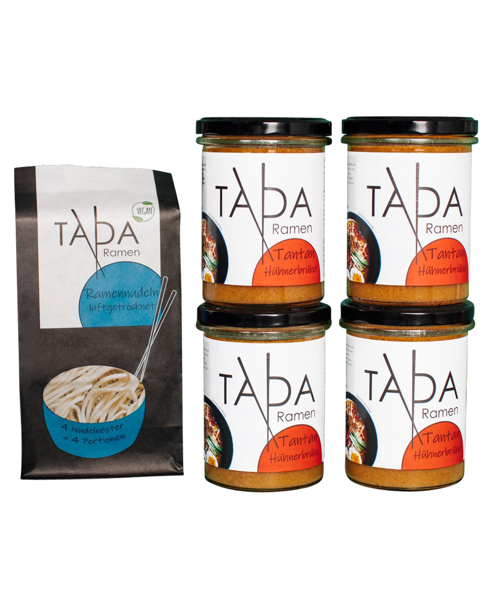
The image features a combination of packaging types: a pouch and jars. The pouch is made of a flexible material, likely a laminated film, with a matte finish and a resealable top. It displays a prominent logo and product information in a clean layout. The jars are glass with metal lids, showcasing a clear view of the contents. Each jar has a label with the brand name and product details, printed in vibrant colors. The overall arrangement suggests a retail display for a food product.

The packaging is a stand-up pouch made of flexible material, featuring a matte black background with a large blue bowl graphic on the front. The bowl contains a visual representation of ramen noodles. The top of the pouch has a resealable zipper closure, allowing for easy access and storage. The front displays the brand name 'TADA Ramen' prominently in a bold, modern font, with a green 'Vegan' label positioned at the top right. The back of the pouch likely contains nutritional information and preparation instructions, though not visible in the image.
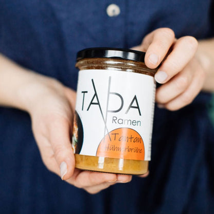
The packaging is a clear glass jar with a black screw-on lid. The jar is cylindrical in shape and contains a yellowish sauce. The label wraps around the jar, featuring a white background with a prominent logo and product name. The label has a matte finish and includes a colored section at the bottom.
About the Brand
TADA Ramen is a German direct-to-consumer food company specializing in authentic ramen meal kits, broths, and sauces. Their packaging approach integrates glass jars, flexible stand-up pouches, and branded carton boxes to optimize freshness, visual appeal, and environmental responsibility.
Operating from Hesse, Germany, TADA Ramen targets health-conscious and convenience-driven consumers seeking high-quality ramen experiences at home. The brand’s packaging choices prioritize regional production, additive-free ingredients, and sustainability, with visible investments in recyclable and reusable materials. Clear branding, modern design, and informative labeling are consistent across their portfolio, underscoring both logistical performance and shelf differentiation.
Key Differentiator: TADA Ramen differentiates itself through a holistic packaging strategy that combines eco-friendly materials, minimalistic yet vibrant design, and strong visual consistency, aligning with its brand values of quality, transparency, and community engagement.
Design System
Visual Style
Modern, minimalist typography with bold sans-serif fonts; color palette dominated by matte blacks, vibrant accent hues (blue, green, yellow), and clean white backgrounds; overall aesthetic is contemporary and visually differentiated within the food sector.
Brand Identity
Prominent use of the TADA logo and wordmark, consistent iconography such as stylized ramen bowls, and clear, legible labeling. Visual consistency is maintained through uniform placement of branding elements and cohesive color schemes across all packaging formats.
Packaging Design
Prioritizes recyclable glass and paperboard for core products, with laminated film pouches for freshness and ease of use. Structural designs focus on resealability, clarity of contents, and robust protection for shipping. Minimalism and functionality guide the structural and graphic execution.
User Experience
Packaging design is tailored for at-home convenience, intuitive navigation (easy-open, resealable features), and positive unboxing moments that reinforce brand values. Informative labeling and prominent visuals support customer confidence and product enjoyment throughout the user journey.
Company Metrics
Business insights for TADA Ramen based on available data
Market Positioning
Brand Values & Focus
Key Competitors
Target Market: Health-conscious and convenience-driven consumers in Germany and the broader DACH region seeking authentic, high-quality ramen meal kits and pantry staples delivered direct-to-door.
Packaging Assessment
Overall Grade
Visual appeal and presentation quality
Packaging durability and protection
Eco-friendliness and recyclable materials
Cost efficiency and value for money
Packaging assessment for TADA Ramen based on industry standards and best practices
Frequently Asked Questions
What types of packaging materials does TADA Ramen use?
TADA Ramen utilizes a mix of recyclable glass jars with metal lids, flexible laminated film pouches, and paperboard carton boxes. These choices support product freshness, sustainability, and visual branding.
How does TADA Ramen’s packaging support sustainability?
The brand’s packaging leverages recyclable and reusable materials, such as glass and paperboard, alongside minimal plastic use for pouches. Their approach reduces environmental impact and aligns with eco-conscious consumer expectations.
Does TADA Ramen’s packaging enhance the customer unboxing experience?
Yes, TADA Ramen employs custom-designed packaging with strong visual branding and clear labeling, contributing to a positive and memorable unboxing experience for consumers.
Discover other Food & Drink companies
Explore more companies in the food & drink industry and their packaging strategies
PrepMyMeal
Food & Drink
PrepMyMeal is a food production company specializing in high-protein meal delivery services. They offer a variety of natural, nutritious meals designed for fitness enthusiasts and those seeking convenience in meal preparation.
Teegschwendner GmbH
Food & Drink
Teegschwendner GmbH is a specialty tea company based in Germany, offering a wide selection of high-quality teas and tea-related accessories. They focus on providing unique tea experiences through carefully sourced and curated products.
kerex - terre exotique
Food & Drink
Kerex - Terre Exotique specializes in the international trade of gourmet food and drink products, offering a unique selection of spices and culinary ingredients.