Super Streusel packaging
Super Streusel, a Hamburg-based food company, specializes in vibrant baking decorations and kits targeting festive occasions. Their packaging leverages playful, colorful designs and multiple formats to enhance product appeal and customer engagement.
Packaging Portfolio
Super Streusel’s packaging portfolio encompasses a mix of stand-up flexible pouches, clear PET jars, and retail carton boxes. Flexible pouches feature resealable closures for freshness and ease of use, while clear jars showcase product appearance and support portion control. Carton boxes are used for kits and multipacks, providing structural protection and enhanced shelf presentation. Across all formats, the packaging integrates high-impact, child-focused graphics and consistent branding, optimizing both consumer engagement and retail visibility.
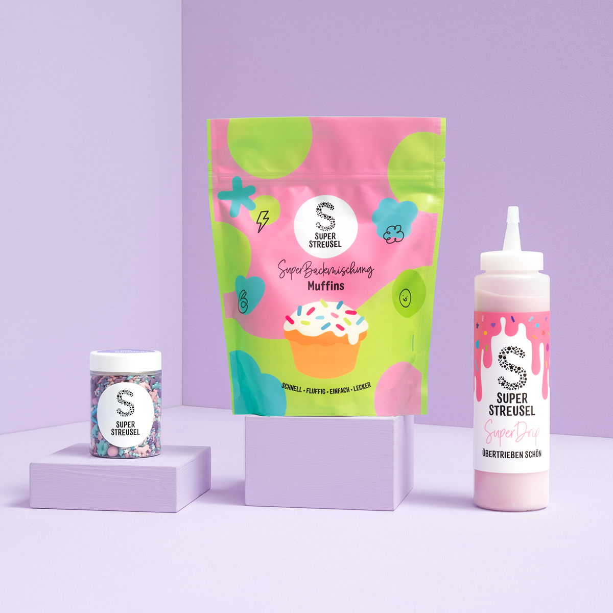
The packaging consists of a stand-up pouch with a colorful design featuring a cupcake and various playful graphics. The pouch has a resealable top, allowing for easy access and storage. The overall shape is rectangular with a flat bottom, enabling it to stand upright. The surface is smooth with a glossy finish, enhancing the vibrant colors.
The image features a variety of packaging types, including a flexible pouch and a retail carton. The flexible pouch is brightly colored with a vibrant design featuring playful graphics and text. The retail carton is flat with a smooth finish, displaying a clean and colorful design, likely used for product display. Both types are visually appealing and designed for retail presentation.
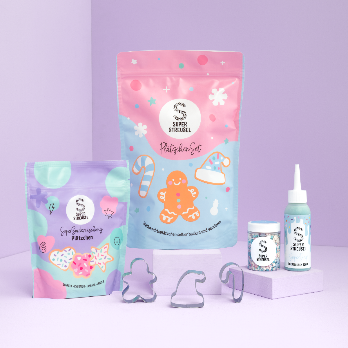
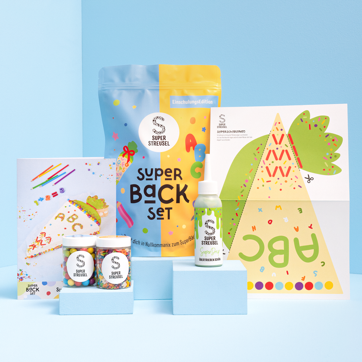
The image features several flexible pouches and containers. The main pouch is a stand-up type with a colorful design, featuring pastel colors and festive graphics. It has a resealable top and a clear window showing the contents inside. The other items include a smaller pouch with a similar design, a jar, and a squeeze bottle, all showcasing vibrant colors and playful graphics.

The packaging consists of a variety of items including a stand-up pouch, a booklet, and a bottle, all featuring vibrant colors and playful graphics. The stand-up pouch has a smooth, flat construction with a resealable top, while the booklet is a folded paper product with clean edges. The bottle appears to be made of plastic with a label. The overall design is colorful and appealing to children, with a cohesive theme across the items.

The packaging is a stand-up pouch made of flexible material, featuring a vibrant design with a split color scheme of green and pink. The front displays playful graphics, including confetti-like shapes and the brand name 'SUPER STREUSEL' prominently in bold, black letters. The pouch has a resealable top, allowing for easy access and storage. The overall shape is rectangular with a flat bottom, enabling it to stand upright on shelves.

The packaging consists of clear plastic jars with screw-on lids, showcasing colorful sprinkles inside. The jars are cylindrical in shape with a smooth surface and a glossy finish. The labels on the jars feature vibrant colors and playful graphics, prominently displaying the brand name 'SUPER STREUSEL' along with promotional text. The overall design is bright and appealing, aimed at attracting customers.
About the Brand
Super Streusel operates in the food and baking decoration sector, offering a wide range of products such as sprinkles, glazes, and baking kits. The company emphasizes high-quality ingredients and creative experiences, utilizing distinctive packaging solutions to reinforce its brand identity.
Founded in Hamburg in 2013, Super Streusel has developed a strong e-commerce presence with a focus on engaging visual branding and community-driven marketing. Packaging plays a central role in their strategy, supporting product differentiation and enhancing the consumer experience, particularly for children’s events and seasonal celebrations.
Key Differentiator: Super Streusel distinguishes itself through cohesive, child-centric packaging design and a consistent use of vibrant visuals that reinforce its playful, creative brand positioning within the baking decoration market.
Design System
Visual Style
Typography is bold and playful, often using sans-serif fonts for clarity and child-friendly appeal. The color palette is vibrant, with pastel and primary hues dominating, creating a cheerful and energetic visual identity. Packaging surfaces feature glossy finishes to enhance color vibrancy and shelf impact.
Brand Identity
Consistent use of the Super Streusel logo, prominent placement of product names, and thematic iconography such as confetti or baking motifs. Visual elements are harmonized across different formats to ensure immediate brand recognition and reinforce the playful, creative ethos.
Packaging Design
Material choices prioritize lightweight PET and flexible plastics for pouches and jars, balancing durability with cost efficiency. Structural design emphasizes resealability, tamper evidence, and ease of handling, supporting product safety and user convenience.
User Experience
Design supports an interactive and enjoyable customer journey, from initial unboxing to repeat use. Resealable closures, clear product visibility, and engaging graphics foster a positive emotional response and encourage creative product usage, aligning with the brand’s core values.
Company Metrics
Business insights for Super Streusel based on available data
Market Positioning
Brand Values & Focus
Key Competitors
Target Market: Primarily B2C consumers, with a focus on families, parents, and baking enthusiasts seeking creative and safe baking decoration products for children’s celebrations and seasonal events.
Packaging Assessment
Overall Grade
Visual appeal and presentation quality
Packaging durability and protection
Eco-friendliness and recyclable materials
Cost efficiency and value for money
Packaging assessment for Super Streusel based on industry standards and best practices
Frequently Asked Questions
What types of packaging formats does Super Streusel utilize?
Super Streusel employs a mix of stand-up pouches, retail carton boxes, and clear plastic jars, each designed with resealable or secure closures and strong branding to protect product integrity and maximize shelf appeal.
How does Super Streusel's packaging support its brand strategy?
Their packaging integrates colorful graphics, consistent logo placement, and playful themes aligned with key occasions, fostering both visual differentiation and emotional engagement with their target audience.
What is the sustainability profile of Super Streusel’s packaging?
While the company utilizes recyclable materials for some packaging formats, the use of mixed plastics and decorative elements may limit overall recyclability, reflecting a moderate sustainability performance relative to industry benchmarks.
Discover other Food & Drink companies
Explore more companies in the food & drink industry and their packaging strategies
Thés de la Pagode
Food & Drink
Thés de la Pagode is a French company specializing in organic teas and infusions, focusing on health and well-being. Established in 1987, they prioritize sustainable practices and high-quality ingredients sourced through fair trade.
PrepMyMeal
Food & Drink
PrepMyMeal is a food production company specializing in high-protein meal delivery services. They offer a variety of natural, nutritious meals designed for fitness enthusiasts and those seeking convenience in meal preparation.
ruf lebensmittelwerk kg
Food & Drink
RUF Lebensmittelwerk KG is a German food production company specializing in a variety of baking mixes and drink products. Founded in 1920, the company is known for its high-quality ingredients and innovative food solutions.