Spinnrad packaging
Spinnrad is an online retailer specializing in sustainable beauty, fitness, and wellness products, with a packaging approach that emphasizes eco-consciousness and brand consistency. Their packaging solutions are tailored to reflect their commitment to environmental responsibility and product integrity.
Packaging Portfolio
Spinnrad’s packaging portfolio comprises stand-up kraft paper pouches with viewing windows for dry goods, rigid plastic and glass jars for creams and body care, and carton boxes employing minimalist, windowed designs for retail products. Plastic bags with sealed or header card closures are used for granular and powdered items, prioritizing product visibility and protection. Across all formats, branding is consistent and prominently featured, while the structural choices reflect a balance between shelf appeal, product safety, and environmental impact.

The packaging consists of a transparent plastic bag containing small white granules, likely beeswax. The bag is sealed at the top and has a header card that displays product information. The header card is white with a printed label that includes the brand name 'spinnrad.de' and product details in German. The bag itself is clear, allowing visibility of the contents, and the edges are heat-sealed.
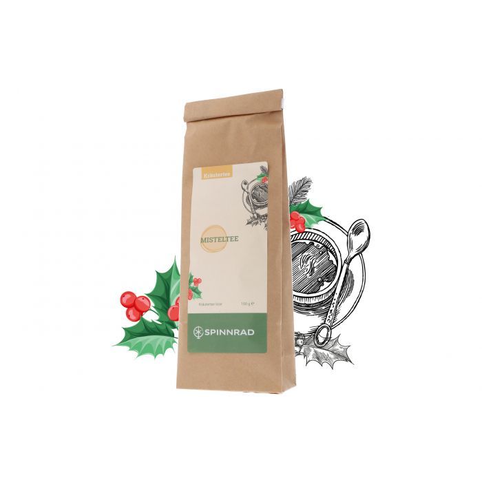
The packaging is a stand-up pouch made of a brown kraft paper material with a flat bottom that allows it to stand upright. The pouch features a smooth, matte finish with a simple design. It has a resealable top with a fold-over flap, which is typical for this type of packaging. The front displays a circular window that allows visibility of the contents inside, with festive graphics surrounding it, including holly leaves and a decorative spoon.
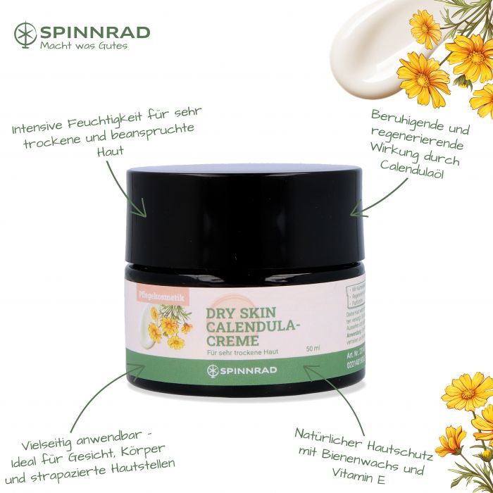
The packaging is a cylindrical jar with a black lid and a white label wrapped around the body. The label features floral graphics and text in both German and English, indicating the product type and benefits. The jar has a smooth surface with a glossy finish, and the lid appears to have a matte texture. The overall design is clean and modern, appealing to a cosmetic audience.

The packaging consists of a clear plastic bag containing small beads, likely beeswax, with a white container visible in the image. The container has a screw-on lid and is labeled with product information. The bag appears to be sealed at the top, and the container is positioned in front of the bag.

The packaging is a cylindrical container with a smooth, flat surface and a screw-on lid. The container is predominantly white with a matte finish, giving it a clean and simple appearance. The lid is slightly domed and fits securely onto the base. The overall shape is uniform and lacks any visible fluted layers, indicating it is not corrugated. The container appears to be designed for holding cosmetic products, specifically shea butter, as indicated by the labeling.
The packaging is a flat, rectangular box made of smooth, white paperboard. It has clean, precise edges and folds, typical of folding cartons. The front features a clear window displaying the product inside, with a simple design that includes text and a logo. The overall appearance is lightweight and suitable for retail display.
About the Brand
Spinnrad operates in the Beauty & Fitness sector, offering over 600 products focused on sustainability and health. Their packaging strategy integrates clear brand identification with materials selected for both product protection and environmental impact mitigation.
With a product catalog spanning beauty oils, body care, fitness accessories, and health-oriented foods, Spinnrad consistently applies packaging solutions that balance presentation, logistics safety, and eco-friendly values. The brand leverages stand-up pouches, rigid jars, carton boxes, and transparent resealable bags, often featuring prominent branding and ingredient transparency. This approach is informed by market demand for sustainability and authenticity, catering to consumers seeking ethical and well-presented products.
Key Differentiator: Spinnrad stands out for its integration of traditional craftsmanship with modern, sustainable packaging choices, aligning visual design and structure with the values of eco-conscious, health-focused consumers.
Design System
Visual Style
Clean, modern typography with sans-serif fonts; a muted, natural color palette with whites, greens, and browns; and uncluttered layouts emphasizing product transparency and simplicity.
Brand Identity
Consistent use of the Spinnrad logo and product names on all packaging, with clear ingredient listings and supporting iconography. Visual identity is reinforced through uniform label placement and cohesive graphic elements across categories.
Packaging Design
Material selection favors recyclable kraft paper, PET/PP rigid plastics, and glass; structures are chosen for resealability, protection, and retail presentation. Design philosophy emphasizes minimalism, functional reusability, and reduction of excess material.
User Experience
Packaging is designed for intuitive handling, clear product visibility, and ease of opening, supporting trust and positive brand perception throughout the customer journey.
Company Metrics
Business insights for Spinnrad based on available data
Market Positioning
Brand Values & Focus
Key Competitors
Target Market: Eco-conscious consumers seeking sustainable, health-oriented beauty and fitness products in the DACH (Germany, Austria, Switzerland) e-commerce market.
Packaging Assessment
Overall Grade
Visual appeal and presentation quality
Packaging durability and protection
Eco-friendliness and recyclable materials
Cost efficiency and value for money
Packaging assessment for Spinnrad based on industry standards and best practices
Frequently Asked Questions
What types of packaging materials does Spinnrad use?
Spinnrad utilizes a range of materials including kraft paper stand-up pouches, rigid plastic and glass jars, carton boxes with viewing windows, and resealable plastic bags, with a focus on both product protection and recyclability.
How does Spinnrad address sustainability in its packaging?
Sustainability is addressed through the selection of recyclable materials, minimalist design to reduce waste, and packaging formats that support reusability and efficient storage, although some reliance on plastics remains for certain product categories.
Is Spinnrad’s packaging customizable for different product lines?
Yes, Spinnrad employs custom labeling and branded graphics tailored to each product category, ensuring consistency in visual identity while optimizing packaging type for product safety and consumer appeal.
Discover other Beauty & Fitness companies
Explore more companies in the beauty & fitness industry and their packaging strategies
Big Moustache
Beauty & Fitness
Big Moustache specializes in shaving and grooming products tailored for men, providing a hassle-free subscription service for razor blades and skincare essentials.
Owari
Beauty & Fitness
Owari specializes in 100% natural beauty and fitness products, designed to enhance health and wellness. The company proudly offers its products made in France, emphasizing quick delivery and customer support.
Pure Altitude
Beauty & Fitness
Pure Altitude specializes in high-quality beauty and skincare products that leverage the expertise of spa treatments to enhance daily routines. The brand offers a diverse range of products tailored for both facial and body care.