So Shape packaging
So Shape specializes in direct-to-consumer meal replacement products, leveraging vibrant, branded packaging to reinforce convenience and nutritional value. Their packaging strategy emphasizes quick identification, on-the-go usability, and a visually consistent unboxing experience.
Packaging Portfolio
So Shape’s packaging portfolio is dominated by single-layer paperboard carton boxes and flexible, triangular pouches, each engineered for portion control and shelf impact. The use of bright colors, glossy finishes, and clear branding elements ensures high shelf visibility and strong consumer recall. Packaging formats are tailored for both individual servings and multipack displays, supporting D2C logistics and efficient storage. Structural choices prioritize ease of use and portability, though the mix of materials results in varying degrees of recyclability.
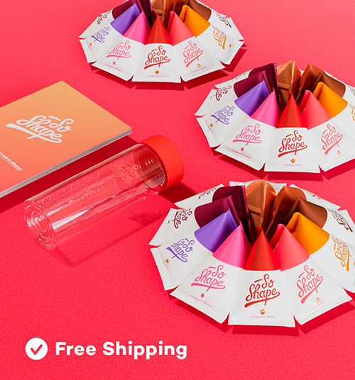
The packaging consists of multiple small, cone-shaped cartons arranged in a circular pattern. Each carton is made of smooth, flat paperboard with clean edges and folds, showcasing a vibrant color palette of pink, purple, orange, and red. The cartons are designed to hold individual servings, likely of a product related to health or nutrition. The overall appearance is bright and eye-catching, aimed at attracting consumer attention. A clear plastic bottle is also present, which has a red cap, suggesting a functional element for product use.

The packaging consists of a folding carton box that is predominantly light blue with white cloud graphics. The box has a smooth, flat construction without any visible fluted layers, indicating it is made from single-layer paperboard. The edges are clean and precise, and the box is designed to stand upright. The front features a prominent graphic of the product name 'POP CORN' in bold, white lettering, with additional text indicating flavor and nutritional information. The sides have printed details about the product, including ingredients and serving suggestions. The box has a glossy finish that enhances the visual appeal.

The image features a variety of retail packaging for nutritional products, including protein powders and supplements. The boxes are predominantly flat with clean edges and folds, showcasing a smooth surface finish. The colors are vibrant, with a mix of purple, white, and other bright hues. Each package displays distinct branding elements and product information, with some having transparent windows to showcase the product inside. The overall arrangement is visually appealing, designed for retail display.
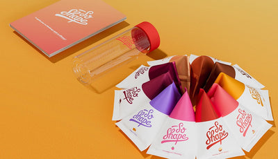
The packaging consists of several small, flat pouches arranged in a circular formation, each featuring a colorful design with the brand name 'So Shape' prominently displayed. The pouches are made of a smooth, single-layer paperboard, showcasing a clean and precise edge with a glossy finish. The color palette includes vibrant shades of pink, orange, purple, and yellow, contributing to a lively and appealing visual presentation. The overall assembly appears to be designed for easy access to the individual pouches.

The packaging consists of several triangular pouches, each with a distinct color scheme. The pouches have a smooth, flat construction with a glossy finish. The colors include gold, red, and pink at the top, transitioning to white at the bottom. The brand name 'So Shape' is prominently displayed in a stylized font on each pouch. The pouches are sealed at the top and have a flat base, allowing them to stand upright.
About the Brand
So Shape operates in the health and wellness sector, centering on meal replacements and nutritional supplements with a strong emphasis on convenience, taste, and customer experience. Their packaging supports brand communication by using distinctive colors, clear labeling, and formats optimized for portion control and portability.
Founded in Paris in 2014, So Shape delivers a wide range of protein shakes, healthy snacks, and supplements through a direct-to-consumer model. The company’s packaging portfolio features both carton boxes and flexible pouches, designed to protect shelf life while providing a positive unboxing experience. Branding is integrated throughout the packaging, utilizing signature colors and bold typography to drive recognition and consumer trust.
Key Differentiator: So Shape’s packaging combines single-serve convenience with strong visual identity, supporting a dual focus on nutrition and user experience.
Design System
Visual Style
The visual system features bold, sans-serif typography, a saturated color palette with prominent blues, pinks, purples, and yellows, and a preference for high-contrast, playful graphic elements. Glossy finishes and clean lines reinforce a modern, energetic aesthetic.
Brand Identity
Consistent So Shape logo usage is evident across all packaging, with prominent placement on both primary and secondary packs. Iconography and flavor cues are standardized for quick recognition. Visual consistency is maintained through uniform color assignments and typographic hierarchy.
Packaging Design
Material selection favors lightweight, single-layer paperboard for carton solutions and flexible, laminated plastics for pouches. Structural designs prioritize single-serve functionality, retail shelf presence, and consumer convenience. Cut-out windows and upright-standing formats enhance product presentation.
User Experience
Packaging supports the user journey with intuitive opening mechanisms, portioned servings, and clear nutritional labeling. The design emphasizes a positive, energetic unboxing experience that aligns with the brand’s commitment to healthy, enjoyable eating.
Company Metrics
Business insights for So Shape based on available data
Market Positioning
Brand Values & Focus
Key Competitors
Target Market: Health-conscious, time-constrained consumers seeking convenient, effective meal replacement and nutritional supplement solutions, primarily in Tier I urban markets.
Packaging Assessment
Overall Grade
Visual appeal and presentation quality
Packaging durability and protection
Eco-friendliness and recyclable materials
Cost efficiency and value for money
Packaging assessment for So Shape based on industry standards and best practices
Frequently Asked Questions
What types of packaging materials does So Shape use?
So Shape primarily utilizes single-layer paperboard carton boxes and flexible plastic or laminated pouches, both optimized for portion control, shelf stability, and visual impact.
How does So Shape's packaging support its brand strategy?
Packaging is integral to So Shape’s brand, leveraging signature colorways, bold product labeling, and a consistent logo presence to build trust and enhance recognition among health-focused consumers.
Is So Shape’s packaging environmentally friendly?
While the company uses recyclable paperboard materials for many products, the use of flexible plastics and glossy finishes may limit overall recyclability, resulting in a moderate sustainability profile relative to industry standards.
Discover other Beauty & Fitness companies
Explore more companies in the beauty & fitness industry and their packaging strategies
Big Moustache
Beauty & Fitness
Big Moustache specializes in shaving and grooming products tailored for men, providing a hassle-free subscription service for razor blades and skincare essentials.
Owari
Beauty & Fitness
Owari specializes in 100% natural beauty and fitness products, designed to enhance health and wellness. The company proudly offers its products made in France, emphasizing quick delivery and customer support.
Pure Altitude
Beauty & Fitness
Pure Altitude specializes in high-quality beauty and skincare products that leverage the expertise of spa treatments to enhance daily routines. The brand offers a diverse range of products tailored for both facial and body care.