SLYRS Bavarian Whisky Distillery packaging
SLYRS Bavarian Whisky Distillery produces premium single malt whiskies rooted in Bavarian tradition and alpine terroir. Their packaging strategy combines luxury rigid boxes and branded retail cartons to emphasize product quality, regional identity, and an immersive consumer experience.
Packaging Portfolio
SLYRS employs a diverse range of packaging solutions, including rigid cylindrical boxes for limited and high-value editions, matte black luxury boxes for tasting sets, and robust retail cartons for bottle protection and shelf display. Materials are primarily single-layer paperboard and chipboard, with finishes ranging from kraft brown matte to glossy, color-intensive exteriors. Branding is prominent on most formats, with consistent logo placement and regional motifs. Structural choices prioritize both shelf impact and gifting, while also providing moderate protection during transit.

The packaging is a tall, rectangular carton designed to hold a whisky bottle. It features a smooth, flat construction with clean edges and folds. The exterior is predominantly green with a glossy finish, showcasing a vibrant design. The front displays the brand name 'SLYRS' prominently in white, with 'BAVARIAN PEAT' in a bold, orange font beneath it. The back and sides may contain additional product information and branding elements. The top is open, allowing for easy access to the bottle inside.
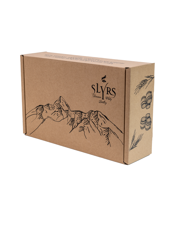
The packaging is a rectangular box made of smooth, single-layer paperboard. The exterior features a kraft brown color with a matte finish. The box has clean, precise edges and folds, indicative of a folding carton design. On one side, there is a stylized illustration of mountains and a cluster of coins, alongside the brand name 'SLYRS' prominently displayed in a bold font. The overall appearance is lightweight and designed for retail presentation.

The packaging is a tall, rectangular carton designed to hold a whisky bottle. It features a smooth, flat construction without any visible fluted layers, indicating it is made from single-layer paperboard. The carton has clean, precise edges and folds, with a glossy finish that enhances its visual appeal. The front displays a large, elegant graphic of the product name and brand, with a subtle background image that complements the overall design.
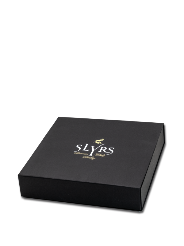
The packaging is a square-shaped box with a sleek, matte black exterior. It features a premium appearance with clean, sharp edges and a sturdy construction. The box has a smooth surface without any visible flutes, indicating it is made from thick chipboard. The lid fits snugly over the base, providing a secure closure. The interior is likely designed to hold a product securely, though it is not visible in the image.
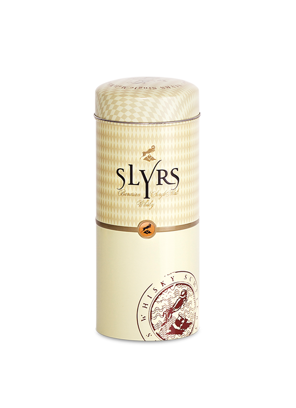
The packaging is a cylindrical rigid box with a smooth, glossy finish. It features a cream-colored exterior with a subtle diamond pattern and a prominent logo. The top is slightly domed, and the box has a secure closure mechanism, likely a friction fit or a push-on lid. The overall appearance is premium and elegant, suitable for high-end products.
About the Brand
SLYRS is a leading Bavarian whisky distillery, focused on crafting single malt whiskies that embody local culture and artisanal methods. Their packaging approach prioritizes premium materials and distinctive branding to reinforce a luxury positioning within the spirits sector.
The distillery's packaging solutions are characterized by a blend of rigid cylindrical boxes for high-end releases and structurally robust retail cartons for core products. Attention to branding, tactile finishes, and protective features is evident throughout their portfolio. SLYRS also leverages packaging as a critical touchpoint in their visitor experiences and direct-to-consumer sales.
Key Differentiator: Comprehensive use of premium packaging formats that integrate regional branding, luxury cues, and structural integrity for both shelf impact and gifting occasions.
Design System
Visual Style
Typography leans towards bold, serif fonts for product names and quotes, complemented by clean sans-serif for supporting text. The color palette draws on natural tones—kraft brown, cream, deep green, and matte black—evoking Bavarian landscapes and premium cues. Aesthetic approach is sophisticated yet rustic, balancing luxury with regional authenticity.
Brand Identity
Brand identity is reinforced through prominent logo placement, stylized mountain iconography, and consistent use of the 'SLYRS' name. Visual consistency is maintained across packaging lines through recurring motifs and a restrained, harmonious design language.
Packaging Design
Material selection favors sturdy, recyclable paperboard and chipboard with attention to tactile finishes. Structural design is focused on protection, shelf presence, and unboxing impact, with gift-ready formats for special editions.
User Experience
Packaging is designed to enhance the customer journey, offering a premium unboxing experience that aligns with high-value gifting and immersive brand storytelling. Visual and structural elements guide the consumer from initial purchase to consumption, reinforcing the brand’s artisanal and regional identity.
Company Metrics
Business insights for SLYRS Bavarian Whisky Distillery based on available data
Market Positioning
Brand Values & Focus
Key Competitors
Target Market: Premium whisky consumers in Germany and international markets, with a focus on spirits connoisseurs, gift buyers, and experiential visitors seeking authentic Bavarian products.
Packaging Assessment
Overall Grade
Visual appeal and presentation quality
Packaging durability and protection
Eco-friendliness and recyclable materials
Cost efficiency and value for money
Packaging assessment for SLYRS Bavarian Whisky Distillery based on industry standards and best practices
Frequently Asked Questions
What types of packaging does SLYRS use for its whisky products?
SLYRS utilizes a mix of rigid cylindrical boxes, luxury gift boxes, and branded retail cartons, designed for both protection and premium shelf presence.
How does SLYRS integrate sustainability into its packaging?
While primary materials are paperboard and chipboard, SLYRS demonstrates moderate sustainability through recyclable substrates and minimalist design, though further improvements in renewable sourcing and reduction of finishes could increase eco-friendliness.
What role does packaging play in SLYRS’s branding strategy?
Packaging is central to SLYRS’s premium positioning, using consistent visual motifs—such as mountain illustrations and prominent logos—to reinforce brand identity at every consumer touchpoint.
Discover other Food & Drink companies
Explore more companies in the food & drink industry and their packaging strategies
Terres de Café
Food & Drink
Terres de Café is a specialty coffee retailer based in Paris, France, known for its commitment to sustainability and high-quality coffee sourcing.
Thés de la Pagode
Food & Drink
Thés de la Pagode is a French company specializing in organic teas and infusions, focusing on health and well-being. Established in 1987, they prioritize sustainable practices and high-quality ingredients sourced through fair trade.
kerex - terre exotique
Food & Drink
Kerex - Terre Exotique specializes in the international trade of gourmet food and drink products, offering a unique selection of spices and culinary ingredients.