Skintips packaging
Skintips is a French skincare brand focused on vegan, organic beauty products for young consumers. Their packaging strategy emphasizes modern aesthetics, sensory appeal, and sustainability, using branded cosmetic pouches and rigid containers to reinforce a clean, youthful identity.
Packaging Portfolio
Skintips employs a mix of holographic, iridescent pouches and rigid cosmetic jars, optimizing both visual appeal and protective function. The flexible pouches are constructed from transparent, light-reflective materials, offering strong shelf and social media impact. Rigid jars use sturdy chipboard or premium plastics with matte finishes to ensure product safety and a premium tactile experience. Branding is consistently applied across all formats, maximizing recognition and supporting cohesive multi-product routines.
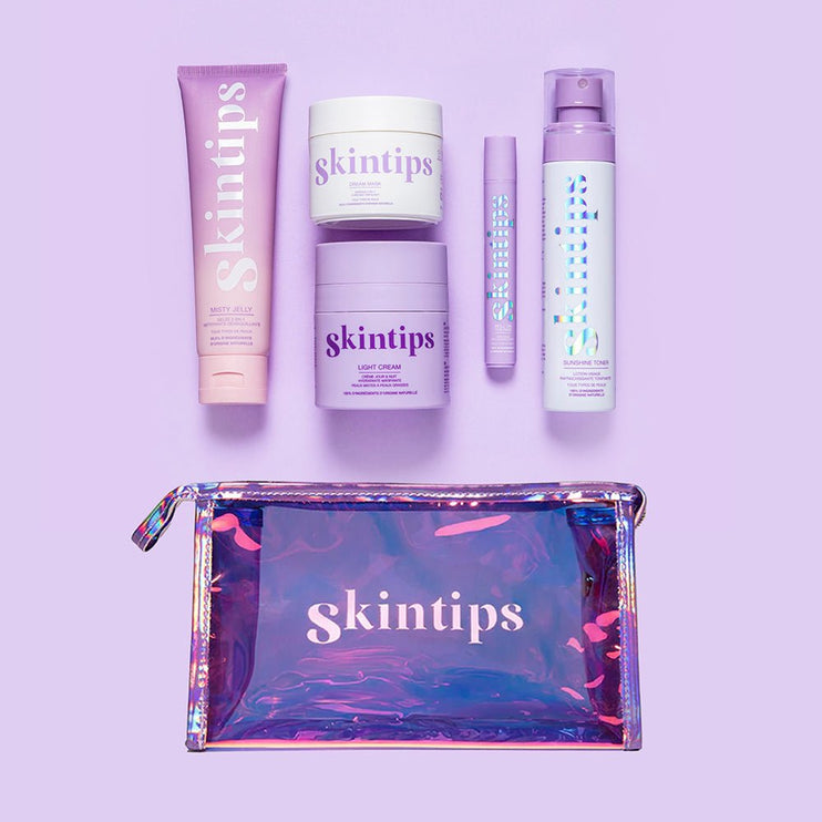
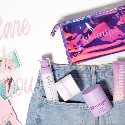
The image features a collection of cosmetic products arranged on a purple background. The products include a tube, a jar, a stick, and a spray bottle, all branded with the 'skintips' logo in a consistent font and color scheme. They are housed in a clear, iridescent pouch that has a zipper closure, showcasing the products inside. The overall aesthetic is modern and appealing, with a cohesive color palette of purples and whites.
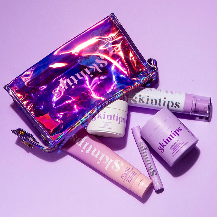
The image features a collection of cosmetic products arranged on a purple background. The products include a cream jar, a tube, and a pen-like applicator, all housed within a shiny, holographic pouch. The pouch has a structured, rigid appearance with a metallic finish, reflecting light in various colors. The products are predominantly in pastel shades of purple and white, with clear branding visible on each item.
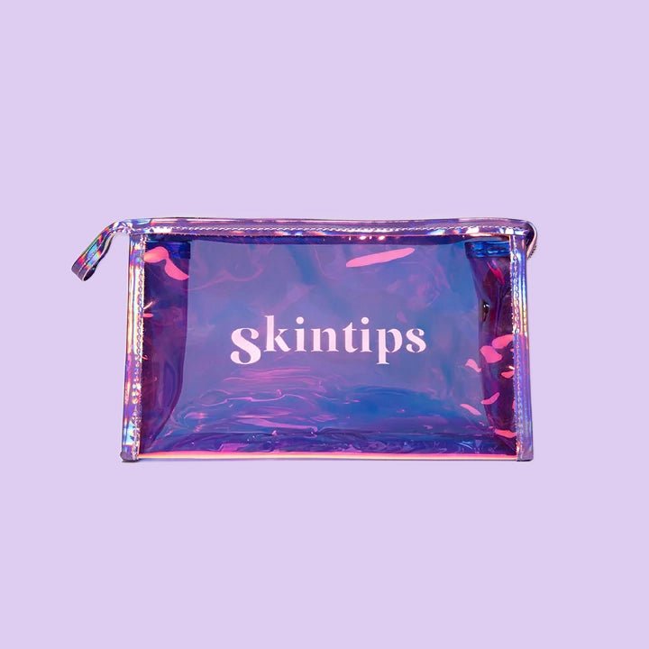
The packaging is a transparent pouch made from a shiny, iridescent material that reflects light, creating a holographic effect. The pouch has a zip closure at the top and features a flat base, allowing it to stand upright. The front of the pouch displays the brand name 'skintips' in bold, white lettering, centered within the clear section of the pouch. The overall shape is rectangular with rounded corners, and the edges are stitched for durability.
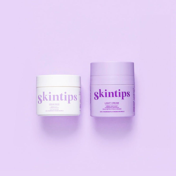
The packaging consists of two cosmetic jars, one white and one lavender, both with a smooth, cylindrical shape. The jars have thick, sturdy walls, indicative of premium chipboard construction. The lids are flat and screw-on, providing a secure closure. The surface finish appears matte with a slight sheen, enhancing the luxurious feel. The jars are labeled with clear, bold text indicating the product names.
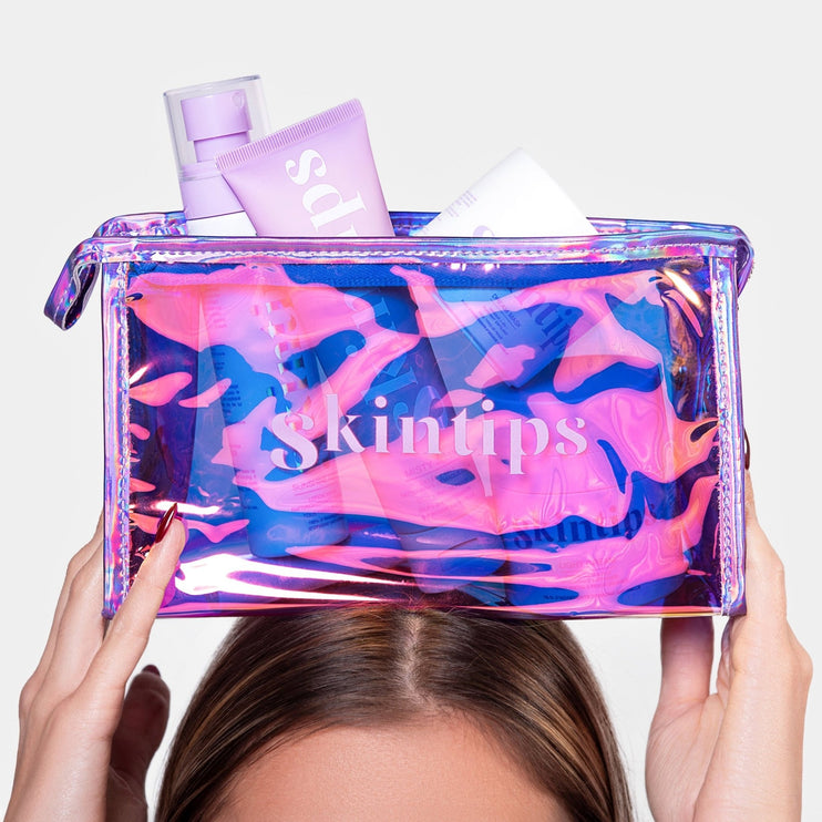
The packaging is a clear, holographic cosmetic pouch with a zip closure. It features a smooth, shiny surface that reflects light in various colors, creating a visually striking effect. The pouch is filled with various skincare products, which are partially visible through the transparent material. The top of the pouch has a zipper for easy access, and the overall shape is rectangular with rounded edges.
The packaging is a transparent cosmetic pouch made from a shiny, iridescent material. It has a zippered closure at the top and features a smooth surface with a reflective quality. The pouch is filled with skincare products, which are partially visible through the clear material. The overall shape is rectangular with rounded edges, and it appears to be lightweight and flexible.
About the Brand
Skintips operates in the clean beauty sector, providing vegan and organic skincare solutions primarily to younger demographics. The brand leverages direct-to-consumer e-commerce and integrates packaging as a core element of its identity, focusing on both sensory experience and sustainability.
Packaging at Skintips is designed to enhance both product protection and emotional value, utilizing modern, iridescent pouches and robust jars. The consistent use of pastel tones, holographic finishes, and clear brand marks supports both shelf impact and online presentation. With all products made in France, the brand aligns its packaging choices with its ethical and environmental values, appealing to consumers seeking transparency and quality.
Key Differentiator: Distinctive use of holographic, branded cosmetic pouches paired with vegan and organic product positioning sets Skintips apart in the clean beauty segment.
Design System
Visual Style
Skintips favors bold, sans-serif typography paired with a pastel and iridescent color palette (primarily purples, whites, and holographic effects), establishing a modern, youthful aesthetic. The overall look is clean and vibrant, with high visual consistency across product lines.
Brand Identity
Logo and brand name are featured prominently and consistently, ensuring clarity in all packaging forms. Iconography is minimalistic, and visual elements are harmonized to reinforce the clean beauty positioning. Consistent use of color and type enhances recognizability online and in person.
Packaging Design
Primary materials include iridescent plastics for pouches and rigid chipboard or plastic for jars, with an emphasis on structural integrity, tactile appeal, and reusability. The design philosophy balances visual impact with product protection and sustainability considerations.
User Experience
Packaging is engineered to enhance the customer journey, from first visual contact (vivid shelf and digital presentation) to tactile unboxing. The use of transparent and holographic elements supports both product discovery and shareability, fostering positive brand interaction and repeat purchase intent.
Company Metrics
Business insights for Skintips based on available data
Market Positioning
Brand Values & Focus
Key Competitors
Target Market: Environmentally conscious young adults and teens seeking vegan, organic skincare products with a focus on modern design and ethical sourcing.
Packaging Assessment
Overall Grade
Visual appeal and presentation quality
Packaging durability and protection
Eco-friendliness and recyclable materials
Cost efficiency and value for money
Packaging assessment for Skintips based on industry standards and best practices
Frequently Asked Questions
What types of packaging materials does Skintips use?
Skintips primarily utilizes holographic, iridescent plastic pouches with zip closures for bundling products, as well as rigid cosmetic jars made of chipboard and premium plastics for creams and masks.
How does Skintips approach sustainability in packaging?
The brand prioritizes recyclable materials and reusable pouch formats, though the use of plastics for holographic effects presents a moderate environmental tradeoff. Their vegan and organic ethos extends to packaging decisions where feasible.
Does Skintips packaging enhance the unboxing experience?
Yes, Skintips packaging incorporates modern design, strong color consistency, and sensory materials to create a memorable and visually appealing unboxing experience tailored to a youthful market.
Discover other Beauty & Fitness companies
Explore more companies in the beauty & fitness industry and their packaging strategies
Owari
Beauty & Fitness
Owari specializes in 100% natural beauty and fitness products, designed to enhance health and wellness. The company proudly offers its products made in France, emphasizing quick delivery and customer support.
Pure Altitude
Beauty & Fitness
Pure Altitude specializes in high-quality beauty and skincare products that leverage the expertise of spa treatments to enhance daily routines. The brand offers a diverse range of products tailored for both facial and body care.
Big Moustache
Beauty & Fitness
Big Moustache specializes in shaving and grooming products tailored for men, providing a hassle-free subscription service for razor blades and skincare essentials.