Sauna Bedarf Schneider packaging
Sauna Bedarf Schneider delivers premium sauna and wellness products to both consumers and businesses, focusing on quality, natural ingredients, and an elevated user experience. Their packaging strategy employs retail carton formats that reinforce the brand’s wellness-centric identity and prioritize product protection and visual appeal.
Packaging Portfolio
Sauna Bedarf Schneider’s packaging portfolio is dominated by custom single-layer paperboard cartons and cylindrical containers tailored for sauna essences, salts, and gift sets. These solutions offer crisp folding, clean edges, and a high degree of print quality, supporting both retail display and e-commerce functionality. The packaging consistently features natural imagery and earthy color schemes to reinforce the wellness positioning, with clear product windows on some sets to enhance visibility. The use of recyclable materials aligns with moderate sustainability goals, while the structural integrity ensures protection of fragile liquid and granular contents.

The packaging is a folding carton box made from a single layer of paperboard. It features a smooth, flat construction with clean edges and folds. The box is primarily brown with a textured appearance that resembles wood, enhancing its natural aesthetic. The front displays a large image of honeycomb and mint leaves, indicating the product's ingredients. The text is printed in a combination of dark green and white, with a clear product name and description. The overall design is simple yet elegant, appealing to a wellness-focused audience.
The packaging consists of two retail cartons designed for cosmetic products, featuring a smooth, flat construction without fluted layers. The boxes have a clean, precise appearance with sharp edges and folds. The left box has a light wood grain design with a white label, while the right box has a darker wood texture with a similar white label. Both boxes are visually appealing and designed for retail display.

The packaging is a folding carton made of single-layer paperboard. It features a smooth, flat construction with clean edges and folds. The box is predominantly white with colorful graphics, including images of honey and mint leaves, which suggest a natural and wellness-oriented product. The design includes a prominent brand logo and product information on the front, with a glossy finish that enhances the visual appeal. The box has a rectangular shape, suitable for holding multiple small bottles.

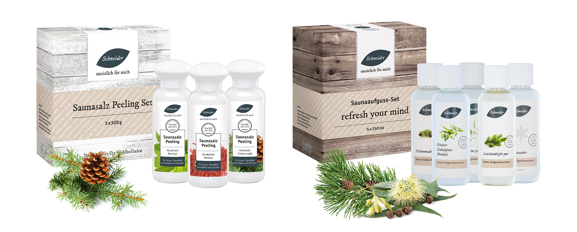
The packaging consists of a cylindrical container for bath salts and a rectangular carton for herbal oil. The cylindrical container is made of thick paperboard with a smooth finish, featuring a clear label that includes product information and branding. The rectangular carton is made of single-layer paperboard, displaying vibrant colors and graphics related to the product, with clean edges and folds. Both packaging types are designed for retail display.

The packaging is a flat, rectangular box made of smooth, single-layer paperboard. It features a clean design with a predominantly white exterior and subtle graphics. The edges are crisp and well-defined, indicating precise folding. The box is designed to hold three individual bottles of sauna salt peeling, which are visible through a cut-out window on the front. The surface has a matte finish with a slight texture, enhancing its tactile appeal. The top flap is designed for easy opening and closing, likely using tuck tabs.
About the Brand
Sauna Bedarf Schneider specializes in sauna-focused wellness products, targeting health-conscious consumers and commercial spa operators with a broad range of essences, salts, textiles, and body care items. Their packaging approach is rooted in the use of custom paperboard cartons, reflecting both premium quality and natural brand positioning.
The company’s packaging emphasizes clean, natural aesthetics through the use of earthy color palettes and botanical imagery. Product information and branding are consistently applied across all formats, supporting both in-store presentation and e-commerce shipping. Packaging structures are designed for both visual prominence on shelf and effective protection during transport.
Key Differentiator: A consistent focus on natural materials and wellness-driven visual identity, paired with robust packaging structures that balance retail display needs with sustainability considerations.
Design System
Visual Style
Typography is clean and modern, with bold sans-serif fonts for product names and legible body text. The color palette emphasizes natural, earthy tones—such as browns, greens, and whites—complemented by botanical or ingredient imagery for visual impact.
Brand Identity
Logo usage is prominent on all packaging, typically positioned on the front panel alongside clear product names. Iconography is minimal, favoring natural images (e.g., honeycomb, mint, pine cones) that reinforce product ingredients and brand message. Visual consistency is achieved through repeated color themes and structured layout across SKUs.
Packaging Design
Material choices favor single-layer paperboard for boxes and thick paperboard for cylindrical containers, balancing print quality, recyclability, and structural performance. Structural design prioritizes rectangular and cylindrical forms for efficient stacking, retail display, and shipping protection.
User Experience
Packaging supports the customer journey by delivering a premium unboxing experience—through high-quality visuals, tactile finishes, and clear product information—while ensuring easy openability and secure containment. The design philosophy reinforces trust and aligns with the brand’s wellness narrative at every touchpoint.
Company Metrics
Business insights for Sauna Bedarf Schneider based on available data
Market Positioning
Brand Values & Focus
Key Competitors
Target Market: Health-conscious B2C consumers, spa operators, and wellness centers in Germany and broader European markets seeking premium, natural sauna and wellness products.
Packaging Assessment
Overall Grade
Visual appeal and presentation quality
Packaging durability and protection
Eco-friendliness and recyclable materials
Cost efficiency and value for money
Packaging assessment for Sauna Bedarf Schneider based on industry standards and best practices
Frequently Asked Questions
What types of packaging does Sauna Bedarf Schneider primarily use?
The company utilizes single-layer paperboard cartons and cylindrical containers, optimized for retail display, product protection, and brand consistency across sauna and wellness products.
How does the packaging support the brand’s wellness positioning?
Earthy colors, natural imagery, and clear product information reinforce the brand’s focus on wellbeing, while packaging formats are chosen for both aesthetics and protective performance.
Are Sauna Bedarf Schneider’s packaging materials recyclable?
Most packaging solutions use recyclable paperboard materials, contributing to moderate sustainability performance, though specific details on post-consumer content or certifications are not provided.
Discover other Beauty & Fitness companies
Explore more companies in the beauty & fitness industry and their packaging strategies
Orris Paris
Beauty & Fitness
Orris Paris specializes in creating artisanal skincare products that combine potent botanical ingredients with modern cleansing rituals. The company emphasizes natural, holistic practices in its formulations.
Big Moustache
Beauty & Fitness
Big Moustache specializes in shaving and grooming products tailored for men, providing a hassle-free subscription service for razor blades and skincare essentials.
Pure Altitude
Beauty & Fitness
Pure Altitude specializes in high-quality beauty and skincare products that leverage the expertise of spa treatments to enhance daily routines. The brand offers a diverse range of products tailored for both facial and body care.