Sanoflore packaging
Sanoflore is a French skincare company specializing in organic, botanical-based solutions for face and body care. Their packaging strategy prioritizes eco-friendly materials, premium presentation, and strong brand alignment to reinforce their commitment to natural beauty.
Packaging Portfolio
Sanoflore utilizes a mix of rigid boxes for gift sets, single-layer paperboard cartons for individual retail products, and flexible cosmetic tubes for topical applications. Their packaging emphasizes recyclable materials, matte and glossy finishes, and the inclusion of cut-out windows and botanical illustrations to enhance visual engagement. The structural integrity of rigid boxes supports premium presentation and logistics safety, while lightweight cartons and tubes optimize shelf presence and consumer usability. Consistent use of earthy tones and organic motifs reinforces the brand’s commitment to sustainability and natural beauty.
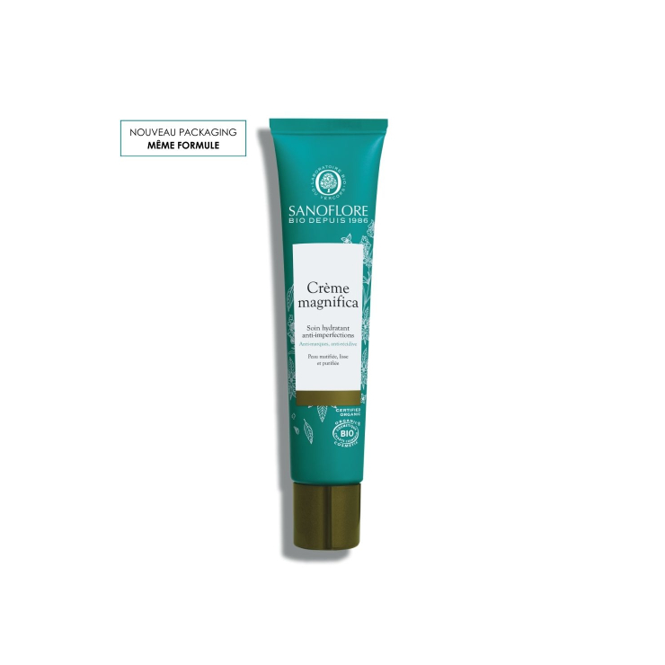
The packaging is a cylindrical tube with a smooth surface and a matte finish. It features a teal color with white and gold accents. The tube has a flip-top cap at the bottom for dispensing the product. The design includes botanical illustrations and text indicating the product name and brand.

The packaging is a rigid box designed for a gift set, featuring a sturdy construction with thick chipboard walls. The exterior is adorned with a colorful design that includes floral motifs and festive elements, indicative of a premium gift presentation. The box has a clean, flat surface with precise edges and folds, contributing to its luxury appearance. The interior is likely designed to securely hold the products, which are skincare items, suggesting a thoughtful arrangement.
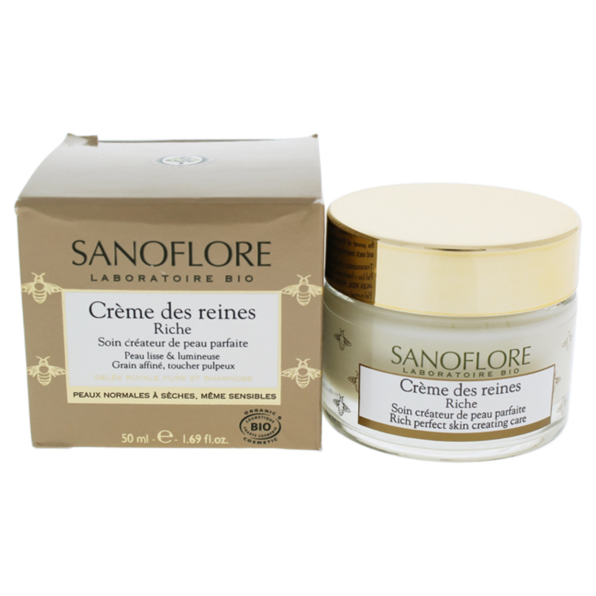
The packaging consists of a small, square folding carton that houses a round cosmetic jar. The carton is made of smooth, flat paperboard with clean edges and folds. It features a matte finish with a light beige color, adorned with green and gold accents. The front displays the product name and brand prominently in a stylish font, while the sides contain additional product information and certifications. The jar itself is clear with a white lid, showcasing the cream inside.

The packaging is a rigid box designed for retail display, featuring a colorful floral design. The box has a sturdy construction with thick walls, providing a premium feel. The front of the box has a cut-out window that showcases the products inside, which include a bottle and a tube. The box is predominantly white with vibrant pink, green, and blue floral patterns. The edges are clean and well-defined, and the box is likely covered in a glossy finish that enhances its visual appeal.

The packaging consists of a smooth, flat construction made from single-layer paperboard. It features clean, precise edges and folds, with a predominantly kraft brown color accented by vibrant graphics. The design includes floral motifs and branding elements that suggest a natural aesthetic. The packaging is lightweight and appears to be designed for retail display, with a glossy finish that enhances its visual appeal. The boxes are neatly folded and assembled, showcasing a professional appearance.

The packaging is a cylindrical tube made of flexible plastic, featuring a matte finish with a natural brown kraft appearance. The tube has a rounded top and a flip-top cap that allows for easy dispensing of the product. The surface is smooth with a slight texture that mimics paper, giving it an organic feel. The front of the tube prominently displays the product name and key features in white and teal text, with additional information printed in smaller fonts.
About the Brand
Sanoflore delivers botanical dermatology products with a focus on certified organic ingredients and sustainability. The company operates a direct-to-consumer e-commerce model targeting health-conscious consumers seeking natural skincare solutions.
With a medium-sized operational footprint and a product line addressing hydration, imperfections, and anti-aging, Sanoflore is recognized for its consistent use of recyclable materials and visually distinctive packaging. Their approach integrates scientific research with a holistic, eco-conscious ethos, ensuring packaging choices reinforce both functional protection and brand values.
Key Differentiator: Sanoflore’s unique positioning lies in its integration of certified organic ingredients with a visual and structural packaging system that consistently communicates natural, sustainable luxury.
Design System
Visual Style
The visual design incorporates serif and sans-serif typography for clarity and elegance, with a predominantly earthy color palette featuring greens, browns, whites, and botanical accent colors. Imagery and graphical elements focus on flora and natural motifs, lending a scientific-yet-artisanal aesthetic.
Brand Identity
Branding relies on prominent logo placement, consistent use of certification symbols, and clear product naming. Iconography is minimal but purposeful, supporting clean layouts and easy information scanning. Visual consistency is maintained through repeating patterns, color usage, and structured label hierarchies.
Packaging Design
Material choices prioritize recyclable paperboard, sturdy chipboard for rigid boxes, and minimal-plastic flexible tubes. Structural design emphasizes both product protection and retail appeal, with features such as cut-out display windows and premium finishes to support both function and perception.
User Experience
The design system aims to deliver a premium and reassuring unboxing journey, with tactile materials and layered graphics enhancing emotional connection. Packaging supports clear product recognition, ease of use, and a cohesive brand impression from purchase through post-use disposal.
Company Metrics
Business insights for Sanoflore based on available data
Market Positioning
Brand Values & Focus
Key Competitors
Target Market: Health-conscious consumers seeking organic, effective skincare solutions with a strong emphasis on environmental responsibility and clean beauty standards.
Packaging Assessment
Overall Grade
Visual appeal and presentation quality
Packaging durability and protection
Eco-friendliness and recyclable materials
Cost efficiency and value for money
Packaging assessment for Sanoflore based on industry standards and best practices
Frequently Asked Questions
What packaging formats are most common for Sanoflore products?
Sanoflore primarily uses rigid gift boxes, retail cartons, and cosmetic tubes, all designed to optimize both product protection and consumer unboxing experience while emphasizing eco-friendly materials.
How does Sanoflore address sustainability in its packaging?
Sanoflore employs recyclable paperboard, avoids unnecessary plastics where possible, and integrates organic certification and earthy aesthetics to reinforce its environmental commitments.
Does Sanoflore’s packaging impact the customer experience?
Yes, the packaging is designed to deliver a premium unboxing experience with clear brand cues and visual appeal, supporting positive emotional engagement and reinforcing product quality perceptions.
Discover other Beauty & Fitness companies
Explore more companies in the beauty & fitness industry and their packaging strategies
Pure Altitude
Beauty & Fitness
Pure Altitude specializes in high-quality beauty and skincare products that leverage the expertise of spa treatments to enhance daily routines. The brand offers a diverse range of products tailored for both facial and body care.
Orris Paris
Beauty & Fitness
Orris Paris specializes in creating artisanal skincare products that combine potent botanical ingredients with modern cleansing rituals. The company emphasizes natural, holistic practices in its formulations.
Big Moustache
Beauty & Fitness
Big Moustache specializes in shaving and grooming products tailored for men, providing a hassle-free subscription service for razor blades and skincare essentials.