Royal Herbs packaging
Royal Herbs delivers a diverse range of herbal and natural products for both human and pet consumption via a dedicated e-commerce platform. Their packaging strategy centers on retail-ready carton boxes with strong brand emphasis, prioritizing premium shelf appeal and product integrity.
Packaging Portfolio
Royal Herbs employs a portfolio of folding carton boxes constructed from single-layer paperboard, consistently finished with glossy or matte coatings for enhanced shelf appeal. These cartons are structurally robust for lightweight contents and feature vibrant color palettes, bilingual text, and prominent branding to optimize retail display. The design prioritizes clear product identification and efficient stacking for logistics, with material choices that balance presentation and basic sustainability. The absence of complex multi-material packaging streamlines both production and post-consumer recycling processes.

The packaging consists of two retail cartons made of smooth, single-layer paperboard. The boxes feature clean, precise edges and folds, with a predominantly red color scheme and decorative graphics. The front of each box displays illustrations of individuals, along with the product name 'BREATHE' in both English and Arabic. The design includes a combination of matte and glossy finishes, enhancing visual appeal. The boxes are designed for retail display, showcasing product information clearly.

The packaging consists of two retail cartons, both made from a smooth, single-layer paperboard. The cartons have clean, precise edges and folds, indicative of a folding carton design. The surface features a glossy finish with vibrant colors, primarily turquoise and white, and includes illustrations and text. The design is visually appealing, with a playful illustration of a character and a clear brand logo prominently displayed on the front. The cartons are rectangular in shape, with a standard height and width suitable for retail display.

The packaging consists of two retail cartons, both made of smooth, single-layer paperboard. The cartons have clean, precise edges and folds, with a colorful design featuring illustrations of figures in motion. The primary colors are warm tones of orange and yellow, with contrasting dark brown elements. Each carton has a glossy finish, enhancing the visual appeal. The front displays the brand name 'ROYAL' prominently, along with product information and graphics that suggest an energizing theme.
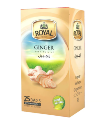
The packaging is a rectangular folding carton made from a single layer of paperboard. It features a smooth, flat construction without any visible fluted layers. The exterior is predominantly a light beige color with a glossy finish, enhancing its visual appeal. The front displays a large, vibrant image of ginger roots, complemented by a green landscape background. The brand name 'ROYAL HERBS' is prominently featured at the top in bold, gold lettering, while the product name 'GINGER' is displayed in a smaller font below. The sides of the carton include additional product information and graphics, maintaining a consistent design theme.

The packaging consists of two folding cartons with a smooth, flat construction. The boxes are primarily purple with gold accents and feature a glossy finish. The front of each box has a prominent logo and product name, with additional text in Arabic. The edges are clean and precise, indicating a well-constructed design typical of retail packaging.

The packaging is a tall, rectangular box with smooth, flat construction. It features a vibrant purple color with a glossy finish. The front displays the brand name 'ROYAL' prominently at the top in gold lettering, along with the product name 'WELLSPRING DREAM' in white text. The box has clean, precise edges and folds, indicating a well-constructed folding carton. There are decorative elements, including a stylized image of a tied envelope at the bottom, enhancing its retail appeal. The overall design is sleek and modern, suitable for a premium product.
About the Brand
Royal Herbs specializes in the direct-to-consumer sale of dried herbs, natural foods, and pet supplies, with a pronounced focus on quality and organic sourcing. The company's packaging choices reinforce a premium perception, leveraging visually distinctive carton designs to align with health-conscious market trends.
Operating from Poland and serving international markets, Royal Herbs utilizes folding carton packaging with high-gloss finishes and vivid graphics to convey product quality and brand reliability. Their packaging consistently incorporates brand elements, bilingual product information, and visually engaging motifs to appeal to both local and global consumers. The uniform use of paperboard cartons optimizes handling, shelf presence, and unboxing satisfaction while supporting efficient logistics.
Key Differentiator: Royal Herbs differentiates through an integrated packaging approach that combines elevated retail aesthetics with strategic brand messaging, catering to both health-focused individuals and pet owners seeking trustworthy, natural products.
Design System
Visual Style
Royal Herbs utilizes clean, sans-serif and decorative serif typefaces paired with a high-contrast color palette including purples, reds, turquoise, and gold accents. The aesthetic approach is modern, with emphasis on vibrancy and clarity to attract attention in health and wellness retail environments.
Brand Identity
Branding is reinforced through consistent use of the 'ROYAL' or 'ROYAL HERBS' logo, strong color blocking, and recurring iconography such as botanical illustrations and bilingual product names. Visual consistency is maintained across all packaging SKUs, supporting instant recognition and cohesive brand presentation.
Packaging Design
Packaging is primarily single-layer folding carton, focusing on cost-effective yet premium-feeling substrates. Structural design favors standard rectangular forms for efficient packing and display, with visual differentiation achieved via surface graphics and finish selection. The philosophy balances high-impact graphics with operational simplicity.
User Experience
The design supports the customer journey by providing intuitive visual cues, clear product differentiation, and a tactile unboxing experience that reinforces perceptions of quality. Bilingual text and clear weight/pricing information facilitate international sales and purchasing confidence, while the consistent branding aids in building long-term customer trust.
Company Metrics
Business insights for Royal Herbs based on available data
Market Positioning
Brand Values & Focus
Key Competitors
Target Market: Health-conscious consumers, pet owners, and international buyers seeking natural, organic, and herbal product solutions.
Packaging Assessment
Overall Grade
Visual appeal and presentation quality
Packaging durability and protection
Eco-friendliness and recyclable materials
Cost efficiency and value for money
Packaging assessment for Royal Herbs based on industry standards and best practices
Frequently Asked Questions
What types of packaging does Royal Herbs use for its products?
Royal Herbs primarily utilizes retail carton boxes made from single-layer paperboard with glossy or matte finishes. These cartons are designed for visual impact, brand consistency, and effective product protection during distribution.
How does Royal Herbs' packaging contribute to product safety during shipping?
The folding carton structure provides moderate protection for lightweight herbal products, reducing risk of surface damage. However, for high-impact logistics scenarios, additional secondary packaging may be required to ensure integrity.
Is Royal Herbs' packaging environmentally sustainable?
Royal Herbs leverages recyclable paperboard materials for its cartons, which supports basic sustainability objectives. While the use of glossy finishes can impact recyclability, the overall material choice aligns with industry efforts to reduce environmental footprint.
Discover other Food & Drink companies
Explore more companies in the food & drink industry and their packaging strategies
Thés de la Pagode
Food & Drink
Thés de la Pagode is a French company specializing in organic teas and infusions, focusing on health and well-being. Established in 1987, they prioritize sustainable practices and high-quality ingredients sourced through fair trade.
kerex - terre exotique
Food & Drink
Kerex - Terre Exotique specializes in the international trade of gourmet food and drink products, offering a unique selection of spices and culinary ingredients.
Terres de Café
Food & Drink
Terres de Café is a specialty coffee retailer based in Paris, France, known for its commitment to sustainability and high-quality coffee sourcing.