Redroaster Coffee packaging
Redroaster Coffee is a Brighton-based coffee roaster and restaurant recognized for its organic menu, direct farm sourcing, and B Corp-certified ethical practices. Their packaging strategy reflects a commitment to premium presentation and sustainability, utilizing branded, visually appealing flexible pouches and cartons designed for both retail and e-commerce distribution.
Packaging Portfolio
Redroaster Coffee’s packaging portfolio predominantly features flexible stand-up pouches with flat bottoms for coffee and related products, designed for optimal shelf presentation and product protection. The materials are primarily multi-layer flexible films and high-grade paperboard for cartons and cups, balancing visual appeal with product freshness. Resealable closures enhance functionality, while the structural design supports e-commerce and in-store logistics. Consistent use of bold botanical graphics and clear branding elements creates a unified, premium experience across all packaging formats.
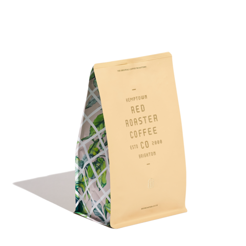
The packaging is a stand-up pouch made of flexible material, featuring a smooth surface with a glossy finish. The front displays a vibrant design with green and white graphics, likely representing coffee leaves or a related theme, and the brand name 'RED ROASTER CO' prominently featured in a modern font. The back of the pouch is likely plain or has minimal information, typical for coffee bags.
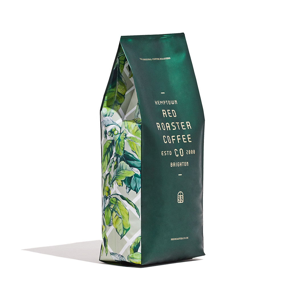
The packaging is a stand-up pouch with a distinctive shape, featuring a flat bottom that allows it to stand upright. The front displays a vibrant green background with a botanical design of coffee leaves, while the back has a more muted green tone. The top is slightly tapered, with a sealed closure that is typical for flexible pouches. The overall appearance is modern and appealing, aimed at attracting coffee enthusiasts.
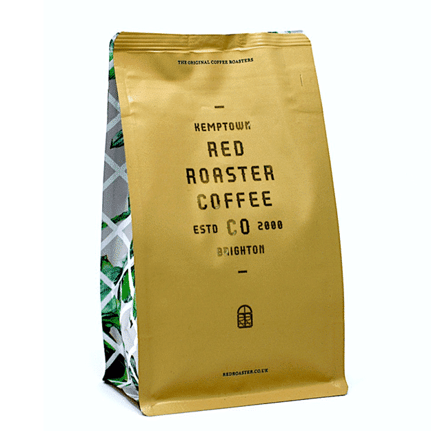
The packaging is a stand-up pouch with a flat bottom, allowing it to stand upright. It features a glossy finish with a metallic gold color dominating the front. The design includes a white geometric pattern on the sides, adding visual interest. The top of the bag has a resealable zipper closure, ensuring freshness. The front displays the brand name prominently in bold black letters, along with product information and a logo.

The packaging consists of a stand-up pouch with a flat bottom, allowing it to sit upright. The exterior features a smooth, glossy finish with vibrant green botanical illustrations on the sides. The front displays the brand name 'RED ROASTER COFFEE' prominently in a modern, sans-serif font, with additional text indicating the location 'KEMPTOWN' and the establishment year 'ESTD 2000'. The overall color scheme is predominantly white with green accents, creating a fresh and inviting appearance.
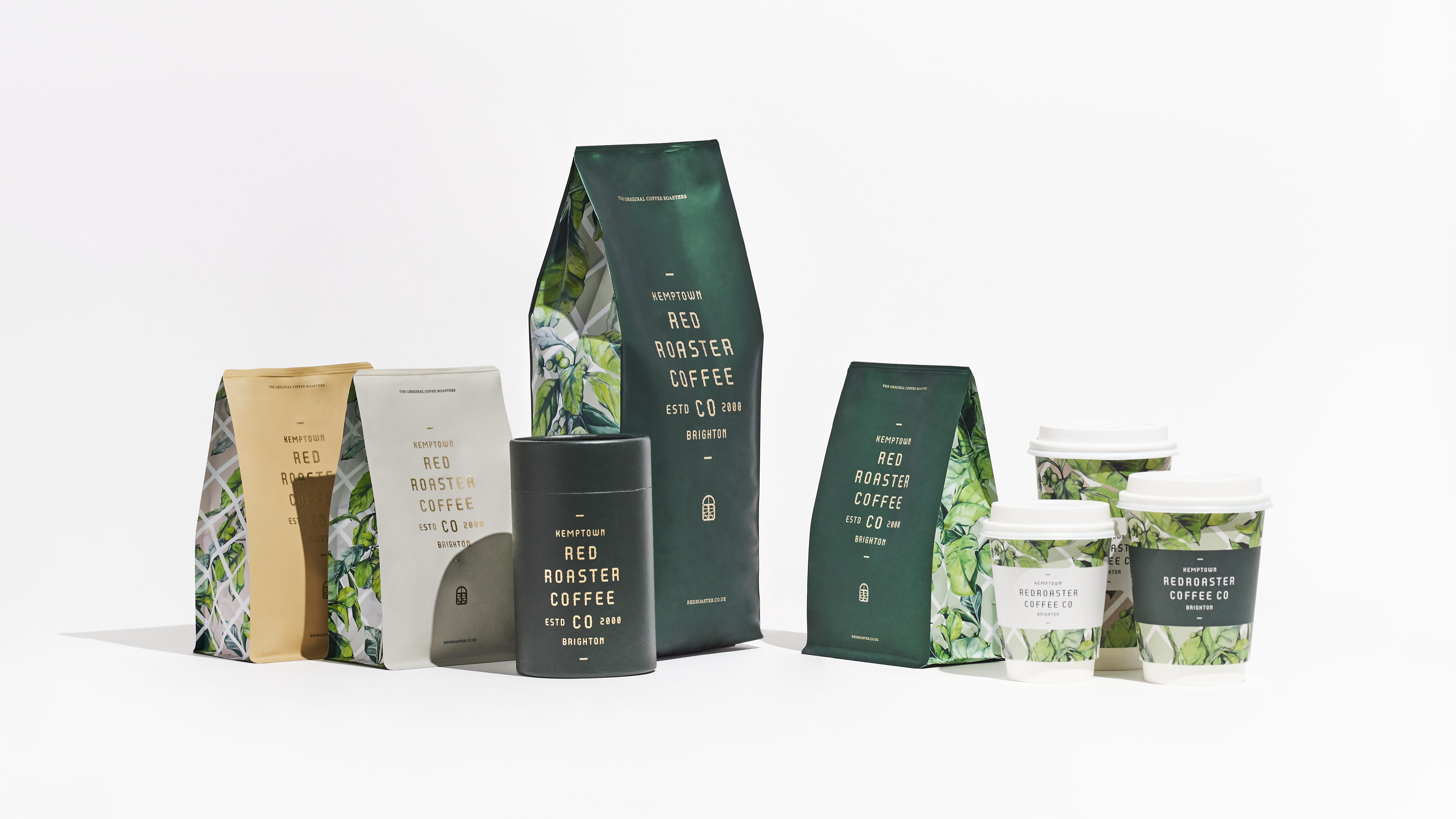
The image features a variety of coffee packaging and cups. The coffee bags are made from a smooth, single-layer paperboard with a matte finish, showcasing vibrant graphics and colors. The bags have clean, precise edges and folds, with some featuring a resealable top. The cups are made of paperboard with a white exterior and a printed design, likely featuring a protective coating. The overall presentation is clean and modern, emphasizing the product's premium quality.
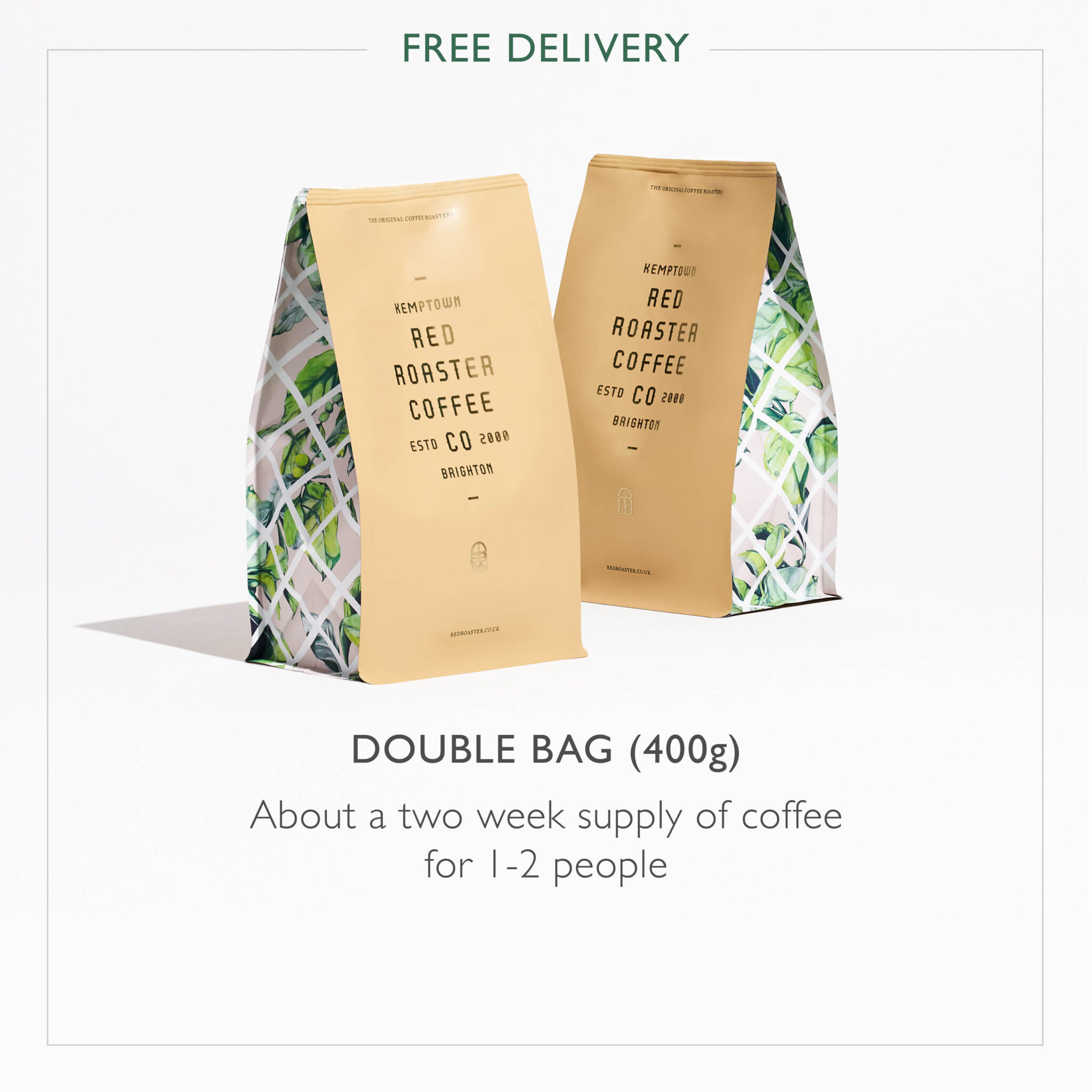
The packaging consists of two bags with a sleek, modern design. Each bag features a predominantly gold exterior with a matte finish, complemented by a vibrant green and white botanical pattern at the bottom. The bags are upright, showcasing a flat bottom that allows them to stand. The top of each bag is slightly crimped, indicating a sealed closure. The text is prominently displayed in bold red font, with the brand name 'RED ROASTER COFFEE' and additional product information beneath. The overall appearance is clean and contemporary, appealing to a premium coffee market.
About the Brand
Redroaster Coffee specializes in freshly roasted coffee and a diverse food menu, operating both a local restaurant and an online coffee shop with UK-wide delivery. The company emphasizes sustainable sourcing and ethical practices, with packaging that communicates brand values through modern design and clear visual identity.
The brand adopts flexible packaging formats—primarily stand-up pouches and carton boxes—optimized for freshness, shelf appeal, and logistical efficiency. Their packaging features high-impact botanical graphics and consistent branding, contributing to a cohesive unboxing experience. As a Certified B Corp with a medium-sized team, Redroaster aligns packaging decisions with its broader mission of social and environmental responsibility.
Key Differentiator: Redroaster's unique value lies in its integration of sustainability credentials, direct farm relationships, and a consistent, contemporary packaging aesthetic that reinforces its ethical and premium market positioning.
Design System
Visual Style
Modern, clean typography with a focus on sans-serif fonts; a color palette dominated by white, green, gold, and botanical motifs; balanced use of matte and glossy finishes for visual contrast and premium appeal.
Brand Identity
Prominent display of the Redroaster name, logo, and location; consistent application of brand colors and botanical iconography; visual hierarchy reinforces brand recognition and product differentiation.
Packaging Design
Preference for flexible pouches and paperboard cartons with resealable or secure closures; emphasis on fresh-keeping, tactile finishes, and visual shelf impact; structural design supports both retail and e-commerce channels.
User Experience
Packaging is designed to enhance the customer journey, from visually engaging shelf presence to a tactile, premium unboxing experience. Clear labeling and cohesive visual cues support brand storytelling and reinforce trust in product quality and sourcing.
Company Metrics
Business insights for Redroaster Coffee based on available data
Market Positioning
Brand Values & Focus
Key Competitors
Target Market: Environmentally conscious coffee consumers, local Brighton diners, and UK-wide specialty coffee buyers seeking ethical sourcing and premium experiences.
Packaging Assessment
Overall Grade
Visual appeal and presentation quality
Packaging durability and protection
Eco-friendliness and recyclable materials
Cost efficiency and value for money
Packaging assessment for Redroaster Coffee based on industry standards and best practices
Frequently Asked Questions
What types of packaging does Redroaster Coffee use for its products?
Redroaster Coffee primarily utilizes flexible stand-up pouches and carton boxes for coffee and related products. These formats are selected for their freshness retention, shelf presence, and suitability for direct-to-consumer e-commerce delivery.
How does Redroaster address sustainability in its packaging strategy?
Redroaster incorporates recyclable materials and emphasizes eco-friendly design aligned with its B Corp status, but the specific proportion of renewable or compostable materials is not fully disclosed.
How does the packaging design reinforce Redroaster’s brand identity?
Packaging consistently features the Redroaster name, location, and establishment year, with green and gold botanical motifs and modern typography, ensuring strong brand recognition across all touchpoints.
Discover other Food & Drink companies
Explore more companies in the food & drink industry and their packaging strategies
Teegschwendner GmbH
Food & Drink
Teegschwendner GmbH is a specialty tea company based in Germany, offering a wide selection of high-quality teas and tea-related accessories. They focus on providing unique tea experiences through carefully sourced and curated products.
PrepMyMeal
Food & Drink
PrepMyMeal is a food production company specializing in high-protein meal delivery services. They offer a variety of natural, nutritious meals designed for fitness enthusiasts and those seeking convenience in meal preparation.
kerex - terre exotique
Food & Drink
Kerex - Terre Exotique specializes in the international trade of gourmet food and drink products, offering a unique selection of spices and culinary ingredients.