Ranna Indian Restaurant & Takeaway packaging
Ranna Indian Restaurant & Takeaway is a London-based multi-branch eatery specializing in authentic Indian cuisine for both dine-in and takeaway markets. Their packaging strategy emphasizes branded flexible pouches and carton boxes, designed to maintain product quality and enhance customer convenience.
Packaging Portfolio
Ranna’s packaging portfolio consists primarily of single-layer paperboard carton boxes and multi-layer flexible pouches. Carton boxes are used for structured menu items and offer high-impact branding with matte and glossy finishes, while flexible pouches provide moisture barriers and resealability for fresh or prepared foods. Both formats demonstrate consistent brand identity through logo placement and color schemes, supporting food safety and visual merchandising standards. The packaging is optimized for takeaway, with a balance between durability and cost efficiency.
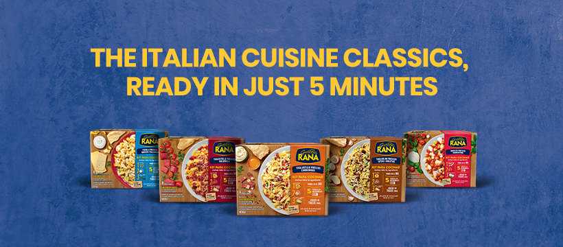
The packaging consists of several rectangular boxes arranged in a row, each featuring a smooth, flat construction typical of single-layer paperboard. The boxes are brightly colored with distinct graphics and product images on the front. The edges are clean and precise, indicating a well-constructed folding carton design. Each box has a glossy finish that enhances visual appeal.
.png)
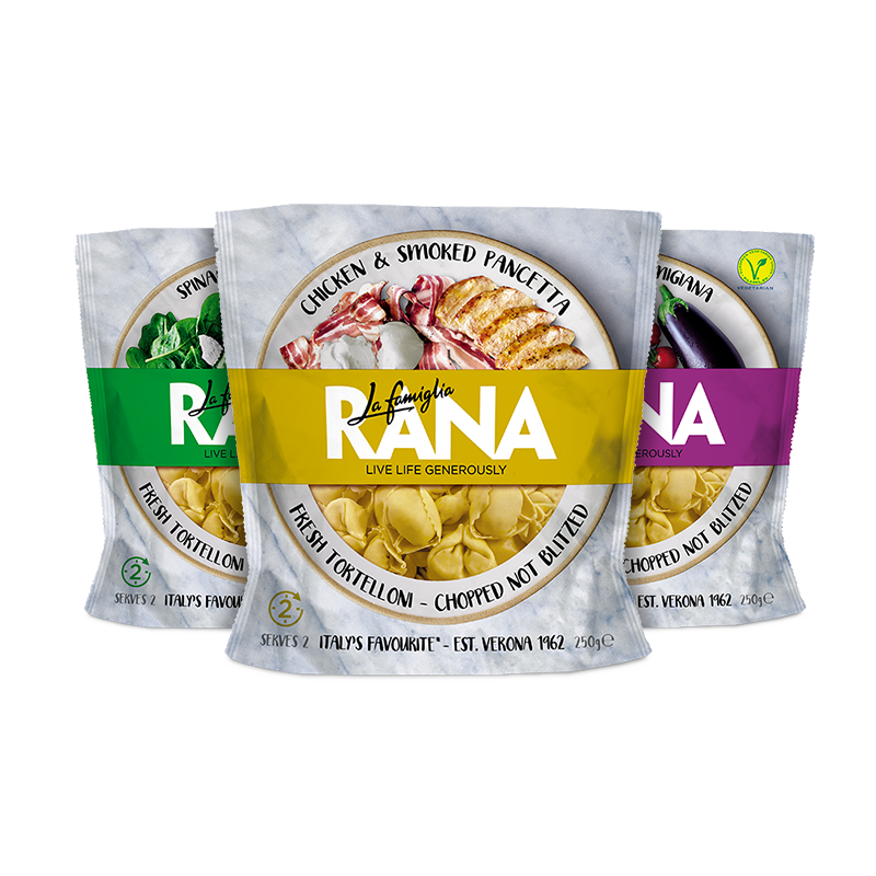
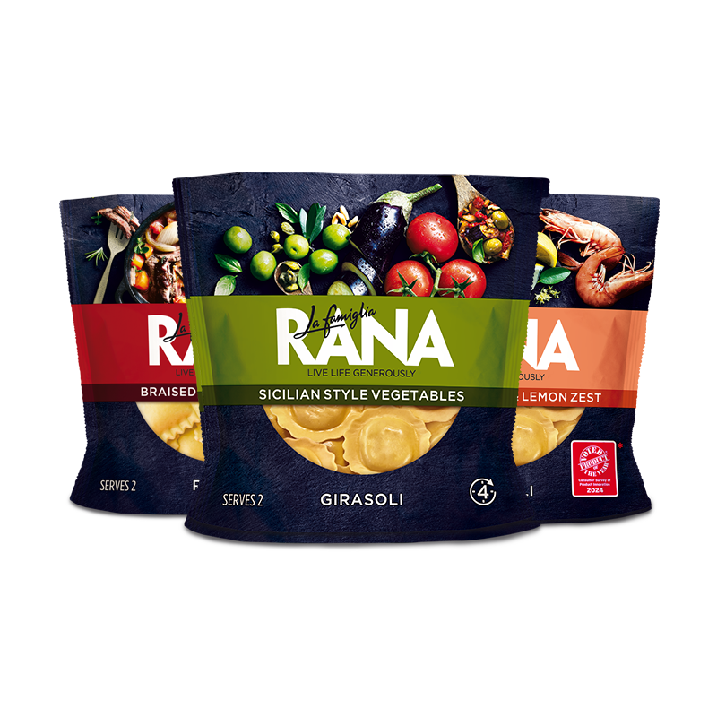
The packaging consists of three flexible pouches, each containing a different type of tortellini. The pouches are made of a thin, flexible material that allows for easy handling and storage. Each pouch features a clear window at the front, showcasing the product inside. The top of the pouches is sealed with a heat seal, and they have a resealable zipper for convenience. The design includes vibrant colors and images of the tortellini, enhancing visual appeal.
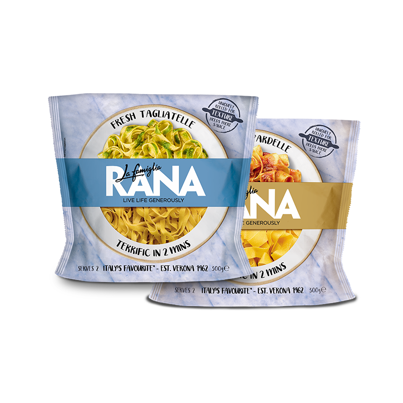
The packaging consists of two pouches of fresh pasta, featuring a transparent front showcasing the product inside. The pouches are made from a flexible material, likely a multi-layer film that provides moisture barrier properties. The pouches have a smooth surface with a glossy finish, enhancing the visual appeal. The design includes vibrant colors, with one pouch in a yellowish tone and the other in a cream color, both adorned with a circular logo and product information.
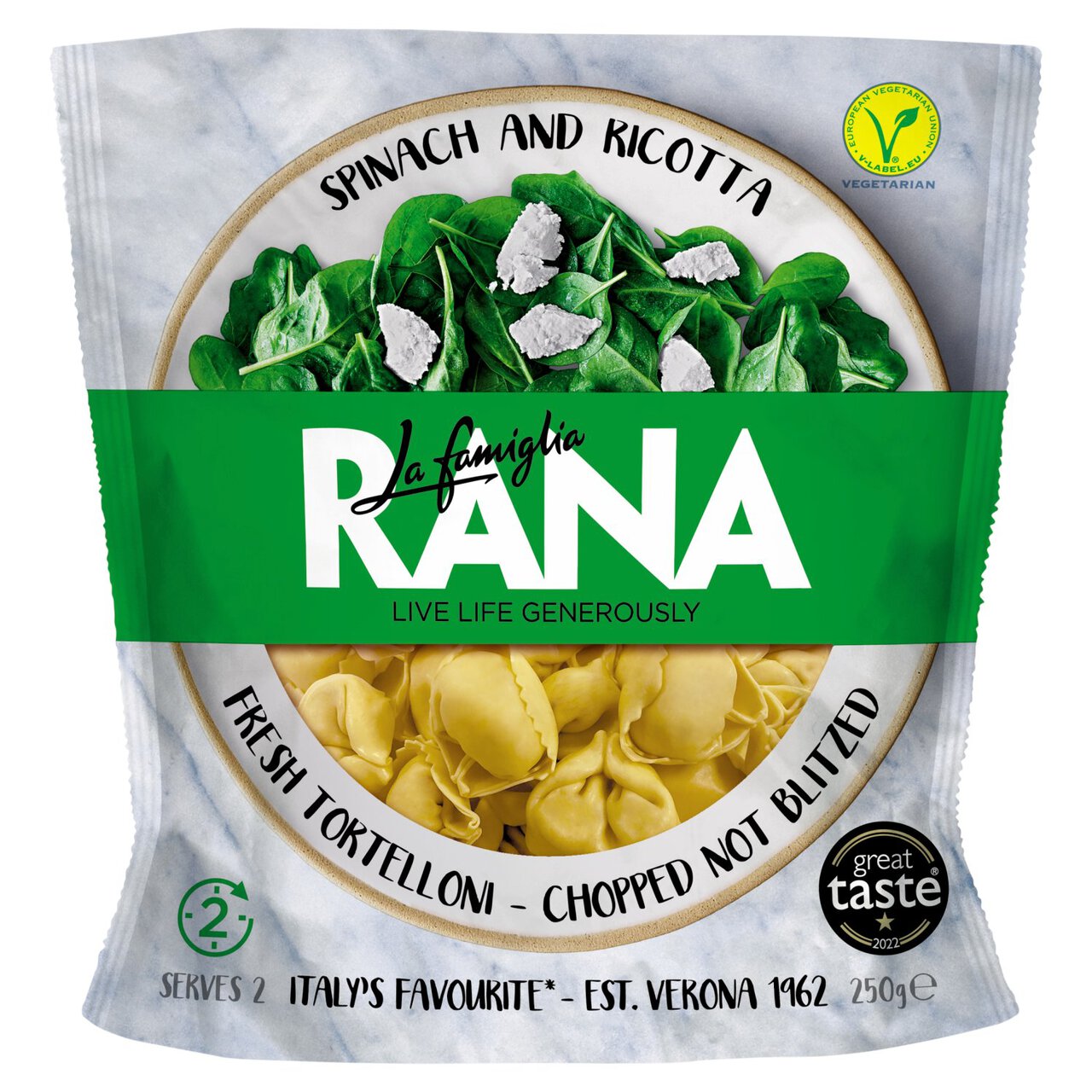
The packaging is a flexible pouch made from a thin, multi-layered material. It features a clear window displaying the product inside, with a vibrant green and yellow color scheme. The front showcases images of spinach and ricotta tortellini, along with the brand name 'La famiglia RANA' prominently displayed in a bold font. The top of the pouch has a resealable feature, allowing for easy opening and closing. The overall shape is rectangular with a slight taper towards the bottom.
The packaging consists of a series of flat, single-layer paperboard boxes, each featuring vibrant colors and images of the product. The boxes are designed to stand upright with a smooth, flat construction and clean edges. Each box has a distinct color scheme corresponding to the product inside, with a matte finish that gives a premium feel. The front of each box prominently displays the brand name 'RANA' in bold, white lettering, along with images of the ingredients.
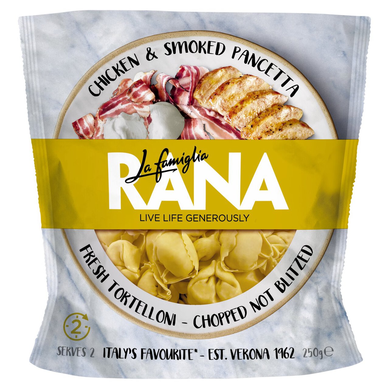
The packaging is a flexible pouch made from a multi-layer film that is designed to contain fresh tortelloni. It features a glossy surface with a photographic representation of the product, including images of chicken, smoked pancetta, and the tortelloni itself. The top of the pouch has a bright yellow band with the brand name 'RANA' prominently displayed, along with the tagline 'LIVE LIFE GENEROUSLY'. The overall design is colorful and appealing, aimed at attracting consumers in a retail environment.
About the Brand
Ranna operates across London, serving a diverse array of Indian dishes with a focus on both on-premise and takeaway dining. Packaging choices reflect their commitment to customer satisfaction and operational efficiency, utilizing industry-standard food-safe materials tailored for convenience and visual impact.
The brand’s packaging approach centers on flexible pouches and paperboard cartons, both of which offer clear branding, product visibility, and practical storage for a wide menu range. Design elements are consistent with modern food retail standards, prioritizing shelf presence, logistics safety, and ease of use for takeaway scenarios. Ranna’s online ordering and community engagement further demand reliable, visually distinctive packaging solutions that support their business model.
Key Differentiator: Ranna’s unique integration of branded flexible packaging with a multi-channel service model ensures a cohesive customer experience across dine-in, takeaway, and delivery.
Design System
Visual Style
Typography is bold and modern, utilizing sans-serif fonts for clarity and legibility. The color palette includes vibrant hues matched to menu items (e.g., yellows and greens), with accent colors for differentiation. The overall aesthetic is clean, approachable, and designed to appeal in both retail and delivery contexts.
Brand Identity
Logo usage is prominent on all packaging surfaces, with consistent placement and sizing to enhance recall. Iconography features ingredient visuals and classic Indian motifs, supporting a cohesive visual system across product lines. Visual consistency is maintained through repeated use of color blocks and standardized layouts.
Packaging Design
Material choices prioritize food safety and shelf life: paperboard for rigid structure and flexible films for barrier protection and ease of handling. Structural design emphasizes stackability, resealability, and visibility of contents, reflecting best practices in modern food packaging.
User Experience
Packaging design supports the customer journey through easy handling, clear product identification, and resealable features for leftovers. The unboxing experience is visually engaging, reinforcing brand values and ensuring a positive first impression, whether at home or on-premise.
Company Metrics
Business insights for Ranna Indian Restaurant & Takeaway based on available data
Market Positioning
Brand Values & Focus
Key Competitors
Target Market: Urban consumers in London seeking authentic Indian cuisine, including both dine-in and takeaway customers with an emphasis on convenience and quality.
Packaging Assessment
Overall Grade
Visual appeal and presentation quality
Packaging durability and protection
Eco-friendliness and recyclable materials
Cost efficiency and value for money
Packaging assessment for Ranna Indian Restaurant & Takeaway based on industry standards and best practices
Frequently Asked Questions
What types of packaging does Ranna Indian Restaurant & Takeaway use?
Ranna utilizes a combination of flexible pouches and carton boxes, both featuring clear branding and optimized for food safety, product visibility, and logistics efficiency.
How does Ranna address packaging sustainability?
Ranna’s primary packaging materials are paperboard and multi-layer flexible films, with some recyclable components. However, industry-standard flexible packaging may limit overall recyclability.
What is the primary focus of Ranna’s packaging design?
The design emphasizes strong brand presence, product differentiation, and customer convenience, supporting both takeaway and dine-in service models.
Discover other Food & Drink companies
Explore more companies in the food & drink industry and their packaging strategies
Thés de la Pagode
Food & Drink
Thés de la Pagode is a French company specializing in organic teas and infusions, focusing on health and well-being. Established in 1987, they prioritize sustainable practices and high-quality ingredients sourced through fair trade.
Terres de Café
Food & Drink
Terres de Café is a specialty coffee retailer based in Paris, France, known for its commitment to sustainability and high-quality coffee sourcing.
PrepMyMeal
Food & Drink
PrepMyMeal is a food production company specializing in high-protein meal delivery services. They offer a variety of natural, nutritious meals designed for fitness enthusiasts and those seeking convenience in meal preparation.