PureSpice GmbH packaging
PureSpice GmbH specializes in liquid spice extracts and culinary solutions, utilizing a diverse range of packaging formats to ensure product freshness and shelf stability. Their packaging strategy emphasizes both consumer convenience and strong brand visibility.
Packaging Portfolio
PureSpice GmbH's packaging system incorporates rigid PET or glass containers for liquid extracts, flexible stand-up pouches for solid spices, and single-layer paperboard cartons for spice mixes and gift bundles. The diversity in materials—ranging from recyclable plastics to paperboard—supports extended shelf life, portion control, and product differentiation. Packaging formats are designed to optimize logistics, with resealable closures and tamper-evident features enhancing both usability and security. Branding is consistently maintained across all formats, maximizing shelf impact and consumer recognition.

The packaging is a stand-up pouch with a flat bottom that allows it to stand upright. The front features a vibrant red background with an illustration of a traditional market scene, prominently displaying the product name 'CARDAMOM' in bold white lettering. The back of the pouch includes detailed product information and nutritional facts. The edges are sealed, and the top has a resealable zipper closure.

The packaging consists of three bags of varying sizes, all featuring a similar design. Each bag has a flat bottom, allowing it to stand upright. The bags are made from a flexible material, likely a type of plastic or laminated paper, with a glossy finish. The front of each bag prominently displays the product name 'CARDAMOM' in bold, colorful text, with additional details about the product. The background features a decorative design that includes traditional motifs and colors, enhancing the visual appeal.

The packaging is a retail carton box designed for spice mix powder. It features a smooth, flat construction indicative of single-layer paperboard. The box has clean, precise edges and folds, with a vibrant red exterior. The front displays a prominent logo and product name, while the sides contain additional information. The box appears lightweight and is intended for retail display.
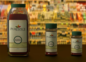
The image features a collection of spice containers, including a larger bottle and two smaller jars. The containers have a smooth, cylindrical shape with a glossy finish. The larger bottle has a wider base and a narrower neck, topped with a green lid. The smaller jars are uniform in shape but vary in height, each also featuring a green lid. The labels on the containers are predominantly white with green accents, showcasing the product name 'Adobo' in a clear, readable font. The background is blurred, suggesting a retail environment filled with various spice products.
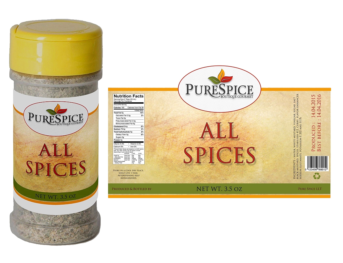
The packaging consists of a cylindrical container with a clear plastic body and a yellow plastic cap. The label wraps around the container, featuring a textured background that resembles parchment. The front displays the product name 'ALL SPICES' in bold, prominent font, with the brand name 'PURESPICE' above it. The label includes nutritional information on the side, printed in a clear, legible format.
About the Brand
PureSpice GmbH, based in Altenberge, Germany, delivers innovative liquid spice products tailored for home cooks and culinary enthusiasts. Their direct-to-consumer model leverages natural ingredients and efficient packaging to streamline the seasoning process.
With a focus on high-yield spice extracts, PureSpice GmbH integrates packaging solutions that balance visual branding, portion control, and logistical efficiency. Product formats include rigid containers, flexible stand-up pouches, and retail carton boxes—each selected for its suitability in maintaining product integrity and supporting the company's modern culinary approach.
Key Differentiator: The brand distinguishes itself through its exclusive focus on liquid spice extracts, high serving yields, and a packaging system designed for freshness, convenience, and strong shelf presence.
Design System
Visual Style
The visual design employs bold, modern typography with high legibility, complemented by a vibrant color palette of greens, reds, and yellows to signal freshness and flavor diversity. Imagery and background patterns often reference global culinary themes.
Brand Identity
Logo placement is prominent on all packaging, typically positioned above product names for immediate recognition. Iconography includes ingredient illustrations and market scenes, while visual consistency is maintained through recurring color schemes and font styles.
Packaging Design
Material choices prioritize product stability and shelf presence, with rigid plastic or glass for liquid extracts, flexible laminated pouches for spices, and lightweight, printable paperboard for retail cartons. Structural simplicity is favored for cost efficiency and ease of display, with resealable and tamper-evident features where appropriate.
User Experience
Design decisions focus on facilitating intuitive use—such as easy-pour spouts, resealable zippers, and clear labeling—while reinforcing the brand’s natural, premium positioning. The unboxing experience is enhanced by high-contrast graphics and organized product presentation, supporting both gifting and everyday use.
Company Metrics
Business insights for PureSpice GmbH based on available data
Market Positioning
Brand Values & Focus
Key Competitors
Target Market: Health-conscious home cooks, culinary enthusiasts, and gift buyers seeking premium, convenient spice solutions in Germany and broader European markets.
Packaging Assessment
Overall Grade
Visual appeal and presentation quality
Packaging durability and protection
Eco-friendliness and recyclable materials
Cost efficiency and value for money
Packaging assessment for PureSpice GmbH based on industry standards and best practices
Frequently Asked Questions
What types of packaging does PureSpice GmbH use for its spice products?
PureSpice GmbH employs a variety of packaging solutions, including rigid bottles and jars, flexible stand-up pouches, and retail carton boxes. Each format is chosen based on product requirements for preservation, portioning, and retail display.
How does PureSpice address sustainability in its packaging?
The company utilizes recyclable materials such as paperboard cartons and resealable flexible pouches. While their approach demonstrates moderate environmental consideration, there is room for further improvement in material sourcing and end-of-life recyclability.
What role does packaging play in the PureSpice customer experience?
Packaging is integral to PureSpice’s value proposition—ensuring product freshness, ease of use, and enhancing the unboxing experience with clear branding and practical design.
Discover other Food & Drink companies
Explore more companies in the food & drink industry and their packaging strategies
PrepMyMeal
Food & Drink
PrepMyMeal is a food production company specializing in high-protein meal delivery services. They offer a variety of natural, nutritious meals designed for fitness enthusiasts and those seeking convenience in meal preparation.
kerex - terre exotique
Food & Drink
Kerex - Terre Exotique specializes in the international trade of gourmet food and drink products, offering a unique selection of spices and culinary ingredients.
Teegschwendner GmbH
Food & Drink
Teegschwendner GmbH is a specialty tea company based in Germany, offering a wide selection of high-quality teas and tea-related accessories. They focus on providing unique tea experiences through carefully sourced and curated products.