Pescaderías Coruñesas packaging
Pescaderías Coruñesas is a Spanish seafood retailer specializing in high-quality fish, shellfish, and prepared seafood products. Their packaging strategy centers on rigid and carton boxes with premium finishes, emphasizing product protection, brand alignment, and upscale presentation.
Packaging Portfolio
Pescaderías Coruñesas employs a dual-structure packaging approach, utilizing luxury rigid boxes for gift sets and high-quality folding carton boxes for retail seafood products such as sushi and tartar. Rigid boxes feature thick-walled construction, matte finishes, and interior dividers for multiproduct assortments, supporting both product protection and premium positioning. Carton boxes are designed with clear plastic windows for product visibility and brand labels for retail shelf appeal. Across all formats, color palettes skew dark with metallic accents to reinforce a high-end brand image, while protective inserts and clean manufacturing suggest a focus on logistics safety and unboxing impact.
The packaging consists of a sturdy, rectangular box with a premium appearance. The box is primarily black with a matte finish, featuring a decorative design on the sides. The top of the box has a clean, smooth surface with a subtle sheen, while the interior is likely designed to hold various products securely. The box includes a handle for easy carrying, enhancing its functionality. The packaging is well-constructed, indicating durability and a high-quality presentation.

The packaging is a flat, rectangular box made of single-layer paperboard, featuring a smooth, matte black exterior. The front has a clear plastic window that showcases the sushi inside, allowing visibility of the product. The edges are clean and precise, indicating a well-constructed folding carton. The box has a minimalistic design with a small label on the bottom providing product details.
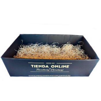
The packaging is a rectangular folding carton with a smooth, flat construction. It features a dark exterior, likely a matte finish, and is designed to hold contents securely. The interior is filled with shredded paper for cushioning. The edges are clean and precise, indicating a well-manufactured product. The overall shape is box-like, with no visible flaps or tabs protruding.
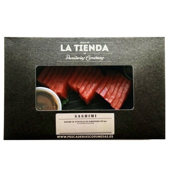
The packaging is a flat, rectangular box made of single-layer paperboard. It features a smooth, matte black exterior with a subtle texture. The box has a clear plastic window on the top, allowing visibility of the sashimi inside. The edges are clean and precise, with a fold-over design that creates a neat appearance. The front displays product information and branding elements in white text, contrasting sharply with the black background.
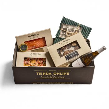
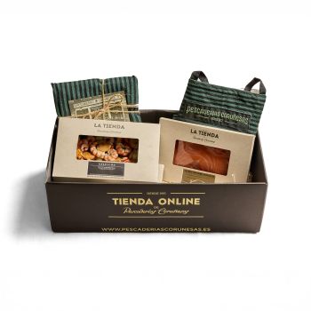
The packaging consists of a sturdy, thick-walled box that holds various seafood products. The box is rectangular with a luxury appearance, featuring a matte finish. Inside, there are compartments for different items, including seafood and a bottle of wine. The exterior is predominantly dark with gold lettering.
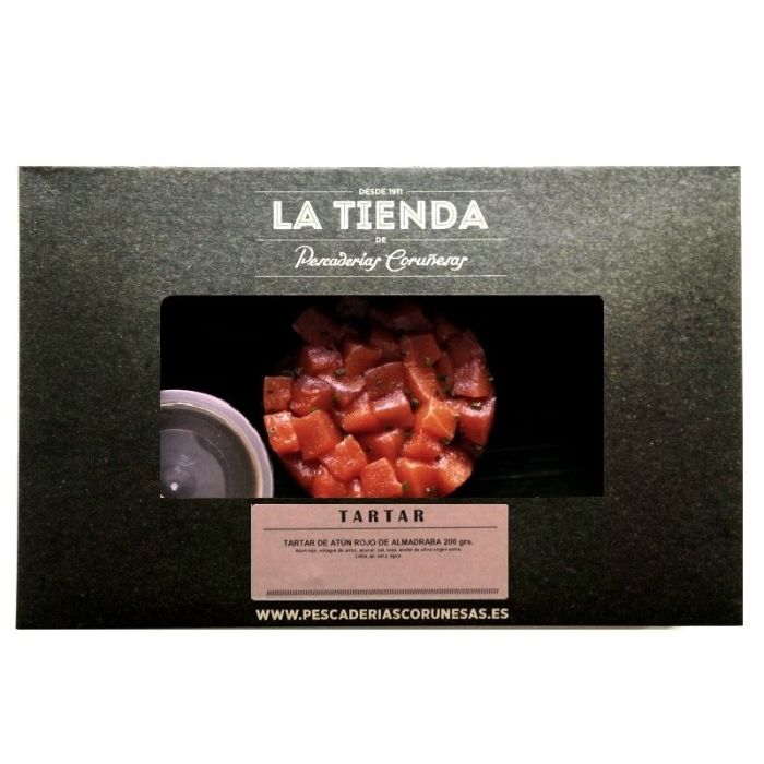
The packaging is a folding carton made of a single-layer paperboard with a smooth, flat construction. It features a dark green exterior with a matte finish, providing a premium appearance. The front has a clear plastic window that allows visibility of the product inside, which is a tartar of red tuna. The edges are clean and precise, indicating high-quality manufacturing. The packaging is designed for retail display, with a focus on aesthetics and product visibility.
About the Brand
Pescaderías Coruñesas delivers fresh seafood direct to consumers via a robust e-commerce platform and physical locations, utilizing packaging designed for optimal freshness and presentation. Their packaging portfolio features rigid gift boxes and retail cartons with high structural integrity and consistent brand messaging.
All packaging formats are engineered to reinforce the company's premium positioning, with matte finishes, dark color palettes, and clear brand identifiers. The use of internal dividers and protective materials reflects a focus on both logistics safety and unboxing experience, crucial for perishable and high-value seafood products. Brand consistency is maintained across all packaging forms, from luxury gift sets to retail sushi cartons, ensuring a cohesive customer perception.
Key Differentiator: Integration of premium rigid and carton packaging with strong brand cues, designed to balance luxury presentation, protection for perishable goods, and direct-to-consumer logistics.
Design System
Visual Style
Typography favors bold, sans-serif fonts in white or gold against matte dark backgrounds (primarily black, deep green, or navy), supporting a refined, upscale aesthetic. The color palette is dominated by dark neutrals with metallic highlights, conveying quality and tradition.
Brand Identity
Consistent logo usage and company name placement are visible on all packaging, typically accompanied by the website URL. Iconography is minimal, focusing on clarity and reinforcing brand recognition. Visual consistency is maintained across product formats through unified color schemes and typography.
Packaging Design
Material selection prioritizes rigid board and high-grade folding carton for structure, with plastic windows for product display in select SKUs. Structural design emphasizes durability and compartmentalization, balancing protection with visual appeal and ease of use.
User Experience
The packaging design enhances the customer journey by facilitating secure transport, an engaging unboxing experience, and immediate product recognition. High-touch finishes and well-organized interiors elevate perceived value, supporting the premium seafood positioning and encouraging repeat purchases.
Company Metrics
Business insights for Pescaderías Coruñesas based on available data
Market Positioning
Brand Values & Focus
Key Competitors
Target Market: Spanish premium seafood consumers, online grocery buyers, and Madrid-based restaurant clientele seeking high-quality, fresh seafood with luxury presentation.
Packaging Assessment
Overall Grade
Visual appeal and presentation quality
Packaging durability and protection
Eco-friendliness and recyclable materials
Cost efficiency and value for money
Packaging assessment for Pescaderías Coruñesas based on industry standards and best practices
Frequently Asked Questions
What packaging formats does Pescaderías Coruñesas use for seafood products?
The company primarily uses rigid boxes for gift sets and folding carton boxes for retail-ready items such as sushi and tartar. These formats include protective inner materials and clear branding elements.
How does their packaging support logistics and product freshness?
Packaging is constructed with sturdy walls and internal compartments or cushioning, helping maintain product integrity during transit and supporting the freshness of temperature-sensitive seafood.
Is sustainability considered in Pescaderías Coruñesas' packaging strategy?
While packaging uses recyclable paperboard materials and minimalistic design to reduce waste, the inclusion of plastic windows and luxury finishes indicates moderate sustainability performance within the food sector.
Discover other Food & Drink companies
Explore more companies in the food & drink industry and their packaging strategies
PrepMyMeal
Food & Drink
PrepMyMeal is a food production company specializing in high-protein meal delivery services. They offer a variety of natural, nutritious meals designed for fitness enthusiasts and those seeking convenience in meal preparation.
ruf lebensmittelwerk kg
Food & Drink
RUF Lebensmittelwerk KG is a German food production company specializing in a variety of baking mixes and drink products. Founded in 1920, the company is known for its high-quality ingredients and innovative food solutions.
kerex - terre exotique
Food & Drink
Kerex - Terre Exotique specializes in the international trade of gourmet food and drink products, offering a unique selection of spices and culinary ingredients.