Parfümerie GRADMANN 1864 packaging
Parfümerie GRADMANN 1864 is a luxury beauty and fragrance retailer specializing in high-end perfumes, skincare, and cosmetics. Their packaging strategy emphasizes premium materials, minimalist aesthetics, and strong brand alignment to reinforce the upscale positioning of their curated product range.
Packaging Portfolio
Parfümerie GRADMANN 1864 employs a mix of high-quality carton and rigid boxes for its product and gift packaging. Carton packaging is used for retail and individual items, featuring matte finishes, precise folds, and clean-cut windows for product visibility. Rigid boxes are reserved for luxury and gift sets, constructed with sturdy chipboard and complemented by minimalist color palettes and subtle branding. The use of internal product holders and secure closures reflects a focus on protection and premium presentation, aligning with luxury beauty sector standards.
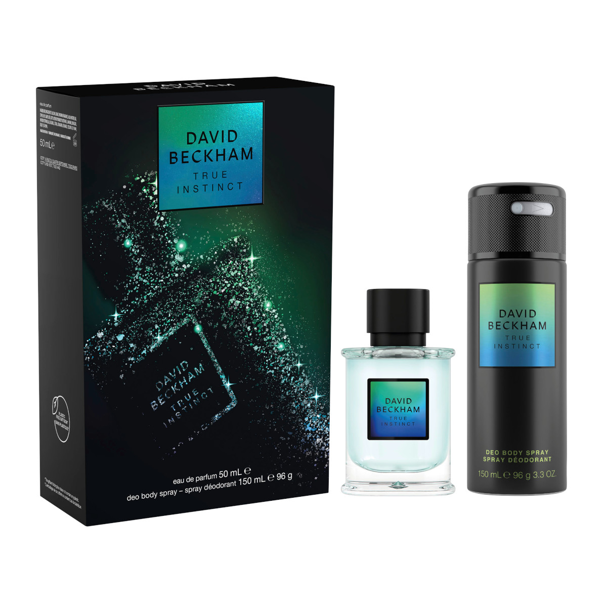
The packaging consists of a folding carton that houses a perfume bottle and a deodorant spray. The outer box features a smooth, flat construction with clean edges and folds. It has a glossy finish with vibrant graphics, including a holographic logo and product name. The interior holds the two products securely, preventing movement during transport.

The packaging is a rectangular, flat construction with smooth edges and a clean appearance. It features a dark blue exterior with a matte finish, giving it a premium look. The front displays the brand name 'GRADMANN 1864' prominently at the top, followed by the product description 'GESICHTS-REINIGUNGSSTUCH' in a contrasting color. The text is centered and uses a clear, modern font. A circular emblem with 'EXKLUSIV' is present, adding a touch of elegance.

The packaging consists of thick, sturdy chipboard boxes that house luxury candles. The boxes have a premium appearance with a smooth, matte finish. Each box is designed with clean, precise edges and folds, showcasing a high-quality construction. The colors are primarily white for the candle containers, with one green box that is likely for a specific scent. The overall design is elegant and minimalistic, aligning with luxury branding.

The packaging consists of a series of white cylindrical candle containers with a smooth, flat construction. Each candle is labeled with a clean, minimalistic design featuring the product name and a brand logo. The labels are neatly applied, with precise edges and folds. The background includes a green box that appears to be a folding carton, likely used for packaging multiple candles together. The overall presentation is elegant and aligns with a premium product offering.

The packaging is a rectangular retail carton featuring a smooth, flat construction without any fluted layers. It has a dark blue exterior with a matte finish, giving it a premium appearance. The front displays a clear window showcasing the contents, which are two facial cleansing cloths. The edges are clean and precise, with a well-defined fold at the top. The back of the carton includes product information and care instructions in white text against the blue background.
About the Brand
Parfümerie GRADMANN 1864 operates as a distinguished e-commerce platform within the beauty and fragrance sector, focusing on luxury products and customer experience. The company leverages meticulously designed packaging to support brand perception and product integrity.
The brand’s packaging approach utilizes high-quality carton and rigid boxes, tailored for both individual and gift purchases. Consistent use of premium finishes, precise folding, and modern typography underscores their commitment to an elevated consumer experience. Packaging elements are carefully selected to align with both product protection and visual impact, supporting logistics and unboxing satisfaction.
Key Differentiator: Distinctive for its integration of luxury packaging formats and strong brand consistency, Parfümerie GRADMANN 1864 stands out by enhancing unboxing rituals and reinforcing exclusivity within the premium beauty segment.
Design System
Visual Style
Modern, sans-serif typography with a focus on legibility and refinement. The color palette features muted tones—primarily whites, deep blues, greens, and soft neutrals—that convey sophistication. Aesthetic approach is minimalistic with restrained use of accent elements.
Brand Identity
Consistent application of the Gradmann 1864 logo and company name on packaging. Iconography is subtle, with occasional use of emblems for exclusivity. Visual consistency is maintained across products through uniform font styles and color schemes.
Packaging Design
Material selection favors premium, recyclable cartons and rigid chipboard for structural integrity. Structural design prioritizes clean edges, snug fits, and minimal external graphics, reflecting a philosophy of understated luxury and product protection.
User Experience
Packaging design supports a seamless customer journey by facilitating easy unboxing, clear product visibility, and a tactile premium feel. The approach reinforces the brand’s luxury positioning and enhances perceived value at each interaction point.
Company Metrics
Business insights for Parfümerie GRADMANN 1864 based on available data
Market Positioning
Brand Values & Focus
Key Competitors
Target Market: Affluent beauty consumers seeking luxury fragrances, skincare, and cosmetics via e-commerce channels across Germany and Switzerland.
Packaging Assessment
Overall Grade
Visual appeal and presentation quality
Packaging durability and protection
Eco-friendliness and recyclable materials
Cost efficiency and value for money
Packaging assessment for Parfümerie GRADMANN 1864 based on industry standards and best practices
Frequently Asked Questions
What types of packaging does Parfümerie GRADMANN 1864 use for its products?
The company primarily uses premium carton and rigid boxes with matte finishes, clean lines, and minimalistic branding. These include custom retail cartons for items like candles and skincare, as well as luxury rigid boxes for gift sets.
How does the packaging strategy support product safety during shipping?
Packaging formats are engineered for durability with snug fits, sturdy chipboard construction, and secure internal holders, minimizing product movement and reducing the risk of damage during transit.
Is sustainability considered in Parfümerie GRADMANN 1864’s packaging choices?
While the packaging prioritizes premium materials and aesthetics, there are indications of recyclable carton usage. However, the primary focus remains on luxury presentation, with sustainability practices likely at an intermediate level compared to industry leaders.
Discover other Beauty & Fitness companies
Explore more companies in the beauty & fitness industry and their packaging strategies
Institut Karité Paris
Beauty & Fitness
Institut Karité Paris specializes in luxury beauty products made with natural Shea Butter, offering a wide range of skincare and body care solutions. The brand combines Parisian heritage with a commitment to quality and creativity in its offerings.
Pure Altitude
Beauty & Fitness
Pure Altitude specializes in high-quality beauty and skincare products that leverage the expertise of spa treatments to enhance daily routines. The brand offers a diverse range of products tailored for both facial and body care.
Big Moustache
Beauty & Fitness
Big Moustache specializes in shaving and grooming products tailored for men, providing a hassle-free subscription service for razor blades and skincare essentials.