Orangefit packaging
Orangefit, a Dutch health and nutrition company, specializes in plant-based protein shakes and wellness foods. Their packaging strategy leverages bold, branded flexible pouches and cartons, emphasizing strong shelf presence and consumer recognition while integrating modern design principles.
Packaging Portfolio
Orangefit utilizes a mix of flexible packaging formats, primarily stand-up pouches with resealable zippers, complemented by paperboard cartons and branded shaker bottles. These solutions prioritize product freshness, ease of use, and retail display impact. The flexible pouches are constructed from multilayer materials offering moisture and oxygen barriers, while cartons deliver structural integrity for shipping. The use of vibrant, matte and glossy finishes enhances shelf appeal and reinforces brand identity. Packaging choices reflect a balance between sustainability, cost efficiency, and consumer engagement.
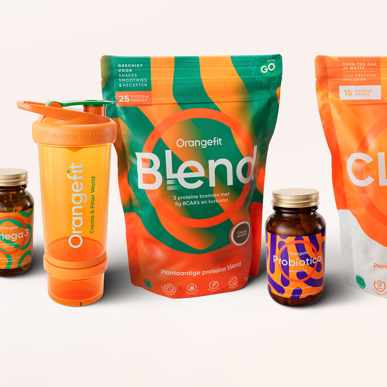
The image features a variety of packaging types, including a stand-up pouch for protein powder, a bottle for probiotics, and a shaker bottle. The stand-up pouch has a vibrant design with a mix of orange and green colors, showcasing the product name 'Blend' prominently. The bottle has a simple design with a dark color, likely indicating a supplement. The shaker bottle is orange with a clear body, indicating its functional use.
The image features two retail pouches and a shaker bottle. The pouches are made of flexible material with a smooth surface, featuring vibrant colors and graphics. The shaker bottle is a solid plastic container with a screw-on lid and a mixing ball inside. The pouches have a resealable top and are designed for easy storage and use.
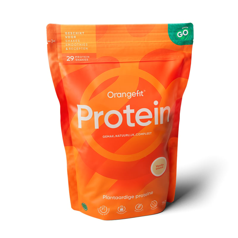
The packaging is a stand-up pouch made from a flexible material that allows it to stand upright. The front features a vibrant orange background with a circular logo and the word 'Protein' prominently displayed in white. The design includes a subtle texture and a matte finish, giving it a modern look. The top of the pouch has a resealable zipper closure, allowing for easy access and storage. The back of the pouch likely contains nutritional information and product details, although this is not visible in the image.
The image features two retail cartons and a cylindrical container. The cartons are made from smooth, flat paperboard with clean edges and folds, showcasing a vibrant orange color with white text. The cylindrical container is also made of paperboard, featuring a similar color scheme and design. The cartons are designed for protein powder, with clear labeling and a modern aesthetic.
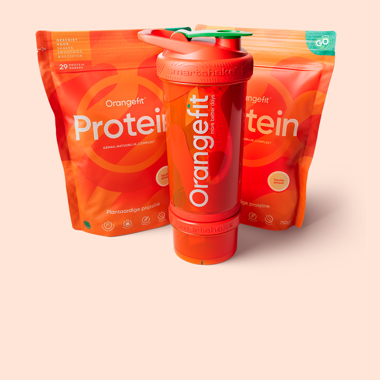
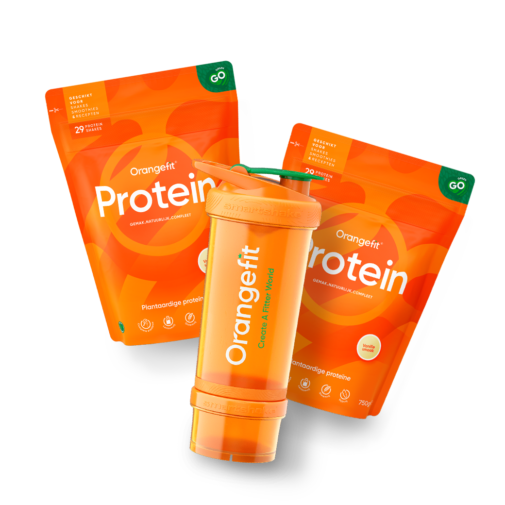
The image features two retail pouches and a shaker bottle. The pouches are made of a flexible material with a glossy finish, prominently displaying the brand name 'Orangefit' in bold white letters against a vibrant orange background. The pouches have a zip-lock closure at the top, allowing for easy resealing. The shaker bottle is cylindrical, made of a durable plastic, and includes a screw-on lid with a flip-top spout for easy pouring. The bottle also features a mixing ball inside for blending contents. The overall design is modern and appealing, targeting health-conscious consumers.
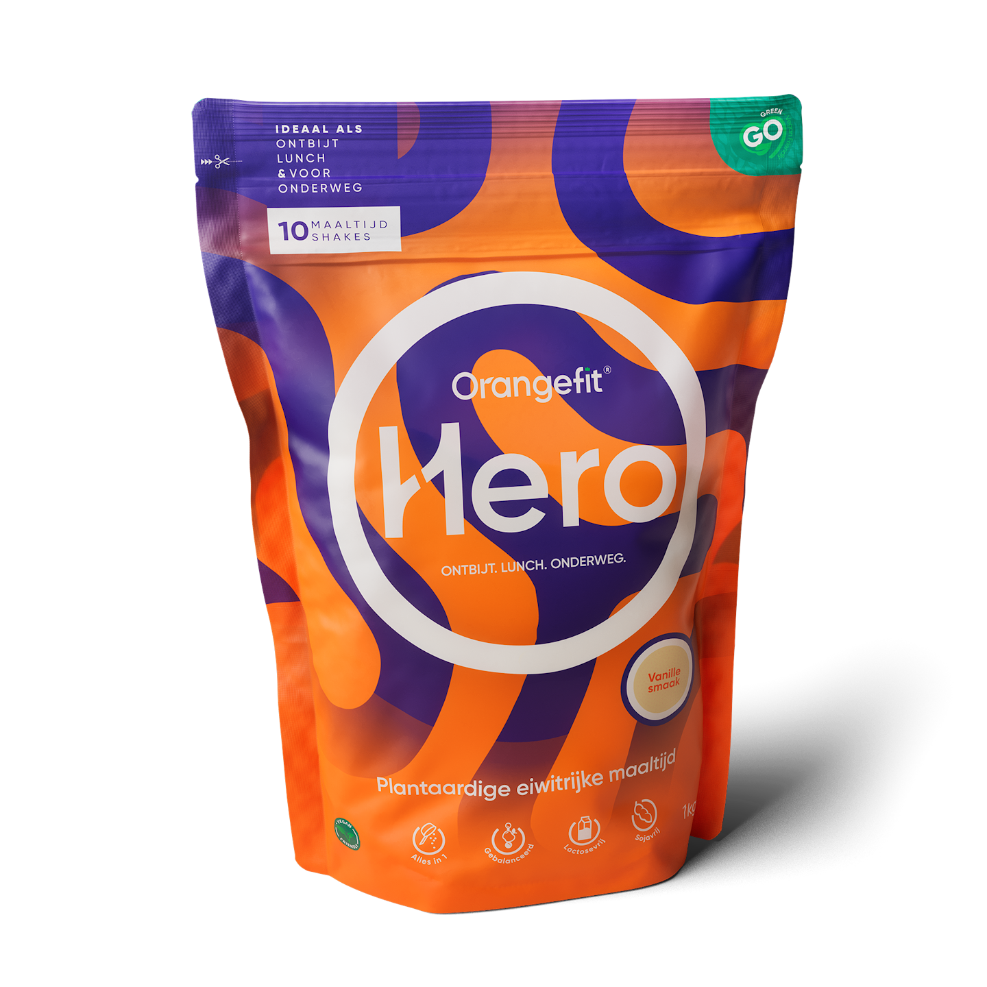
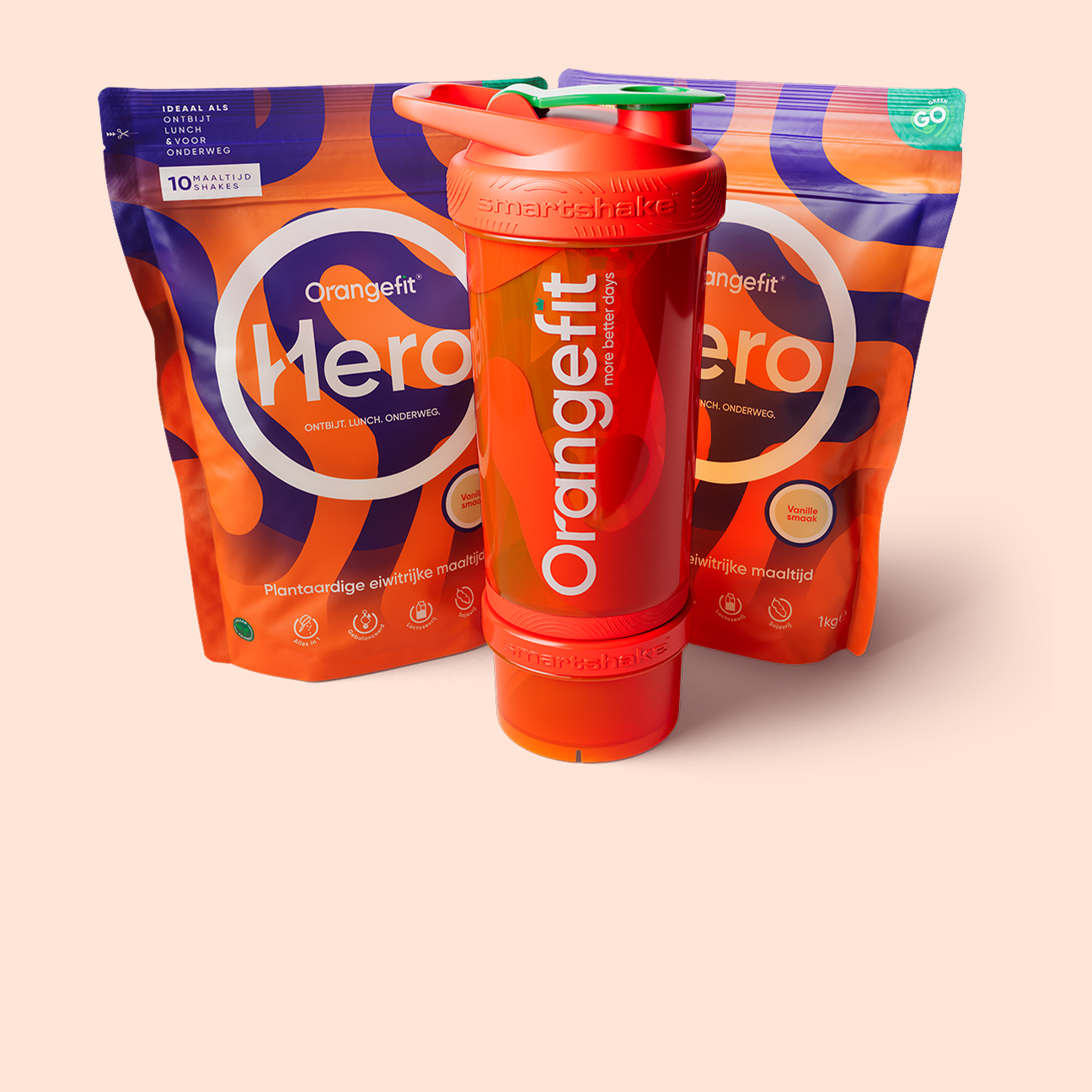
The packaging is a stand-up pouch made from a flexible material that allows it to maintain an upright position. The pouch features a vibrant design with a mix of orange, purple, and green colors, creating a dynamic visual appeal. The front displays the product name 'Hero' prominently, along with the brand name 'Orangefit' in a bold font. The surface has a glossy finish, enhancing the colors and making the graphics pop. The top of the pouch has a resealable zipper closure, allowing for easy access and storage.
About the Brand
Orangefit operates within the health-focused food and beverage sector, distributing protein shakes, meal replacements, and dietary supplements via a direct-to-consumer digital model. Their packaging system is designed around vibrant visual branding, protective formats, and resealable features to maintain product integrity and user convenience.
Founded in 2015 and headquartered in Alkmaar, Orangefit addresses the growing demand for convenient, nutritious foods. The company’s packaging approach utilizes flexible stand-up pouches with resealable closures, retail cartons, and branded shaker bottles—each selected for their protective properties, material efficiency, and capacity for high-impact visual branding. Their focus on vegan and health-conscious consumers is reflected in both product and packaging choices, with an increasing emphasis on sustainable materials and efficient logistics.
Key Differentiator: Orangefit distinguishes itself through consistent, high-visibility branding across all packaging formats and a clear alignment with sustainability initiatives in the health food sector.
Design System
Visual Style
Orangefit adopts a bold, modern aesthetic with a focus on high-contrast orange, white, and accent greens or purples. Typography is clean, sans-serif, and highly legible, paired with large product names and straightforward nutritional cues.
Brand Identity
Consistent application of the Orangefit logo, clear product naming, and signature color palette across all packaging touchpoints. Iconography is minimal and functional, supporting a cohesive and easily recognizable shelf presence.
Packaging Design
Material selection emphasizes lightweight, flexible pouches for powders and snacks, paired with recyclable paperboard for structural cartons. Structural design favors resealability, stackability, and efficient logistics while maintaining visual impact.
User Experience
Packaging is engineered for intuitive use, from easy-open and resealable closures to ergonomic shaker bottles. Design supports a positive brand interaction at each touchpoint, reinforcing trust and facilitating repeat purchase behavior.
Company Metrics
Business insights for Orangefit based on available data
Market Positioning
Brand Values & Focus
Key Competitors
Target Market: Health-conscious consumers in the Netherlands and broader European market seeking plant-based nutrition solutions, with a focus on vegan, active, and wellness-oriented demographics.
Packaging Assessment
Overall Grade
Visual appeal and presentation quality
Packaging durability and protection
Eco-friendliness and recyclable materials
Cost efficiency and value for money
Packaging assessment for Orangefit based on industry standards and best practices
Frequently Asked Questions
What packaging materials does Orangefit primarily use?
Orangefit predominantly uses flexible stand-up pouches with resealable closures, paperboard retail cartons, and branded plastic shaker bottles to package and deliver their products.
How does Orangefit address sustainability in packaging?
Orangefit’s packaging portfolio incorporates recyclable materials such as paperboard and flexible plastics, with a growing focus on reducing environmental impact through material selection and efficient design.
What is the visual approach in Orangefit’s packaging design?
The design emphasizes bold orange color palettes, clear typography, and consistent logo placement, supporting brand recall and a modern, energetic consumer experience.
Discover other Food & Drink companies
Explore more companies in the food & drink industry and their packaging strategies
PrepMyMeal
Food & Drink
PrepMyMeal is a food production company specializing in high-protein meal delivery services. They offer a variety of natural, nutritious meals designed for fitness enthusiasts and those seeking convenience in meal preparation.
kerex - terre exotique
Food & Drink
Kerex - Terre Exotique specializes in the international trade of gourmet food and drink products, offering a unique selection of spices and culinary ingredients.
ruf lebensmittelwerk kg
Food & Drink
RUF Lebensmittelwerk KG is a German food production company specializing in a variety of baking mixes and drink products. Founded in 1920, the company is known for its high-quality ingredients and innovative food solutions.