Ocha Ocha - Die Teebellion packaging
Ocha Ocha - Die Teebellion specializes in unsweetened, additive-free beverages, targeting health-conscious consumers in Europe. Their packaging strategy leverages single-use beverage cartons with strong branding, prioritizing functional design and visual consistency across the product range.
Packaging Portfolio
Ocha Ocha’s packaging portfolio centers on Tetra Pak-style beverage cartons constructed from single-layer paperboard with integrated screw caps, optimized for both product freshness and user convenience. The packaging demonstrates a high level of design consistency, featuring bold color palettes, geometric patterns, and prominent brand elements. These cartons are lightweight, stackable, and suitable for liquid logistics, offering reliable protection during shipping. While the mono-material focus aids recyclability, some limitations persist due to multi-material composites in beverage cartons. The choice of formats and materials reflects a balance between retail shelf impact, sustainability, and cost efficiency.

The packaging is a rectangular beverage carton with a smooth, flat construction. It features a screw cap at the top for easy pouring. The carton is predominantly green with geometric patterns and has a matte finish. The front displays product information, including the product name 'minz tee' in bold pink text, along with additional details in white and green. The sides have a consistent design with a mix of colors and shapes, enhancing visual appeal.
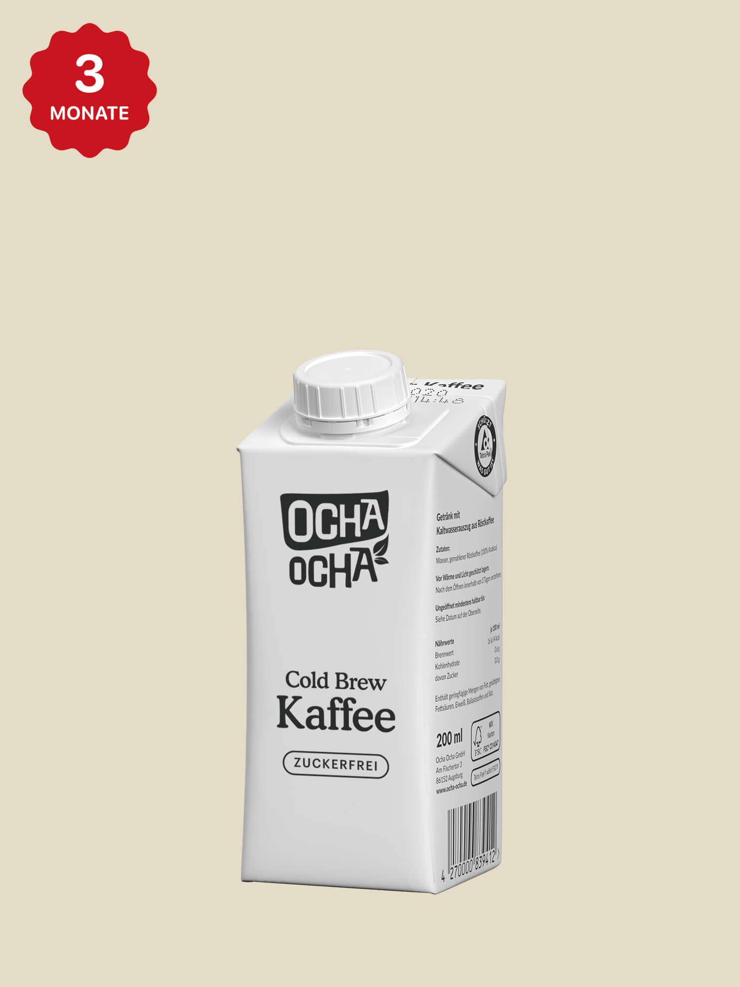
The packaging is a rectangular beverage carton with a smooth, flat construction. It features a screw cap on top and is primarily white with black text and graphics. The carton has clean edges and precise folds, typical of folding cartons used for retail packaging. The front displays the brand name and product type prominently, while the back includes nutritional information and other details.

The packaging consists of several beverage cartons, each with a smooth, flat construction. The cartons are made of single-layer paperboard, featuring colorful graphics and a clean design. The tops of the cartons have screw caps for easy pouring. Each carton has a rectangular shape with precise edges and folds, showcasing a lightweight appearance typical of retail beverage packaging.
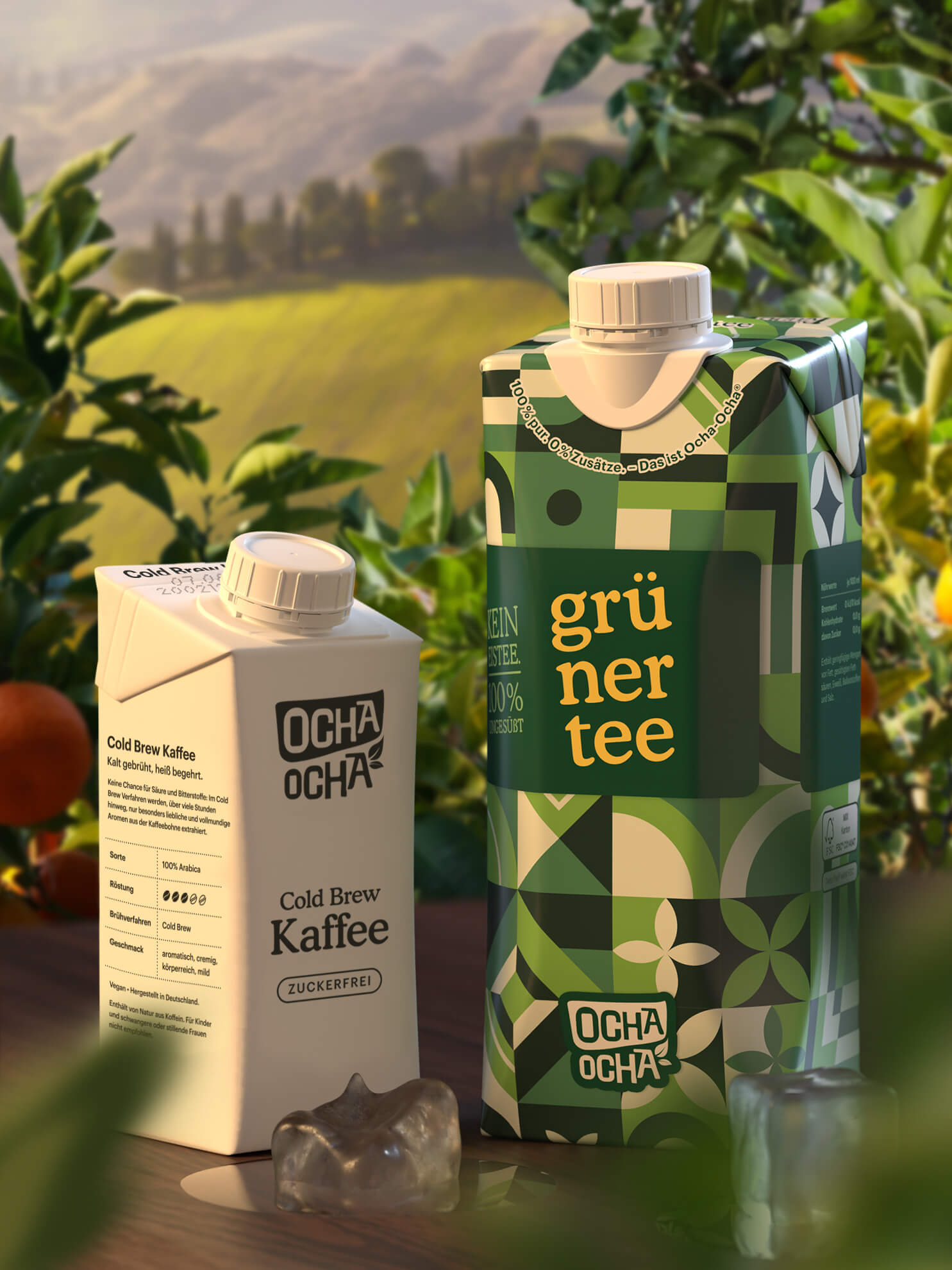
The image features two beverage cartons, one for Cold Brew Kaffee and the other for Grüner Tee. Both cartons have a smooth, flat construction typical of folding cartons, with clean edges and precise folds. The Cold Brew Kaffee carton is predominantly white with black text and a minimalist design, while the Grüner Tee carton showcases a vibrant green pattern with geometric shapes. Both cartons have a rectangular shape and a pour spout at the top, indicating functionality for liquid dispensing.

The packaging consists of Tetra Pak cartons in various sizes, designed for liquid beverages. Each carton features a rectangular shape with a spout for easy pouring. The surface is smooth and has a glossy finish, showcasing vibrant colors and intricate geometric patterns. The designs include a mix of green, red, and white colors, with clear labeling of the product types such as 'grüner tee' and 'früchte tee'.
About the Brand
Ocha Ocha, founded in 2018 in Augsburg, Bavaria, operates in the food and beverage sector, offering organic teas and cold brew coffee with a focus on natural ingredients and health-driven formulations. The company’s direct-to-consumer model is supported by a robust e-commerce presence and a packaging portfolio designed for both shelf appeal and logistics efficiency.
The brand’s product lineup includes bio-certified fruit teas, mint teas, and cold brew coffee, all presented in visually distinct, screw-cap beverage cartons. Ocha Ocha’s packaging aligns with its broader commitment to wellness and sustainability, utilizing recyclable paperboard materials and exploring further sustainable innovations to minimize environmental impact. The packaging is designed to communicate purity and simplicity, with clear labeling and a modern aesthetic.
Key Differentiator: Ocha Ocha distinguishes itself by exclusively offering unsweetened, additive-free beverages in Europe, reinforced by packaging that visually underscores naturalness and brand authenticity.
Design System
Visual Style
The visual design style uses a clean, modern sans-serif typography, a vibrant color palette (greens, reds, whites) with geometric patterns, and matte or semi-gloss finishes for visual differentiation. The overall aesthetic is minimal yet bold, supporting shelf visibility and brand recall.
Brand Identity
Brand identity is maintained through consistent logo placement, clear product naming, and integration of organic certification symbols. Iconography is minimal, with emphasis on clarity and legibility, ensuring every package is immediately recognizable as part of the Ocha Ocha family.
Packaging Design
Material selection favors recyclable paperboard cartons with screw caps, prioritizing ease of use and environmental responsibility. Structural design philosophy emphasizes rectangular, stackable formats for efficient storage and shipping, while vibrant patterns differentiate SKUs.
User Experience
The packaging is engineered to facilitate a straightforward customer journey—from easy opening and pouring to clear information display. The visual cues and ergonomic design elements enhance the perceived value and align with consumer expectations for clean, healthy beverage brands.
Company Metrics
Business insights for Ocha Ocha - Die Teebellion based on available data
Market Positioning
Brand Values & Focus
Key Competitors
Target Market: Health-conscious consumers seeking natural, unsweetened beverages in the European market, particularly those prioritizing organic ingredients and eco-friendly packaging.
Packaging Assessment
Overall Grade
Visual appeal and presentation quality
Packaging durability and protection
Eco-friendliness and recyclable materials
Cost efficiency and value for money
Packaging assessment for Ocha Ocha - Die Teebellion based on industry standards and best practices
Frequently Asked Questions
What types of packaging materials does Ocha Ocha use for its beverages?
Ocha Ocha primarily utilizes single-layer paperboard beverage cartons with screw caps, commonly recognized as Tetra Pak-style cartons. These formats allow for effective product protection, portability, and branding, while supporting recyclability initiatives.
How does Ocha Ocha address sustainability in its packaging?
Ocha Ocha’s packaging uses recyclable paperboard cartons and is exploring additional sustainable packaging options. The current approach reduces plastic content and supports the brand’s commitment to eco-friendly practices, though multi-material layers in beverage cartons present some recycling challenges.
Discover other Food & Drink companies
Explore more companies in the food & drink industry and their packaging strategies
ruf lebensmittelwerk kg
Food & Drink
RUF Lebensmittelwerk KG is a German food production company specializing in a variety of baking mixes and drink products. Founded in 1920, the company is known for its high-quality ingredients and innovative food solutions.
PrepMyMeal
Food & Drink
PrepMyMeal is a food production company specializing in high-protein meal delivery services. They offer a variety of natural, nutritious meals designed for fitness enthusiasts and those seeking convenience in meal preparation.
Thés de la Pagode
Food & Drink
Thés de la Pagode is a French company specializing in organic teas and infusions, focusing on health and well-being. Established in 1987, they prioritize sustainable practices and high-quality ingredients sourced through fair trade.