oatsome packaging
Oatsome specializes in health-focused food products, delivering smoothie bowls, spreads, and toppings through a robust e-commerce platform. Their packaging emphasizes vibrant branding, consumer convenience, and product protection across various materials and formats.
Packaging Portfolio
Oatsome’s packaging portfolio consists of flexible stand-up pouches, cylindrical composite containers, and Tetra Pak beverage cartons. Materials are selected for their balance between product protection, visual presentation, and logistical efficiency. The use of single-layer paperboard, resealable flexible films, and rigid food-safe containers supports a modular approach, facilitating both shelf impact and e-commerce fulfillment. Packaging formats are optimized for portion control, freshness retention, and branding display, while their print finishes (matte and gloss) enhance tactile and visual engagement.
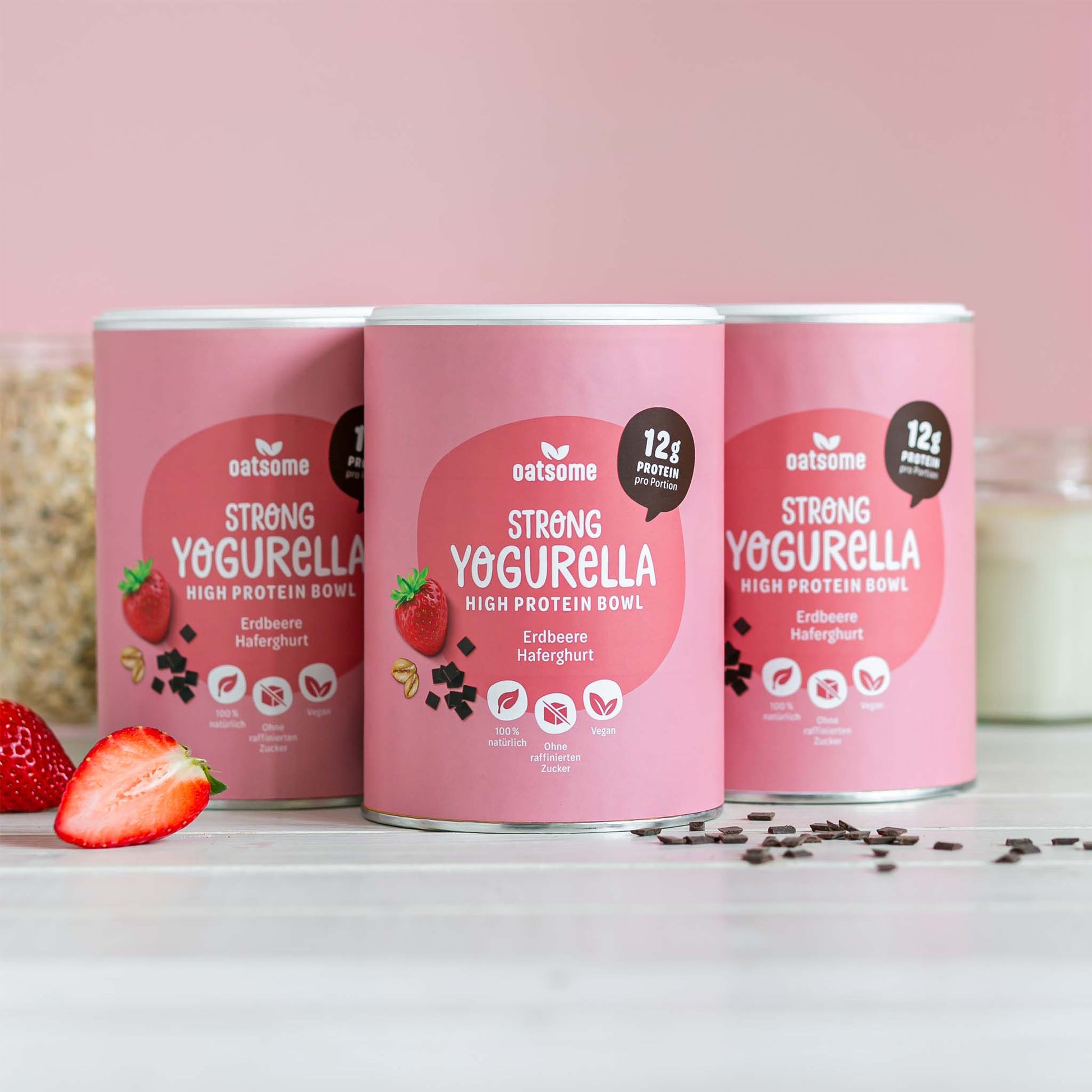
The packaging consists of cylindrical containers with a smooth, flat construction. The containers are predominantly pink with a matte finish, featuring a clean design with rounded edges. Each container has a lid that fits snugly on top, and the overall appearance is sleek and modern, suitable for retail display.

The packaging consists of a rectangular carton designed to hold multiple units of oat drink. It features a smooth, flat construction without fluted layers, indicating it is made from single-layer paperboard. The exterior is predominantly white with vibrant purple accents, showcasing a clean and modern design. The front displays the product name 'OATSOME' in a bold, playful font, alongside images of oats and a clear indication of the product being organic and plant-based. The carton has a spout for pouring, which is a common feature for beverage packaging. The overall shape is tall and slender, optimized for shelf display.

The packaging consists of multiple colorful pouches for smoothie bowls, each featuring a distinct design that includes vibrant colors and playful graphics. The pouches have a flat construction without visible fluted layers, indicating they are made from a single layer of paperboard. Each pouch has a clean, precise edge and fold, typical of retail packaging. The surface finish appears to be a matte or slightly glossy, enhancing the visual appeal. The graphics include illustrations of the ingredients and product names, with a consistent font style across the different flavors.

The image features multiple flexible pouches, each containing different flavors or types of products. The pouches are brightly colored with vibrant graphics and clear labeling. Each pouch has a resealable top and a flat bottom, allowing them to stand upright. The overall design is modern and appealing, with images of the product inside prominently displayed.

The packaging is a Tetra Pak carton designed for liquid beverages, featuring a rectangular shape with a smooth, flat construction. The carton has a clean, precise edge and is predominantly white with vibrant purple and green graphics. The surface has a glossy finish, enhancing the visual appeal. The front displays the brand name 'OATSOME' in bold, playful typography, along with product information such as 'Organic Oat Drink' and 'Original'. The design includes illustrations of oat grains and leaves, contributing to a fresh, organic feel. The top of the carton has a sealed opening with a straw slot, indicating a functional design for easy pouring.
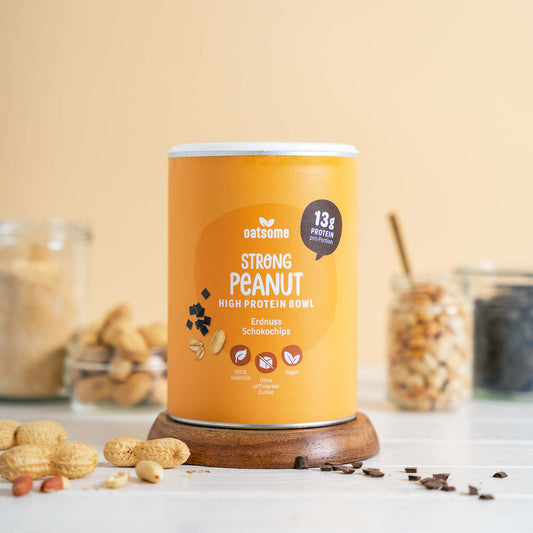
The packaging is a cylindrical container with a smooth surface and a glossy finish. The container features a bright orange color with a clear label that includes product information. The top is sealed with a metal lid, and the base appears to be made of a sturdy material that supports the cylindrical shape. The design is clean and modern, with a minimalist aesthetic.
About the Brand
Oatsome is a German food and beverage company catering to health-conscious consumers with a diverse portfolio of smoothie bowls, crunchy toppings, and spreads. Their approach to packaging is rooted in striking visual appeal, consistent branding, and practical design for direct-to-consumer logistics.
Founded in 2017 and operating primarily online, Oatsome leverages packaging that balances shelf impact and e-commerce requirements. Their solutions include flexible pouches, cylindrical containers, and Tetra Pak cartons—all designed for optimal product freshness, convenience, and branding uniformity. The company’s mid-sized operations facilitate iterative improvements in packaging efficiency and sustainability.
Key Differentiator: Oatsome’s unique value lies in its integration of high-impact design and functional packaging formats tailored to the needs of health-driven e-commerce consumers.
Design System
Visual Style
Oatsome applies playful, bold typography paired with a vibrant color palette dominated by pinks, purples, and oranges. The overall aesthetic is modern, approachable, and cohesive, emphasizing ingredient illustrations and clean layouts.
Brand Identity
Logo placement is consistent and prominent across all packaging, with supporting iconography (ingredient visuals, certification badges) reinforcing the health and organic positioning. Visual consistency is maintained through unified color schemes, typographic hierarchy, and standardized label formats.
Packaging Design
Material choices prioritize lightweight, recyclable substrates—such as paperboard for cartons and composite materials for containers—while flexible pouches reduce shipping volume. The structural design philosophy emphasizes upright, stackable forms and resealability, enhancing both shelf presence and user convenience.
User Experience
Packaging is engineered to deliver an engaging unboxing experience, with clear labeling, resealable closures, and ergonomic form factors. The design system supports seamless brand recognition and aligns with the consumer’s health-focused lifestyle throughout the purchase and consumption journey.
Company Metrics
Business insights for oatsome based on available data
Market Positioning
Brand Values & Focus
Key Competitors
Target Market: Health-focused individual consumers across Germany and Europe, primarily aged 18-40, seeking nutritious, convenient meal options via e-commerce channels.
Packaging Assessment
Overall Grade
Visual appeal and presentation quality
Packaging durability and protection
Eco-friendliness and recyclable materials
Cost efficiency and value for money
Packaging assessment for oatsome based on industry standards and best practices
Frequently Asked Questions
What types of packaging formats does Oatsome use?
Oatsome employs a combination of flexible pouches, retail carton boxes, cylindrical food containers, and liquid beverage Tetra Pak cartons, each selected for product protection, branding, and consumer convenience.
How does Oatsome address sustainability in its packaging?
Oatsome utilizes recyclable materials such as paperboard and Tetra Pak, while their use of flexible pouches reflects an industry trend towards reducing packaging weight and material use; however, full recyclability and lifecycle impacts depend on local waste management infrastructure.
What is the impact of Oatsome’s packaging on the customer experience?
The brand’s packaging design prioritizes visual engagement and ease of use, enhancing the unboxing experience and reinforcing a health-centric lifestyle image throughout the customer journey.
How does Oatsome’s packaging compare to competitors?
Oatsome’s packaging demonstrates a strong alignment with industry norms for premium health food brands, offering similar levels of branding visibility, modularity, and e-commerce compatibility, while maintaining a distinct, playful visual identity.
Discover other Food & Drink companies
Explore more companies in the food & drink industry and their packaging strategies
kerex - terre exotique
Food & Drink
Kerex - Terre Exotique specializes in the international trade of gourmet food and drink products, offering a unique selection of spices and culinary ingredients.
PrepMyMeal
Food & Drink
PrepMyMeal is a food production company specializing in high-protein meal delivery services. They offer a variety of natural, nutritious meals designed for fitness enthusiasts and those seeking convenience in meal preparation.
Terres de Café
Food & Drink
Terres de Café is a specialty coffee retailer based in Paris, France, known for its commitment to sustainability and high-quality coffee sourcing.